LG G Watch R Hands-On: Controversially Bold
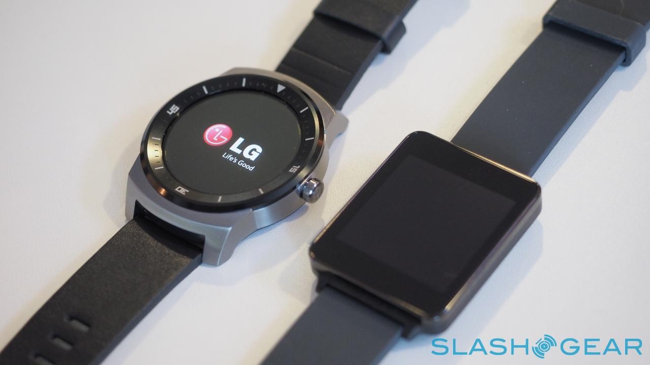
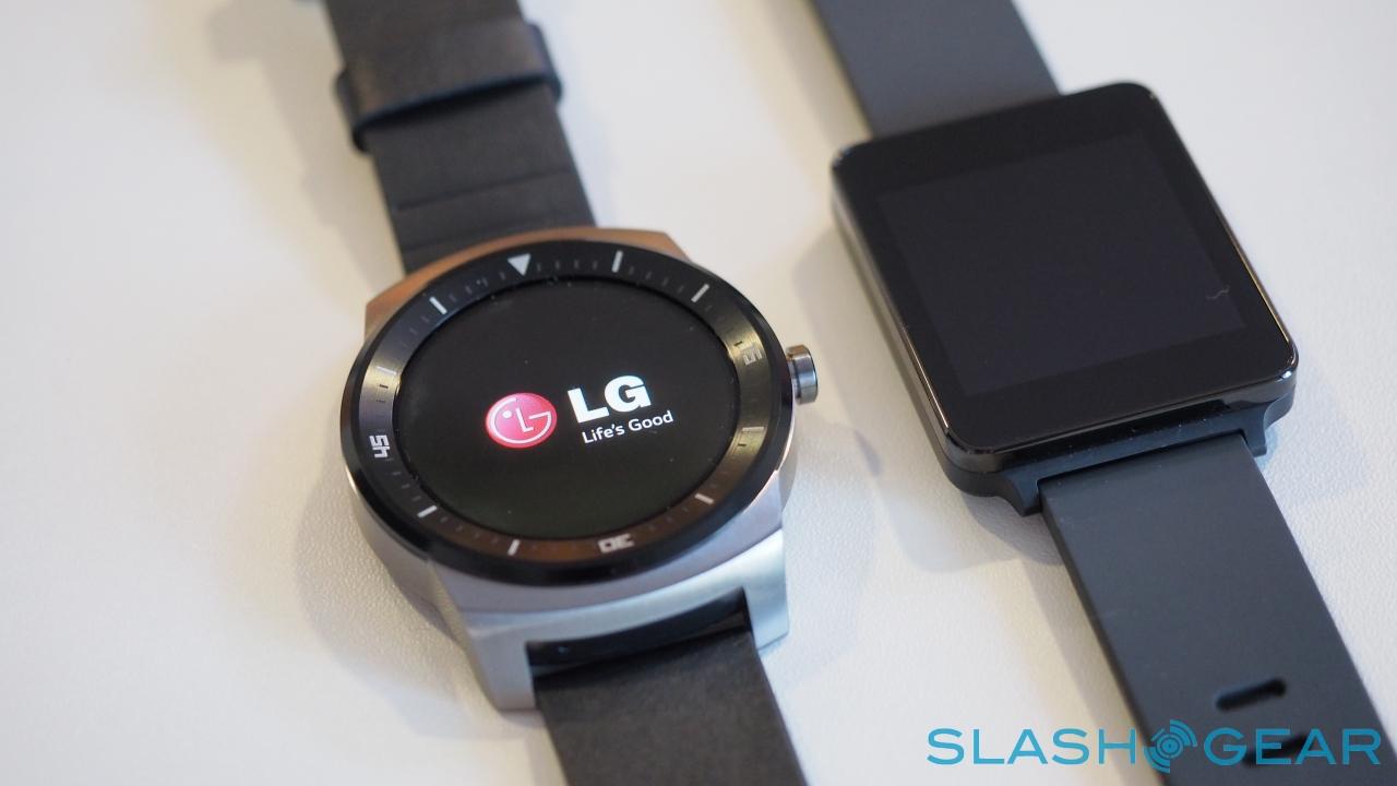
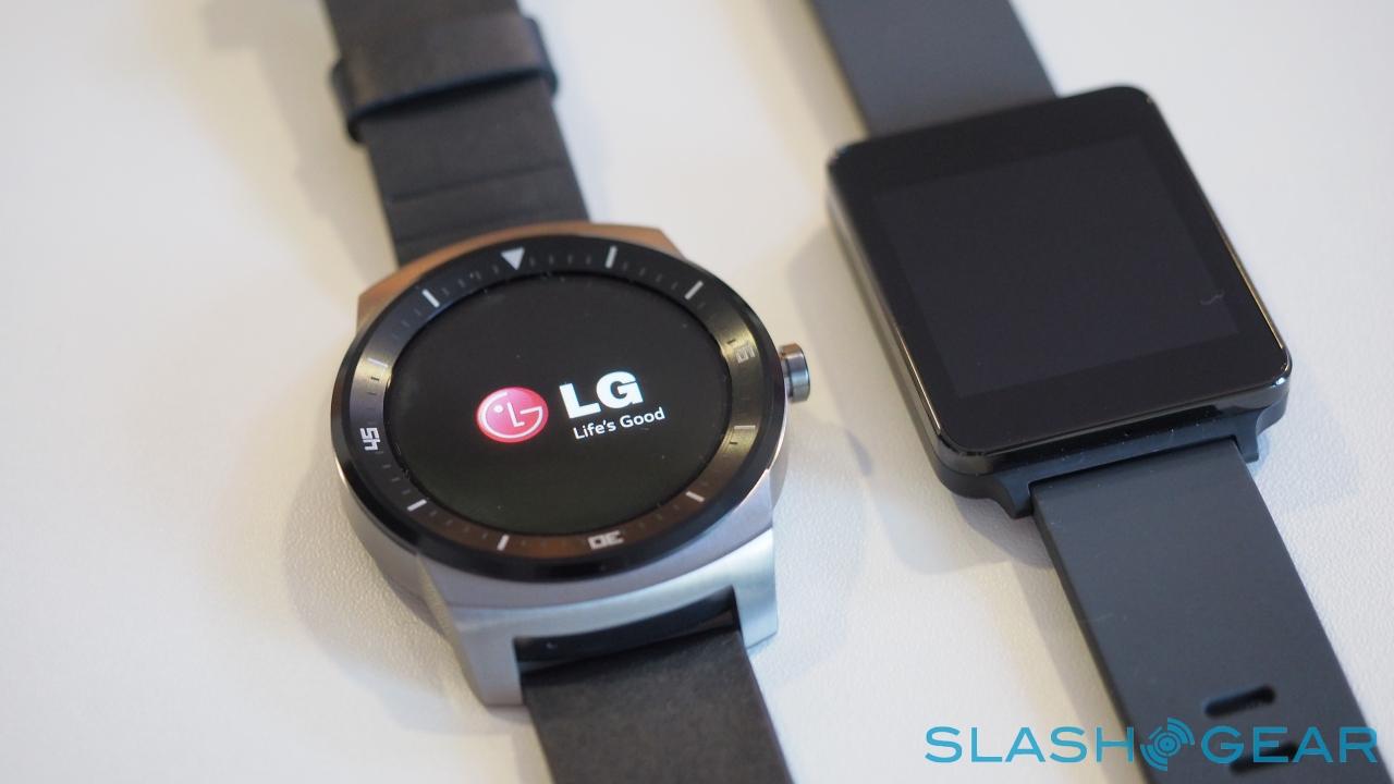
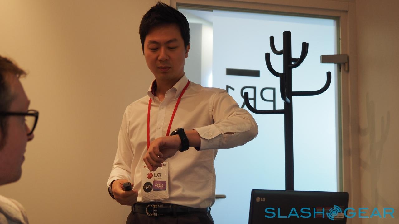
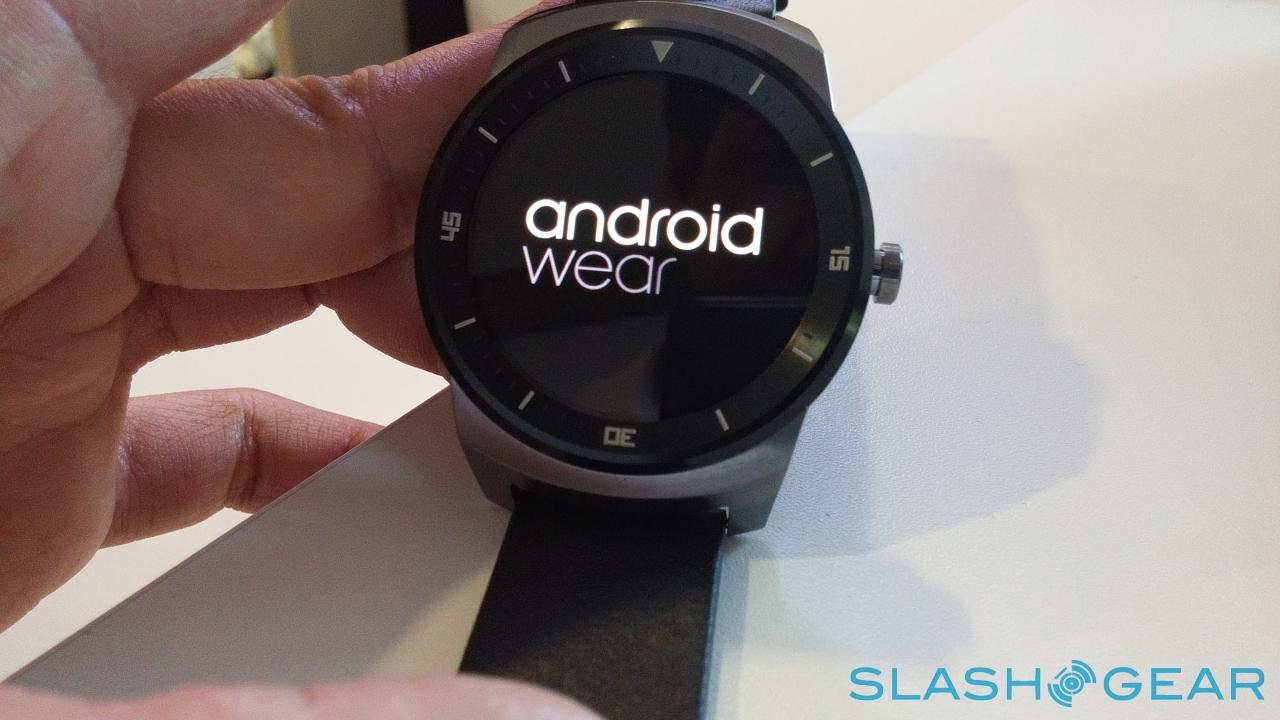
The LG G Watch R came as a surprise. LG had already played its Android Wear hand with the G Watch at Google I/O, and while the square-faced smartwatch was functional it was hardly a stand-out design aesthetically. Turns out, though, LG had already been working on its sibling for more than two years, a round-faced wearable that's far closer in appearance to a regular watch. I sat down with LG and the G Watch R to find out more.
The obvious comparison is the Moto 360, but Patrick Hong from LG's product planning team is keen to make it clear that the G Watch R isn't following Motorola or any other competitor.
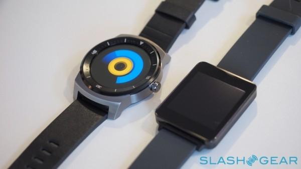
"Honestly, I can say that we didn't make this product because of our competitor's movement, or the strength or position of the market," Hong says. "We started studying this product more than two years ago. We always think about the customer; it's not coming from, or driven by, the technology."
According to Hong, the desire for a round smartwatch from consumers was clear. The first G Watch was effectively an experiment. "Actually, the first smartwatch was a reference model for Android Wear," he explained. "It was more like, it contained essential parts of the Android Wear device, in a neutral design."
As we observed in our own review of the G Watch, that left the timepiece feeling somewhat bland. "It was more like a practical product," Hong admits, "we tried to add emotional values to it."
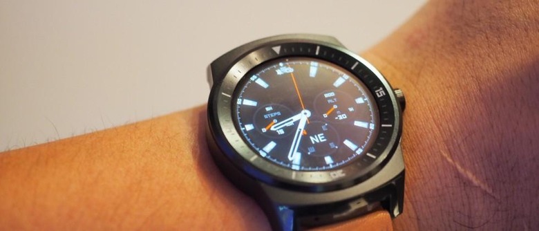
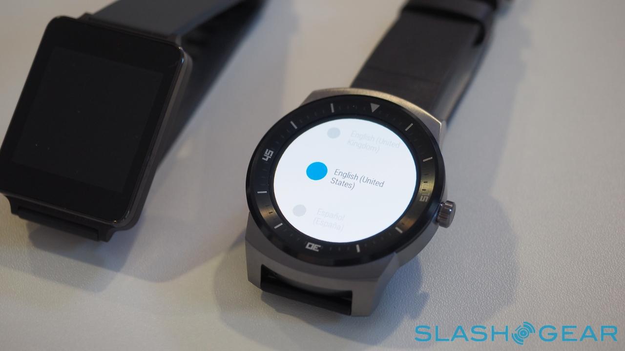
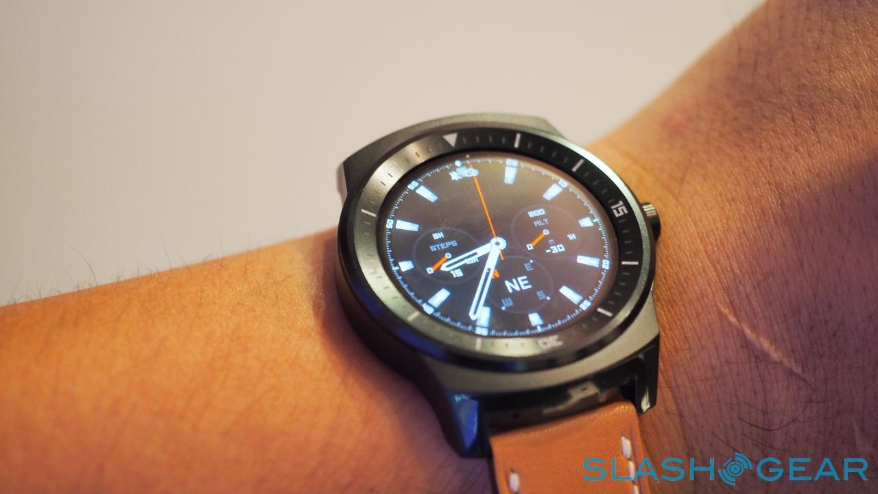
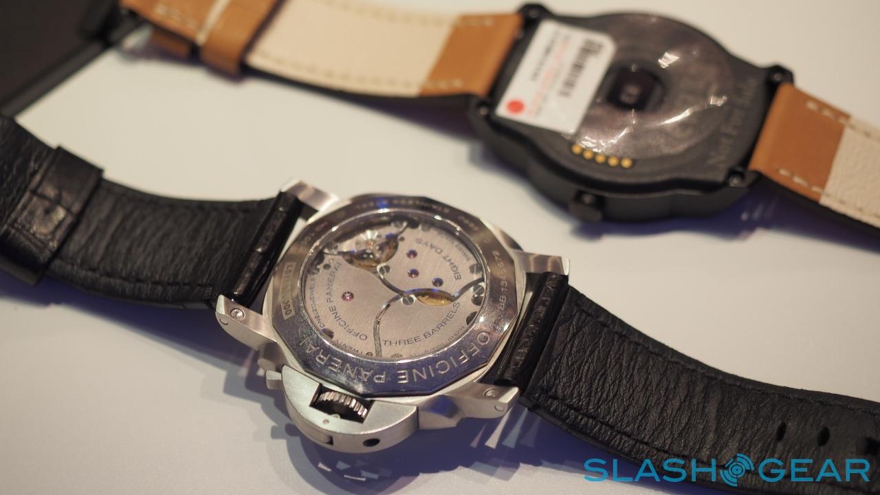
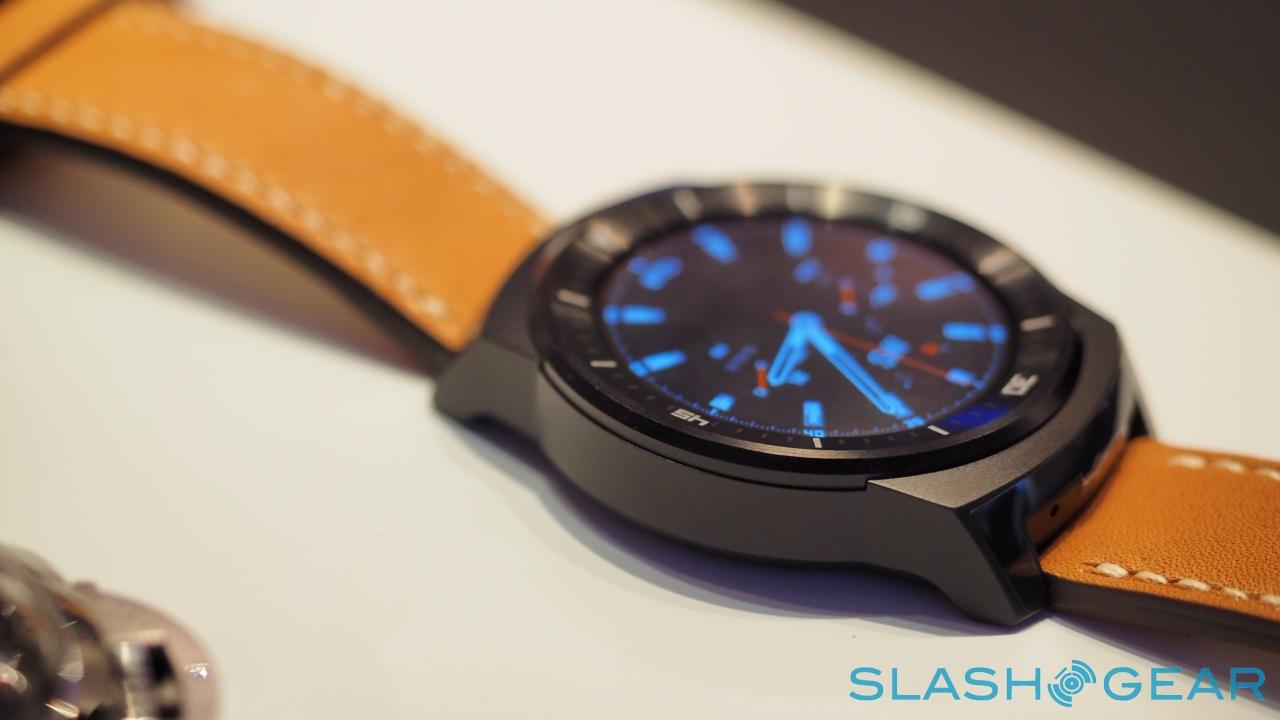
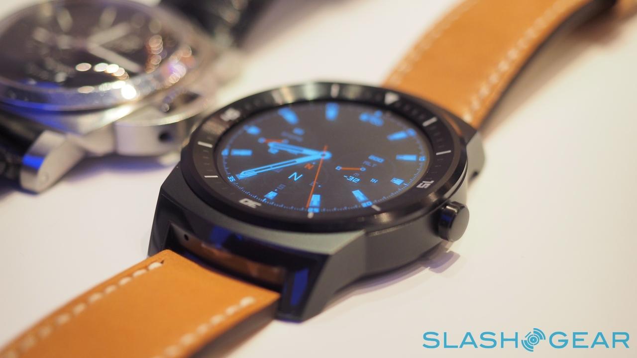
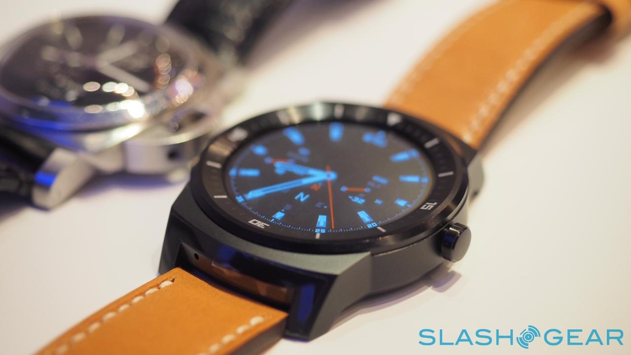
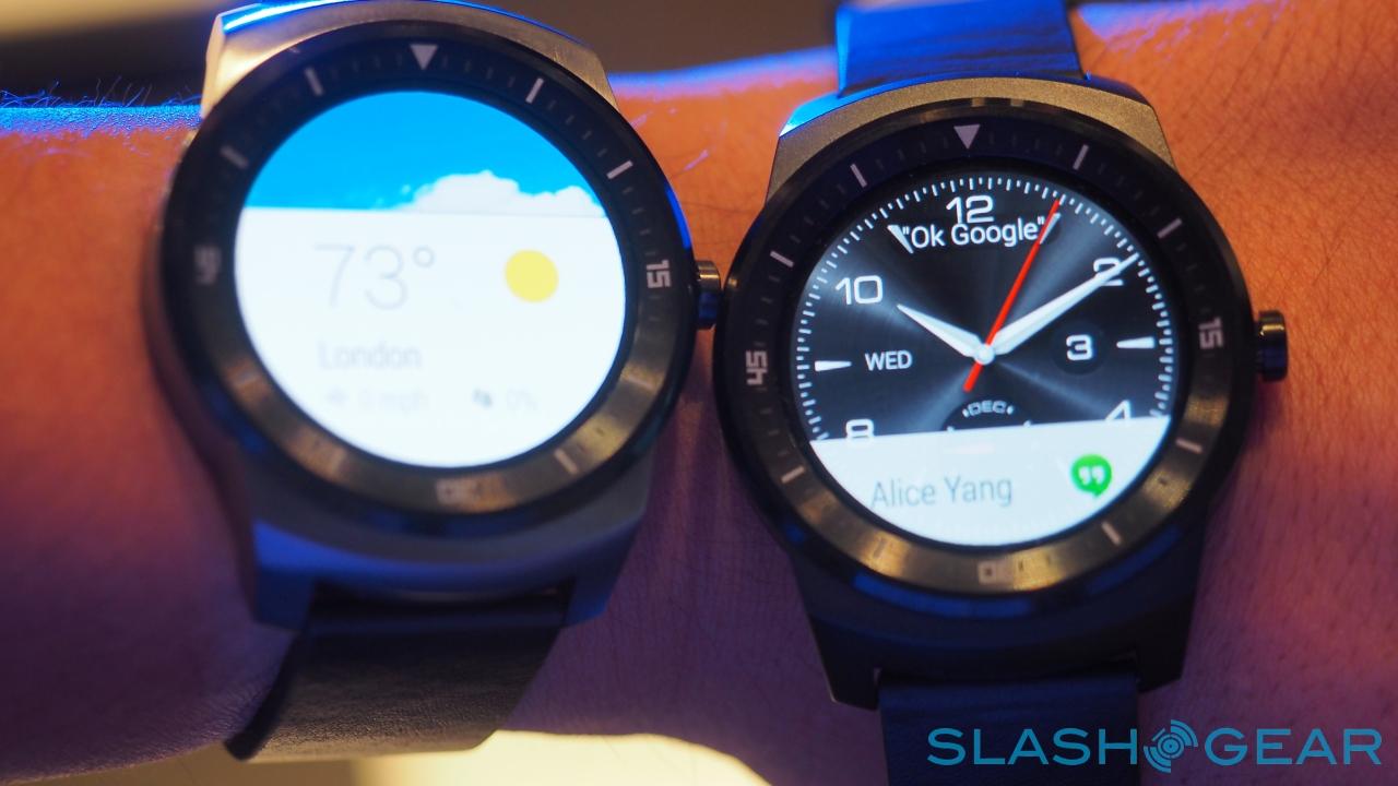
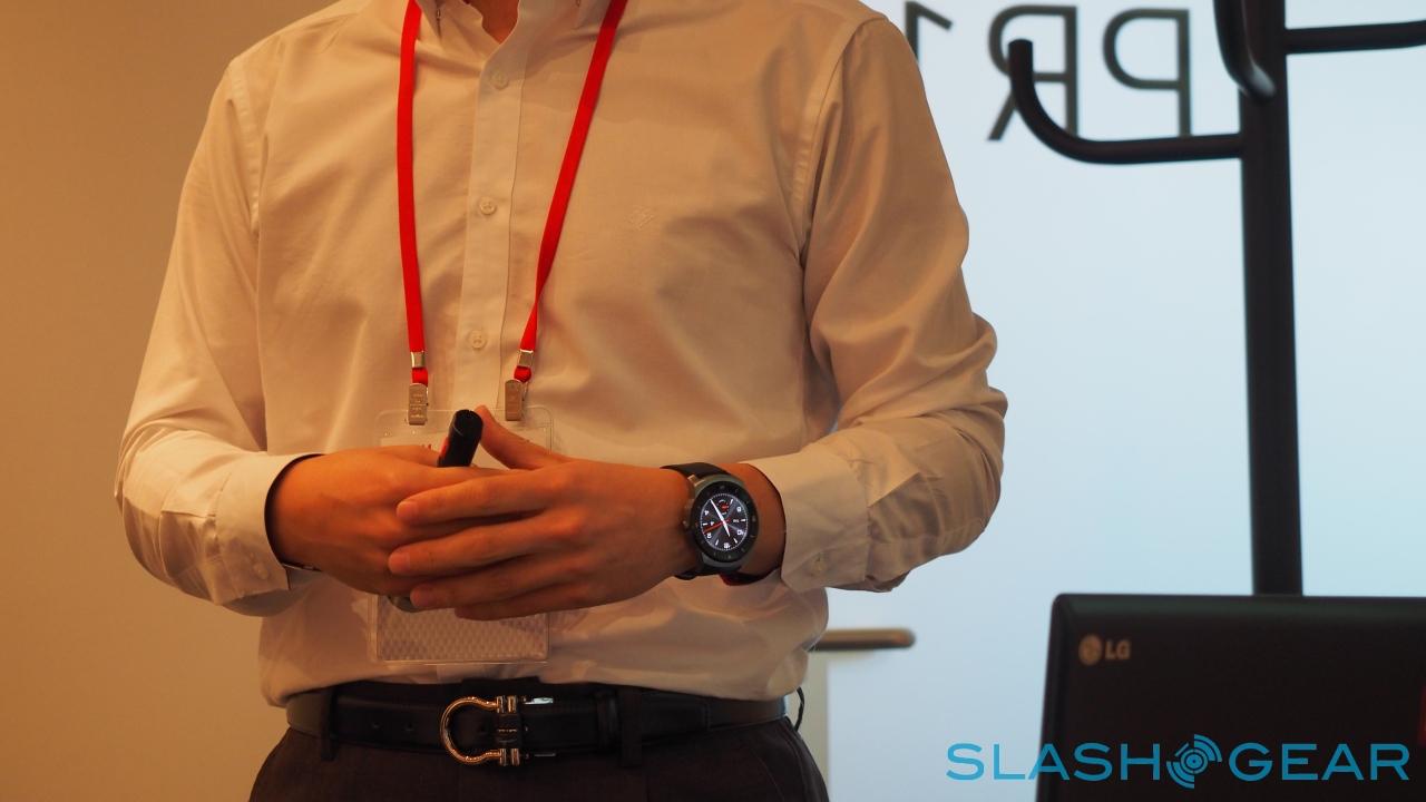
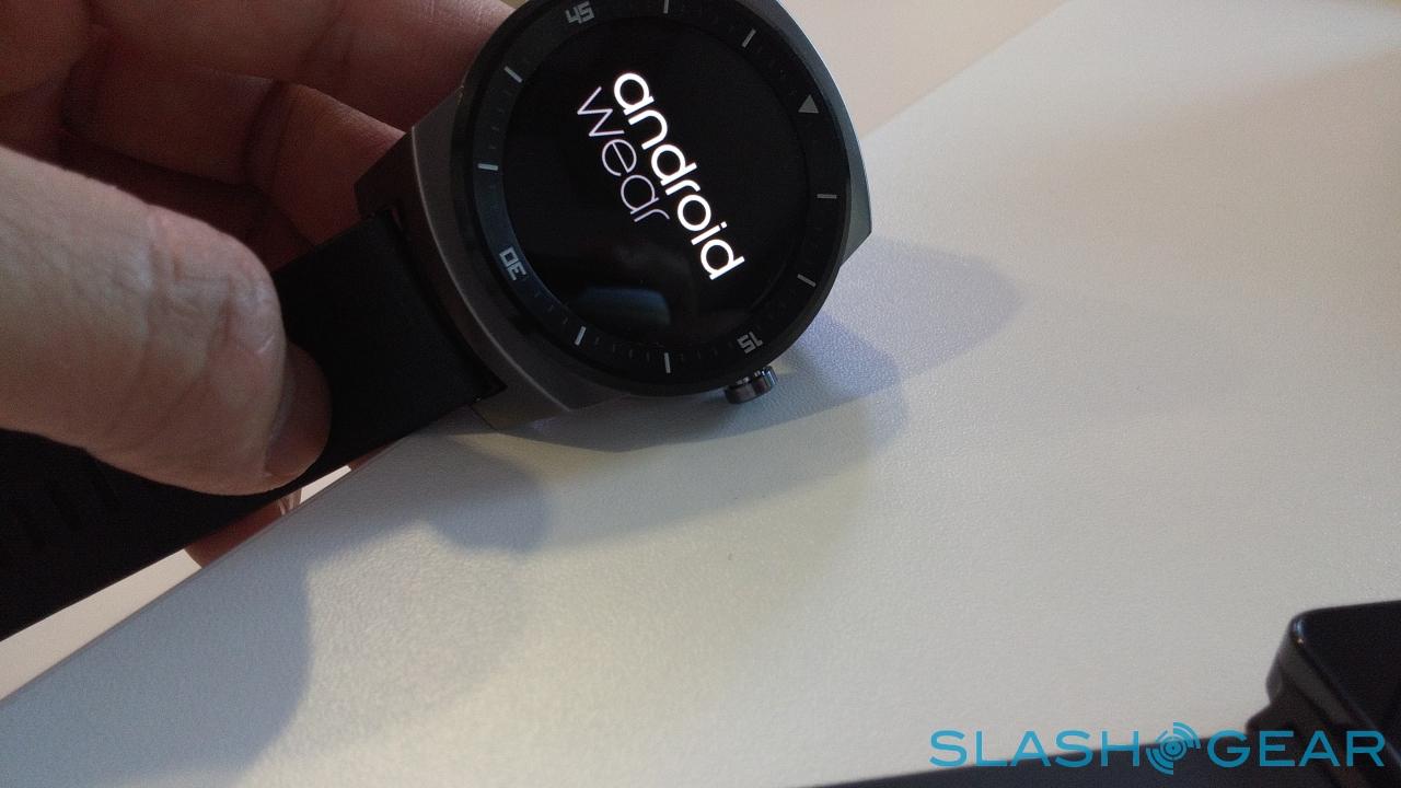
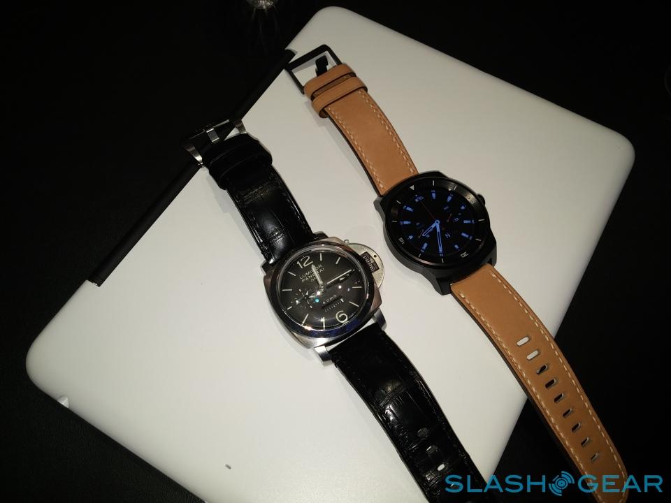
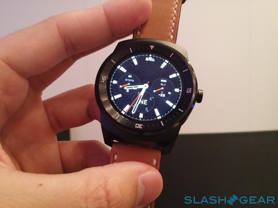
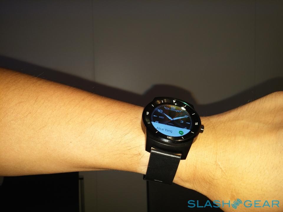
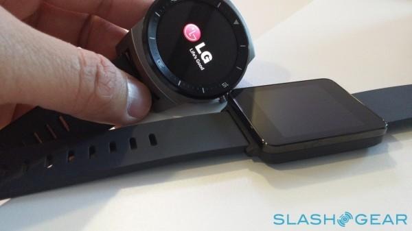
The result is the LG G Watch R. At first glance, it's far closer to a traditional sports chronograph than we've seen from any other Android Wear watch; LG calls that "authentic," though that's helped by the use of standard, interchangeable 22mm straps or bracelets, and watch faces that in many cases mimic analog watches.

"It's not just about one watch," LG designer Michael Kim pointed out. "It's about the possibility to have 29 watches, just changing the watch face or changing the strap."
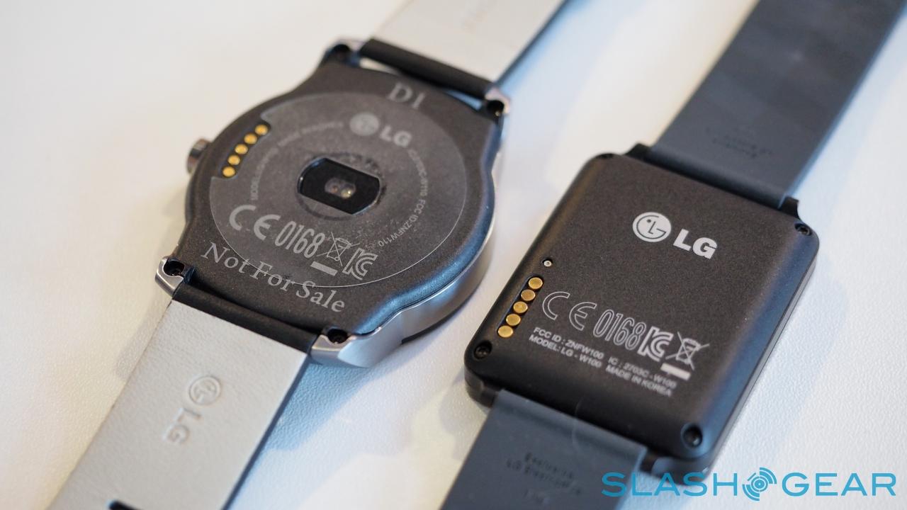
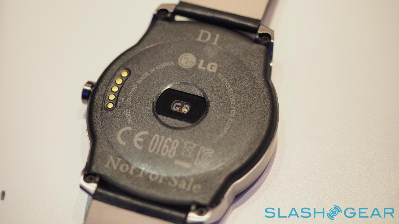
The hardware is, for the most part, the same as what's inside the G Watch. A 1.2GHz Snapdragon 400 processor and 512MB of memory keep Android Wear running, with 4GB of storage, Bluetooth 4.0, a 9-axis accelerometer, barometer, microphone, and IP67 waterproofing. The battery is slightly larger, at 410 mAh, but only by 10 mAh; there's no wireless charging.
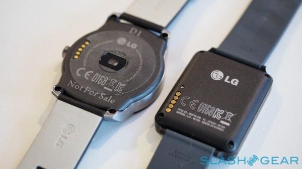
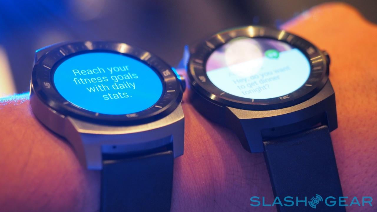
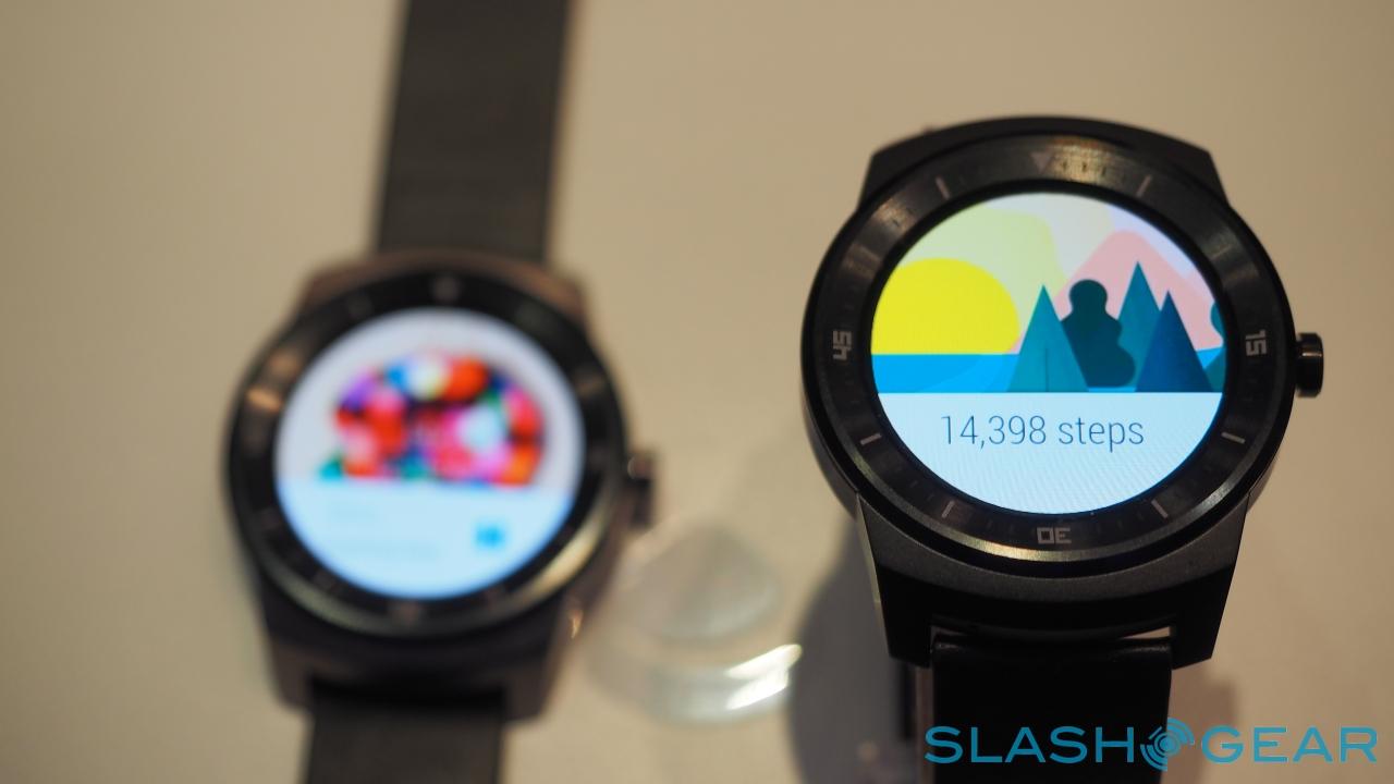
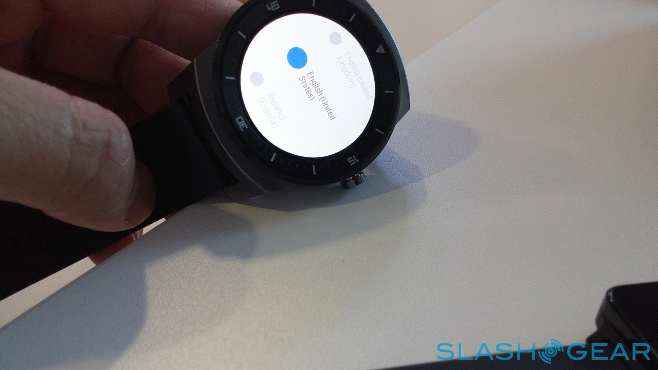
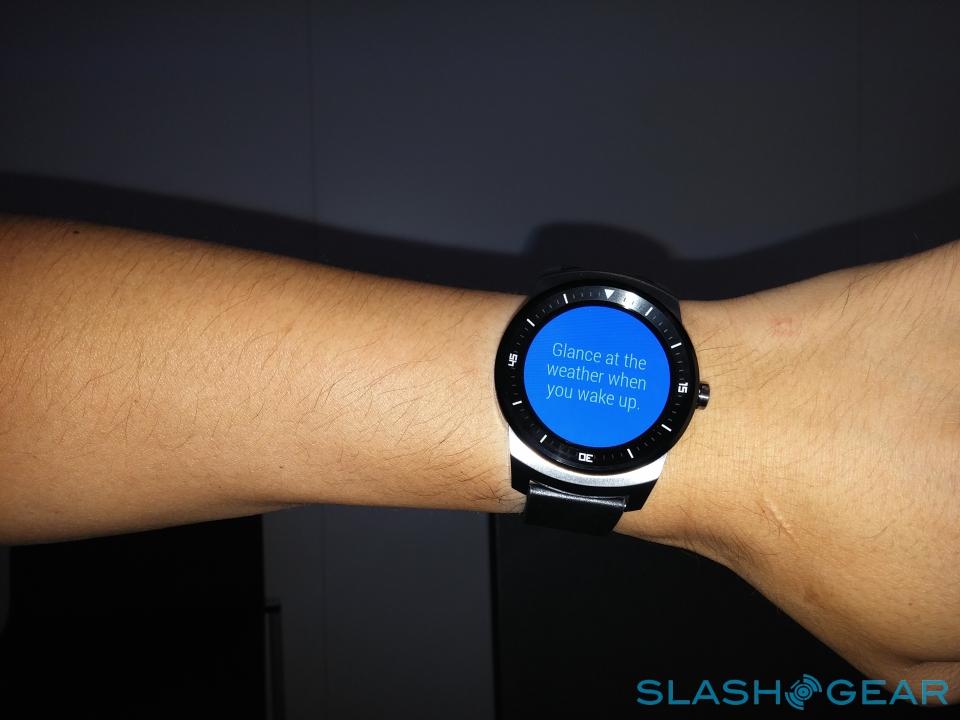
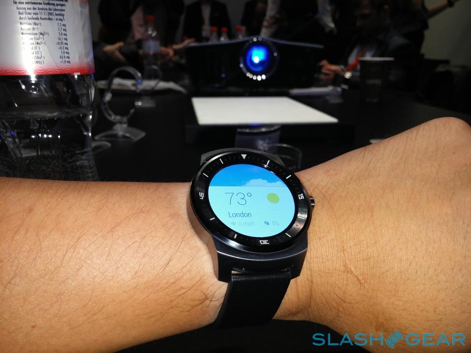
Of course, the big difference is the 1.3-inch diameter POLED 320 x 320 touchscreen, LG Display's own handiwork. It musters 300 nits of brightness and 100-percent color gamut, for better visibility in daylight and when you're glancing at the watch from an angle.
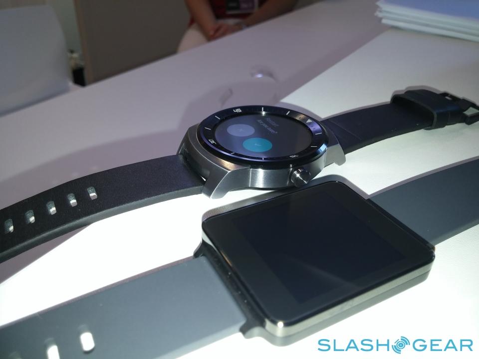
It's an incredible panel. A pure circle – unlike the notched screen of the Moto 360 – it's bright, vivid, and detailed. The resolution is greater than on the G Watch, and the combination of more pixels per inch and that unusual shape means you can't stop looking at it.

Perhaps realizing that, LG has made sure the screen is always active. That's not to say it's always showing bright colors, though: there's an "Ambient Mode" which cuts power consumption for the OLED from 130 mW down to 13 mW, a factor of ten, by effectively showing just white and red clock hands on a black background. LG says the G Watch R will last for up to two days on a single charge as a result.
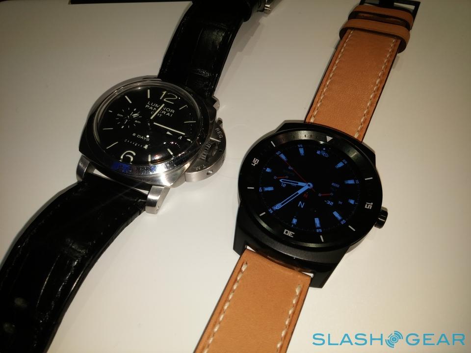
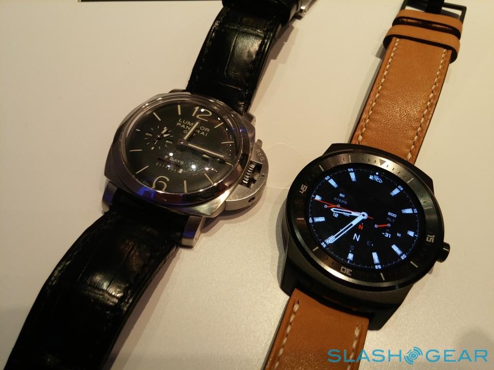
On the wrist, though LG insists the smartwatch is intended to be unisex, the sheer size of it leaves it feeling like a big, masculine chronograph. I've a feeling that will place it out of consideration for many women or men with smaller wrists; it's roughly the equivalent of a traditional 46mm timepiece, which is definitely on the large size.
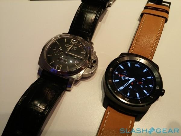
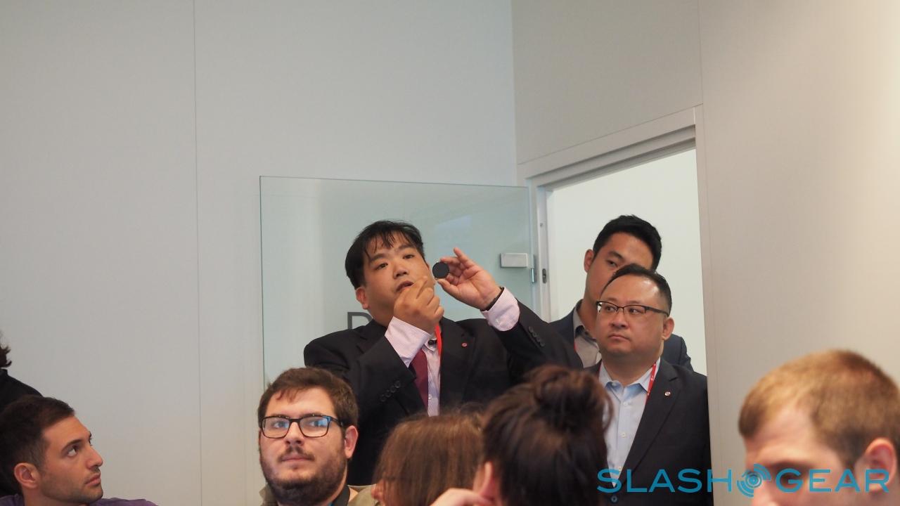
The bulk is in part down to the waterproofing, and LG tells me that adds around 2-3 mm to each side. There aren't any plans for a smaller version at this stage, the company says; "we need more time to develop less bezel," they told me.
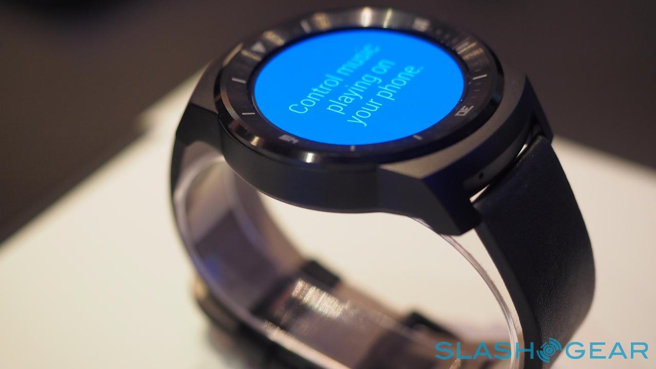
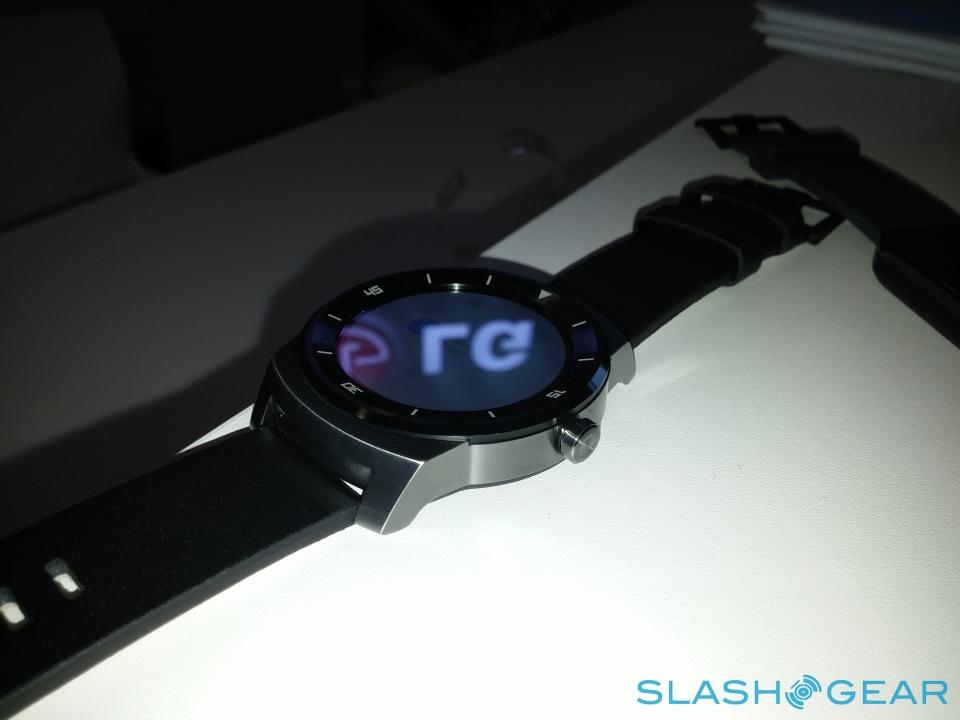
Still, the design could've been toned down from its relatively masculine feel, I believe. The sharply bevelled outer ring, for instance, is a lot more visually striking than, say, the relatively discrete, low-key look Motorola opted for with the Moto 360.
For some, that will be an improvement, but for others it won't be, and that plunges LG into a taste discussion it could, perhaps, have skirted.
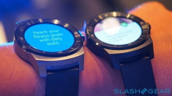
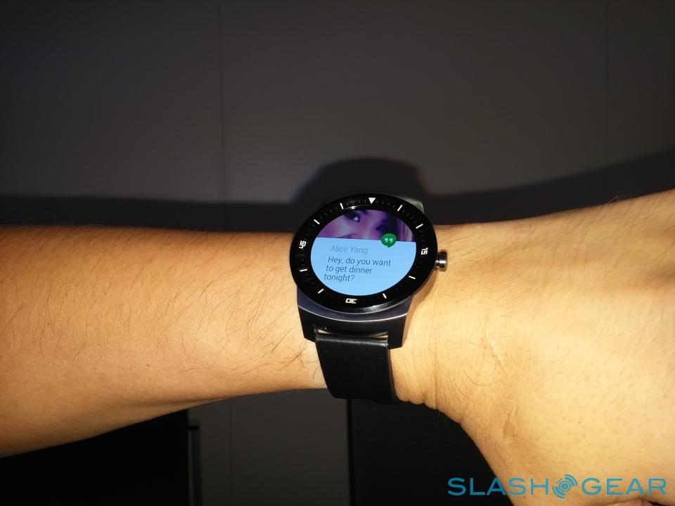
As for Android Wear, that works as we've seen before, controlled by voice and a series of simple swipes and taps. It's obviously reliant on a Bluetooth paired smartphone, though while the graphics and functionality are fundamentally the same as for square-faced models, they look new simply by virtue of the unusual screen shape.
Meanwhile, there'll be an OTA update to Android Wear 2.0 on October 15th. Google hasn't confirmed what features, exactly, will be in 2.0, though we've been told in general to expect things like GPS, Bluetooth music playback, and improvements to voice recognition before the end of the year.
I'm left with mixed feelings about the LG G Watch R. I already wear large watches, so the size wouldn't necessarily dissuade me, but I can certainly see others looking at the round watch and its distinctive aesthetic and feeling that – even with a different watch face and a strap other than the leather band LG provides – it's not to their taste.
A big factor will be pricing, which LG says it will reveal closer to the G Watch R's October release. The original G Watch already carried a premium over the similarly-square Samsung Gear Live; it remains to be seen if history repeats with the G Watch R and the Moto 360.
It's early days for Android Wear still, and new form-factors are to be lauded. In a sense I'm glad to see LG opting to step outside of comfort zones, just as it did with the G3, but it's set itself a challenge that only the market will decide on.
