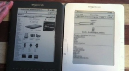
Kindle 3's Webkit Browser Bests Kindle 2 In Video Head-To-Head
The third-gen Kindle's smaller chassis and brighter E Ink display may have been the main selling points for most users, but it was the new, Webkit-based browser that got the true Kindle-geeks excited. The "experimental" browser on previous models was sufficient, in a pinch, to check a Wikipedia entry, but anything more ambitious was a recipe for headaches. A video comparison between Kindle 2 and Kindle 3 by The Kindle Chronicles, though, shows what a step up there's been.Video head-to-head testing after the cut
Gone is the clunky, text-centric app of before, replaced by – joy of joys – image support and much more desktop-like rendering. There's still no touchscreen, of course, but pages load quicker and you're still getting (with the WiFi+3G Kindle at least) free browsing as part of Amazon's inclusive data package.
Less impressive, it seems, is the Kindle 3's new Article Mode, which strips out extraneous images, banners and other in-page elements for easier reading. Unfortunately it doesn't seem to quite go far enough in making large pages suitable for the Kindle's 6-inch display. More info in the video below.
[via The Digital Reader]
