Kindle (2011) Hands-On
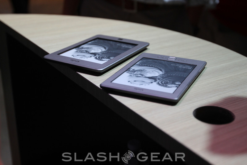
The entry-level Amazon Kindle has price going for it, especially if you don't mind adverts, with a $79 sticker for the WiFi-only ereader. On the flip side, without the touchscreen of its more expensive Kindle Touch siblings, and missing the QWERTY keyboard of its predecessors, it's possible Amazon has slimmed things down a little too much. Read on for our first impressions.
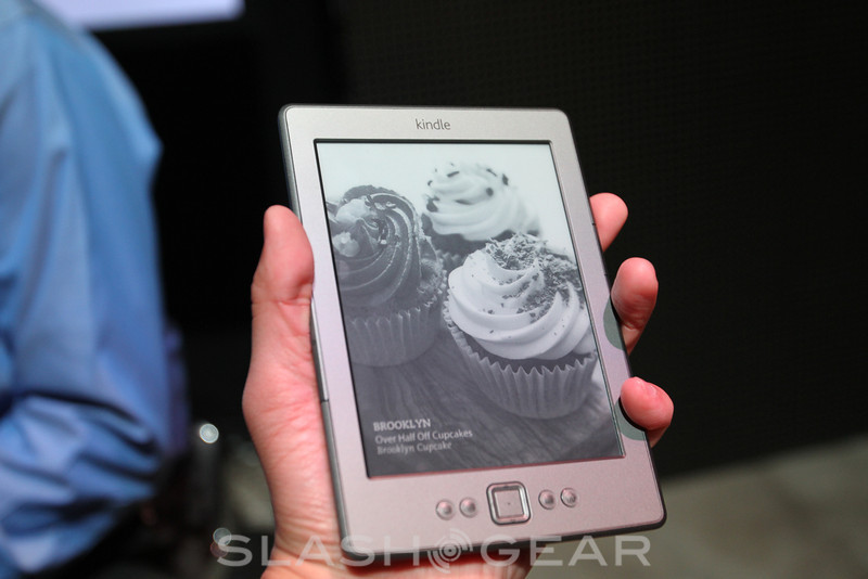
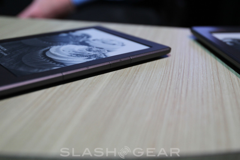
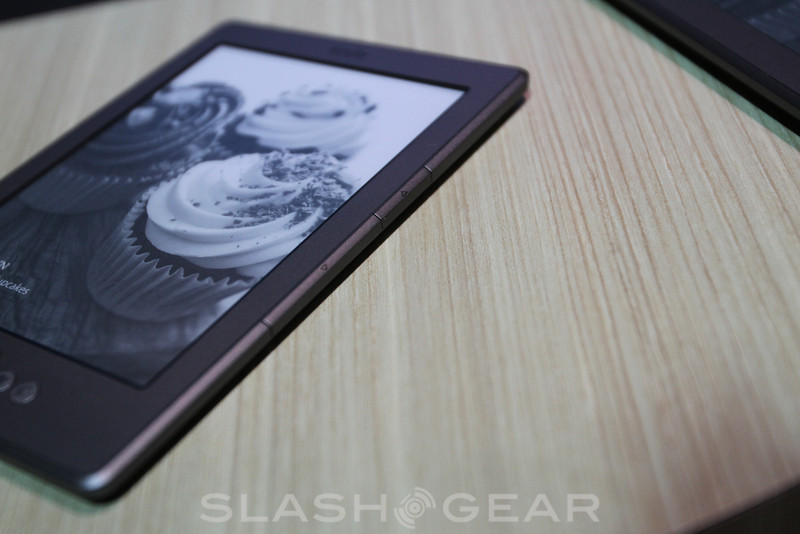
Physically there are a few more buttons than the Touch but less than before: flanking the D-pad are home, menu, back and keyboard keys, while narrow page-turn buttons run down the edges. It's fine for navigating the menus and ebooks, but text entry is a real chore. The on-screen keyboard is laid out alphabetically, and you have to nudge through it with the D-pad, selecting as you go. Punching in an author name for the Kindle ebook store is one thing, but we wouldn't want to use the entry-level Kindle to make notes.
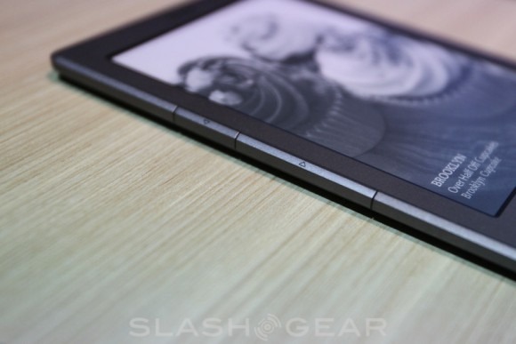
The E Ink screen itself refreshes swiftly, using the latest panel that can quickly show around six different pages before demanding a "proper" scrub that takes a second longer. As always the Kindle reading experience soon becomes transparent, with you able to focus on the book itself rather than what you're reading it on.
There's quite probably a large market of users out there who don't use their Kindle to make annotations or grab notes, and who aren't particularly bothered by some minor D-pad navigation once in a while. Anyone else can spend a relatively minor $20 more and step up to the Kindle Touch; you can find out hands-on with that model here.
