Instagram Changed Your Feed, And Users Are Seriously Unhappy [Update: Rolled Back]
Instagram has updated its app with a new way to scroll through photos, and users are seriously unimpressed. Gone is the familiar scrolling UI that Instagram has used from the start, with friends' photos and videos posted in a long timeline. In its place is a whole lot of tapping to move through the feed.
If you want to see the next photo in the timeline, you have to tap the right side of the screen to move forward. Tapping the left side moves back to the previous image. Your progress through the content is shown with a bar across the top of the screen, underneath the Instagram Stories thumbnails.
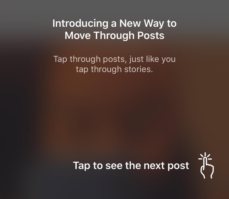
News of the new interface broke this morning, with Instagram users waking up and checking the app to find a new overlay explaining how the updated UI would work. Judging by the outcry on social networks like Twitter, however, it hasn't been a well-received surprise. "Worst update ever" and "they ruined Instagram" are fairly representative of the less-profanity-laced comments shared so far.

Unsurprisingly, many Instagram users are asking why the change was made in the first place. All the company has said so far is that it wanted to bring the Instagram feed in line with how you navigate through Instagram Stories. The latter supports tapping left and right, to skip forward and back through photos and videos posted.
That hasn't stopped conspiracy theories from sprouting up, however. One of the most believable is that the change will benefit advertisers most of all. After all, if you inadvertently tap on their advert, rather than to skip, you could find yourself mistakenly opening up the promotion or at least unmuting it.
That benefits advertisers, who will presumably be getting more eyeballs, but more than that it benefits Instagram. After all, it's paid depending on how many people click its ads. It wouldn't be the first time that the social network's owner, Facebook, has been accused of trying to push more promotion into our feeds.
For Instagram users, it's absolutely not the timeline change they were hoping for. Back when the app switched to an algorithmic layout, rather than chronological, the backlash was significant. Instagram, though, maintains that its way or organizing things is better, and refuses to change back. Now, the pressure is on to see if it can hold off criticism of this new system too.
Update: Well that was quick. Many Instagram users are reporting that the old, scrolling UI is now back, reverting just as unexpectedly as the tap-to-navigate system had appeared. No word if this was a premature A/B test that Instagram is rolling back, launch day jitters, or something else.Update 2: Looks like the answer to our question is "mistake," with head of Instagram Adam Mosseri confirming that this new UI "was supposed to be a very small test" but one which inadvertently spread wider than intended. According to Mosseri, if you haven't already got the old scrolling interface back you should restart the app, which should restore it. No word on whether Instagram plans to roll this out officially at some point in the future, however.
Sorry about that, this was supposed to be a very small test but we went broader than we anticipated. 😬
— Adam Mosseri (@mosseri) December 27, 2018
