I Fell For The HTC One In A Tokyo Cat Cafe
I started off liking the HTC One. Now, having used it as my only camera while on holiday in Japan this past week, I'm in love with it. HTC has a whole lot riding on the One this year, and one of the more contentious features is the Zoe photography system, blending stills and short videos that are simultaneously captured in what the company says will "bring to life" your photo gallery. Attempts to differentiate from the gush of other Android devices with software customization is something we've seen so often now, it's hard not to be cynical (and simply demand "pure" Android instead), but Zoe has turned out to be a different story.
I'm bad at taking photos, especially when I'm away. All too often I'll come back from a trip and realize I have nothing – bar the memories in my own head – to show for it. Stills seldom capture the emotion of a moment, while video gets long and unwieldy, and thus goes unwatched.
Zoe, though, combines a burst of twenty stills with about three and a half seconds of Full HD video. You can shoot just stills, or just HD video, but HTC expects most One users to give up on regular images and instead use Zoe mode: once you've captured a cluster of shots, you can then scroll through and pick out the one with the best framing or facial expressions, or indeed combine features from two stills into one. The One also automatically combines a selection of Zoes into a highlight reel, 30s of curated content complete with music, effects, and transitions.
What Zoe is particularly great at, though, is putting photography into a framework. You're not just snapping hundreds of stills and recording dozens of videos – which, if you're anything like me, you have a strong suspicion that you'll never actually look through or share after you're home. Instead, you start to think about photography in terms of easily snackable chunks of content: a simple 30 second highlight reel that you can imagine actually showing someone without having to worry that you're boring them.
Find out all the details on the UltraPixel camera and Zoe system here
It also makes you think of your life in terms of events. On every other phone I've used, I've never bothered with albums: all of my images and videos have been left in one long stream of content (and one I seldom bother scrolling back through). On the One, though, you start to consider how an event might look when seen as a highlight reel: I started purposefully shooting panning shots that I knew would be particularly good at setting the scene, for instance, and tried to take more photos of people and their reactions, rather than just impressive landscapes.
The result is a gallery I actually want to flick back through, and photos I actually want to show to people. Highlight videos that require less than a minute's investment in time are perfect for attention-short social networks like Facebook, Google+, and Twitter, and of course since it's Android there's fully baked-in sharing with whatever service you have installed.
[aquote]The result is a gallery I actually want to look through[/aquote]
It's not all perfect, however. As we noted in our review, right now the One gives you no control over what resolution the Zoe highlight reel is encoded at – it's Full HD or nothing – and that makes for a big video. When you're roaming abroad, it means finding a (fast) WiFi connection is essential unless you want to bankrupt yourself with foreign data fees.
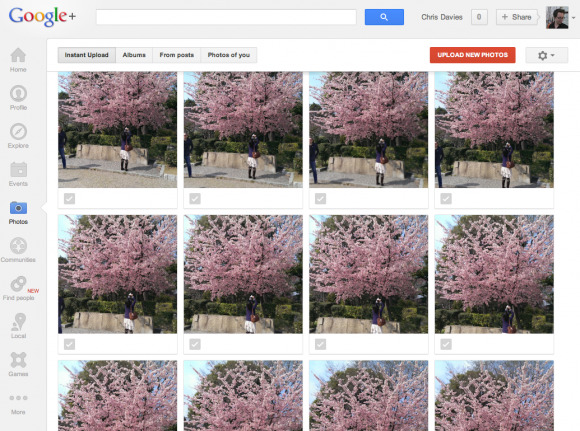
That's not the only upload-related headache. Zoe doesn't work at all well with automatic-upload systems; I love how Google+ pushes new photos and videos to the cloud in the background, ready for me to share them later, but on the One every single shot is queued up for the same online treatment. Given each Zoe consists of twenty stills as well as the brief video, that means a whole lot of unnecessary duplication when you browse through online. "You have 3825 new photos ready to share" Google+ eagerly informed me, after suggesting that I might want to pay to upgrade my Google Drive storage.

In fact, there's a sense that HTC only really thought about the photography experience on the One itself, not that people might want to explore their shots outside of the handset. Having spent a couple of hours sifting through all of the multiple Zoe shots after dumping them over to my computer, picking out the best/least blurry/most interesting to share with family, the comparative value of the highlight reels began to wane. For every scene there were twenty shots to key through, and the HTC Sync Manager app does nothing but push everything into iPhoto.
HTC really needs to offer more granular – and straightforward to use – control over which photos are treated as the default by other apps and services, particularly given the shortcomings of the current highlight reel selection process. Eventually, you should be able to pick out which images are used to build the automagically-edited video; right now, though, the only way to manually control what's included and what isn't is to sort them manually into different Event albums (the One splits up events that are at different times and locations automatically, but I found it still mixed together activities while I was away).
Those Events can then be used to create more specific highlight reels, but then you miss out on auto-uploading, since most such services only look at content in the root Photos folder. Events on the One are organized into subfolders, unless you copy rather than move them, in which case you run into storage limitations (which, since there's no memory card slot, could quickly become an issue given the size of each single Zoe cluster).
I'd love to see HDR support in Zoe mode (at the moment, you can only use it in standard camera mode); that generally works well, though it sometimes left the sky oddly colored in brighter scenes. The ability to opt for longer highlight reels would be great too: a minute or 90 seconds, perhaps, to fit in more media from longer Events.

The fumbles and glitches don't undermine the overall experience, however. HTC's decision to opt for a 4-megapixel-equivalent sensor might mean we get stuck with awkward "UltraPixel" branding, but it doesn't stop the One from taking solid shots and delivering great low-light images (useful for when you're taking food photos in restaurants; yes, I know it's a cliché, but I still did it).
Zoe seemed like a gimmick at first, but it's enough to make me reach for the HTC One in preference to the iPhone 5 or any other Android handset when I know I'm likely to be taking photos. Now HTC just needs to bring its sync app up to speed too, as well as do a better job of explaining to potential consumers why they might end up thinking the same, if they'd only give the One a try.
