HTC Smart First-Impressions
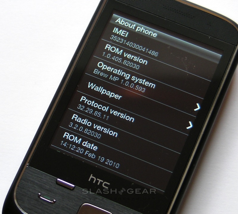
The HTC Smart has just dropped onto the SlashGear desk, and while this budget BREW handset may not have the same wow-factor as one of the company's more recent Android smartphones like the Desire or Legend, it's interesting simply for representing a push from the company into the mainstream. Qualcomm's BREW OS keeps things ticking, but on top of that is the HTC Sense UI complete with Friend Stream social network integration. Check out our first-impressions after the cut.
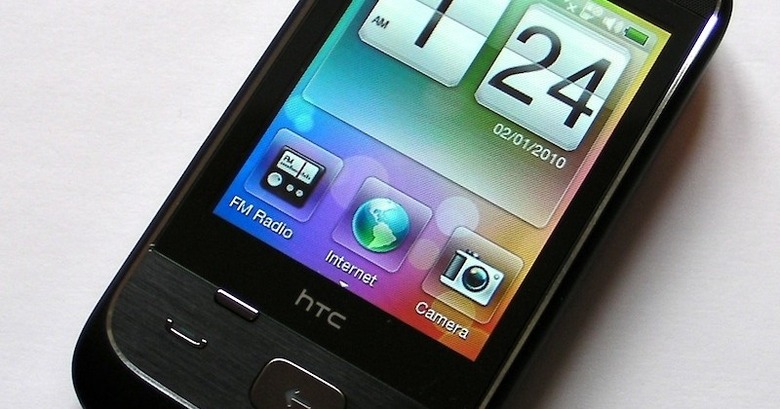
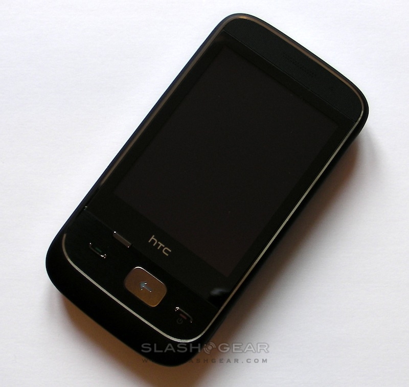
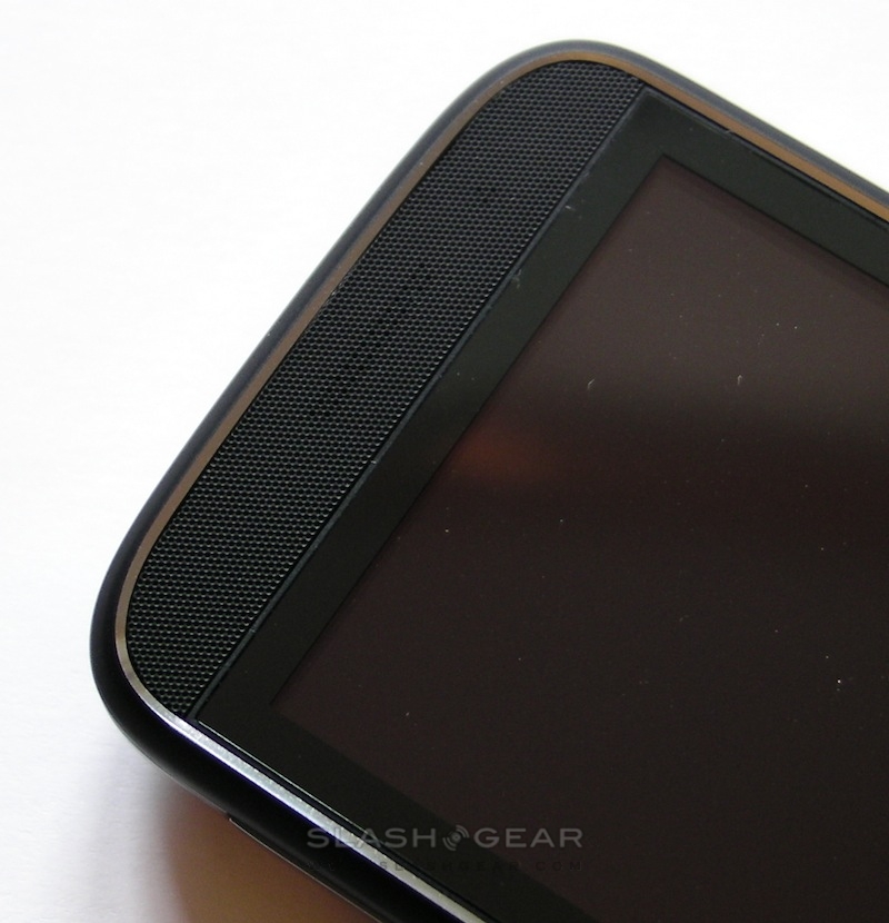
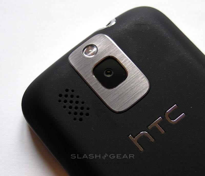
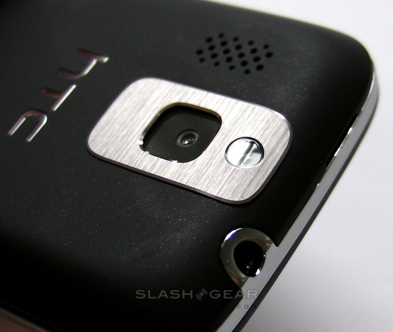
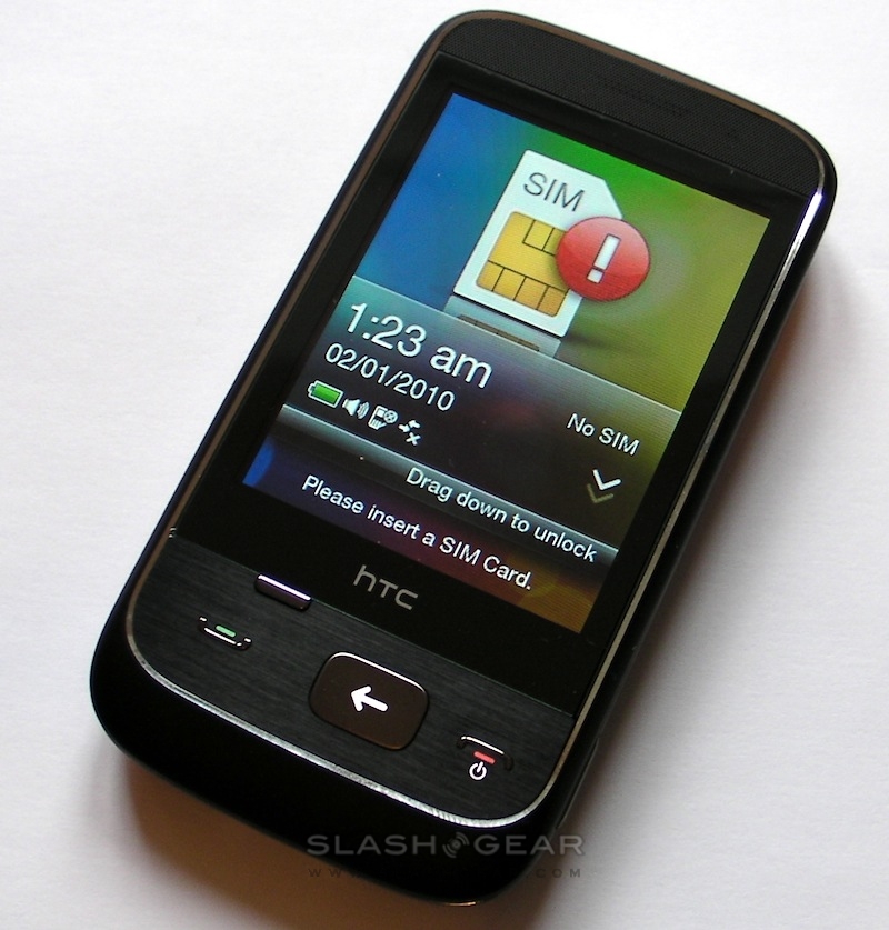
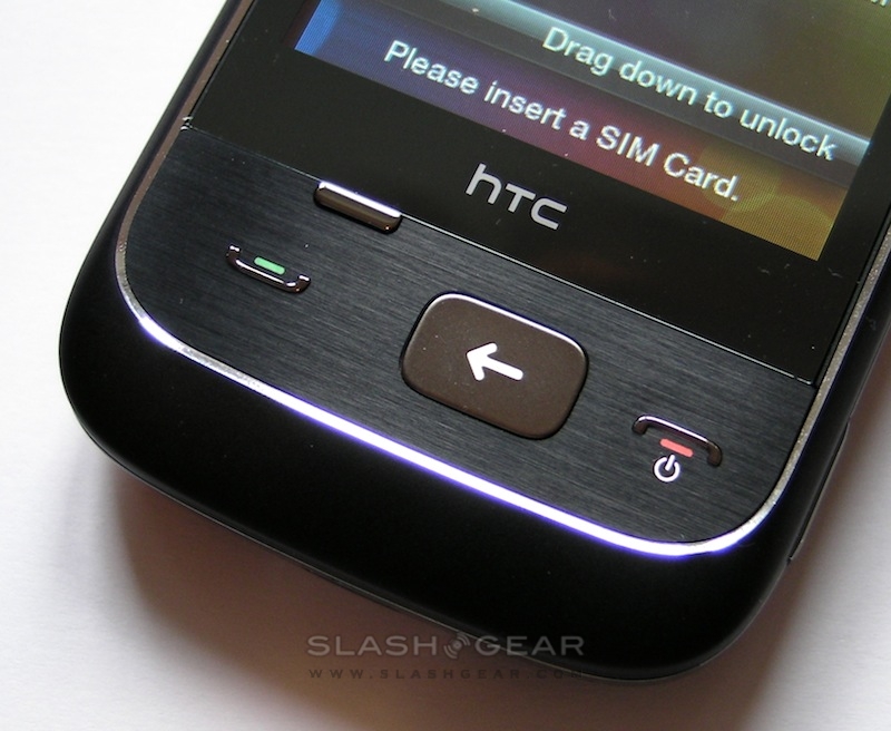
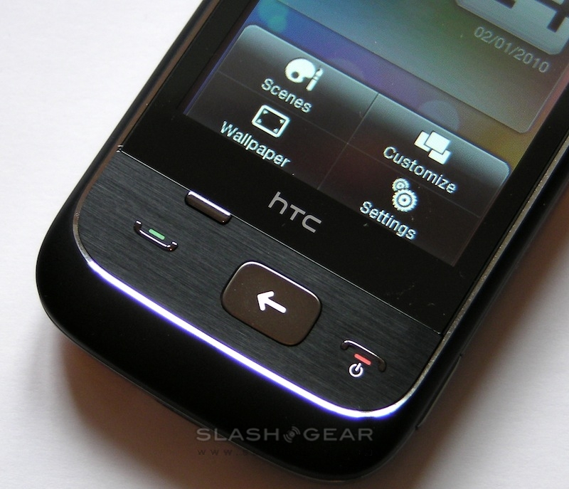
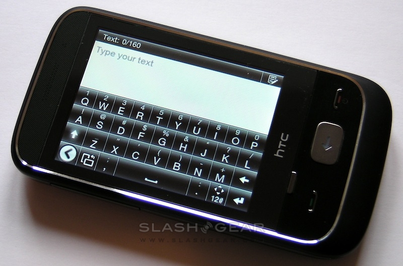
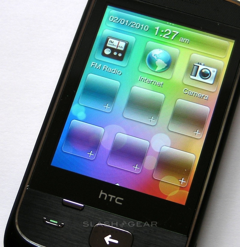
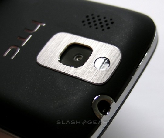
If you're comparing the Smart to recent HTC devices, it's most similar to the Tattoo, their entry-level Android handset. That includes a 2.8-inch resistive QVGA touchscreen and a compact body with a slightly soft-touch plastic chassis. It's a reasonably handsome phone, though relatively nondescript. Under the display there are four buttons – call and end, the latter doubling as screen lock/power, together with a small contextual-menu key and a large back button that also opens up the main menu. On the side there's a volume rocker and – a welcome addition to HTC devices – a dedicated button for the 3.0-megapixel fixed focus camera (which has an LED flash).
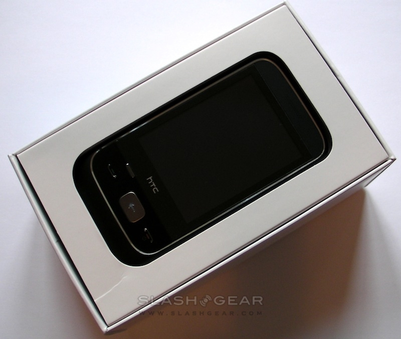
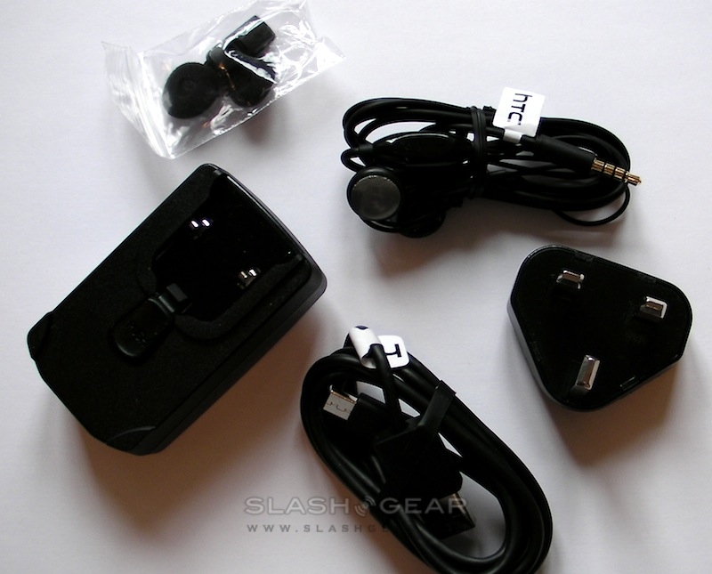
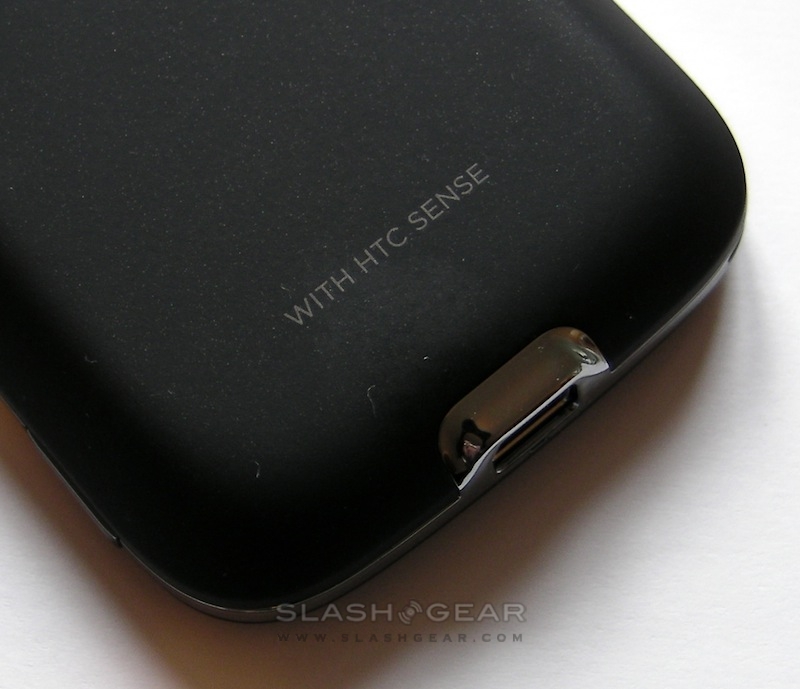
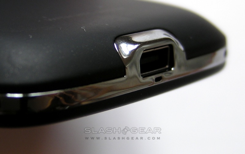
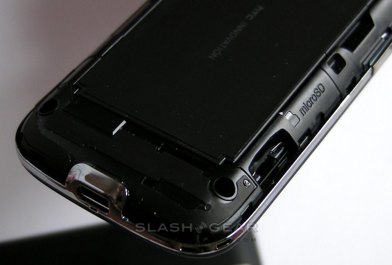
Unfortunately HTC's decision to switch to microUSB wasn't made in time for the Smart, and it still has an ExtUSB port (which is compatible with standard miniUSB plugs too). Up top is a 3.5mm headphone socket, and HTC include a basic stereo hands-free kit in the box. Storage is courtesy of a scant 256MB ROM or a microSD card slot. As for connectivity, you get single-band 2100MHz UMTS/HSPA along with quadband GSM/EDGE and Bluetooth 2.0+EDR, but no WiFi.
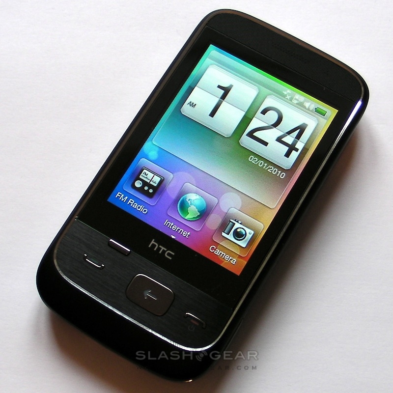
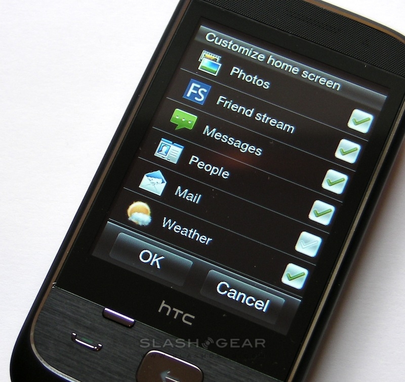
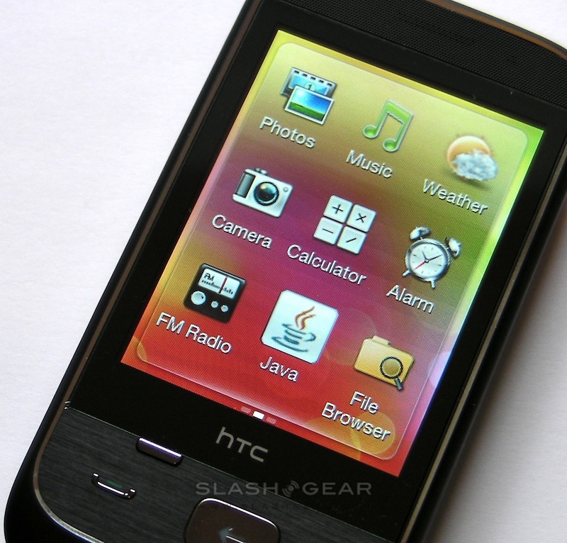
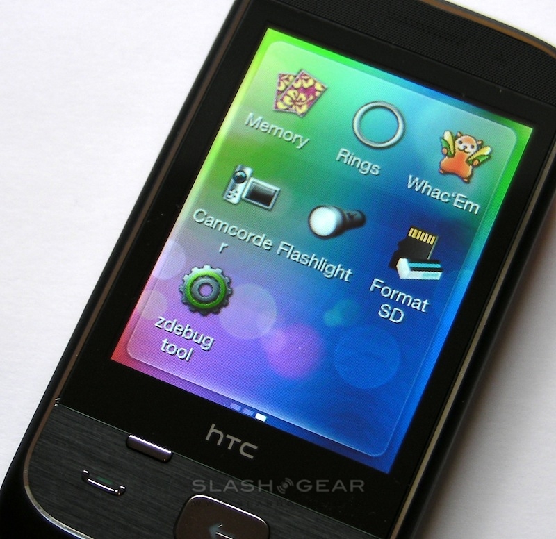
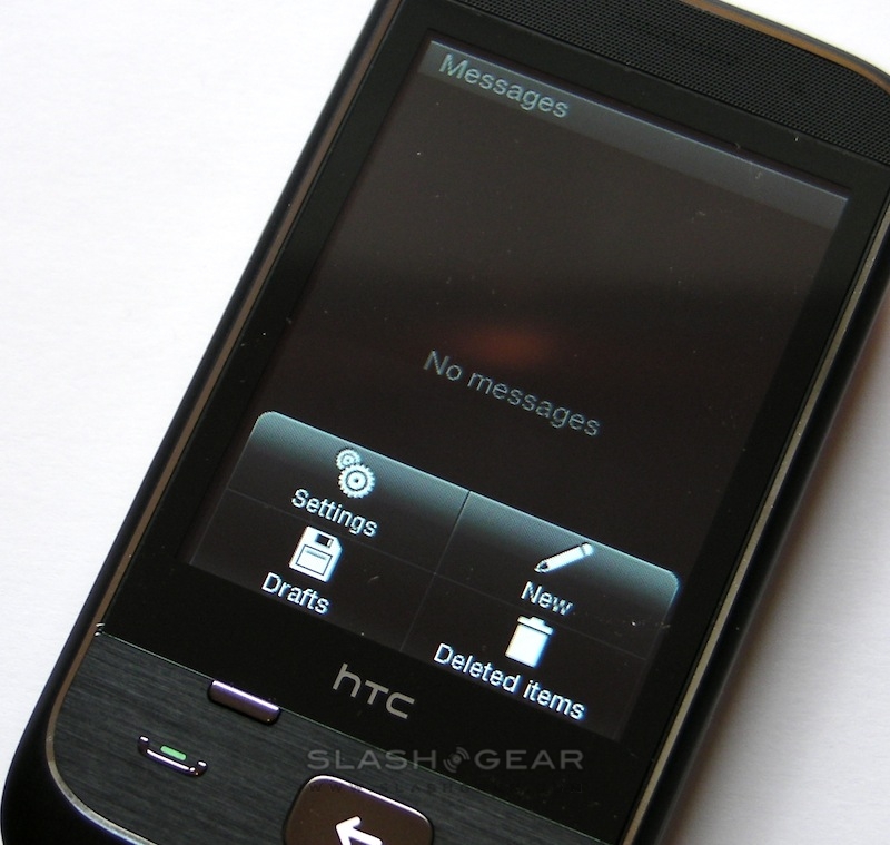
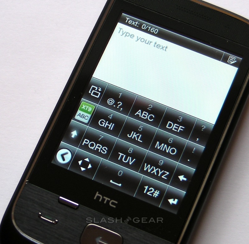
Keeping the price down is a 300MHz chipset which, on paper at least, pales in comparison to even last-generation Android and Windows Mobile handsets. However, the Smart shows very little lag, the small-footprint OS allowing things to whip along nicely. Opening the camera app, for instance, takes under three seconds from hitting the shortcut. The UI is deceptively simple, too; while you can pull the main homescreen pane up to find a panel of shortcut buttons, you can also swipe it from side to side to see music, weather, photo, Friend Stream and other dedicated panels. No widgets, but you can choose which panels are included.
It's too early for a full review, but we'll be putting the Smart through its paces over the next few days to figure out whether it is, indeed, an affordable brainbox or should be sent to the corner wearing a dunces cap. Until then, check out the live photos in the gallery below.
