HTC One M9 Review - Gambling On Quality
What does it take to create a smartphone design classic? For the HTC One M9, the answer is relentless refinement, improving what worked in its metal-bodied predecessors rather than chasing the latest trends. The smartphone spec arms-race is relentless, however, notable as much for its hyperbole as the minimal attention span of would-be buyers in carrier stores. If you can't make your case in seconds, you're going to lose the sale. Amid fierce competition, HTC doesn't exactly have the greatest track record of playing up its strengths and capitalizing on its advantages. Has that changed in the One M9?
Hardware and Design
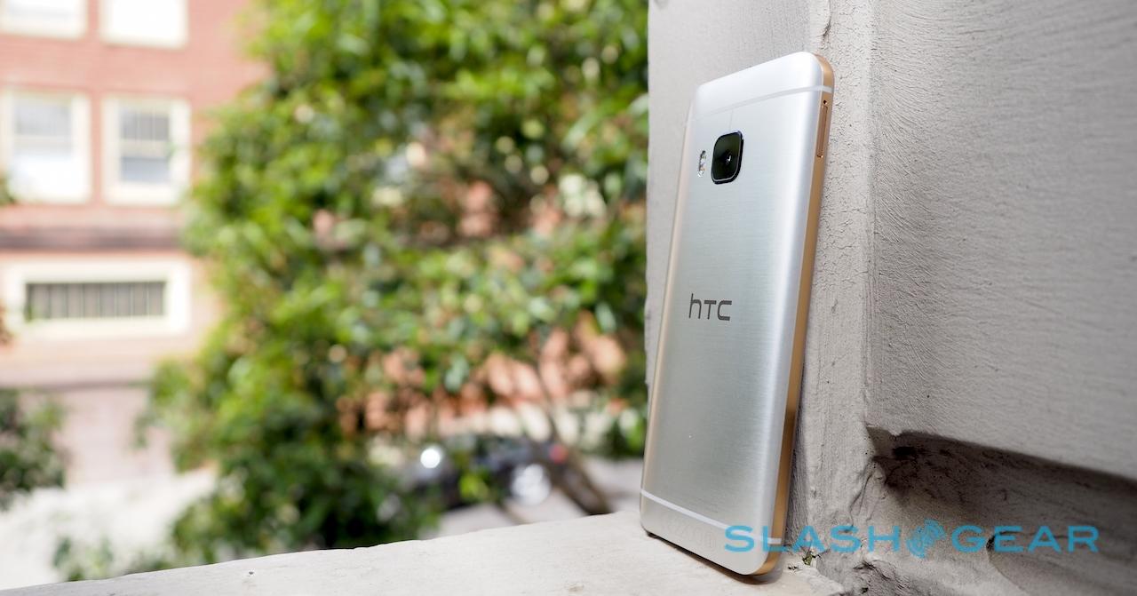
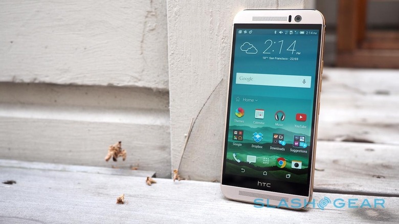
The tl;dr is simple: the HTC One M9 is one of the most solidly-constructed, thoughtfully designed, and generally handsome smartphones on the market today.
The longer answer is, well, longer.
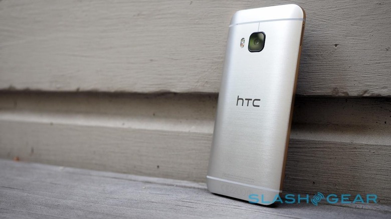
HTC has, of all the Android phone makers, probably the best track record for making handsets with a premium feel. Oh, certainly, Samsung has raised its game immeasurably with the Galaxy S6 and S6 edge in recent weeks, but HTC was frolicking in fields of anodized aluminum back when Galaxy still thought plastic was The Next Big Thing.
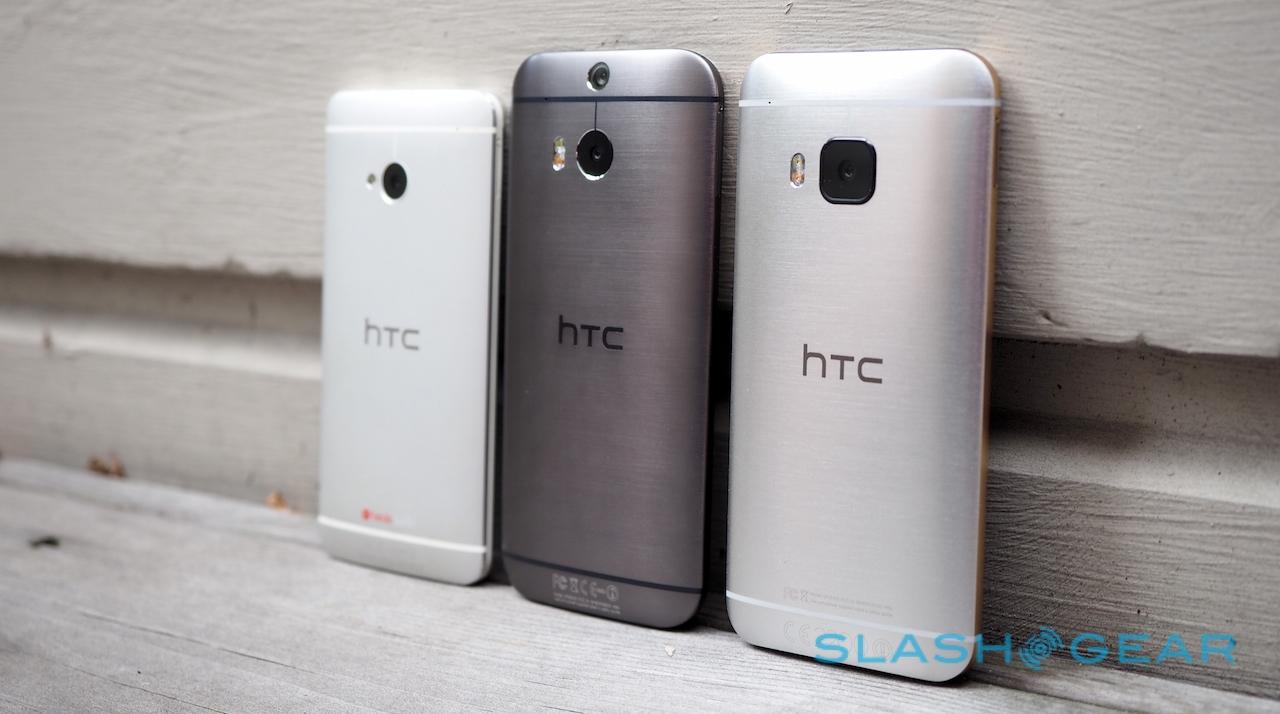
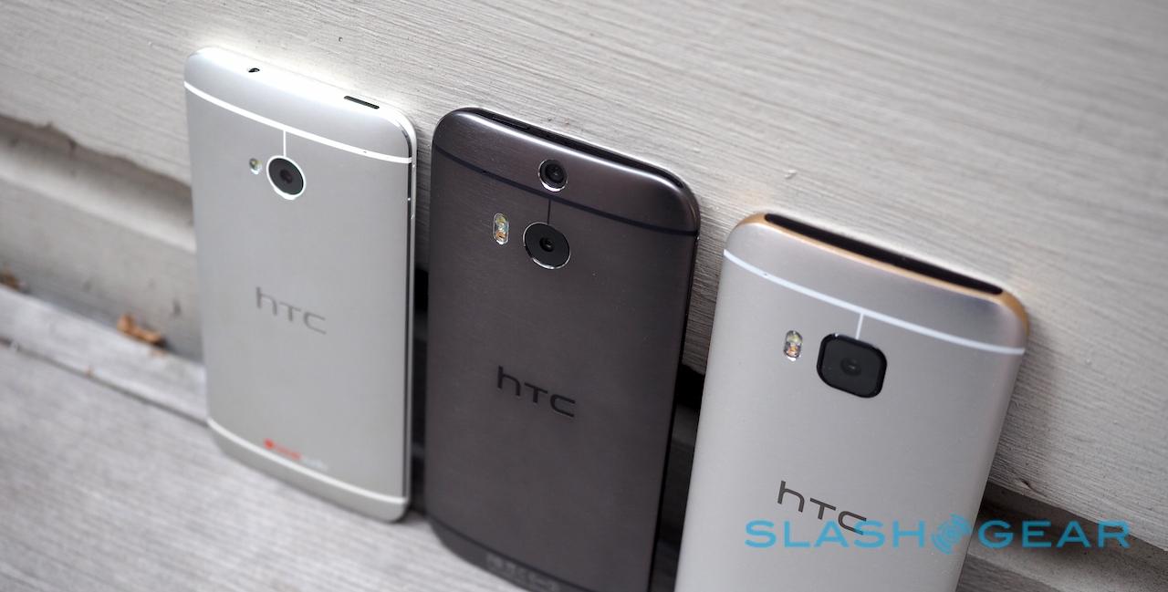
While you can trace that heritage all the way back to early Androids like the Legend, it was with the first HTC One – subsequently known as the One M7 – that the company's ways with metal were truly honed. Techniques like milling out a single lump of aluminum, injecting slices of plastic, and then carving the two together so as to leave a perfectly smooth surface added up to a phone that left rivals in the shade.
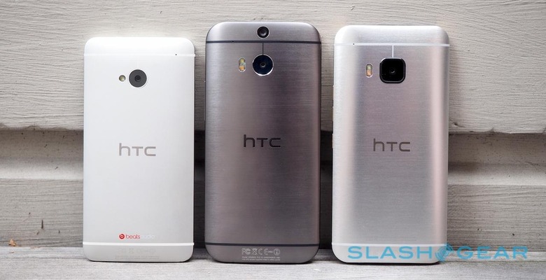
The One M8 took those techniques and pushed them even further. Last year's HTC flagship relied on even less plastic, and felt even more sinuous in the hand (even if, admittedly, it was a little slippery and thus easy to drop).
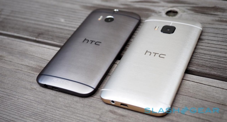
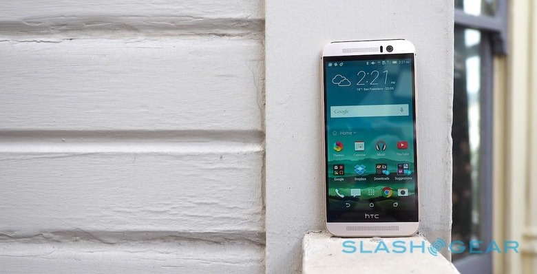
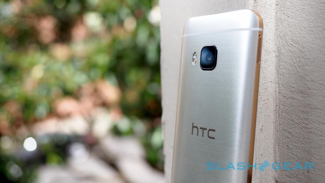
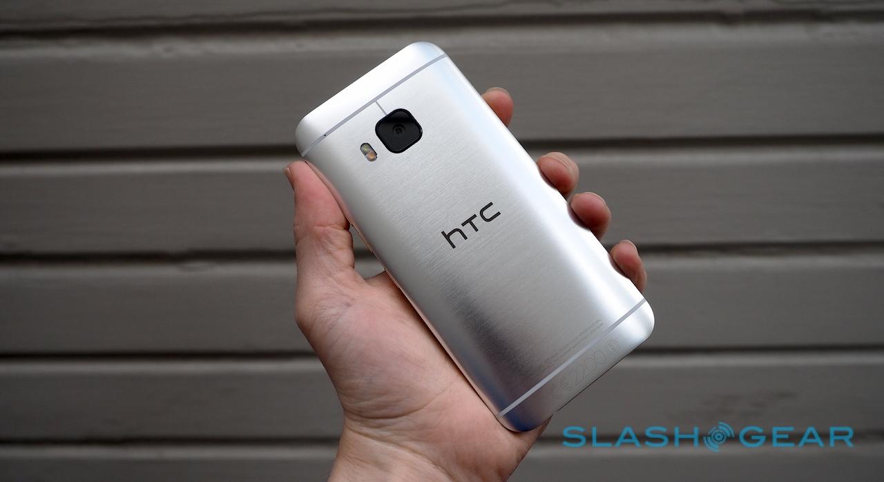
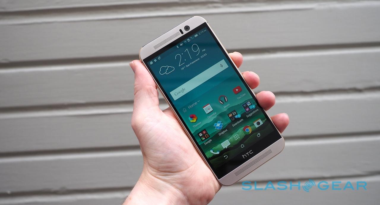
Roll on 2015, and it's the turn of the HTC One M9 to have its moment in the spotlight. HTC is using terms like "jewelry grade" and there's certainly no denying that the attention to detail is incredible. The use of plastic has been trimmed to a sliver across the top edge (conveniently accommodating the IR blaster) and two thin bands across the back, peepholes for the antennas.
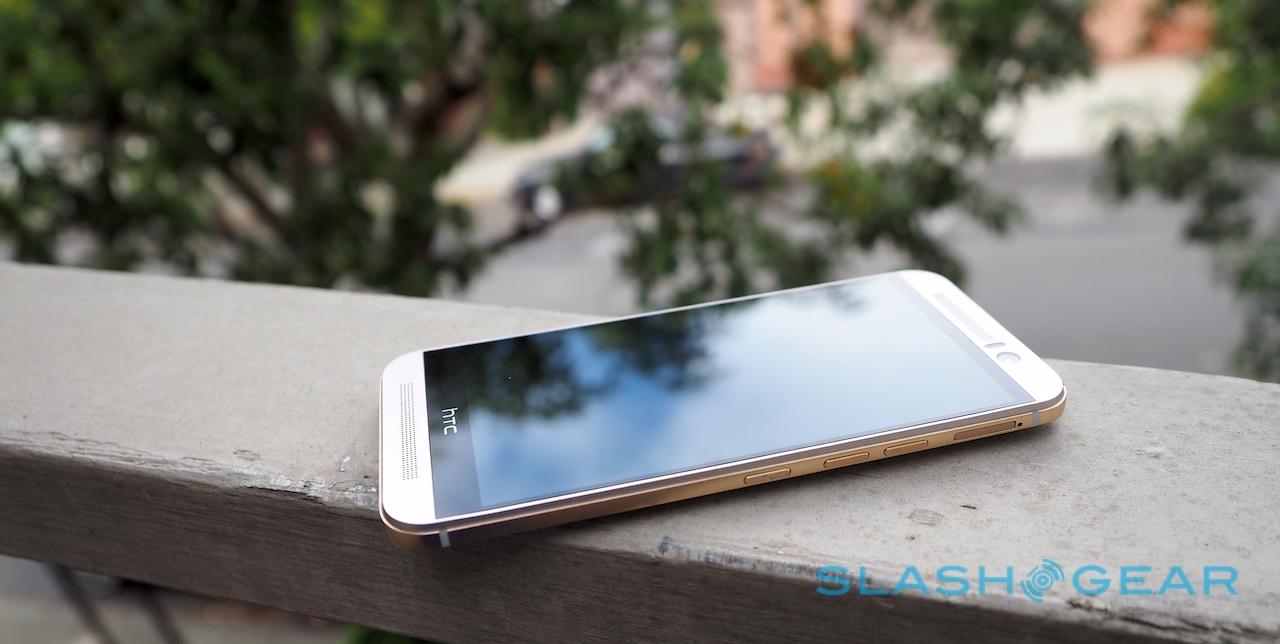
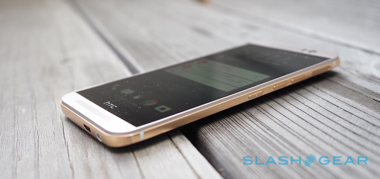
The rest is metal, and it's metal that has been treated with an astonishing degree of attention. The fascia is now a single unibody piece, with a super-slim metal bezel around the Gorilla Glass display, and micro-drilled holes for the BoomSound speakers and microphone. It's shorter and narrower than the M8, if only by a little, though some are still going to criticize the length of the phone.
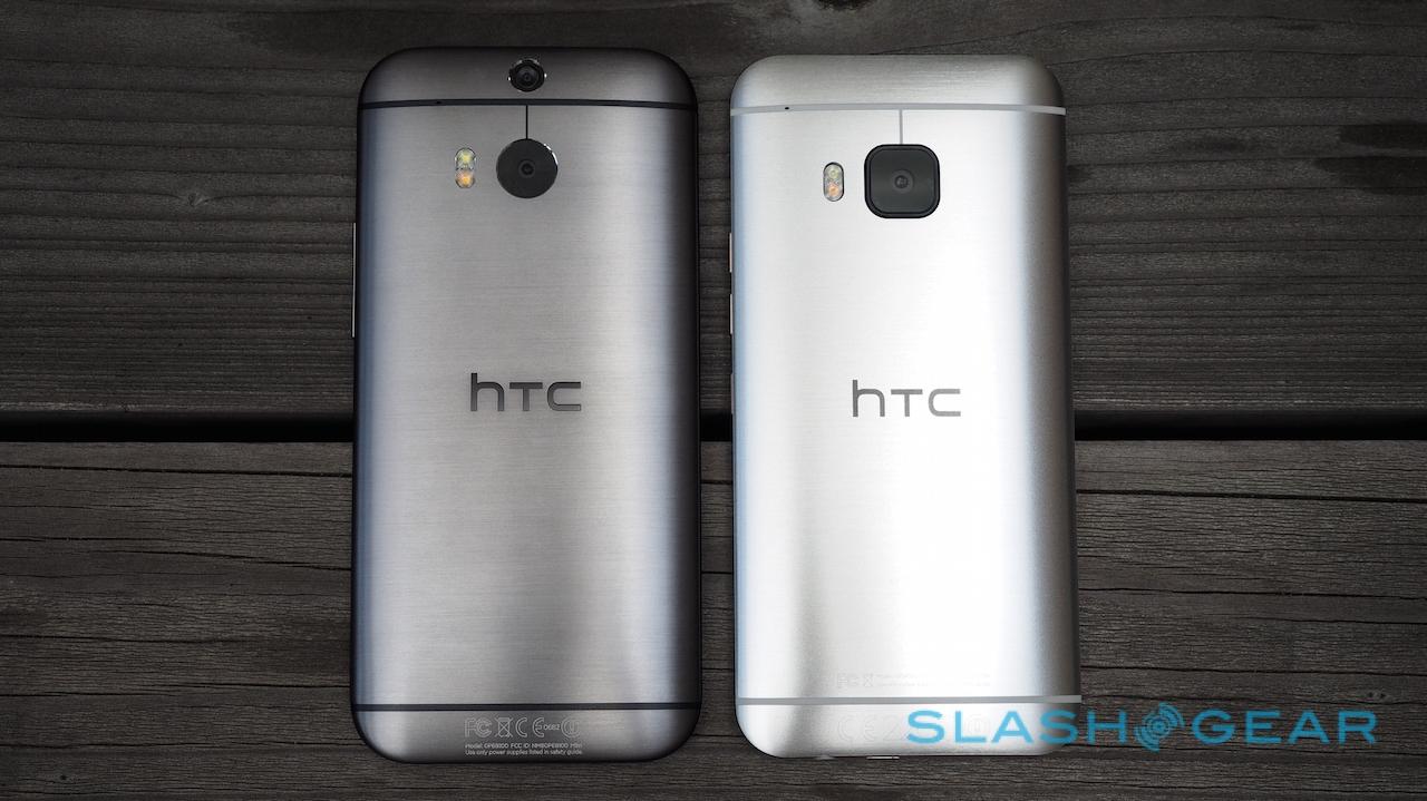
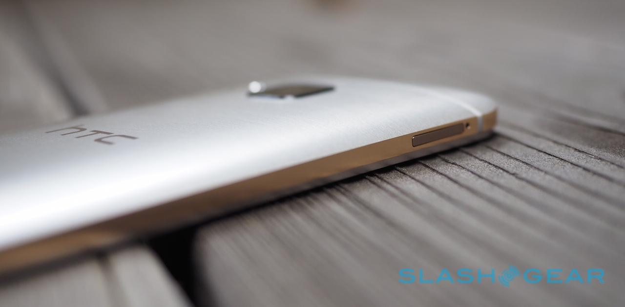
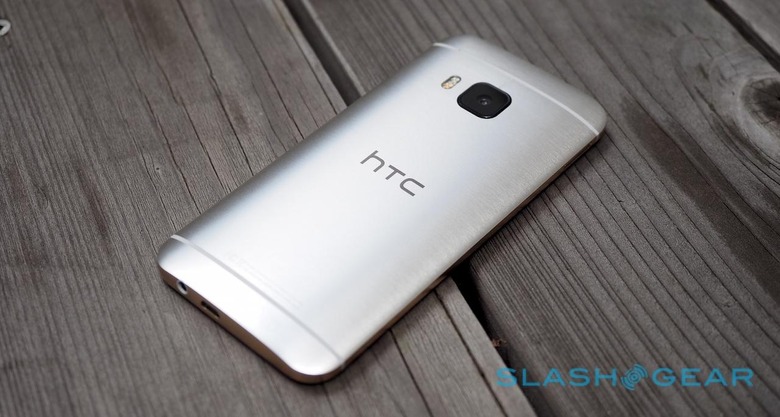
Flip it over, and you find a two-tone rear, the edges mirror-finished while the back is hairline-brushed. It's not quite so simple as that, however: to get its double finish, HTC must first complete one and then, having carefully masked that portion, put the chassis through a whole second process. In total, there are more than seventy steps taking over 300 minutes per device, the company boasts.
Is it worth it? That depends on your tastes in metal. Hero of the lineup is the silver and gold model you see here, with a silver back paired with a contrasting gold rim. If that's a little ostentatious for you, there's a two-tone gold version which switches the silver for matte gold, or an even more subtle black model.
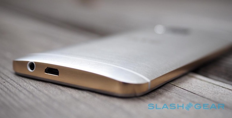
HTC says the rear is easier to grip and more scratch resistant, and that certainly seems to be true. I can't say the same for the polished edge, however, which is both sharp against the palm and, after only a week, has already gathered some scratches around the microUSB port. I'm not particularly careless when it comes to plugging in, either, which leads me to suspect that by the time your contract is up you may have quite the collection of grooves in the bottom of your One M9.
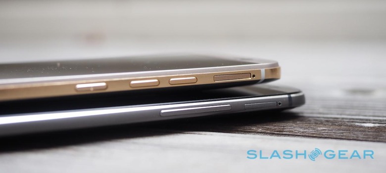
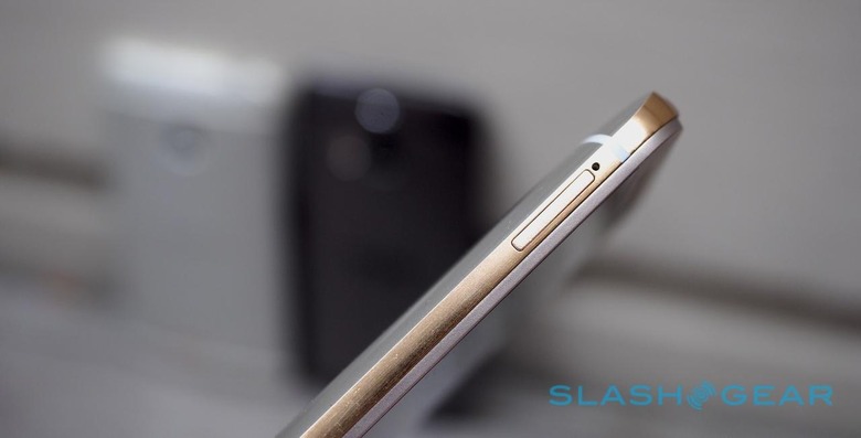
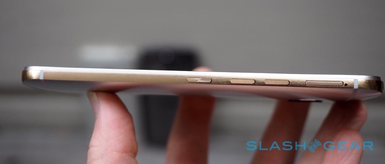
Other ergonomics have been tweaked, too. The power button – previously in a somewhat awkward position on the top edge of the M7 and M8 – has been moved to the right side, below the volume keys, themselves split into individual buttons rather than the single rocker of before. Moving the power key makes sense, but it's too low down to be entirely comfortable; happily you can double-tap the screen to wake the One M9 up instead.
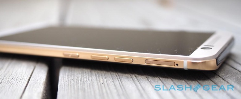
If there's a problem, it's one of familiarity. HTC's evolutionary approach has certainly given the company ample time to refine its manufacturing processes, but the result may not catch the eye of those looking for a distinctly "new" device. Even Apple, notorious for its languid refresh cycle, hits the reset button on a design every couple of years.
2015 is going to be a tough year in mobile. Tougher than many before it: Samsung has finally embraced metal, the iPhone 6 is an excellent device, and buyers can afford to be ever-more selective about the phone they pick. My concern is not so much that HTC spent too much time thinking about aesthetics, but that in doing so it got left behind on specifications.
So what, exactly, do you get? At a time when its Android rivals are embracing 4K, the One M9's 5-inch 1080p display may seem underwhelming on paper. In practice, though, Full HD resolution is certainly crisp enough for my eyes, and HTC's choice of LCD panel is a solid one, with bright colors and good viewing angles.
Inside, Qualcomm's Snapdragon 810 processor is paired with 3GB of memory. Connectivity includes LTE Cat 9 (for up to 410 Mbps downloads, if you could find a network capable of it), WiFi a/b/g/n/ac, Bluetooth 4.1, NFC, and a microUSB 2.0 port with MHL-HDMI support. All of the usual sensors are included, bar the barometer found in the M8; according to HTC, digital barometers were not only rarely used but often inaccurate anyway.
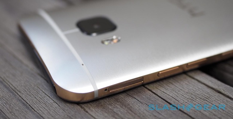
The 2,840 mAh Li-Poly battery is non-user-replaceable, just as before, and still supports Qualcomm's Quick Charge 2.0 for pumping around 60-percent charge inside after just thirty minutes plugged in. HTC deserves credit for sticking with a microSD card slot, augmenting the 32GB of onboard capacity with up to 2TB of removable storage, but then loses the goodwill from that by making the Quick Charge-compatible charger itself an optional extra.
Instead, you get a standard charger in the box, with no speed advantages. All that metal in the construction means no wireless charging option, either.
Software and Performance
Want stock Android? Look elsewhere; HTC takes Android 5.0 Lollipop but mixes things up with HTC Sense 7, the latest iteration of its customized skin and app suite.
That's not to say it's worse than what Google intends with Android, only different. HTC's goal with Sense 7 has been to inject some contextual relevance into the interface, and your first taste of that is the new Home widget.
At its most basic, HTC Sense Home is a launcher that changes the shortcuts depending on your location. So, by default, the "Home" configuration has shortcuts to Music and YouTube, while "Work" prioritizes apps like Calendar and Drive. You can switch between them manually or, after setting your home and work locations, have them switch automatically.
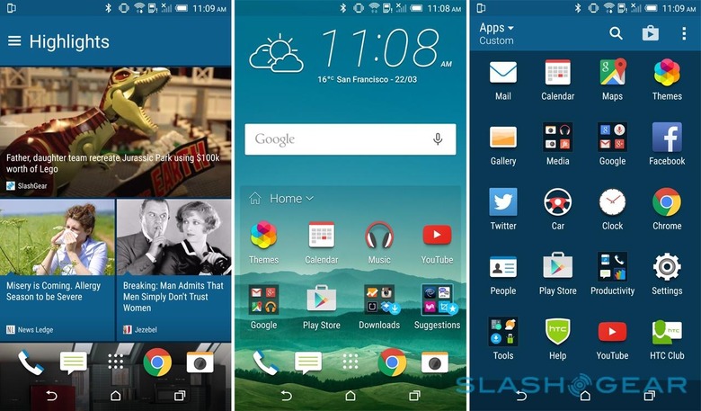
As you use different apps and services, Sense Home learns which are your favorites and adjusts the shortcuts it shows accordingly. For instance, if you're a regular Twitter user at home, eventually the shortcut will show up in the launcher grid. It took opening the Dropbox app perhaps six times in the space of 24 hours for Sense 7 to decide it should be a choice icon. Meanwhile, there are two folders – Downloads and Suggestions – which respectively show your most recent installs and eight possible apps you might want to try, based on what you use already.
In addition to app suggestions, Sense Home also integrates with BlinkFeed, HTC's news and social timeline. The M9, so the theory goes, will figure out when you're likely to want to eat, and make suggestions in BlinkFeed and on the lock screen for restaurants nearby, complete with reviews from Yelp and Foursquare.
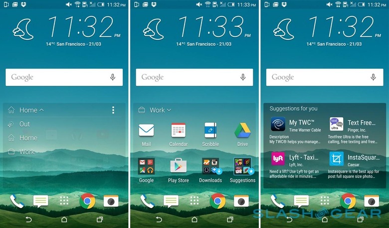
I say "theory"; that's because I had mixed results with the restaurant recommendations. More often than not, a mealtime would come and go and Sense Home hadn't bothered making a suggestion. There's no way of forcing it, either, beyond going to Yelp or Foursquare themselves and searching the traditional way. A "Morning Bundle" did show up on the homescreen first thing, with sunrise and sunset times, but proved reluctant to show agenda data or news headlines as it's meant to.
I'm certainly all for more contextual relevance in how I interact with my phone and vice-versa, but so far Sense 7 isn't quite hitting the spot. My main complaint is that it doesn't really go far enough. For instance, while changing the app shortcuts is useful enough when you leave work, it'd be arguably more helpful if your notification settings were changed too: only pinging when a "Priority" contact sends an email, maybe, or limiting alerts to personal accounts rather than business.
Elsewhere, there's been an increase in how Sense can be customized. Themes are supported, complete sets of wallpapers, icons, fonts, sounds, textures, and color schemes, with a selection preloaded and a download store for grabbing more. Each can be customized, and newly-created themes – the color scheme instantly generated from the hues in your initial choice of wallpaper – can be uploaded and shared with other One M9 users.
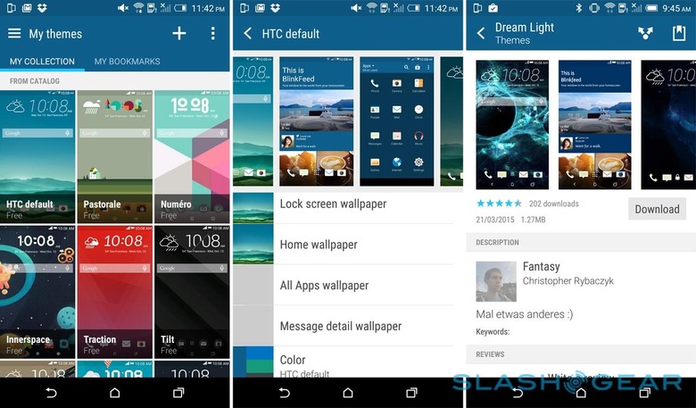
More useful, I found, was the ability to adjust the soft buttons. While normally you get "back", "home", and "app switcher" running across the bottom of the screen, Sense 7 allows you to reorder them, hide one or more of them, or even add a fourth, like opening up the notification shade or jumping into the settings. The ability to quickly expose all of your unread alerts even if you're holing the One M9 one-handed is great.
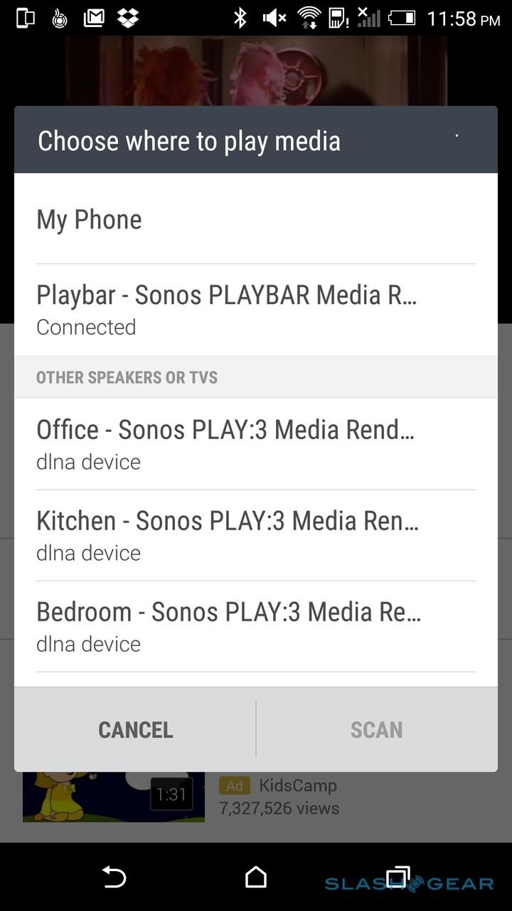
HTC Connect is the One M9's take on simple media streaming. Whenever you're in an app with audio, a three-finger swipe up across the display brings up the Connect menu, with a list of potential wireless outputs you can redirect the sound too. Connect is compatible with the AllPlay, Miracast, DLNA, Bluetooth, and BlackFire streaming protocols.
If you think it all sounds a little like Sonos then you're not alone, but ironically that's one platform Connect won't work with. Although Sonos speakers show up in the list of potential output options, and the One M9 claims to be connected to them when they're selected, the audio still comes out of the phone.
I was able to get it working with a Jawbone Mini Jambox, once I'd manually paired them beforehand, and the switchover was pretty much instantaneous, though I could only stream to a single Bluetooth speaker at a time. If you have AllPlay-compatible WiFi speakers, you should be able to group them together into rooms or zones, and stream to them simultaneously.
It's not wrong to say that the Snapdragon 810 – and the One M9 specifically – have experienced more than a little attention for how hot things get under load. In fact HTC pushed out a software update midway through my review process which, among other things, tweaked the thermal limits under a subset of use-cases: when benchmarking or gaming, or during the firmware upgrade process.
Even before that update, however, I struggled to push the One M9 to the point where it was approaching uncomfortable to hold. In fact, for the most part I have little complaint about the phone's performance – apps load quickly, games play smoothly, and the M9 has no complaint with Full HD video playback – though there are a few lingering annoyances. The brief, fuzzy pause as each image loads in the gallery, for instance, belies the strength of the GPU, especially given that it actually takes a little longer each time than the One M8 before it.
Camera
For two generations of flagship phone, HTC has been telling anybody who will listen that UltraPixel technology is the future. Opting for a smaller number of physically larger pixels, so HTC argued, meant that low-light performance could be improved dramatically. Unfortunately, it also left the M7 and M8 at a disadvantage not only on paper, where the higher resolution of rival phones quickly overshadowed HTC's mere 4-megapixels, but when the lighting was good and you wanted more detail.
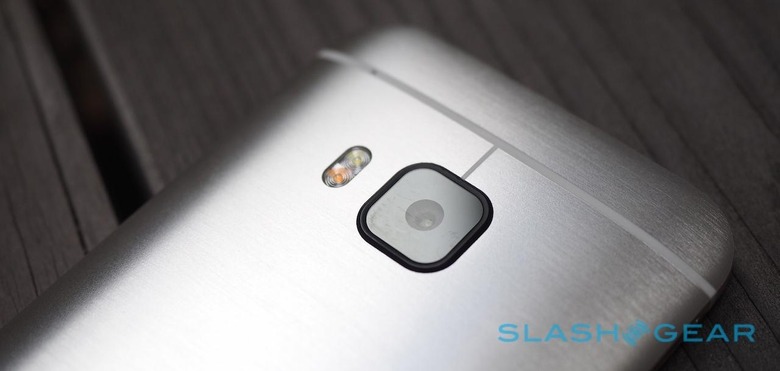
UltraPixel hasn't quite been given the boot on the One M9, but its certainly been sidelined, shifted to the front of the phone where it now does selfie duty. In its place is a more mainstream 20-megapixel sensor capable of 4K video recording. Duo Camera, the second sensor used for depth tracking, has disappeared completely.
Now, 20-megapixels is considerably higher than what you'll find on an iPhone 6 or even a Galaxy S6, but there's more to photography than sheer pixel count. HTC has opted for an f/2.2 lens, for instance, where the Samsung has an f/1.9 aperture, which means the S6 lens lets in more light. Samsung also manages to accommodate optical image stabilization, which HTC leaves out of the M9.
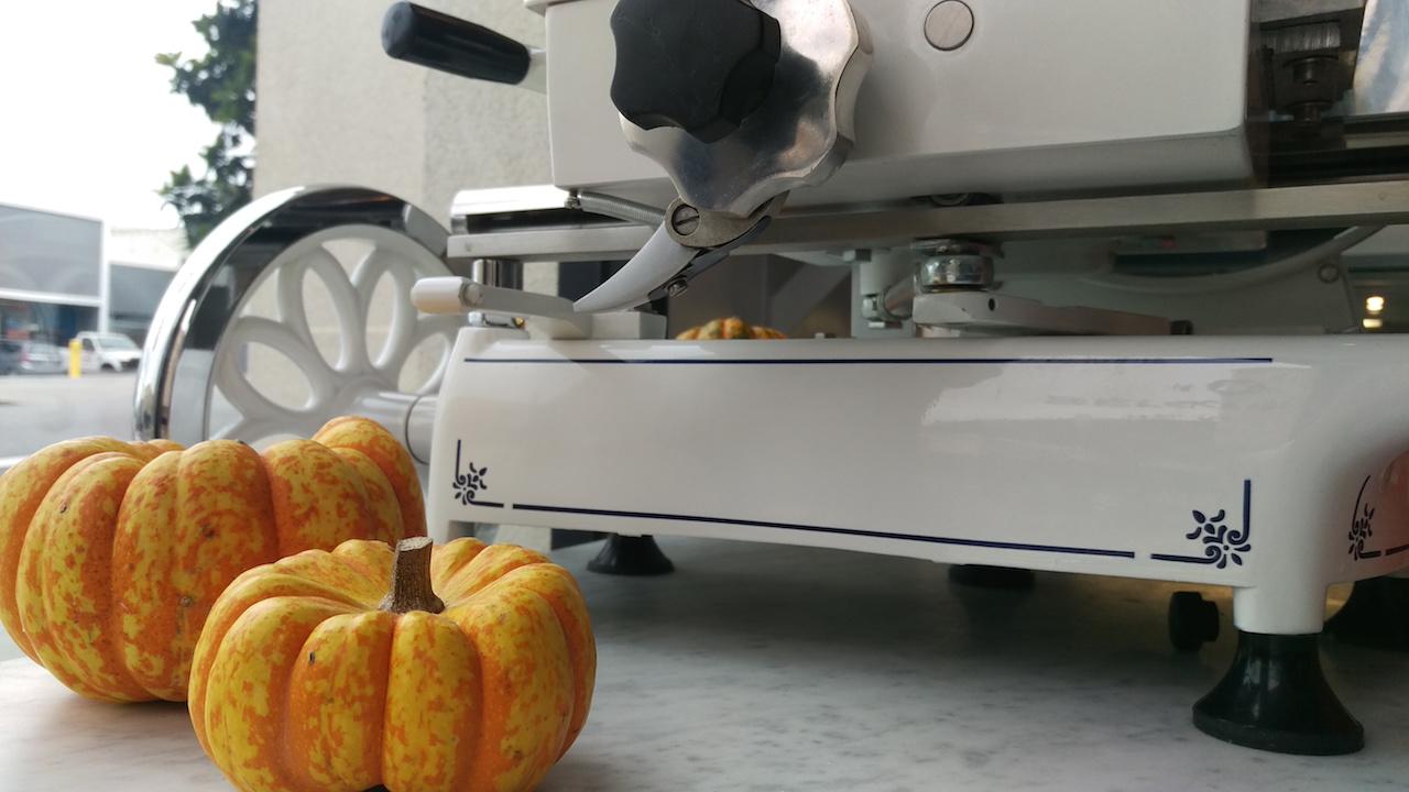
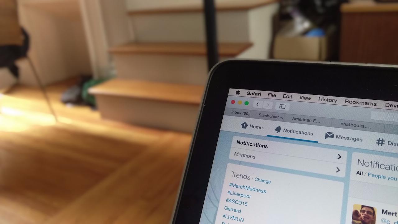
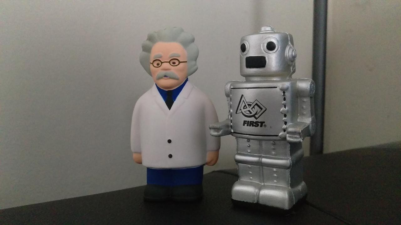
The results leave me torn, even after the same firmware update that tweaked the thermals also refined the camera processing. In a best-case scenario you can coax some solid pictures out of the One M9, though the focus shows a frustrating proclivity to wander, even between near-identical shots. Close-ups seem to fare better overall than broader, landscape shots; there's a tendency, as in the woodland shots in the gallery below, for things to get murky and lose the sense of depth.
Side-by-side with the M8, the One M9's photos have more detail and less noise. Colors look less muted, too, for the most part. UltraPixel has a slight edge in very low-light conditions, where the M9's pictures can gain a slight pinkish tint, but for the most part I prefer the results from the M9's camera.
If you've a taste for macro shots, however, I found I could get closer to a subject and still focus successfully on the M8, whereas the M9 demanded I move back.
The issue seems to have been HTC's desire to use Toshiba's new camera sensor, which opens doors to some impressive flexibility previously unseen on mobile devices. However, even with the sapphire cover glass protruding from the rear of the M9, there was still no room for OIS. Sure, it's fast to load and to snap shots, but on multiple occasions I found the images themselves were slightly blurred once I got home and looked at them on a bigger display.
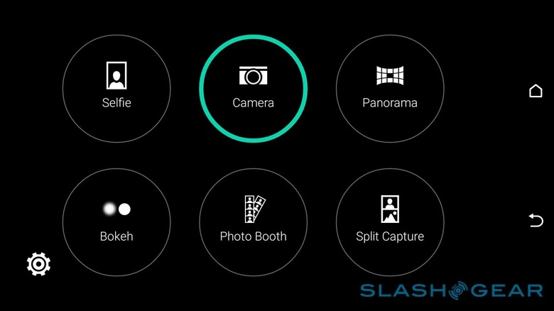
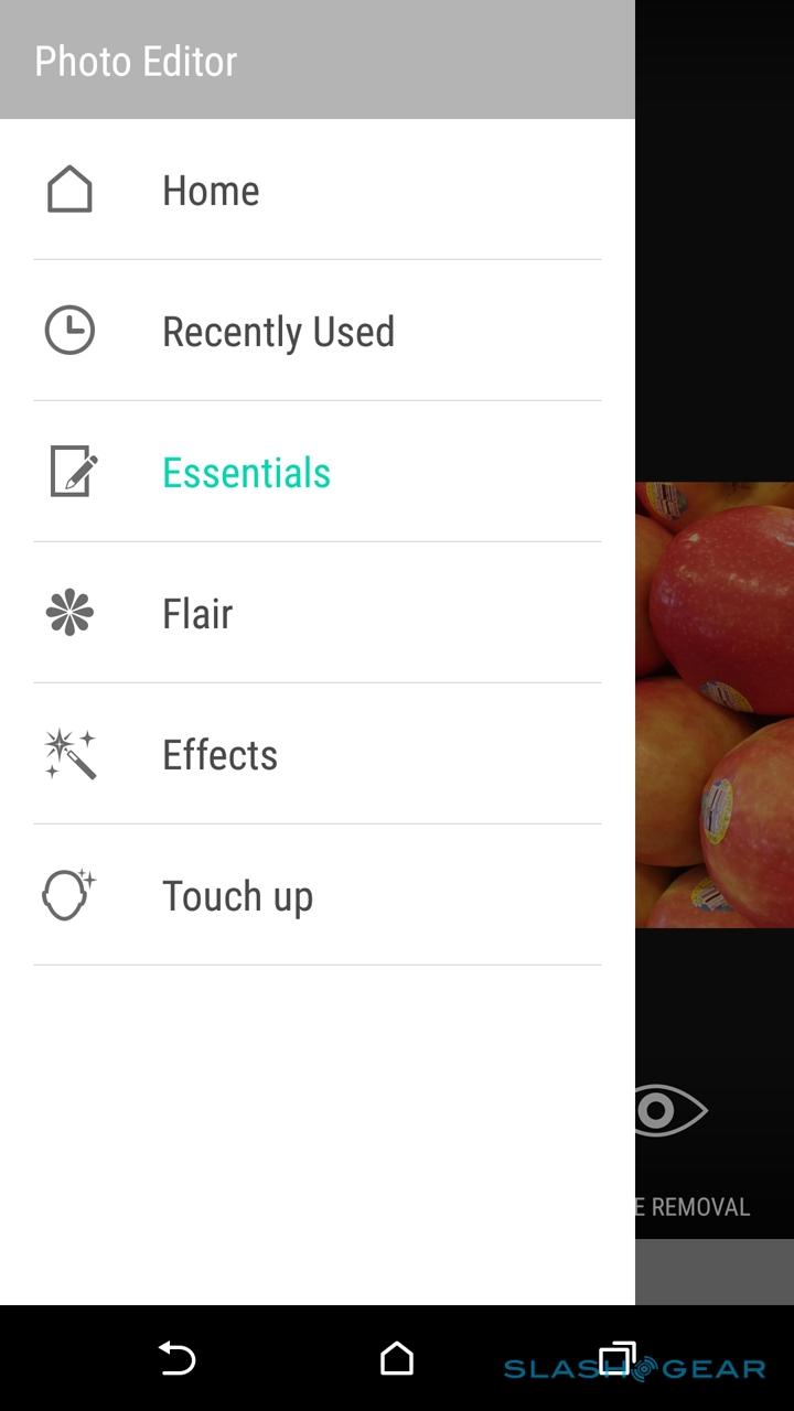
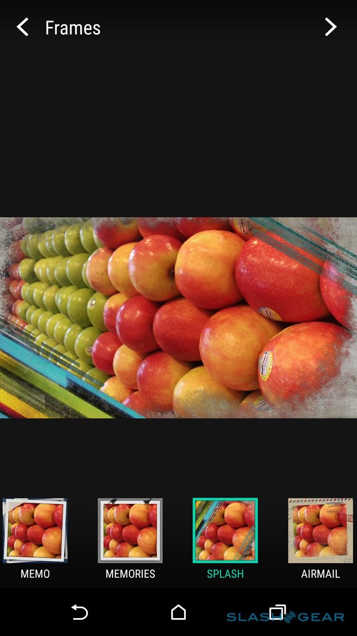
As you might expect, there are a few different camera effects on offer, some within the camera app itself and others in HTC's Photo Editor app. Double Exposure, for instance, selectively blends two different shots into one, presumably targeting those who like to create fake haunting photos or 70s romance paperback covers. Split Capture, meanwhile, uses both front and rear cameras simultaneously, allowing you to drag the split point in-between.

A Bokeh mode replicates the depth-of-field effect you can get with a DSLR (and, for that matter, which Duo Camera tried to mimic), basically isolating the subject and then artificially blurring the background. It's subtle but it works, although I'd have liked to have seen more control on exactly how much blurring was applied. You don't get any of the dreamy, sparkly light pinpricks as you do in true bokeh, for instance.
Finally, there's Photo Booth, which takes four selfies in rapid succession – you get a two second countdown so as to artfully pose – and then combines them into one frame. You can choose between a 2x2 grid that's either rectangular or an Instagram-friendly square, or a long strip like an actual photo booth would've spat out, but HTC doesn't add any retro framing like some other cameras do to make it look more like the real thing.
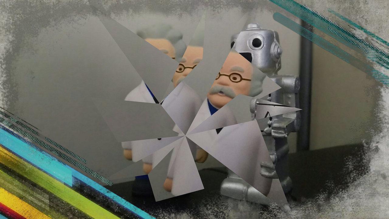
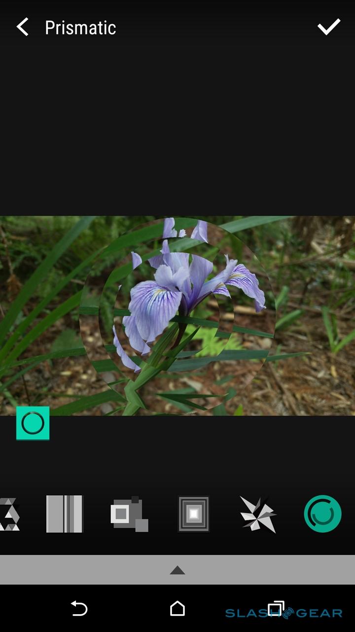
Dig into the Photo Editor app, meanwhile, and there are various changes to be made. Beyond the basics, like red-eye reduction, brightness/contrast controls, and cropping, there are a number of weird optical tweaks, like overlaying shapes cut out from a second photo, or a kaleidoscope-like prism. How well they work depend largely on the original image and your intention; I could see some being eye-catching on Instagram, perhaps.
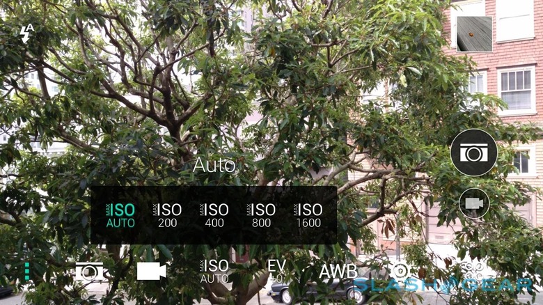
If all that seems gimmicky, then there's something for the more motivated photographers too. The One M9 will in the near future capture RAW images, though you'll need third-party software to actually take advantage of that, since none of HTC's own apps – camera or editor – will do it.
As for video, the One M9 can record at up to 4K resolution, with 1080p and 720p also offered. 4K clips are limited to six minutes in length, and recorded with stereo audio.
Audio, Phone and Battery
Audio quality has, since HTC introduced BoomSound speakers on the original M7, become something of a hallmark for its flagship phones, and the One M9 is no different. Where rivals bury their speakers on the bottom edge, or even on the back, HTC gives its stereo cones pride of place upfront, judging that the extra space they take up is more than offset by the improvement in performance.
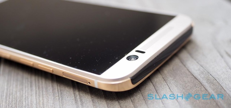
It's a decision I can't really fault. Not only can the One M9 be cranked up to the top end of its volume range without succumbing to distortion or tinniness, it keeps musical detail at lower volumes, too. Plug in a set of headphones, meanwhile, and there's now Dolby Audio for virtual 5.1-channel surround sound. It doesn't need any specific headphones, either, though HTC will offer a high-end headset as an optional extra.
BoomSound pays dividends for speakerphone performance, too, and the One M9 has done solidly in voice calls. It's important to note, though, that this is a European phone being tested in the US. HTC couldn't supply US-spec devices at this stage, and the European models lack support for LTE on either AT&T or T-Mobile USA.
It means that, although I've been able to test out the One M9's performance when on HSPA data networks, I've not seen how it – or its battery – handles 4G. On 3G, with typical use – a few Gmail accounts set to push, some photography, Google Maps use, and browsing, and the usual Twitter, Facebook, and Google+ mixture of social networking, for the most part – I've not struggled to get through a full day.
However, we'll return to battery life in more depth when we have access to US-spec devices, which as well as being capable of LTE connectivity should also be tuned to the US networks.
Wrap-Up
Refinement, not revolution. HTC took what was undoubtedly a handsome, capable phone in last year's M8, and thoughtfully polished away the rough edges. Few would have said that the M8 was lacking in build-quality, but the One M9 is prettier; complaints about UltraPixel have been answered with the new camera that, though more mainstream in its approach to photography (and, it has to be said, is not top of the charts for the pictures it produces), is probably also more suited to casual use.
At the end of the day, I can't knock HTC's attention to detail. I do have concerns, though, that the company has perhaps lost sight of the big picture.
There's nothing inherently wrong with spending 300+ hours on crafting each phone chassis according to custom processes, just like there's nothing wrong with plumping for a 20-megapixel camera that sits near the top of the resolution rankings for recent flagships. All the same, I'm not entirely confident the design will get the attention that investment deserves, not least because of the similarity in appearance to the outgoing phone, and I'd honestly rather have seen fewer megapixels and the inclusion of optical image stabilization.
The One M9 smacks of HTC playing to the HTC faithful: a device that's designed to answer the lingering complaints of current users, and play up to their design tastes. On that level, it does very well. Viewed as part of the smartphone spectrum in 2015 as a whole, however, and the strategy feels myopic. There's none of the goofball appeal of the HTC RE camera, for instance, which while wacky is at least memorable. In short, I'm not entirely sure there's enough to the HTC One M9 to address what has long been HTC's biggest issue: clawing enough attention out of the gate from its well-heeled, well-marketed rivals.
