HTC Desire Z Hands-On [Video]
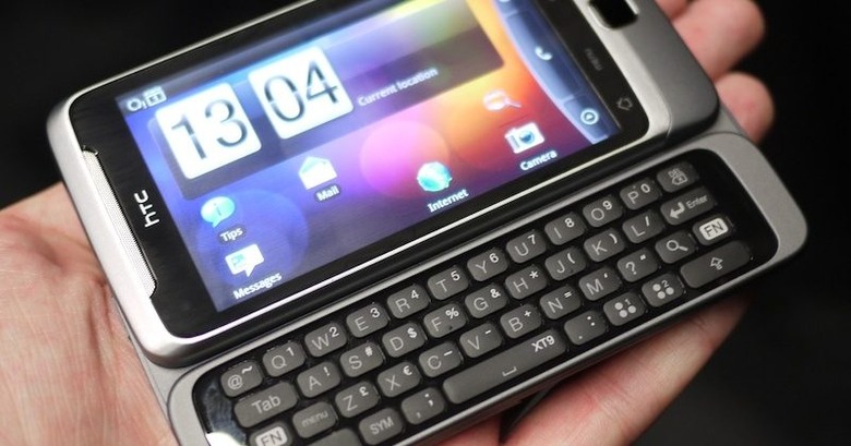
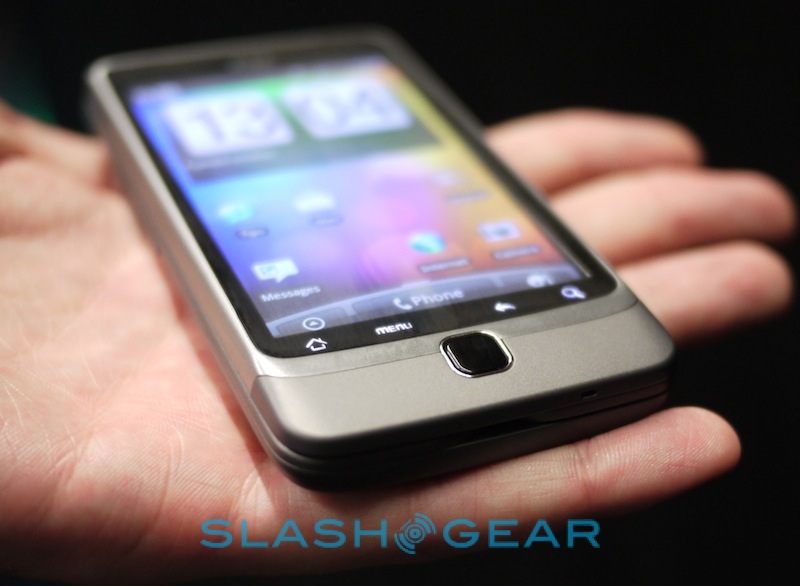
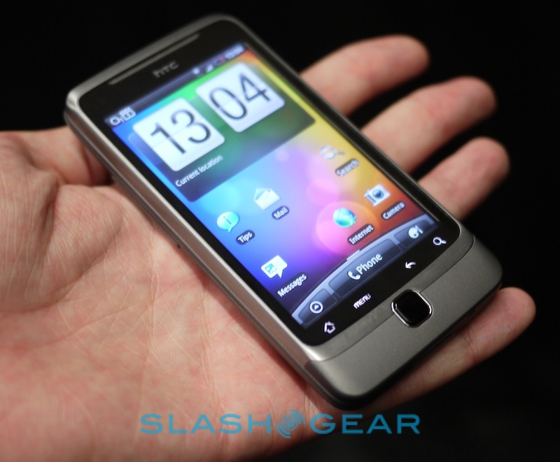
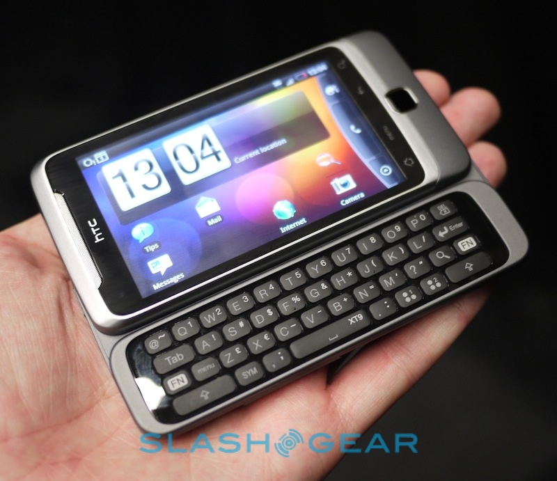
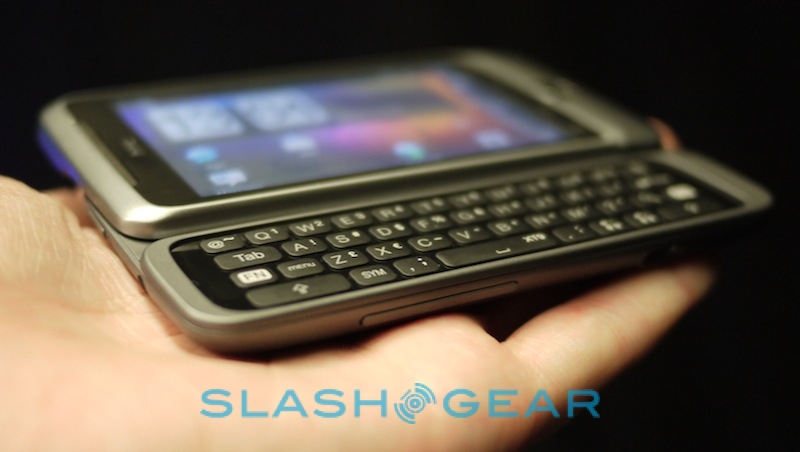
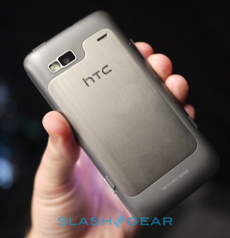
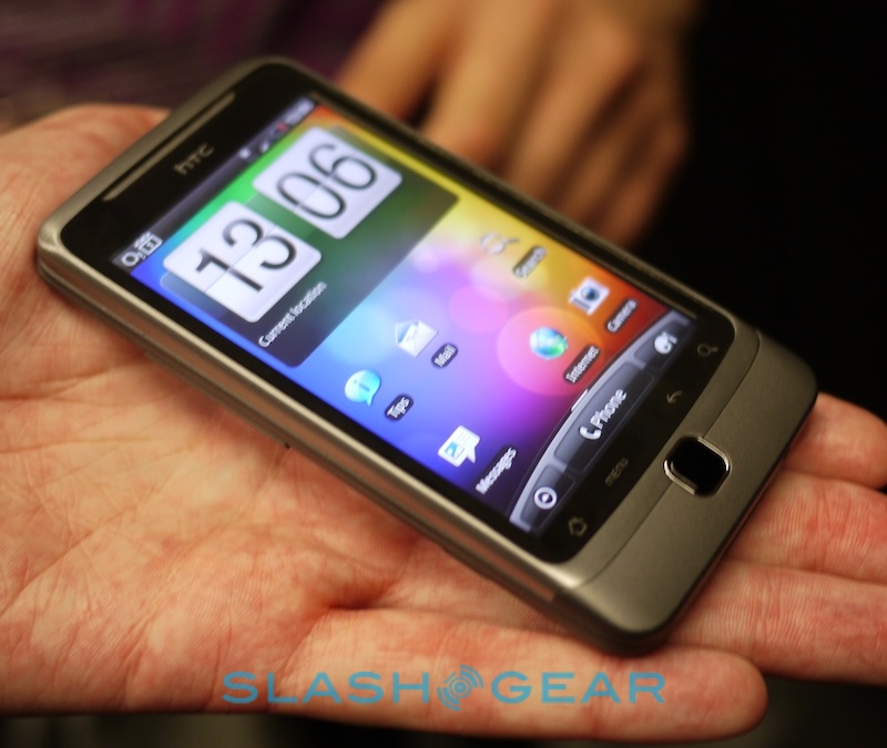
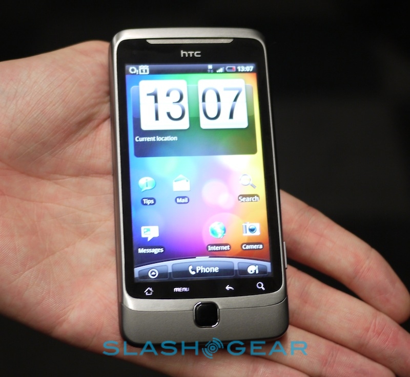
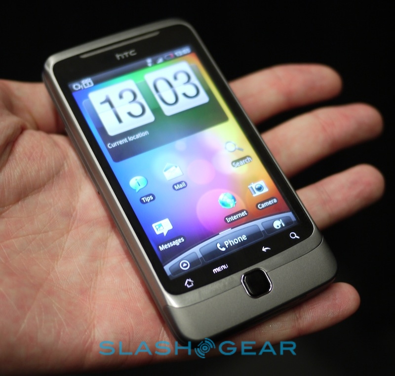
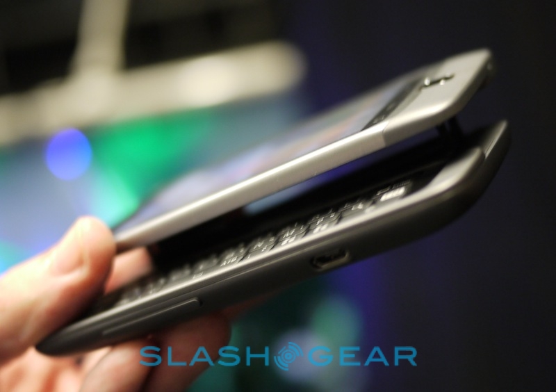
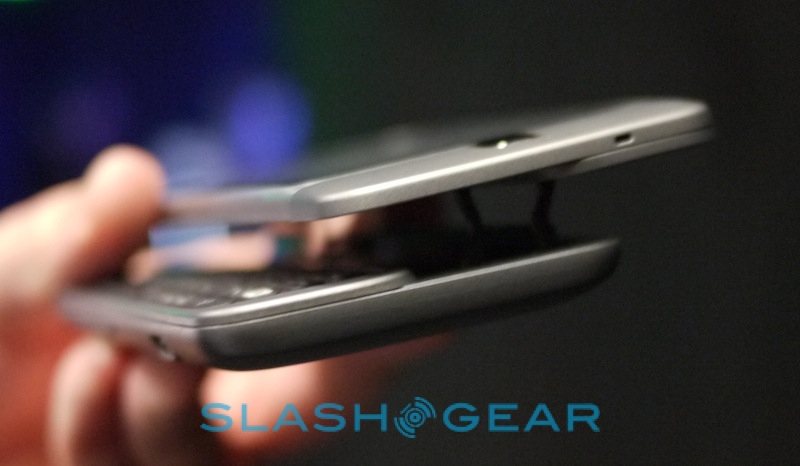
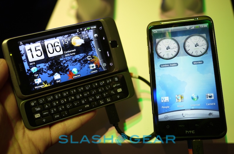
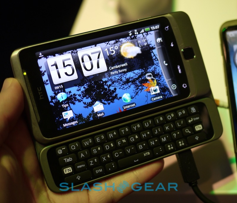
If the Desire HD is HTC's uber-multimedia phone, the HTC Desire Z is their business monster. We've been asking the company to produce a new hardware QWERTY device for twelve months now, and they've certainly delivered: the Desire Z's 'board is finger-friendly, snappy and slotted into a handset that still manages to be pocketable.
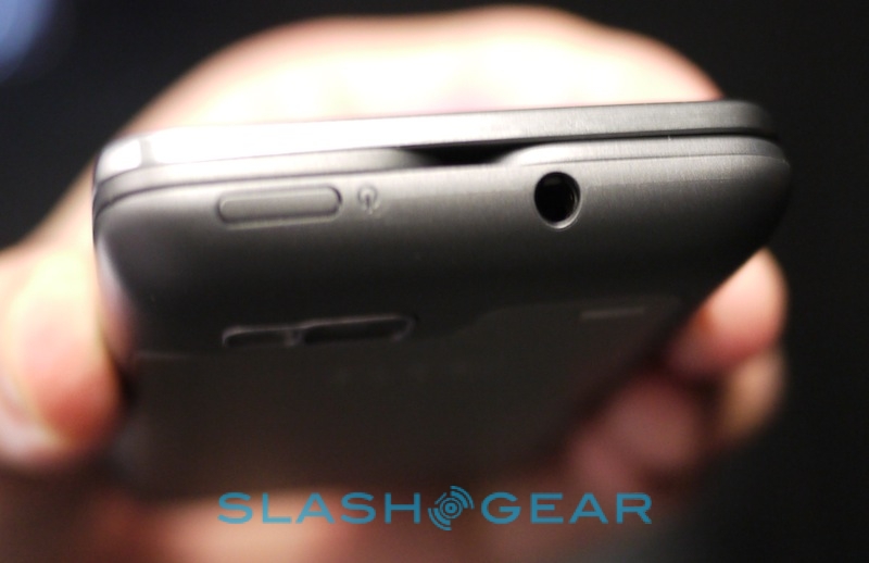
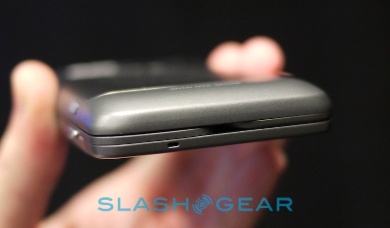
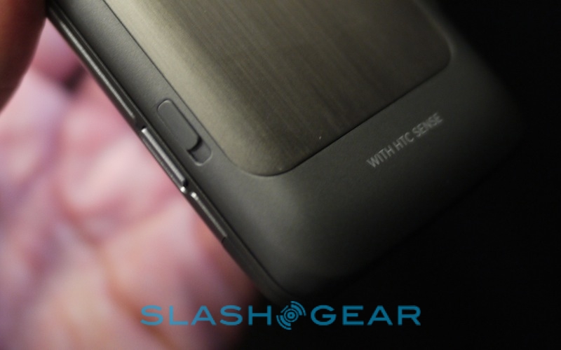
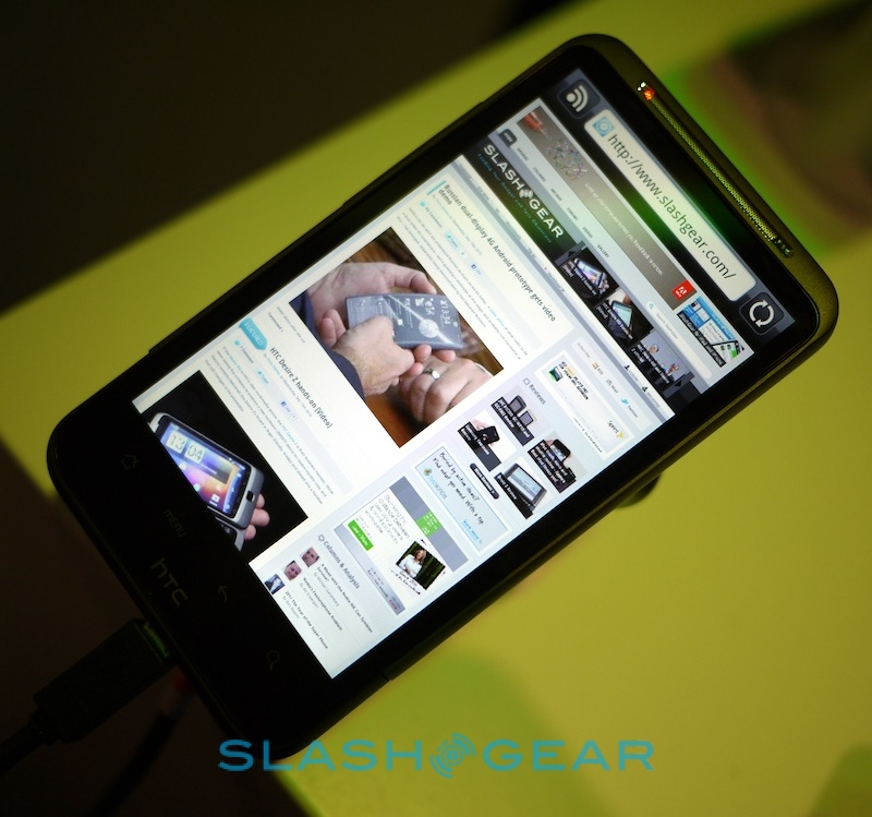
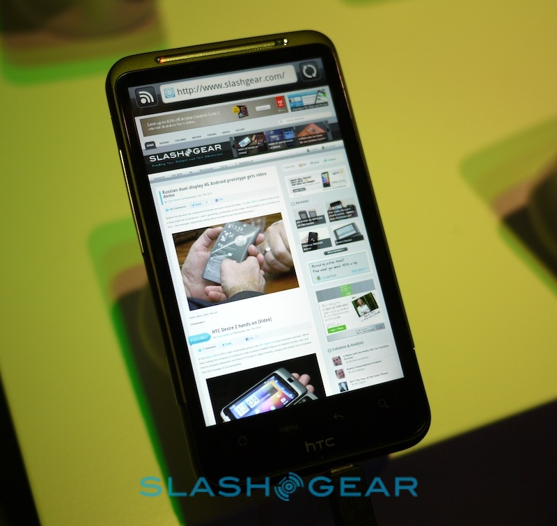
As with the Desire HD, construction is rock-solid – though the "Z Hinge" mechanism feels like the point which is most likely to fail first – and it's quick and responsive. The new version of Sense has some really neat features, including being able to rearrange homescreen panes directly from the zoomed-out "helicopter view", easier widget management, and of course the new navigation package which takes the Google Maps experience and makes it far more like a dedicated PND. The in-car UI, for instance, is now sticky: once you load it, if you tap the home button it takes you back to that UI rather than to the basic Android homescreen. A minor tweak, but an important one to those trying to use their phones for directions while driving.
Ironically, we can't help but compare the Desire Z to Nokia's E7, announced at the first day of Nokia World yesterday. Obviously the Nokia is bigger – with a 4-inch display rather than a 3.7-inch panel – and that means a bigger chassis and a more spread-out keyboard. The E7's keys have an edge over those of the Desire Z's, but we're not sure that's enough to pull users over to Symbian^3 from Android 2.2 Froyo. We'll have to spend hands-on time with both to figure out the compromises and whether they're worth it, but as a mainstream QWERTY smartphone the Desire Z has us very excited indeed.
HTC Desire Z hands-on:[vms dd424a57127423d276bb]
