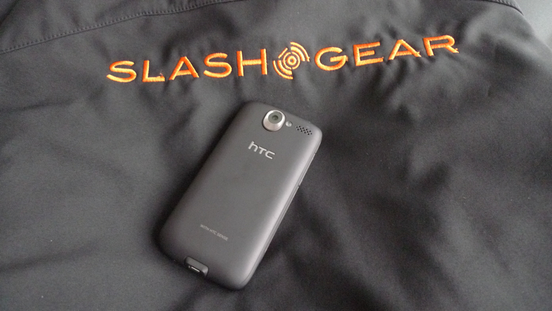
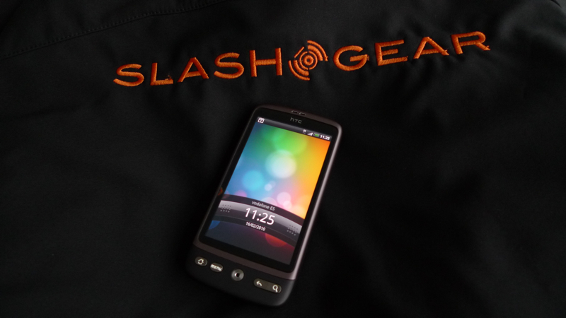
HTC Desire Hands-On
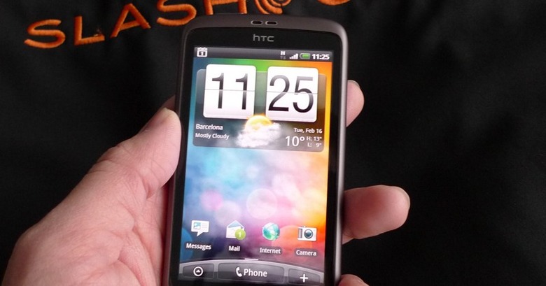
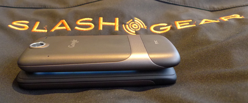
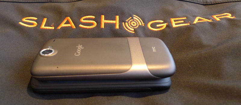
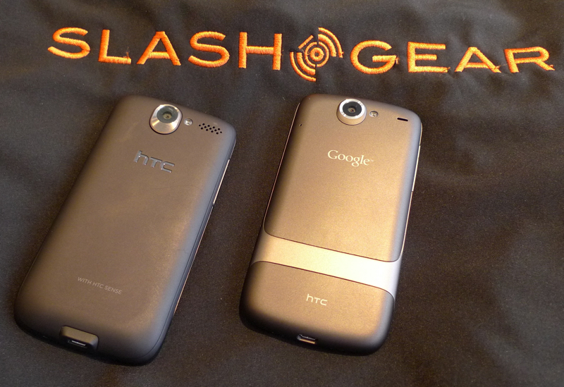
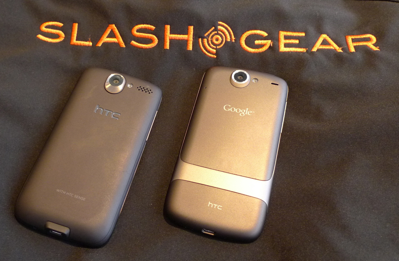
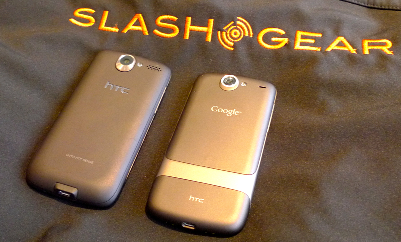
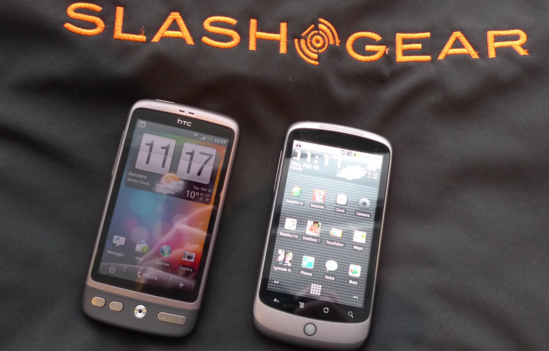
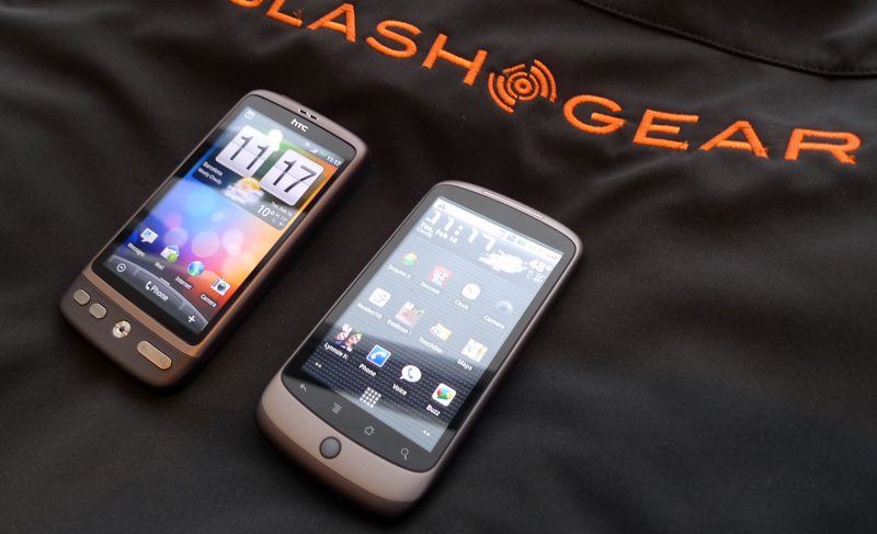
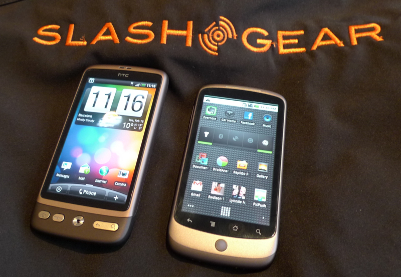
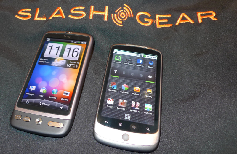
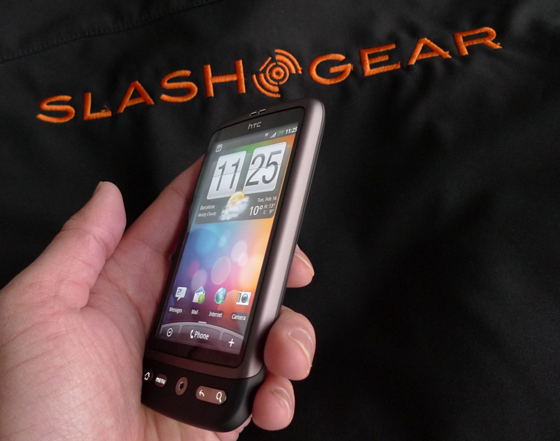
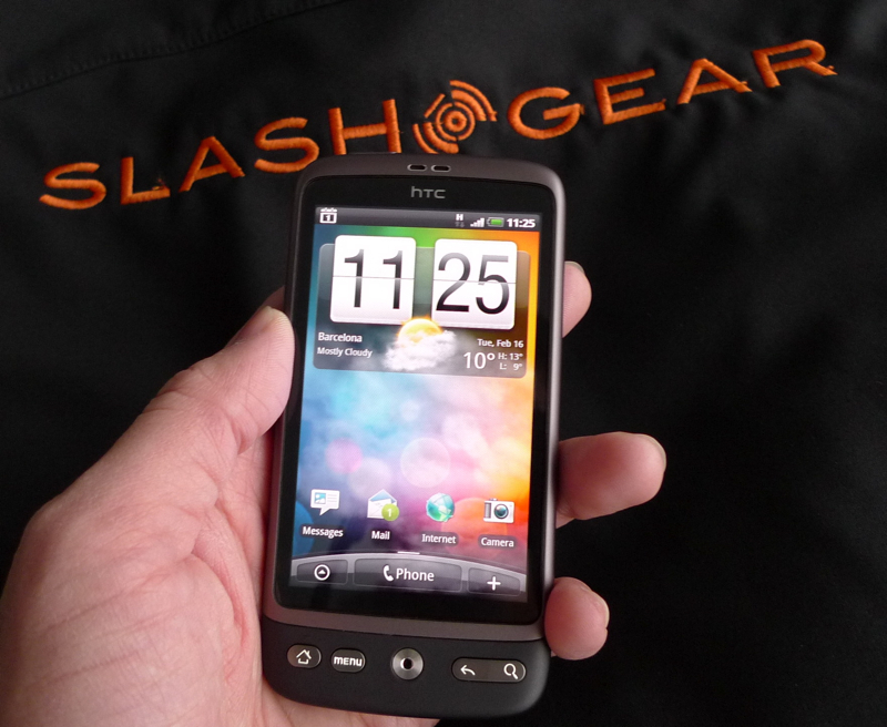
We've made no bones about how impressed we've been by the Google Nexus One – at least one member of the SlashGear team abandoned his iPhone 3GS in favor of it, in fact – but the HTC Desire may just have stolen our hearts. Ostensibly the same device as the Nexus One, albeit in a different casing, what makes the difference is HTC's Sense UI, which as we found on the Legend is a neat step up over previous-gen devices. Check out more first-impressions, together with a hands-on gallery and video, after the cut.
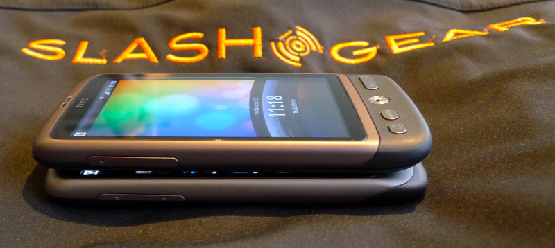
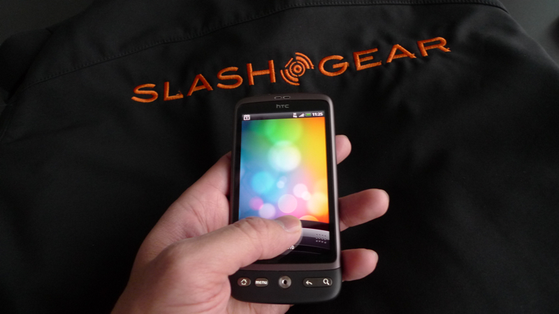
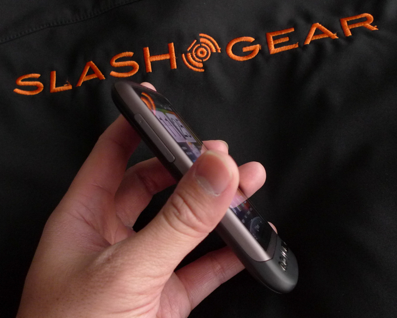
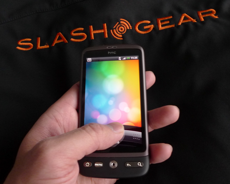
Like its Google counterpart, the Desire is slim but sturdy, with an aluminum chassis and sizeable 3.7-inch WVGA AMOLED display. The most obvious navigation difference is the optical joystick, which we found worked just as well as the Nexus One's trackball. It also makes the front panel slimmer, and that means less prone to damage.
The 1GHz Snapdragon isn't phased by Sense, and the seven homescreen panes flick past swiftly. HTC have obviously optimized their desktop widgets, since there's pretty much no lag in their updating; the Desire also snaps neatly into the new "helicopter view", triggered with a pinch-zoom gesture from the homescreen. The most frustrating aspect is going to be the absence of US-spec 3G connectivity; we can see many would-be US buyers wanting to pick the Desire over the Nexus One.
Availability is set for April 2010, and we'll hopefully have a review unit before that, so we'll be able to see whether HTC's enhanced social networking integration works well with the new Friend Stream desktop widget. Until then, check out the hands-on gallery and demo video below!
HTC Desire hands-on video demo:
https://www.youtube.com/watch?v=Cisk6qhd-bk
