HTC ChaCha Review
You wait all this time for one HTC Facebook phone, and two turn up. Hot on the heels of our HTC Salsa review last week comes this, the HTC ChaCha, also announced back at MWC 2011 in February and bearing the same dedicated Facebook key as its sibling. A quick glance at the QWERTY-encrusted fascia shows the ChaCha is a very different beast to the all-touch Salsa, however; does that make it the social network phone to have? Check out the full SlashGear review after the cut.
Hardware
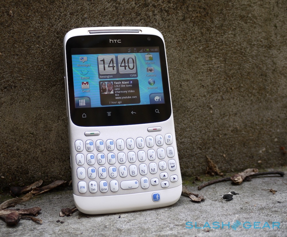
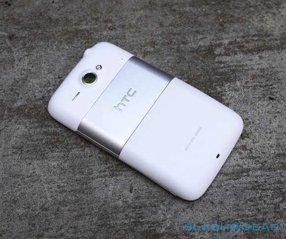
The ChaCha – which will also be known as the HTC ChaChaCha in some territories, where "chacha" has less salubrious meanings – is one of HTC's more distinctive handsets when it comes to design. QWERTY Android phones are still in the minority, despite the popularity of messaging-centric devices like BlackBerry; those we do see tend to include a slide-out keyboard, rather than use a candybar form-factor.
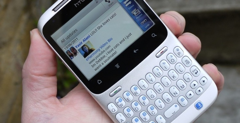
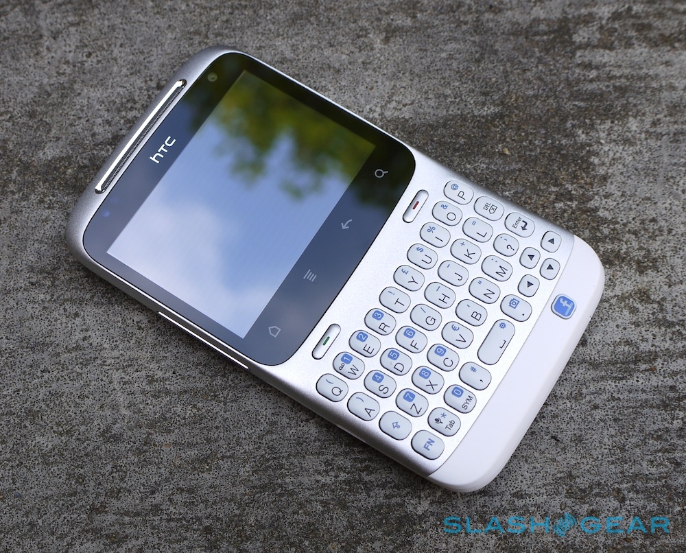
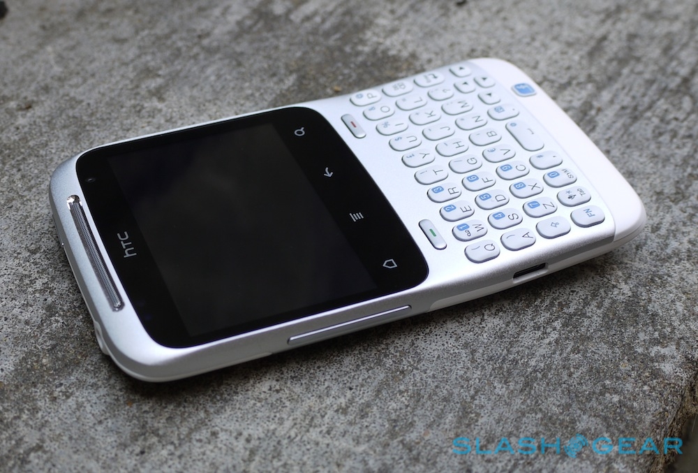
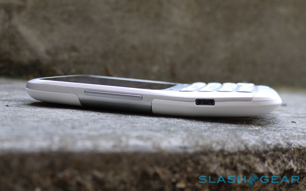
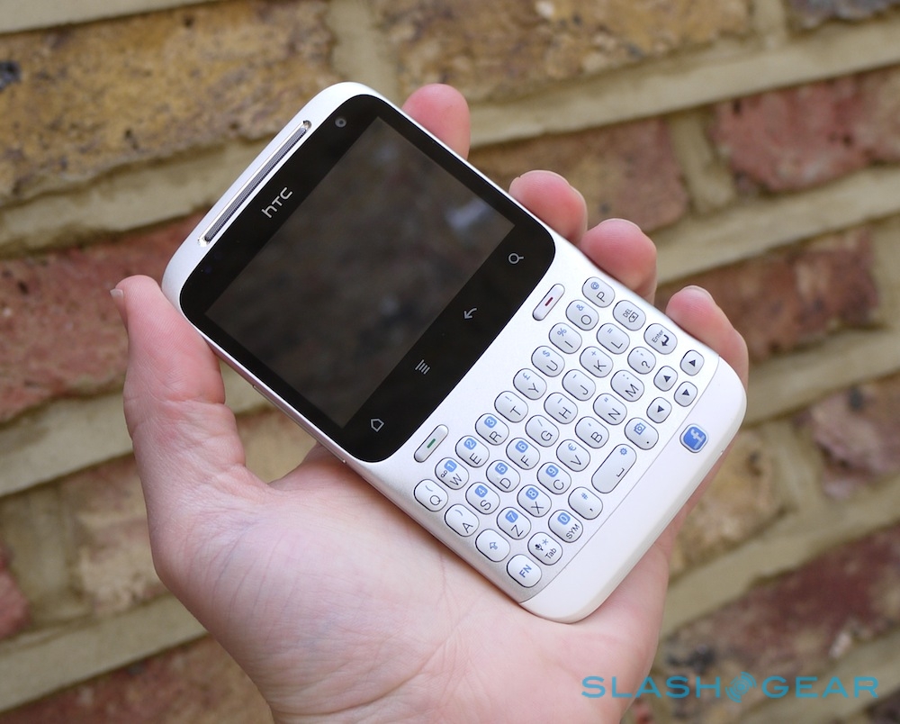
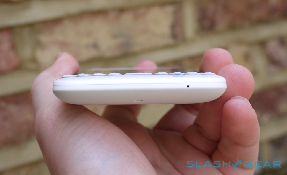
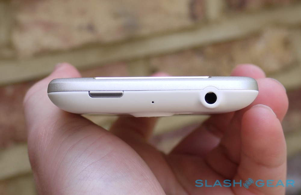
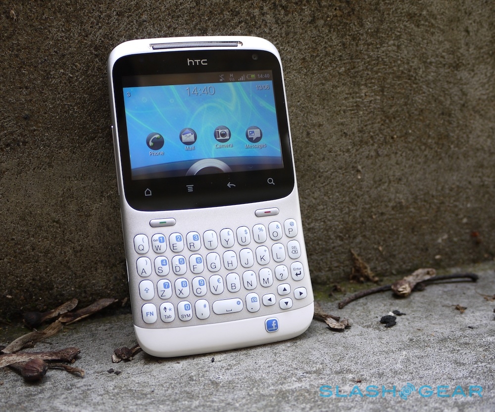
So, the ChaCha gives you a 2.6-inch 480 x 320 resolution touchscreen above a full QWERTY thumbboard, with a row of the usual touch-sensitive Android function buttons – home, menu, back and search – and dedicated call/end keys sandwiched in-between. On the left hand edge there's a volume rocker and a microUSB port, though unlike the Salsa there's no dedicated camera shortcut on the right. The power/lock button and headphone jack are on the top edge.
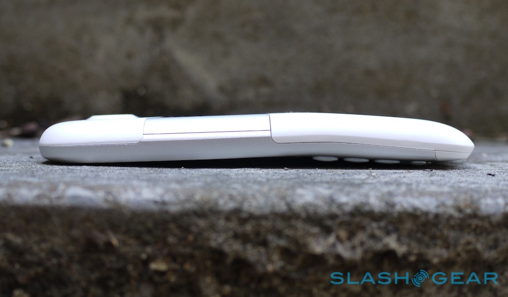
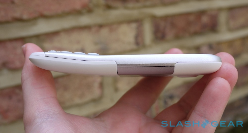
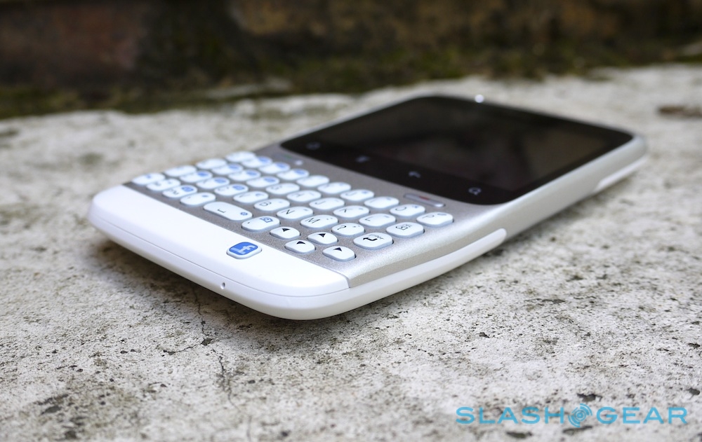
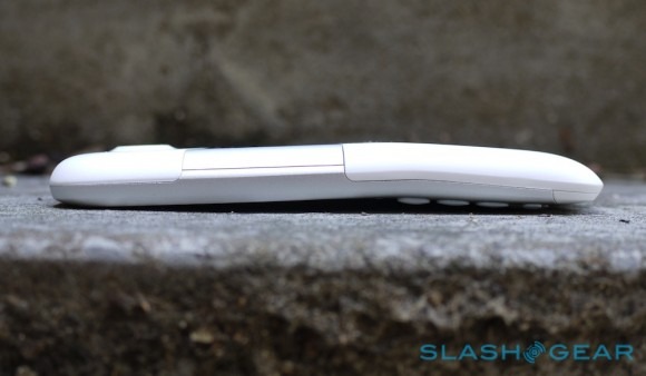
HTC made something of a reputation for itself with its "chin" design, and the ChaCha is more jutting than most. The company claims the bent profile positions the screen at the right angle when you hold the phone for typing, as well as keeping keyboard and display off the surface of the table – and thus scratch-free – when placed face-down. In practice, it divided opinion, some liking the distinctive shape and others wishing it was flat. Measurements are 4.5 x 2.54 x 0.42 inches, though given the thickness takes into account the bend, the ChaCha feels thinner in the hand than the specs would suggest.
HTC ChaCha overview:
[vms 9a01dba3aada5ece2227]
The 2.6-inch display may be small, but it still runs at the same resolution as the larger, 3.4-inch Salsa. It's bright and clear, and the resolution is a nice balance of keeping on-screen icons crisp but not so small as to force you to squint. We wish HTC had fitted either a trackball or an optical joystick, however; the keyboard has a D-pad but it's right down in the bottom right corner, and there were times we'd have liked to have controlled the phone one-handed without stretching a thumb up to tap the display.
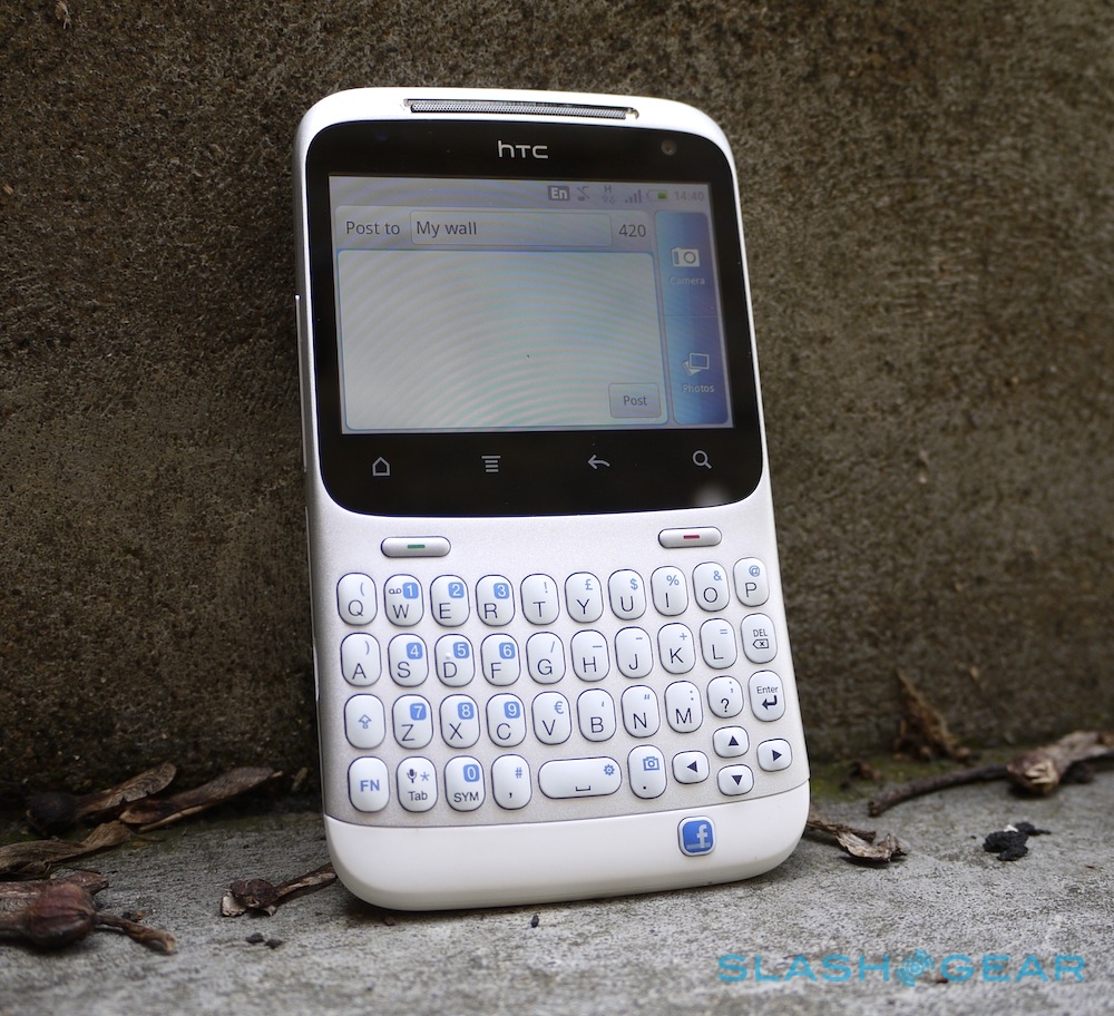
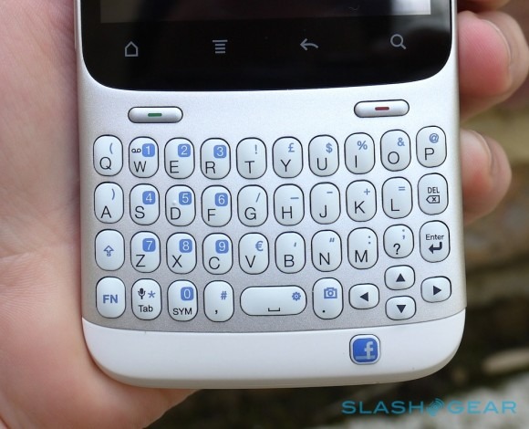
Still, it's hard not to fall for the ChaCha's QWERTY 'board. Four rows of TicTac-sized hard plastic keys, with a double-width spacebar and D-pad cluster, they're pleasingly clicky and have just the right amount of travel. The metal fascia means there's no flex as you type. Numbers are clustered together as secondary functions, triggered with a FN key, and there's a dedicated Tab, symbol key, comma, period and question mark buttons. Hold down FN + period and the camera loads; the same is meant to happen with the spacebar, opening up the settings page, but our review unit showed no inclination of doing so.
Still, it's a minor flaw (and one we're guessing will be tweaked with firmware) in what's otherwise a brilliant keyboard for punching out texts, tweets, emails and – not least – Facebook status updates and comments. Of course, underneath the main 'board is the dedicated Facebook button, the functionality of which we'll cover later on.
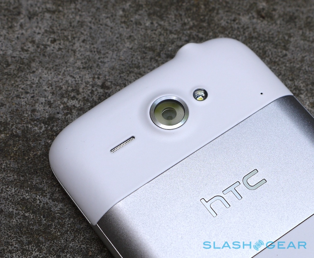
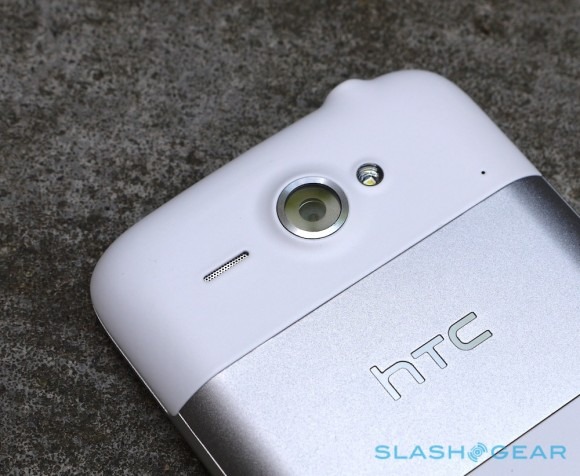
Outwardly the ChaCha and the Salsa look completely different; inside, however, they're far more similar. Both use an 800MHz single-core Snapdragon processor (boosted from the 600MHz chip originally specified) along with 512MB of RAM and 512MB of ROM. There's a 5-megapixel autofocus camera with LED flash on the back and a front facing VGA webcam up front, along with a microSD card slot, 3.5mm headphone jack, micro-USB port and GPS. Connectivity includes WiFi b/g/n and Bluetooth 3.0, along with – on this European model – dualband 900/2100MHz HSPA/WCDMA and quadband GSM/EDGE.
Overall, build quality belies HTC's low-end positioning for the ChaCha: it's creak- and flex-free, nicely weighted and the white and silver color-scheme – while perhaps not to everybody's taste – does at least use the same solid feeling plastic and brushed metal as the Flyer tablet.
Software
Like with Salsa, HTC has used Android 2.3.3 Gingerbread on the ChaCha, complete with its Sense UI and app/widget suite. Appearance-wise, though, it's a very different story: this is the third Sense build we've seen in the past month: "2.1 for Messenger" as opposed to 2.1 on the Salsa and 3.0 on the HTC Sensation. The changes are predominantly to suit the landscape orientation of the display – indeed most of the standard apps and menus won't rotate into portrait orientation – but the light grey color-scheme also makes the UI feel brighter and less dense.
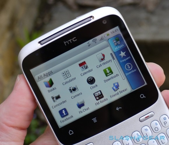
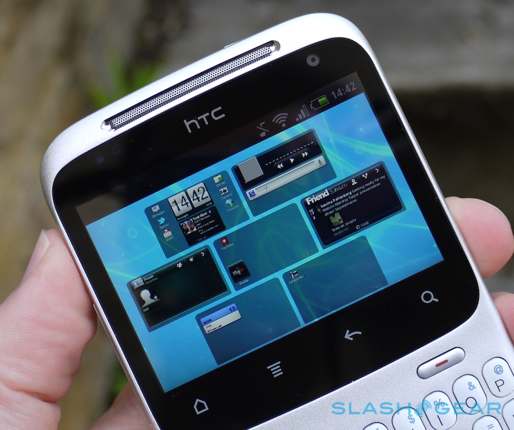
Rather than the center-biased seven pane homescreen layout on all-touch HTC Android phones, the ChaCha defaults to its left-most pane. You can have up to seven of them, filled with the usual icons and widgets, though the first has the app menu and customize keys in its bottom corners by default. There's no recent-apps scrollbar in the notifications menu, nor access to quick settings. Mildly frustrating, you can't get back to the homescreen by pressing the end-call button, as you might expect – in fact it only ever ends calls. The lockscreen has the same four icon launcher as on the Salsa and Sensation, though not the latter phone's weather effects.
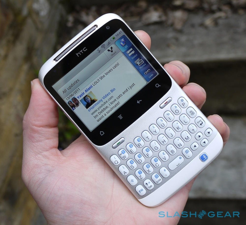
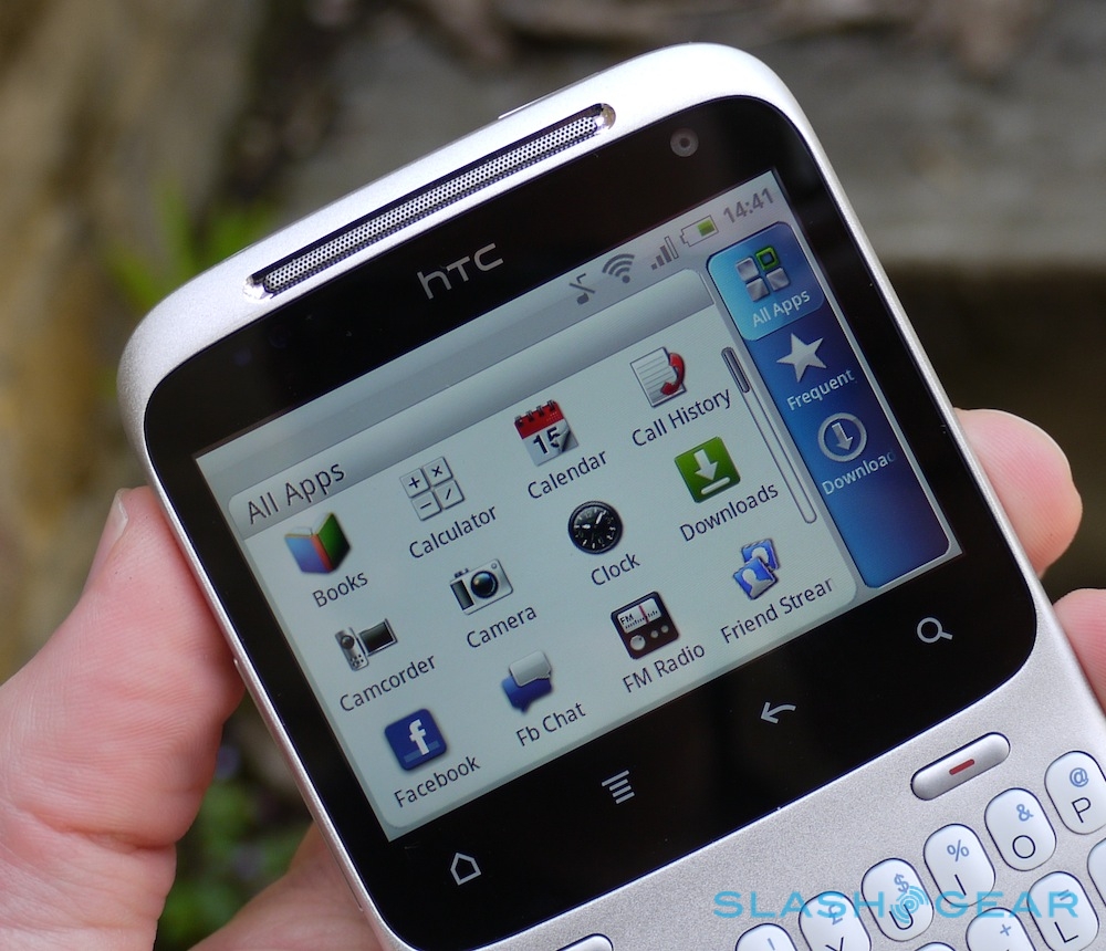
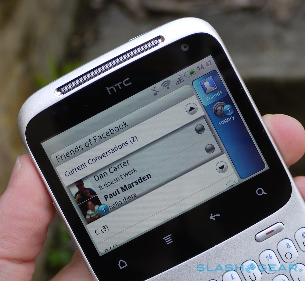
HTC has obviously changed much of its UI to cater to the unusual screen aspect, but it's a mixed bag for usability. The app menu works well, with the All Apps/Frequent/Downloaded filter shifted from the bottom to the side, and that same layout has been carried over into Friend Stream and the Gallery app, among others. It's straightforward to flick the filter slider and then the list, both with your right thumb.

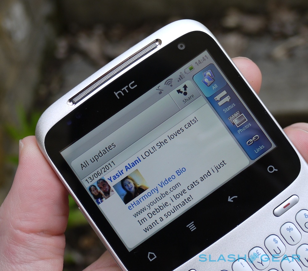
The same suite of apps as on the Salsa is loaded onto the ChaCha, so you get HTC regulars like Books, Friend Stream, HTC Hub, HTC Likes, Mirror, Peep and the WiFi Hotspot app. Unfortunately, HTC hasn't gone quite far enough in tweaking the interface for our liking, and this shows up in Friend Stream – the hub of Facebook activity, no less – most of all. Read on for details.
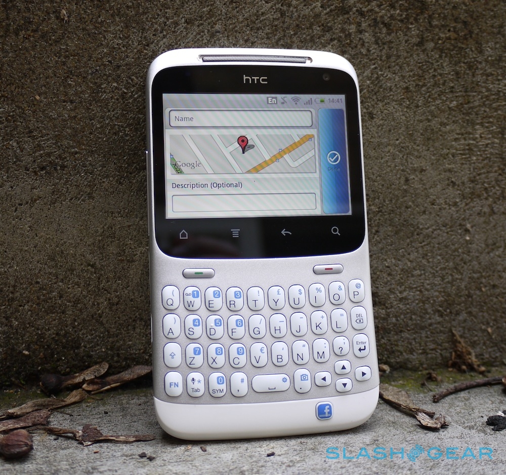
As on the Salsa, the Facebook button allows you to punch in a new status message after a single press, shares the track or webpage you're enjoying, or – after a long-press – your location using Facebook Places. Our existing criticisms about support for sharing recommendations from third-party apps, being unable to edit metadata for things like Amazon music downloads, and an inability to handle Facebook Group or Page accounts still stand. We'd recommend reading our Salsa review for all the details.
HTC ChaCha Facebook integration demo:
[vms 2368a99f1d032c884854]
The most frustrating thing, though, is the amount of screen space you actually get to read all that Facebook content. In Friend Stream, once the notification bar, title bar – with Share button, duplicated with the dedicated Facebook key – and right-hand side filter slider are accommodated, you're left with a tiny window in which to actually read Facebook and Twitter updates. The ideal solution would be to borrow the UI from the browser, where the menu bars disappear automatically to maximize the usable space, but are easily summoned with the menu key.

In short, while the combination of a great keyboard and a handy shortcut makes posting to Facebook incredibly straightforward, actually consuming other people's updates on the move is more difficult than it should be. Great if you're an egotist dedicated to promoting Brand Me; not so much if you actually care about what your friends are saying.
Camera
We were underwhelmed with the 5-megapixel camera on the HTC Salsa, finding its color settings made an unusually ominous purple mess of the sky. Happily the ChaCha's identical-resolution snapper does a better job. As we've often lamented about HTC handsets, the output in general is less impressive – megapixel for megapixel – than some rivals can manage, but the shots are good enough for Facebook sharing certainly. Curiously, they look far better off-device than viewed on the ChaCha's screen: sometimes we thought photos would be hopelessly blurred based on the short preview, only to find the end result was fine.
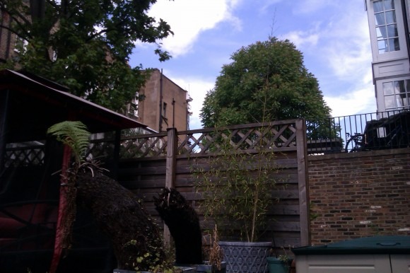
There's still some blotchiness and exposure inaccuracy, but it's reasonable for an entry- to mid-tier handset. Colors are clear and the touch-focus system – which also works during video recording – is swift. Video clips, meanwhile, are limited to 720 x 480 resolution but are crisp and audio pickup is good.
Phone and Battery
The ChaCha is blessed with both a clear earpiece and a loud speaker for hands-free use, though the latter does acquire some crunchy static at the top end of its volume. Perhaps it's the curve of the phone, but callers said we were coming through loud and clear; of course there's also Bluetooth for hands-free use.
Battery life is rated at up to 420 minutes of WCDMA talktime (up to 450 minutes GSM) or up to 660 hours of WCDMA standby (up to 430 hours GSM) from the 1,250 mAh battery. That's almost 300 mAh less than the Salsa offers, though of course there's a smaller display to power too. Overall, we managed to get through a day and a half or so of use, with Facebook and Twitter set to their default updates, push Gmail active, and some use of the browser, camera, Google Maps and other apps.
Wrap-Up
HTC may have given the ChaCha an odd name, but get past that and this QWERTY handset is one of the more usable – and certainly one of the most memorable – Android phones around today. There's a compromise to be made on screen size, but in return you get a frankly brilliant QWERTY keyboard with little in the way of a learning curve. If your smartphone is also your multimedia powerhouse then the ChaCha is unlikely to appeal, but if you spend more time messaging then the thumb 'board pays dividends.

The software isn't perfect, but make no mistake: it would take very little for HTC to finesse the UI to better take advantage of the screen. In fact, just as with the Salsa, the ChaCha's main issue may well be persuading would-be buyers that there's more to it than the Facebook branding. The dedicated Facebook button is a gimmick, but taken as a whole the HTC ChaCha is far more compelling than the silly name might suggest.
Thanks to Three for the loan handset.
