HP Folio 13 Hands On
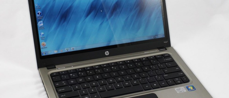
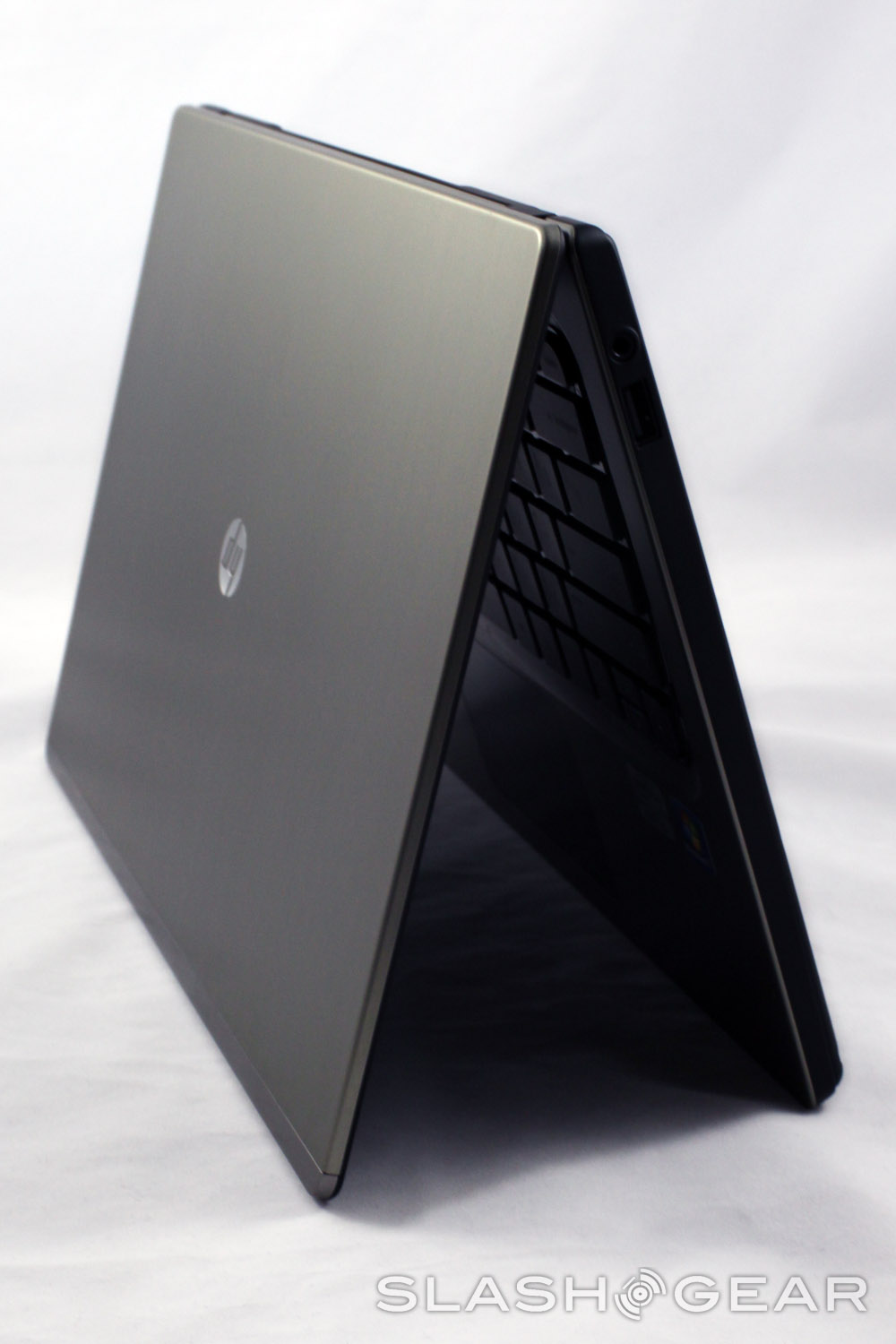
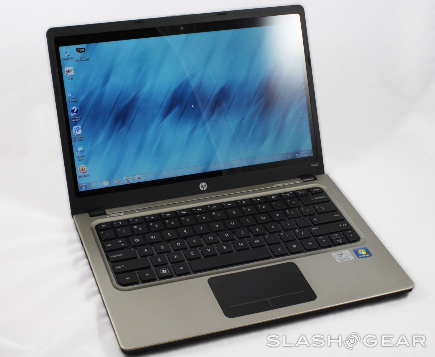
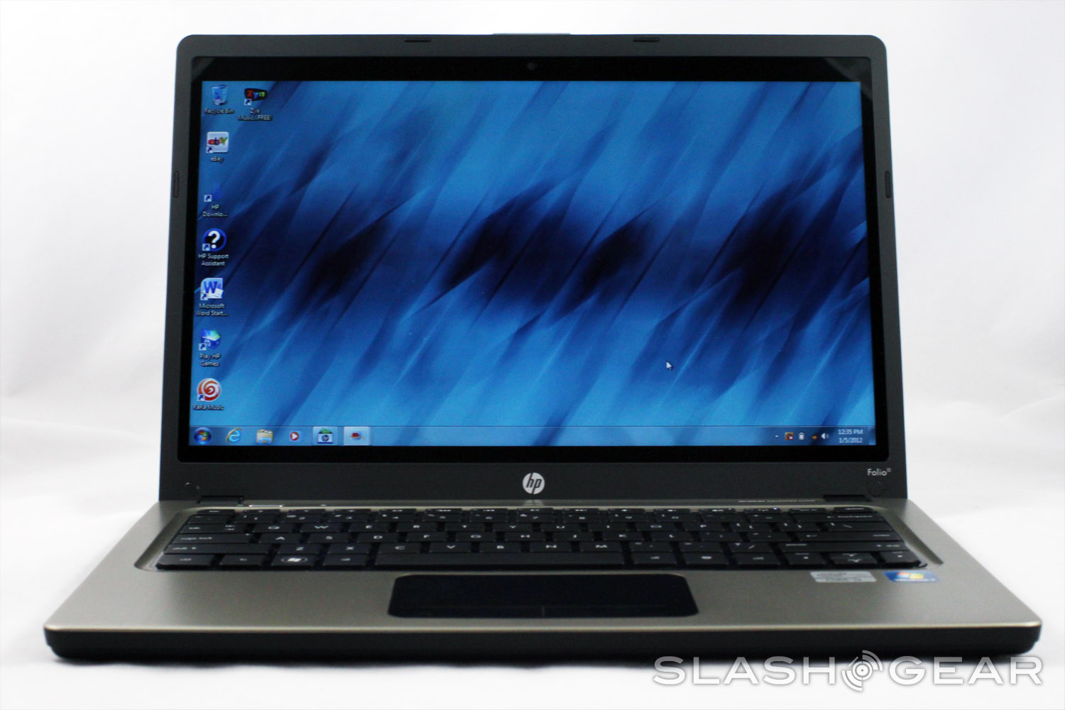
With everybody an their brother hoping on the latest trend in ultraportable computing, HP is due for a svelte laptop of its own to give a hyperbolic adjective. Enter the new Folio series, inappropriate with the Folio 13, a rather standard laptop wrapped in a thin and gorgeous frame. HP sent us one to try out during CES next week, so expect a road-tested review afterwards. In the meantime, here are our initial impressions.
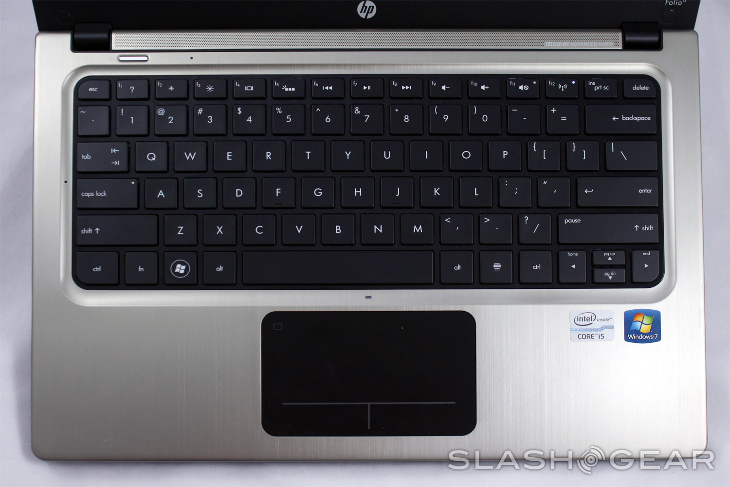
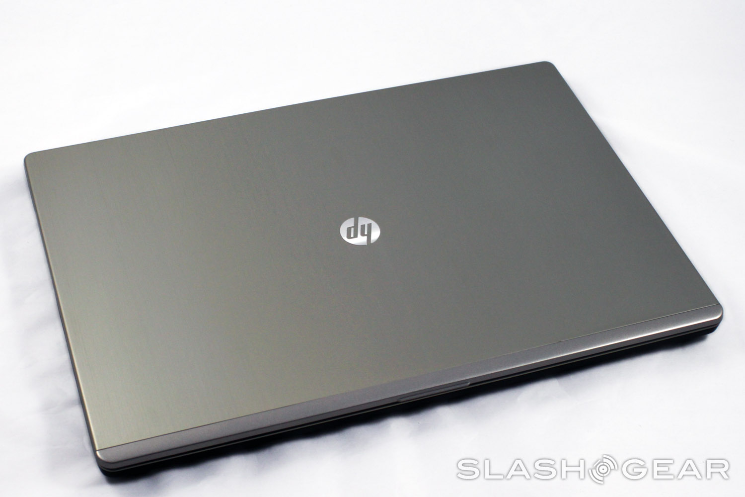
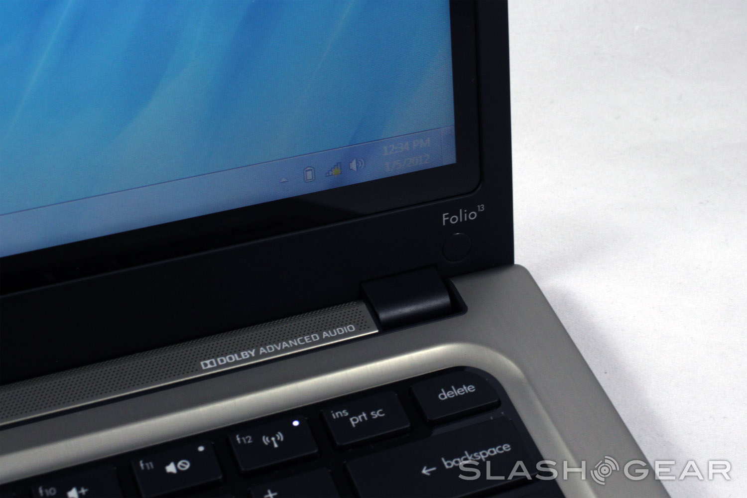
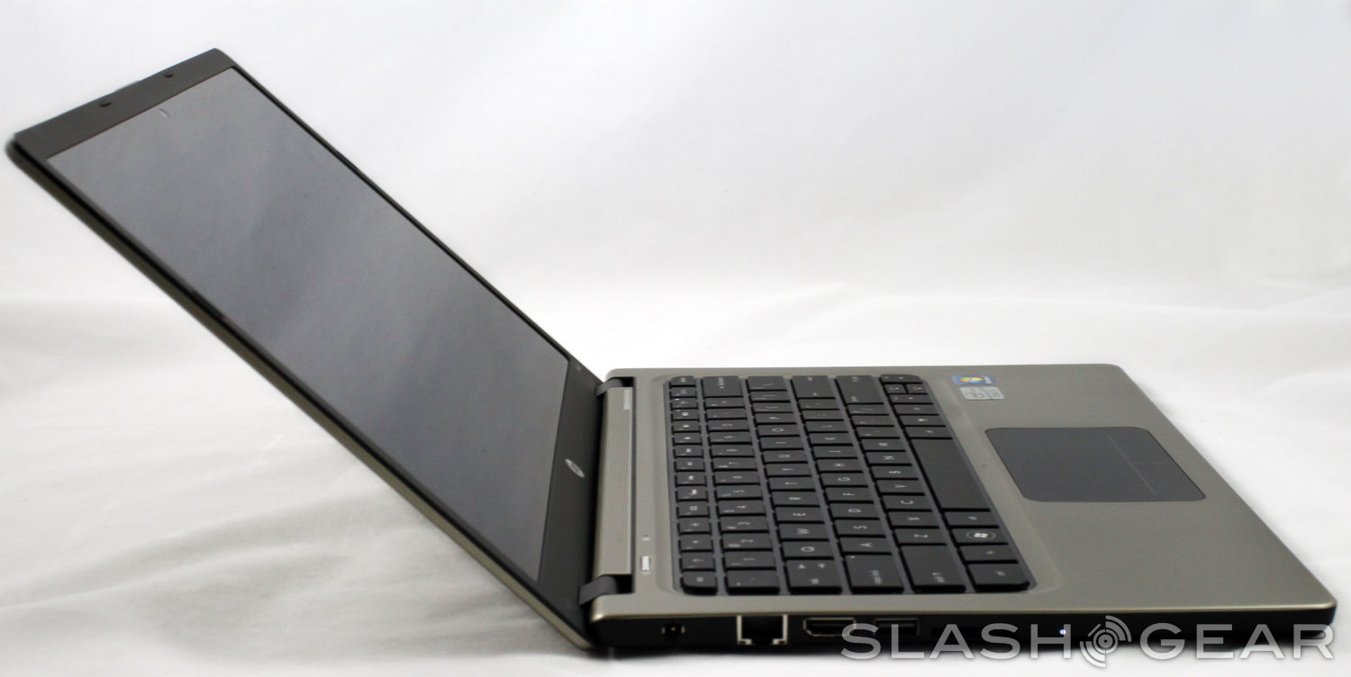
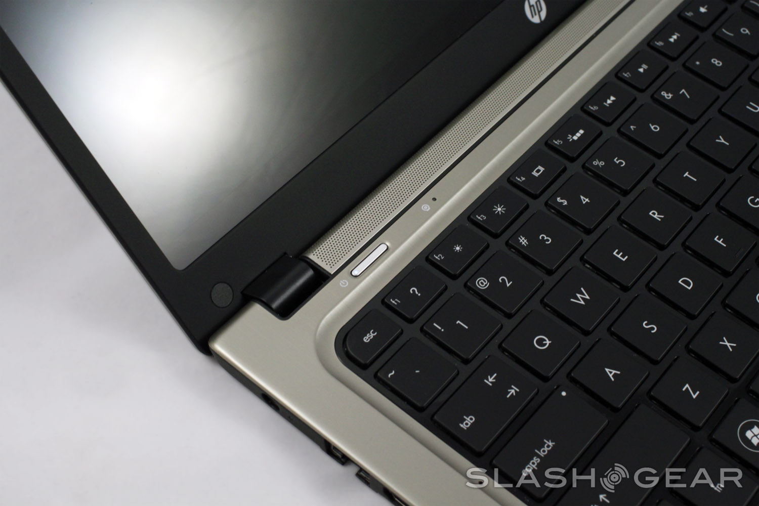
The finish itself is one of the most attractive features, with a brushed aluminum look that's eye-catch yet understated. Photos really don't do it justice. It looks like it should be a fingerprint magnet, and in a way it is, but the pattern on the aluminum masks them effectively and keeps the laptop looking classy. The port selection is a little slim with just two USB ports, HDMI, an SD card slot and Ethernet, but it meets or beats other Ultrabooks that cost much more.
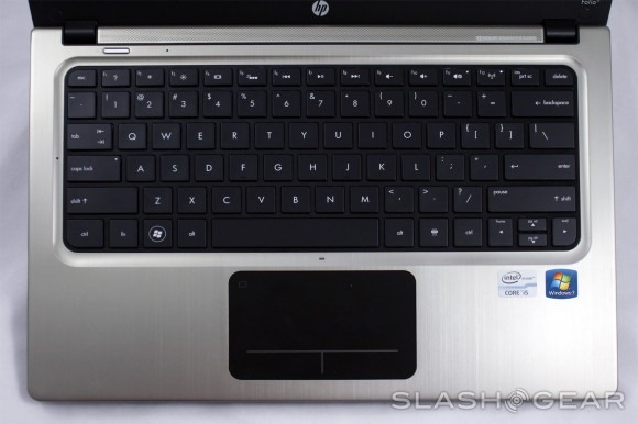
HP's now standard clickable trackpad is present, minus the nice rubber definition line from the ENVY 15. Take it or leave it (or bring along a USB mouse) but it's at least smooth and accurate, with a nice feedback when depressing for a click. It's still to hard to initiate a middle-click, but the trackpad is much better than earlier attempts.
The only big downer for the Folio 13 is the screen, which seems to be the same rather dim TN panel that goes into most low-end 13-inch laptops. At 1366x768 it's not ideal for working, at least not if you're used to a larger laptop or full-sized monitor. I would have liked to have seen an upgrade option for a more dense and sharp screen.
There's not enough time between now and CES to give this little guy a full review, so I'm taking it along for the ride. You'll probably reading quite a few posts written right from the Folio 13, so it's a trial by fire for HP's first Ultrabook. Check out a video walkthrough below:
