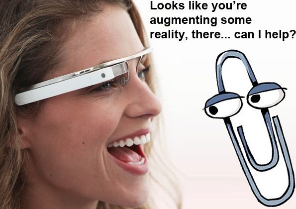
Google Project Glass: Siri Or Clippy?
"Your scientists were so preoccupied with whether they could" Jeff Goldblum memorably said in Jurassic Park, "that they didn't stop to think if they should"; has Google done the same with Project Glass? Initial reactions to the wearable computing concept shown off publicly yesterday were predictably gobsmacked, the eye-catching demo video showing an idealized and alluring view of augmented reality. After the dust has settled, though, comes the question: is Project Glass Google's Siri, or is it actually more like Microsoft's ill-fated Clippy?
Some of us were quickly on-board, offering to open up our wallets to whatever Google wanted to take in order to get our hands on the wearable display. Others have been more reserved, wondering whether the AR system can deliver what Google has promised, and if so whether that's something we'd actually want in our everyday lives.
Tom Scott, for instance, recreated Google's concept video with a rather more cynical slant (be warned, some moderate profanity in the first couple of seconds), warning of what might happen if our reality gets just too augmented:
More serious, though, are the questions around practicality and privacy: can Google really deliver a user experience anything like its glossy promo, and even if it can, do we really want the search giant piggybacking on our everyday lives even more? Technical details, as we've already observed, are in short supply from Google; the slender prototypes in Google's press shots are described as "design studies" with no indication as to whether the test hardware is anywhere near as minimal.
Practical experience with actual wearable displays from Lumus suggests Google's UI mockup may not be quite what we can expect from the real deal. Single-eye overlays aren't the issue – it's actually relatively straightforward to incorporate extra information from one eye into your overall vision – but the amount of light coming through from the outside environment. That could potentially wash out the sort of pale, detailed graphics Google has shown us; bold strokes and wireframes generally work better.
Google Project Glass concept demo:
It's speed and accuracy that is prompting the most questions, however. Microsoft's maligned Clippy incurred the wrath of Office users because most of the time it got it wrong: sluggish, unhelpful and generally annoying, it failed the primary benchmark for a digital assistant, by actually detracting from usability.
In contrast, Apple's Siri digital personal assistant on the iPhone 4S is useful because – although its palette of commands is relatively small – it generally gets things right. It adds to the usability of the device because it adds a new avenue of interaction, unlike Clippy with its attention-distracting and lackluster functionality.
Google needs to make sure Project Glass reacts swiftly and accurately if it wants users to don specialist eyewear. It also needs to make sure that user-expectations are in line with what's capable of being delivered – not showing outlandish concepts if the practical implementation is significantly different, something which can turn off even the most enthused of early adopters. Finally, it needs to be upfront about legitimate fears around privacy and data protection, particularly when the reality that's being augmented consists of plenty of people that haven't signed up to the Project Glass terms of service.
[polldaddy poll=6111008]
