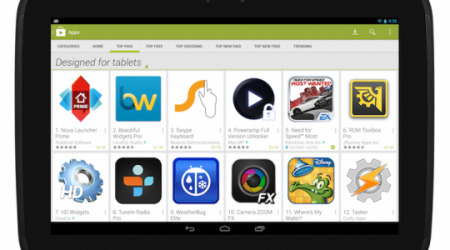
Google Play Store's "Designed For Tablets" Rolling Out As Default
Last month, Google announced that it would be making the Play Store's "Designed for tablets" section default for slate users, something that would take effect on November 21. As promised, Google has started rolling this change out today, and tablet owners should be seeing it show up by default any time now. The change puts the pressure on developers who haven't adjusted their apps already.
This is a move on Google's part to get developers to meet the tablet criteria, and starting today, all apps that don't meet the tablet guidelines will be labelled as "Designed for phones." For tablet owners, this is a potential benefit by allowing them to easily avoid phone apps, and could also prove well for developers — who meet the criteria.
Play Store users can toggle to a wider view of apps if they don't like the new default section, but that will have to be done manually once the section rolls your way. Otherwise, the top lists tabs (Top Free, Top Paid, etc.) will be listing only the apps that meet the tablet criteria for those who use the Play Store on tablets. If your app doesn't show up under the section, you'll need to check and ensure it meets the criteria.
According to an update posted on Google+, the change will be rolling out without fan fare over the next handful of days, so if you're not seeing it yet, hang tight. Developers are being encouraged to head over to the Android Developers website and refresh on the Tablet App Quality Checklist to make sure their offerings are ready for the change.
VIA: Android Community
