Google Nexus Prime Renderings Appear Accurate
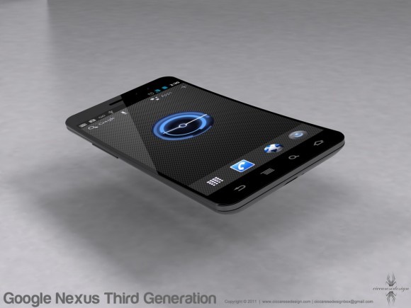
It looks like those fabulous 3D illustrators are at it again, this time to bring us a good glimpse at what might well be what the Nexus Prime looks like. It's the fine team of renderers at Ciccarese Design that draw us up a look at what might well be the next hero phone for Google's mobile operating system, this time looking rather similar to two devices: the last Nexus phone, aka the Nexus S from Samsung, and the Samsung Galaxy S II line here in the USA. From what we understand via the ever-expanding rumor library surrounding this device, that combination might not be all that far off from the truth.
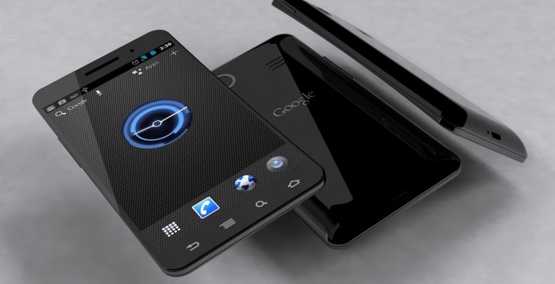
What you'll see here is a an extremely thin device with a giant display in the front probably somewhere in the 4.7-inch range. Inside the display you'll find a Honeycomb-esque clock widget and a dock with apps, phone, browser, and phone shortcuts. Above this you'll find a standard status toolbar above a secondary toolbar that's again reminiscent of what we've seen in Honeycomb. This second bar has Google search, voice command, apps shortcut, and "+" symbol that, inside a Honeycomb tablet device, would lead us to our homescreen customization set of options.

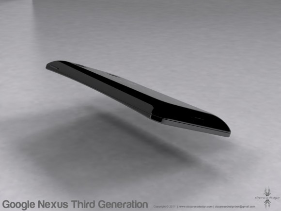
The rest of the device appears very similar to what a flattened out Nexus S would look like. You've got the single microUSB at the bottom back beside a single mic hole, a smooth battery case, speaker grill looking similar to what's become standard on a Samsung device, and a round camera hole again similar to what we've seen on the Nexus S. The front of the device shows the same head that we've seen on a slew of Samsung devices, that being a thin line of a speaker grill next to a black dot we must assume represents a front-facing camera.

The back of the device appears slightly thicker at the bottom than it does at the top, and the display appears slightly curved and shiny like glass. Also the designer here calls this device, safely, the Google Nexus Third Generation. We must assume that this was rendered before the cleaner looks at Ice Cream Sandwich were shown in these past few weeks since this looks to be rather Honeycomb inspired instead, also featuring the classic set of Android menu buttons instead of no buttons at all, as we expect will be true of future devices.
Other than that, look pretty possibly accurate to you? Note that we'll be at the next Samsung Mobile Unpacked event in a few weeks, this one being a special Google episode, so we may well be finding out how accurate it is very soon!
[via Ciccarese Design]
