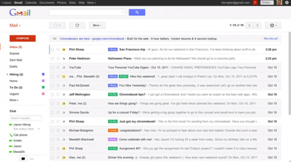
Google Leaks Upcoming Gmail Redesign
Google posted a video to its YouTube account today revealing some of the changes to its upcoming revamp of the Gmail interface. The redesigned UI unsurprisingly carries over the new theme introduced with the Google+ social network and focuses on making Gmail as clean, simple, and intuitive as possible. Overall, the interface is a lot sleeker and more customizable.
The new interface can automatically adapt to fit nicely into any size window and you can manually resize Labels and Chat windows. You can also choose the density of the interface to suit your preferences, which affects the amount of white space and how densely components are laid out on the page. And there's several updated high-resolution themes that you can choose from to customize the look of your Gmail account.
Threaded emails now appear in a new conversation view interface that looks similar to what you see with Facebook Messages and includes a profile pic for each person. It's also easier to go through and read previous messages in the thread.
Additionally, there will be a more advanced search box that drops down from the search field at the top of the page. It makes it quick and easy to access different search features and also allows you to create filters directly from within the search box.
Some users have already been previewing the new theme on their Gmail accounts since June, but it's not clear when the full revamp will roll out to everyone. But given the video preview, it'll probably be sooner than later.
