Google Glass User Interface Demo Video Filmed At SXSW
This past week it would appear that Google has been letting their Project Glass initiative off the leash a bit more freely as several user interface demonstration videos have appeared via South by Southwest. The videos you're about to see show some early third-party developer apps being previewed and a selection of native apps that will be appearing on the first edition of the hardware. This first edition is known as the Explorer Edition and will be arriving in developer hands soon.
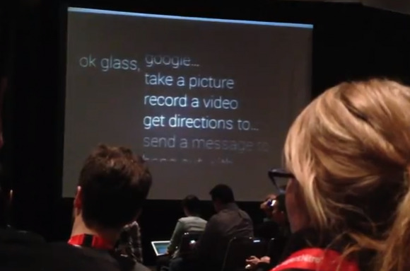
What this first edition works with is a selection of Google-made apps as well as third-party apps that include Gmail, Google search, Google Translate, Evernote, and an app for the New York Times. In the first demonstration video you'll see the user interface we've had our own miniature preview with before being used to translate some English into Japanese on-the-fly.
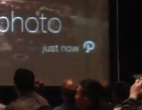
The first video also shows Glass taking a photo (a picture, as the speaker commands), and you'll see how you'll be sharing photos you've taken as well. Though you're only seeing the user interface on a large screen and not the device itself, you'll understand that the speaker is touching the side panel of the Glass hardware as it is fully touch-sensitive. When you want to share a photo, you've only to pull in from the left (or right) after you've taken a photo in the photo app, tap once, and there will be the option to Share.

At the moment, Glass is only being shown sharing to Google+, which makes sense since it is a Google-heavy device. We're expecting the ability to share anywhere on the web in the future – and perhaps to and from your smartphone or other Glass units as well. Near the end of this first video you'll also see the "P" logo from Pinterest appearing – we're expecting Pinterest integration when the first Explorer Edition units arrive as well.

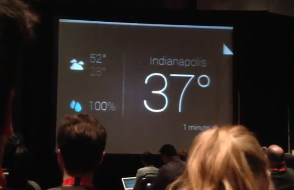
Next you'll see the weather being displayed as well as a fold in the upper right-hand corner of the display, this showing you how you'll be able to see more options with a bit of a slide on the touch interface on the side of your Glass unit. Pulling there will show you a full three-day forecast, for example, while page folds such as this can be used as a simple indicator for any number of "see more" actions in your own app development adventures.
We'll be having a look at another video of Google's User Interface soon – stick around SlashGear as the analysis continues! Hit up our Project Glass tag portal for more!
[via RoadtoVR]
