Google Currents iPad 2 Review
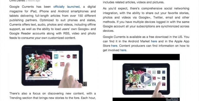
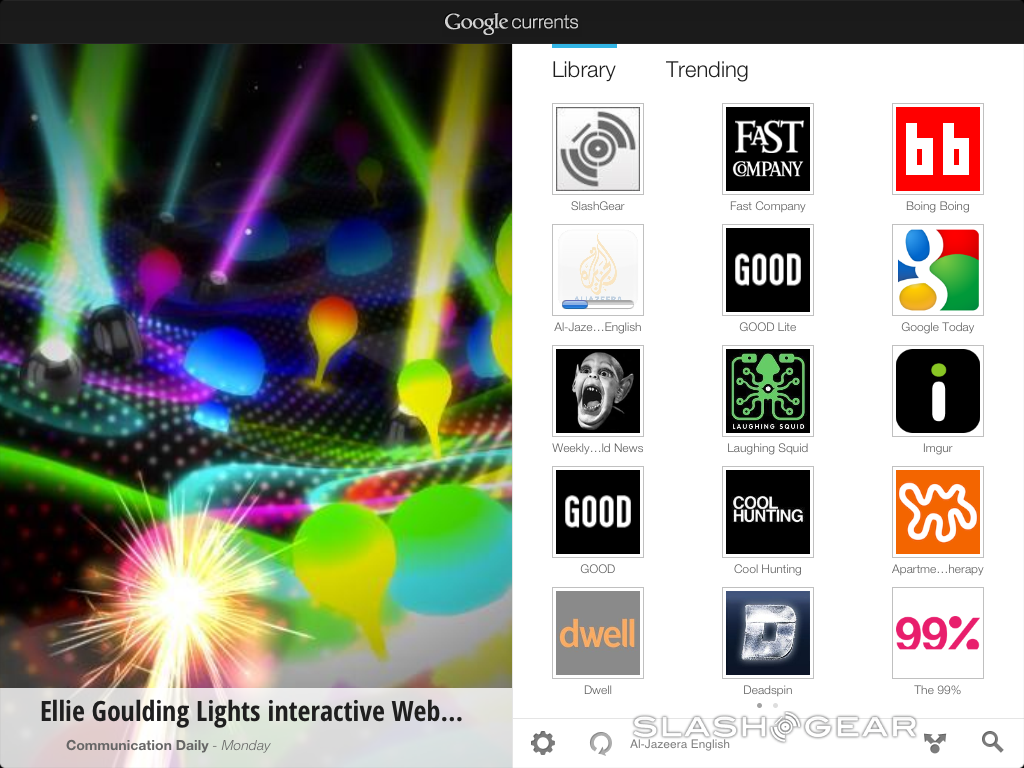
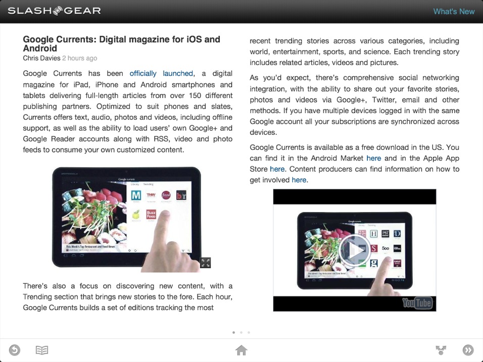
This week Google Currents was released, a project made for the two biggest mobile platforms on the planet by Google in collaboration with a variety of launch partners including your favorite tech and gadget blog SlashGear – what we've got for you here is a closer look at the iPad version of this application. What you'll find different about this app compared to the rest is scale and applicability – there are some limits to being on an iOS device running a Google-made application, but they are few. Instead what we've got here is a lovely bit of organization making the reading of even the most aesthetically displeasing blogs a sight to behold.
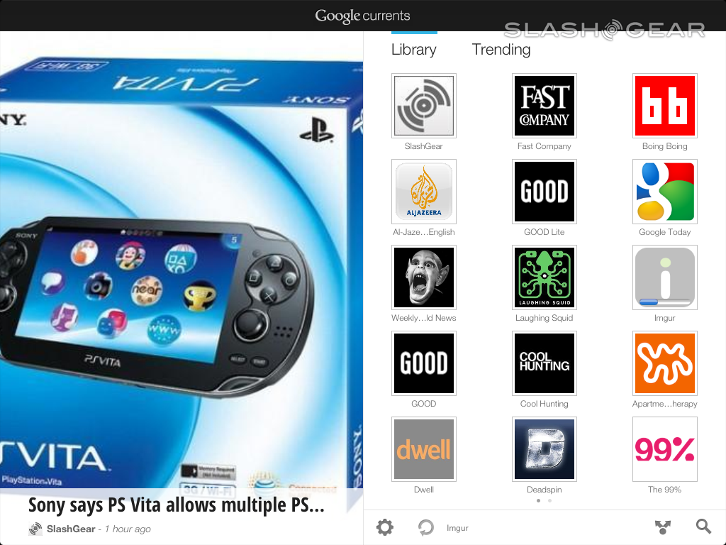
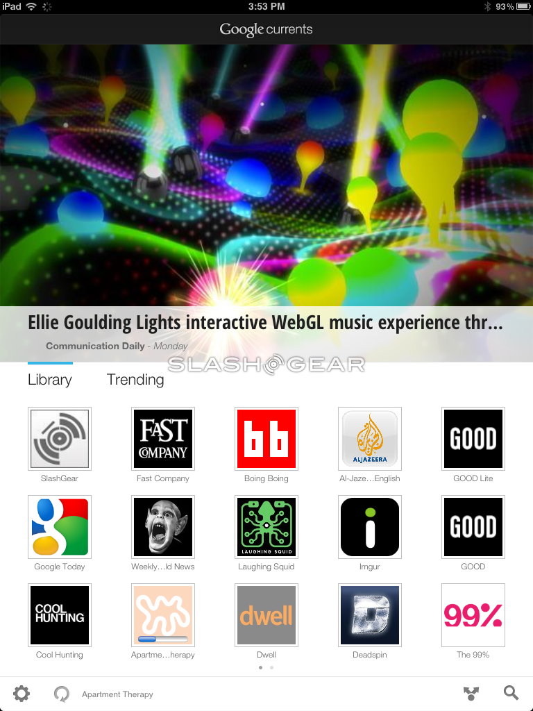
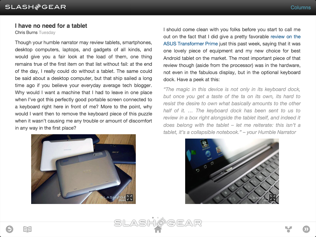
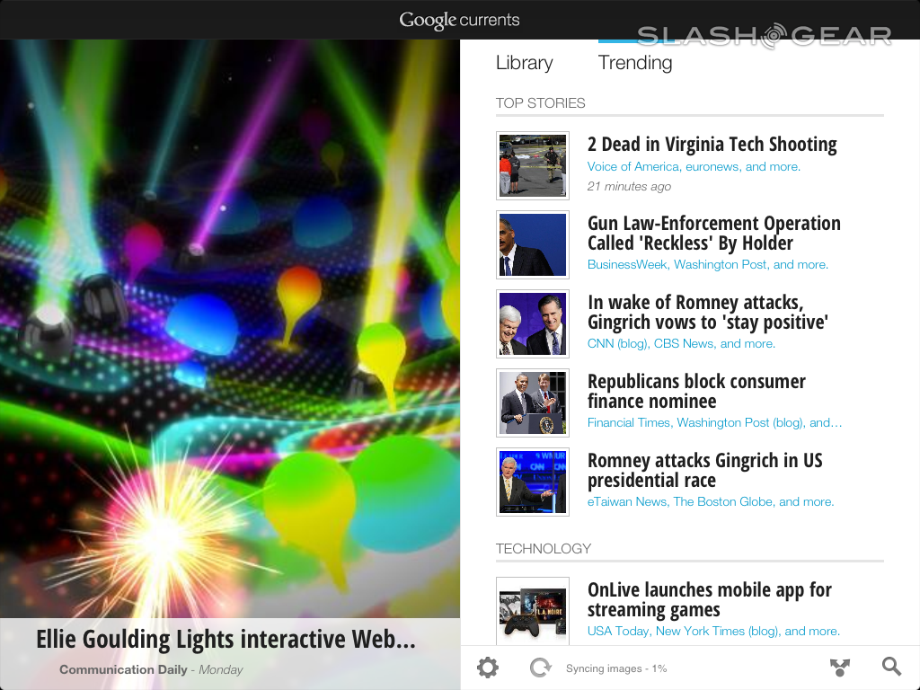
The first thing you'll be bound to notice is that this application is made to look just as nice one way or the other. That is, if you've got a tablet that you want to set up on its landscape side for most of your reading, but then want to bring it with you on the bus and want to hold it more like a portrait-style book, you'll have no worries, as the flipping is both without delay and smooth as butter. This application begins on your home screen where you'll see one ever-turning page of news stories, one by one, and the other side full of icons for sources you yourself add in.
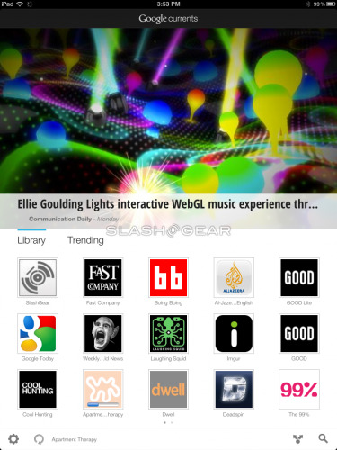

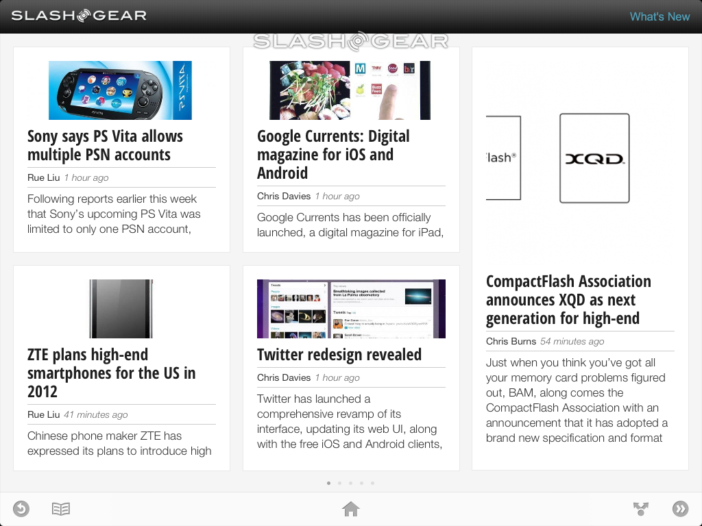
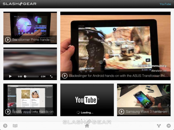
You'll find that each source leads to a page that's either just full of news stories or has a selection of portals leading to different bits of content. If you have SlashGear on your homepage, for example, and head on in, you'll see News Stories (from our main feed), YouTube videos, Columns, and more. YouTube is fully integrated with Currents, playing straight from a news story without a problem, and if you've got a portal to your YouTube Channel, you get an array of videos that can, if you want, play all at the same time – though that'd be rather loud if you ask me.

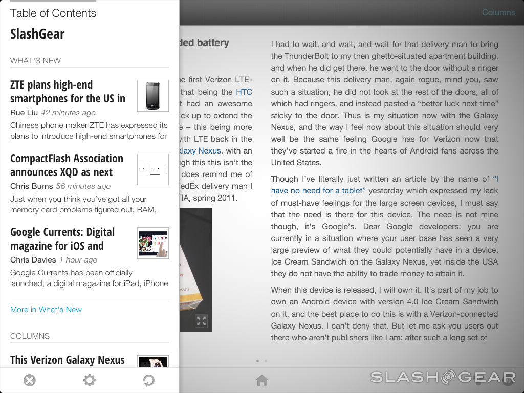
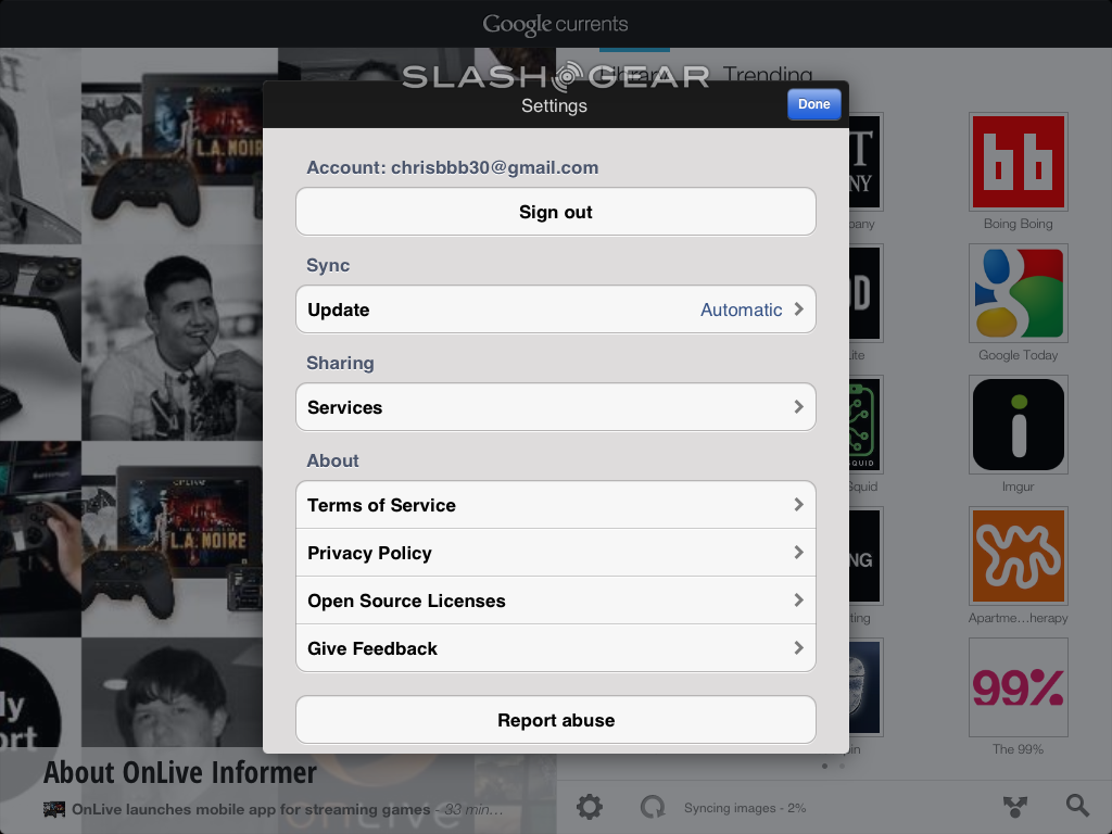
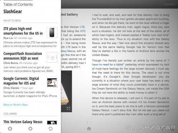
Once you enter a News Story, you'll find that all the text is highlightable and selectable, but none of the images share that freedom. On the other hand, you are able to exit out to a full browser-window version of each story if you wish to see the news how the website publisher originally intended it. Comments and other such bonus features are not currently integrated with Currents, but you are able to Share stories with a variety of sources. There are also options to access a setting screen to change up and sign-in to each of your sharing services as well as a miniature feed access that pops up on the left side of your screen so you can easily access new stories without going back to your source's main home screen.
Finally there's adding sources, which is also a simple, your ability to add featured sources the most obviously easy to do, searching for a source similarly simplified down to the basics. For those of you wishing to add details to your own webpage listing in this situation, head to the Producer Portal — accessible by Google Chrome web browser only, mind you. Featured news stories in "Trending" come from Google News, and you have access to Google Reader sources as well – so you're all tied up!
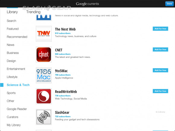
If you live inside the USA you've only to go to the Android Market if you're using an Android device or on the iTunes Appstore for either this iPad version or the smaller version for iPhone / iPod Touch. If you live OUTSIDE the USA, there's a method for that as well, but only for Android at the moment. Check it all out right this second and don't forget to search to add Android Community and head to the Science and Tech section to find SlashGear – and subscribe your heart out!
Have a peek at this hands-on video as well as the screenshots taken from this iPad version of the application and note that the app on all platforms is completely free – what are you waiting for?!
