Google Brings A Double-Tap To In-App Advertisements
Those of you using apps with advertisements and banners inside of them know the horror, one way or another, of accidentally tapping on that link to he facial cream service you never knew you wanted – Google is about to alleviate all that. With a change to the way mobile advertisements are implemented on the regular, Google has made a single click into a double click – but without actually changing the way the advertisements are added to an app.
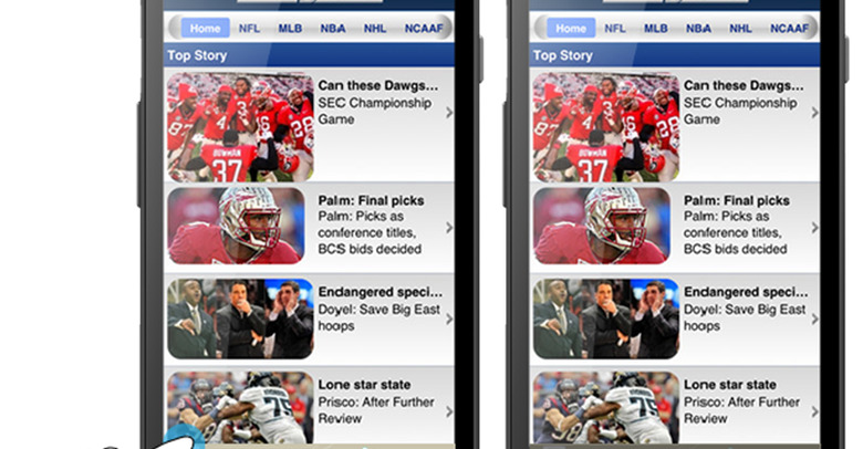
What you're seeing here is an upgrade to the system that Google has in place already with text links in banners. You'll be taken to the link directly if you click the Blue arrow in the banner, but if you click anywhere outside the arrow button, you'll be prompted to confirm your decision to leave the app. This update moves this system over the image-based banners as well.

What you're going to see here is the blue arrow on all advertisements of the image persuasion in your Android apps. If you're not the sort of person who works with apps that have advertisements running through their veins, you'll see nothing new. Google's own Allen Huang, Product Manager of Mobile Display Ads had the following to say on the situation earlier today:
"This is only the beginning. As devices continue to converge there will be new challenges in the fight against what many have called the 'fat finger' problem. But implementing confirmed clicks is an important step that we think will benefit users, advertisers, publishers, and the mobile ecosystem overall, and we'll continue to look for ways to improve mobile ads for everyone." – Huang
Have a peek at the mobile advertisements in your Android apps (if you've not already) and prepare for a whole lot less of the ol' "woops" clicks in the very near future. Never forget – double tap!

[via Google Mobile Ads]
