Gmail Update Released Today, Web-Based Upgrade Live
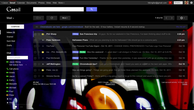
Today Google has begun rolling out their newest look at Gmail, and below we've got an in-depth look at the newest version of the web-based version of the platform, it including both the design and the method for updating your interface to this newest edition. Google aims here to make Gmail as "clean, simple, and intuitive as possible." See if you agree through the description below and see how you like the integration with Google's other systems as well.
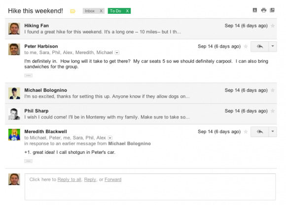
Gmail has been what Google calls "streamlined" through email threading. Where before full emails had to be displayed beneath one another, here you get limited versions of messages with user icons to the left of the message so you can easily see who initiated each email. As Google says "we also stripped out as much as possible so you can focus on communicating with your friends and colleagues." While you might find this enticing, there have been many people commenting on this and the recent upgrade of Google Reader that've said the update makes things harder to read because of the stark contrast and simple black and white nature of the setup. Flip over to the new interface and see what you think.
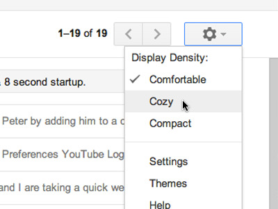
Of course the folks at Google have sort of anticipated this new vision looking a bit hard to read for some people, that's why they've included what they call "Elastic Density," this meaning you literally have the ability to decide how close you want things to one another. Up in the right-hand corner of your interface you've got the settings gear button, hit this and you'll find Display Density able to be changed between Comfortable, Cozy, and Compact. Feeling claustrophobic? Switch to Comfortable. Feeling like your eyes don't know where to go? Switch to Compact.
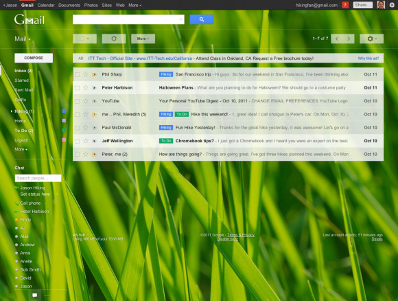
For all you lovers of bright colors and putting your children in the background of your web browser, Google has included HD Themes. You can get to these themes through the same settings button in the upper right of your screen, hit the Themes option and you'll have a selection of images straight from iStockphoto. You'll have quite a few options from the old themes collection as well as a handful of new ones. Try grass out if you're finding the bright white too much to handle.
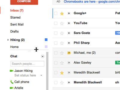
Navigation has been updated on the left of your screen, with labels and chat contacts now in view at all times. This interface is now completely customizable if you only want a tiny bit of folder action going on, and you can hide the chat area entirely with the chat icon in the very lowest left. In addition, your arrow keys can now be used to navigate the entire interface.
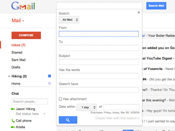
As expected, search has been improved drastically, made now more exacting so you can find just what you're looking for as quickly as possible. Create a filter for your search as well, searching through your hoards of emails with only a few clicks. Search from, to, subject, "has the words", "doesn't have", and inside a certain amount of time, searching through certain folders, your whole mail collection, and with or without attachments.
Though some of these changes are welcome, we've got other opinions about the greater bulk of the changes going on here. Our own Chris Davies had the following to say on the update:
"Gmail's search and navigation improvements are both welcome, helping those of us who are many, many messages away from 'Inbox Zero' to get to grips with their overflowing mails. The HD Themes seem more gimmick than anything else, though, and I'd rather see Google's engineers spend their time better integrating Gmail and Google+ than messing with photos." – Chris Davies
What do you think? I've got a feeling that many people will be feeling the same thing when they hit up the update, and of course there's no knowing whether or not G+ integration isn't right around the corner, but for now, the changes described above are set to take effect this week, so check them out for yourself. Grab the update by heading to the "Switch to the new look" link in the bottom-right of your Gmail page in-browser that should be showing up inside the next few days for everyone!
[via Gmail]
