Facebook Reveals How The Updated News Feed Was Developed
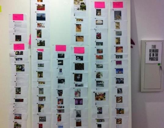
We've seen the new Facebook News Feed quite a few times lately, with all its redesigned goodness. While the features, changes, and other particulars have been detailed over the past weeks, Facebook has given us an alternative look into what went into the redesign – namely, a huge floor-to-ceiling paper storyboard and a stack of cards.
The stack of cards wasn't the only element, of course, but it does provide an interesting visual for what was a fairly elaborate brainstorming process that went on behind the scenes. Facebook's Jane Justice Leibrock posted a detailed write up about how the design process incorporated user feedback over at Facebook's User Experience Lab.
According to the piece, the most common feedback Facebook users supplied was, "My feed is cluttered." Thus the process began of determining what precisely this meant, something that is said to have involved methods from both anthropology and psychology. The meaning of "clutter," as supplied by users, was deconstructed using the open-ended interview method, which revealed that the complaint of clutter involved posts more than design.
A look at the rote data, however, showed that this was also the content – page posts, songs listened to, games played, etc. – that users interacted with the most. This, then, necessitated a task to offer this content while separating it from the News Feed. This involved the "card sort" method, which was used to determine the splitting up and displaying of various feeds. The participants in the research were given a stack of cards that displayed recent content from their Facebook News Feed. These participants were tasked with sorting the cards, picking out the ones featuring content they were interested in.
These stories were then sorted into different categories based on why the participants liked them: funny, friend update, etc. While part of the results of this included obvious things, such as that Facebook users prefer content from close friends, a couple unexpected discoveries were also made: that people prefer content relevant to their interests, as well as a category for Facebook friends who aren't close real life friends, but whose statuses they enjoyed seeing.
This information led to the redesign that Facebook users will see in the near future, which will hopefully prove more intuitive and less that what you see on the social network right now. You can get a run down of what to expect from our guide here.
[via Facebook]
