Facebook For Android Updated, Inherits Speedier UI From iOS
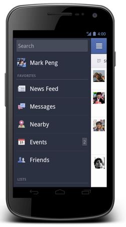
Facebook just launched their updated Facebook app for Android, which the social networking giant claims is "now quicker and easier to view photos, get messages and navigate around the app". What does this actually mean? Basically put, it's inherited the interface from the recently updated iPad and iPhone versions of the app. The UI has also been redone for Android 4.0 Ice Cream Sandwich, with the upper-right drop-down menu instead of the previous hidden menu interface.
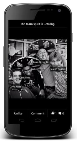
From what Facebook says, photos and albums are up to twice as fast than the previous Android app (not surprising, for those of you who've used the old app, it's nowhere near as smooth of an experience as on, say iOS or Windows Phone 7). Sharing photos, viewing comments and editing captions on the go have all been made easier, too. As long as everything is faster, than I think users will be content. The Facebook app on Android at the moment is incomparable in terms of overall user experience to the one on the iOS app.
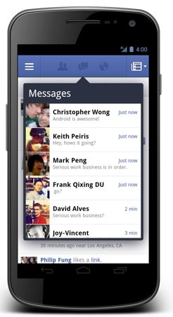
The updated Facebook app puts messages and notifications at the top of the screen, and you can respond to friends and stay updated without leaving the page you're on. Furthermore, you can also quickly access the News Feed, Groups, games and apps from the new left-side menu. The Facebook app update isn't out live on the Android Market yet, but Facebook has just promised that it will be available soon. I'm probably speaking for all Android users when I say that hopefully happens very soon.
[via The Facebook Blog]


