BlackBerry Torch 9800 Review
We've been waiting for the BlackBerry Torch 9800 for months now. RIM's double-whammy of new touch-and-QWERTY hardware and the latest iteration of their software, the much-anticipated BlackBerry 6, the Torch promises usability, functionality and all-round appeal on a par with high-end smartphones from rivals like Apple and HTC. Not just for the jacket pocket, this one; RIM has set its sights on the mainstream, a far more fickle – and demanding – audience. Will the Torch light RIM's way into the lucrative consumer market? Check out the full SlashGear review after the cut.

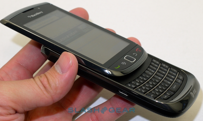
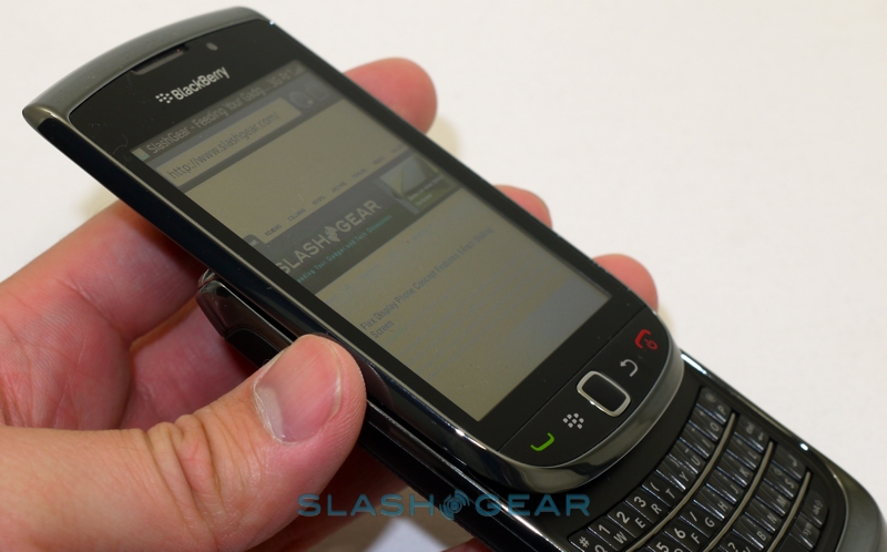
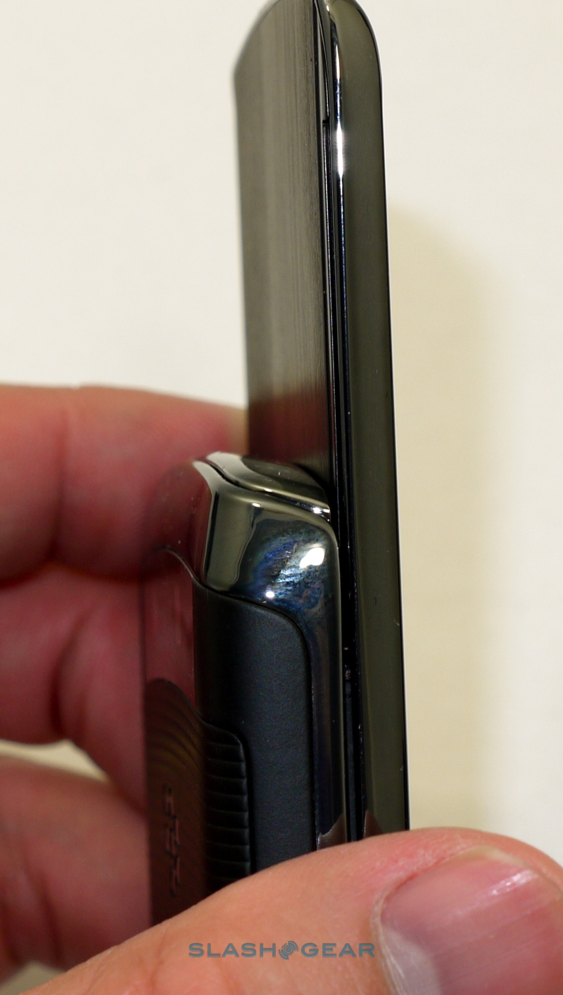
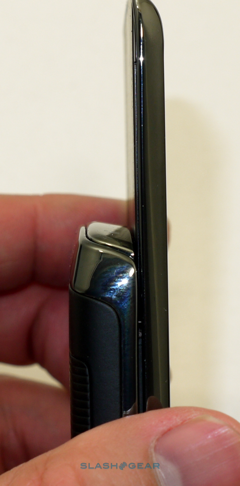
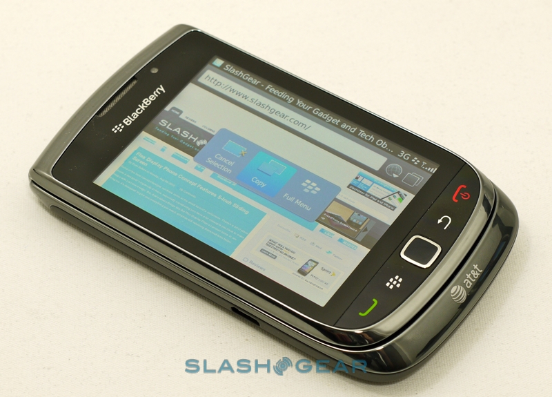
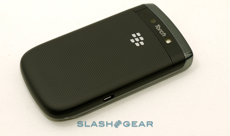
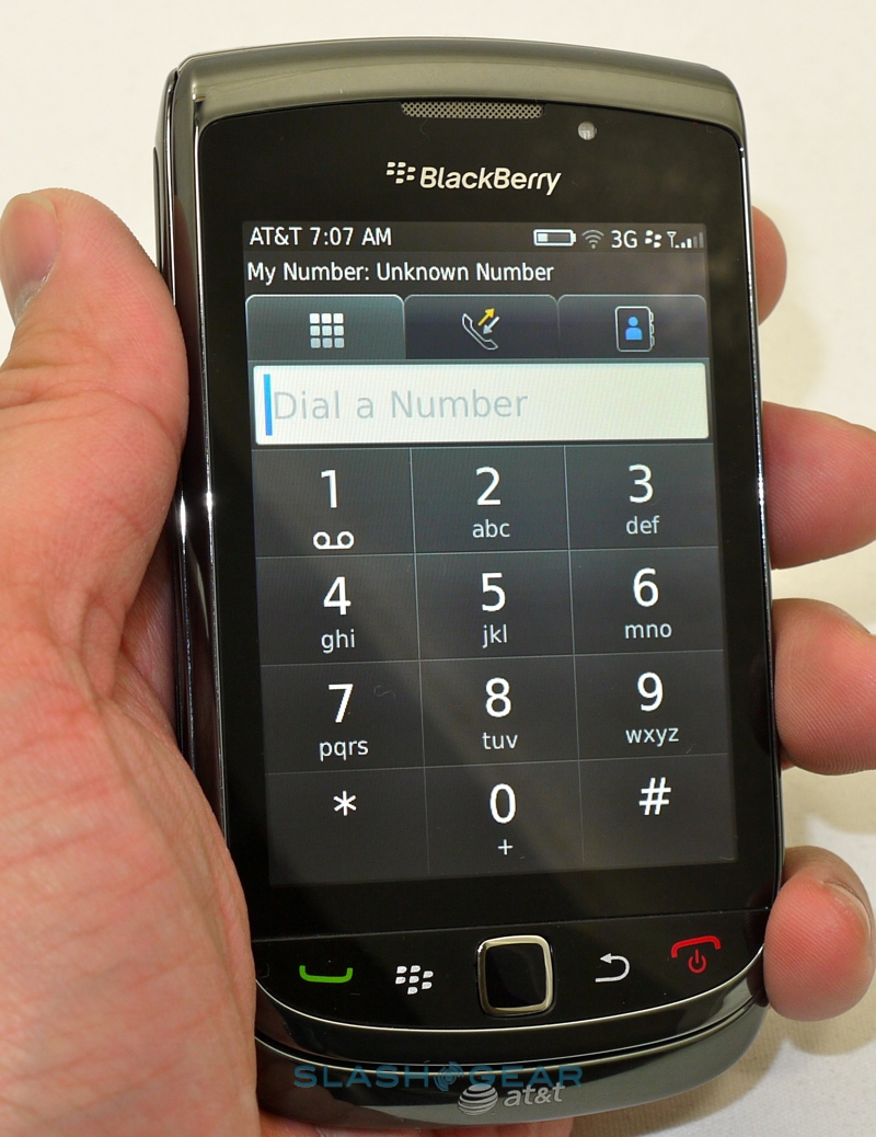
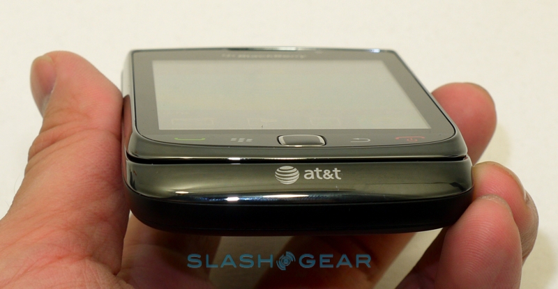
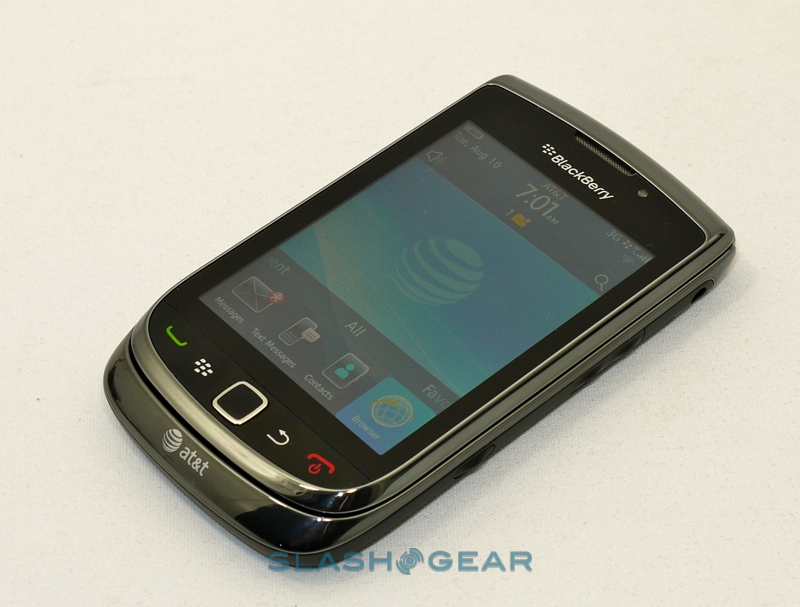
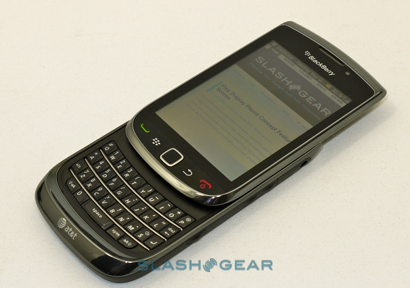
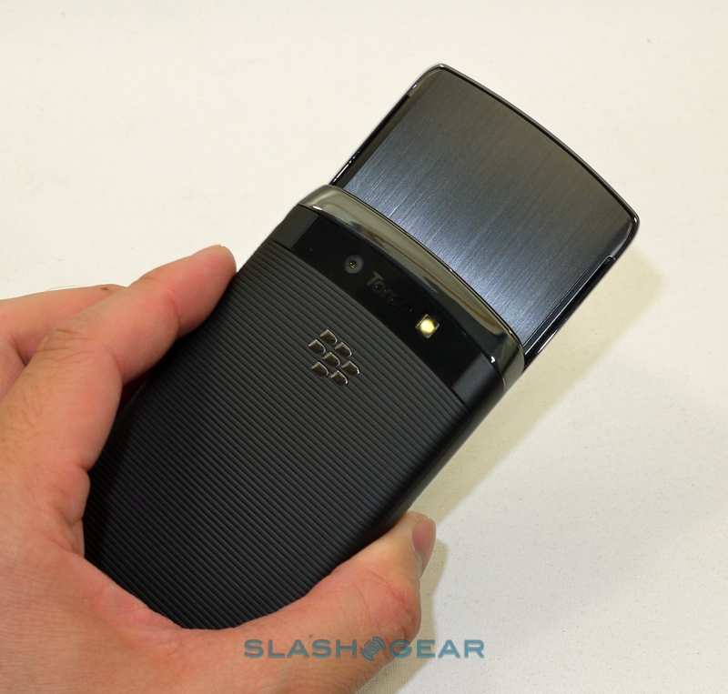
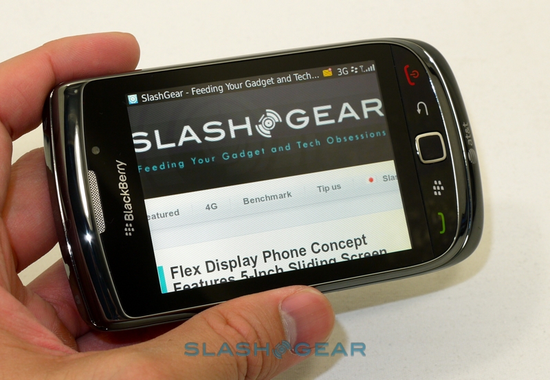
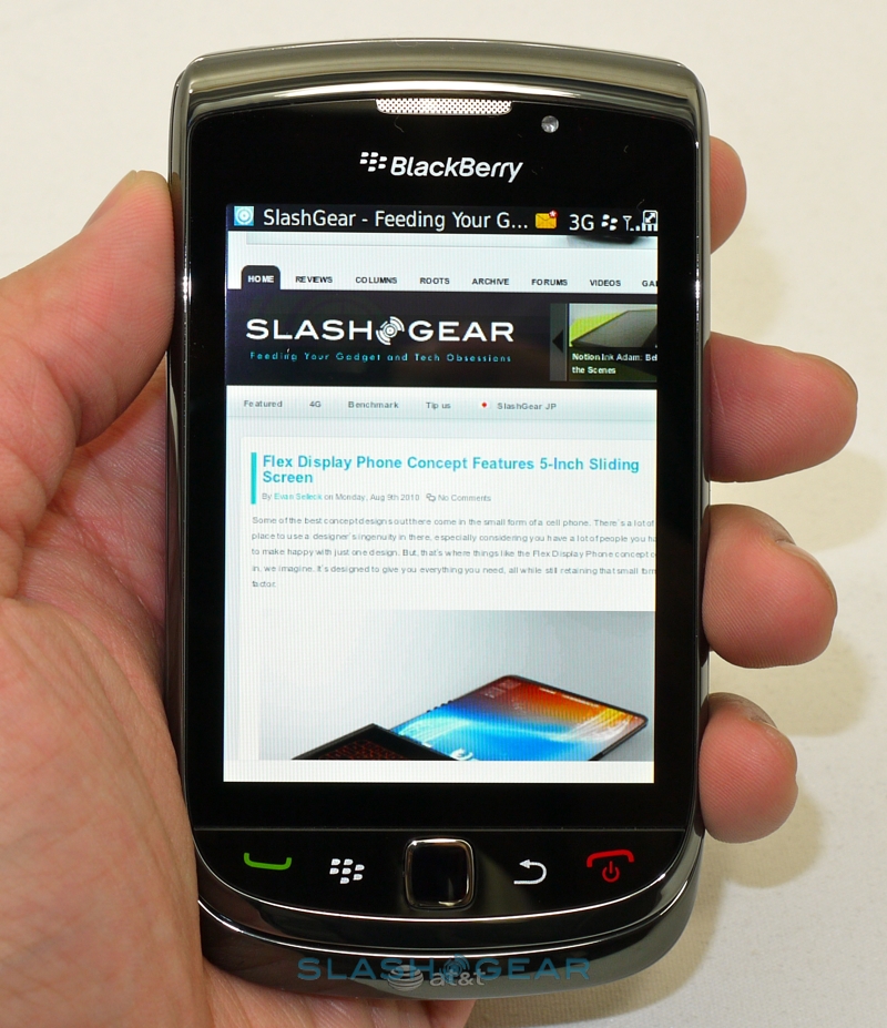
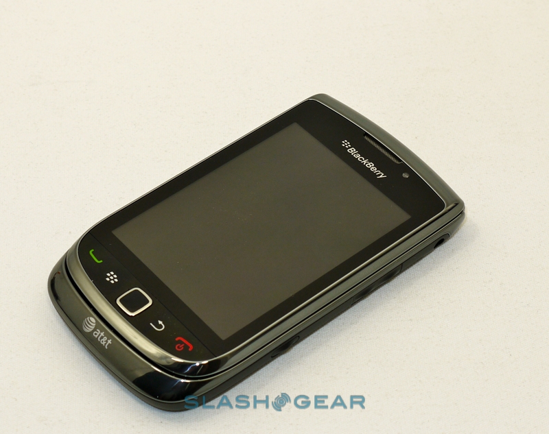
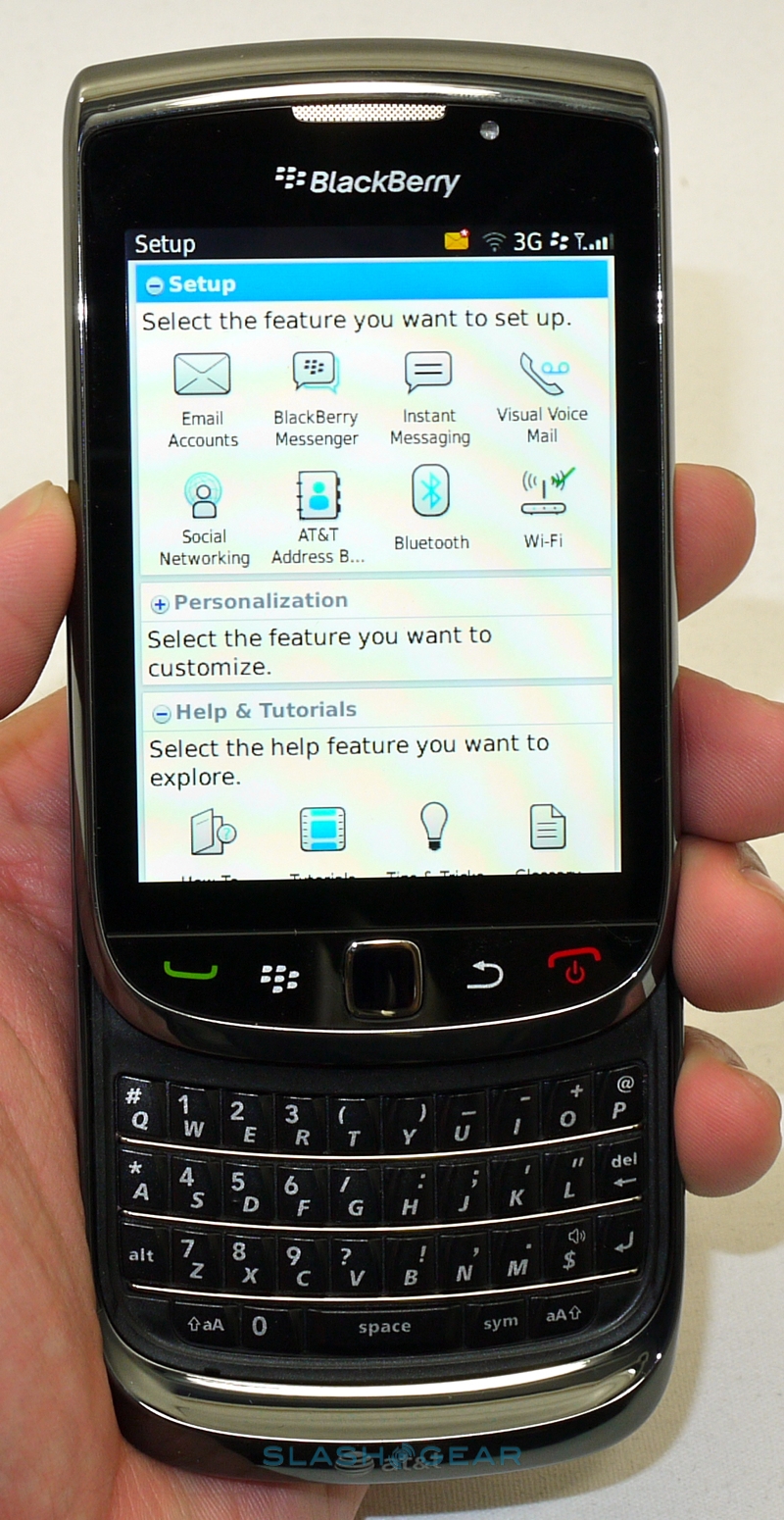
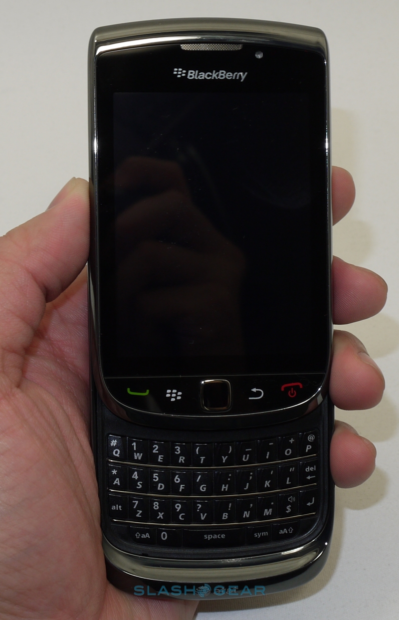
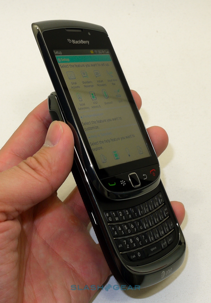
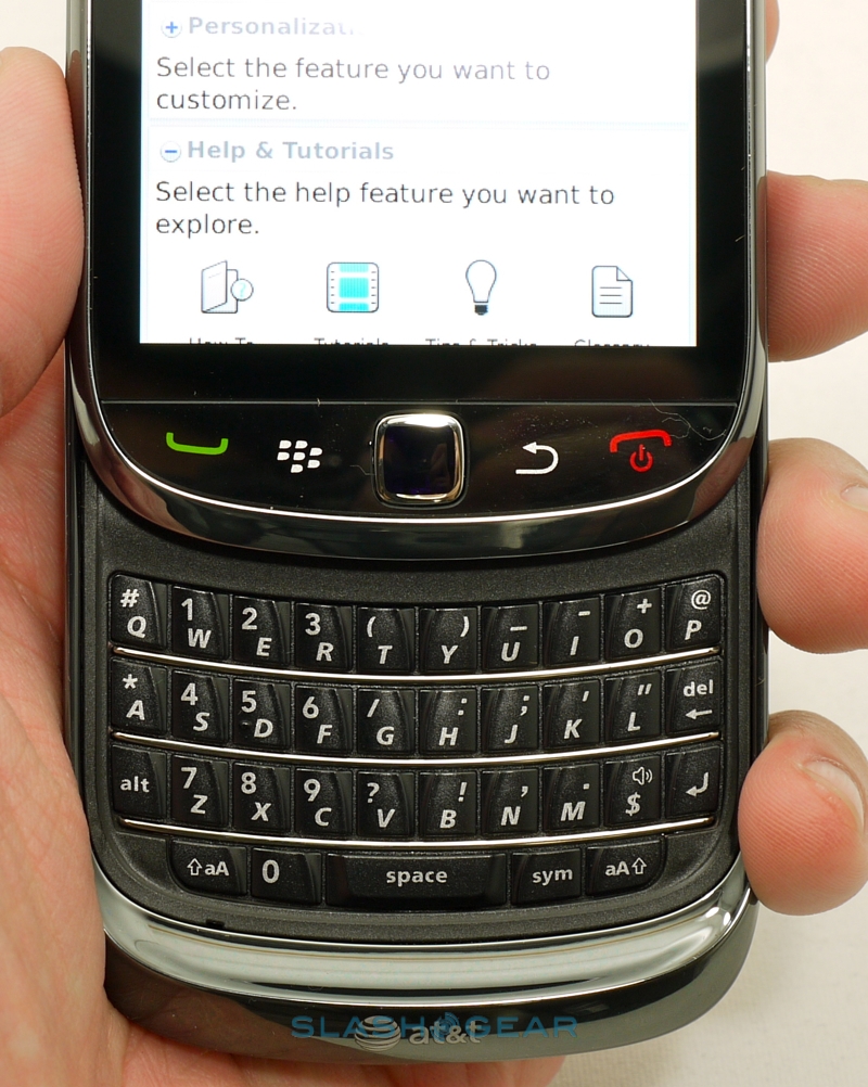
Aesthetically, the Torch won't scare the BlackBerry faithful. It's a well-constructed and sturdy handset, with plenty of RIM's existing style elements dropped in, and points where other manufacturers still struggle – we're particularly thinking about the slider mechanism – feel rock solid. At 4.37 x 2.44 x 0.57 inches (when closed; 5.83-inches long when open) the Torch is pretty close to the Bold 9xxx in size, though it's a heavier handset (5.68 oz versus 4.8 oz) and in contrast with (non-QWERTY) rivals like the iPhone 4 or DROID X it's chunky in the hand.
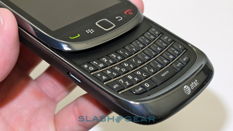
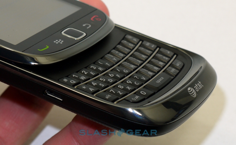
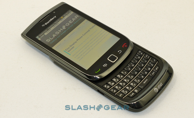
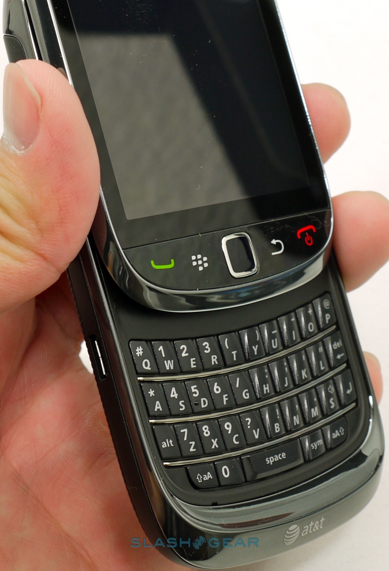
Still, those rivals generally don't have a hardware QWERTY, and RIM has produced another seriously thumbable 'board for the Torch. In comparison to the candybar format devices in the company's range, the keys themselves are lower profile – so as to allow for the sliding mechanism – but still have decent travel and, after a few minutes of acclimatization, we were back up to speed. The slide itself lacks the spring-loaded flick of rivals, and demands something of a conscious effort to open it, but that's probably in the Torch's favor when it comes to longevity of build.
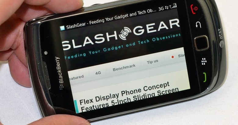
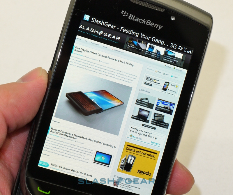
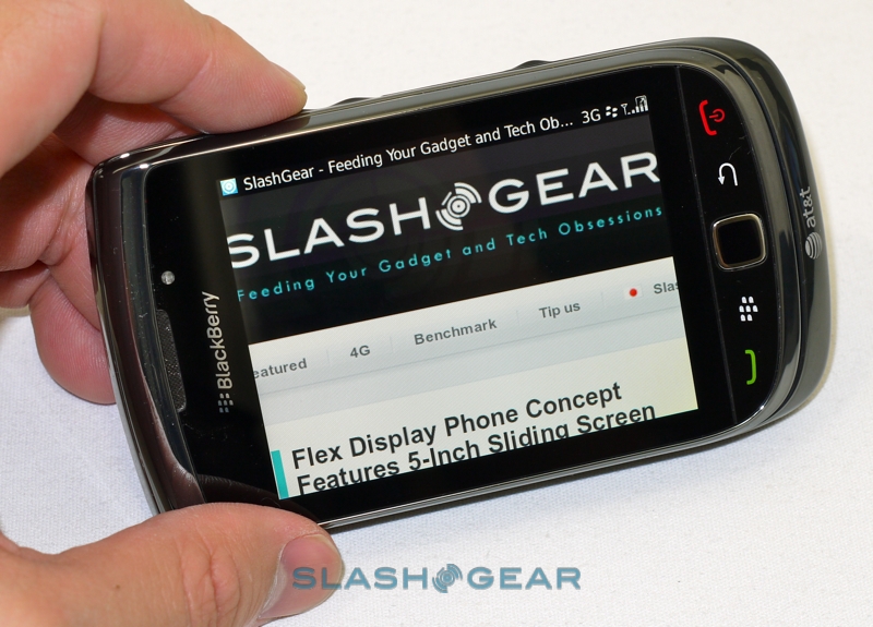
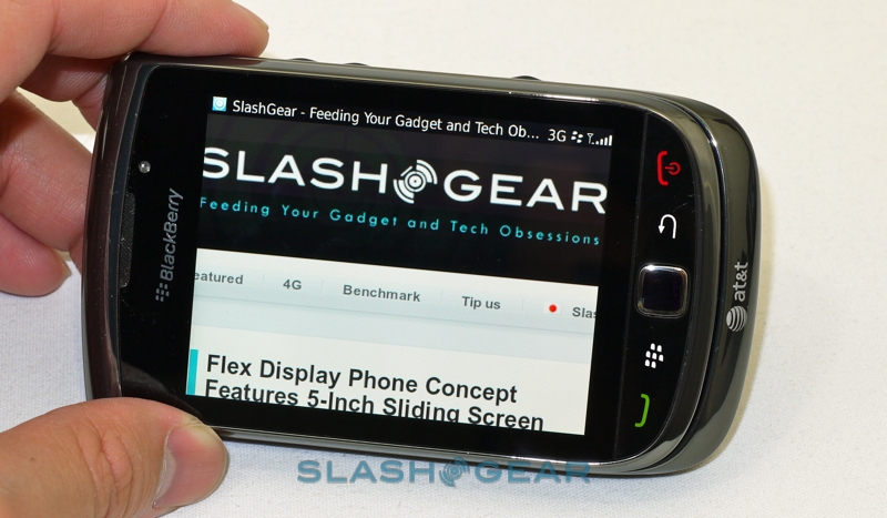
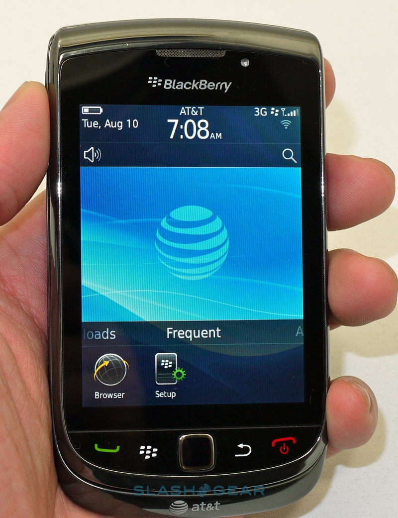
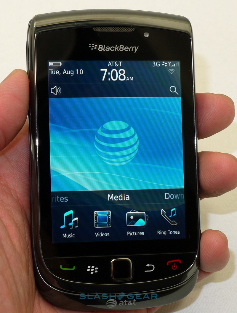
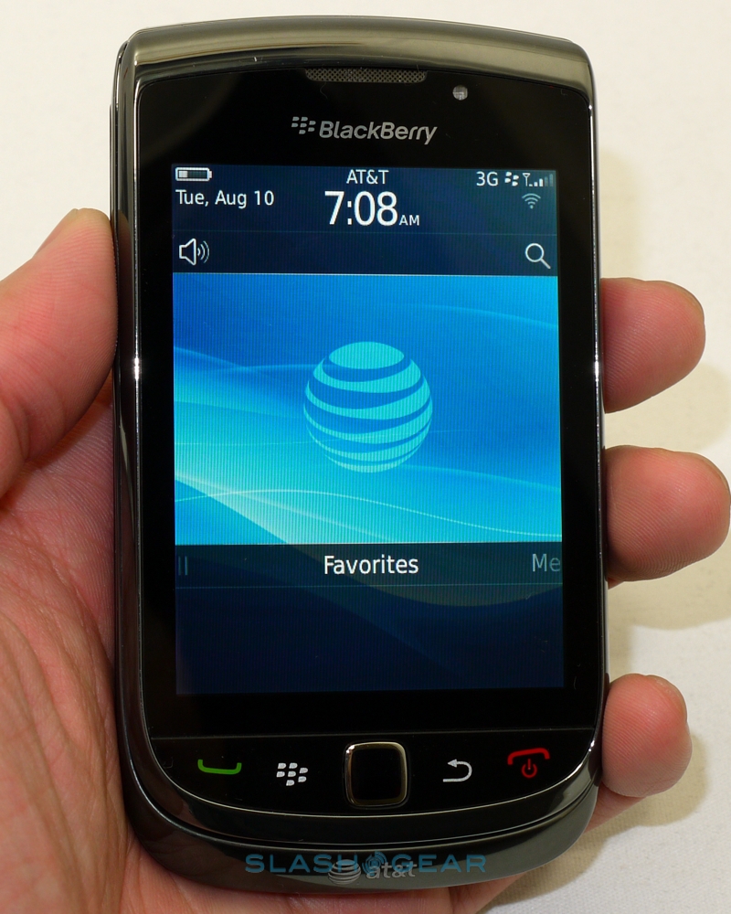
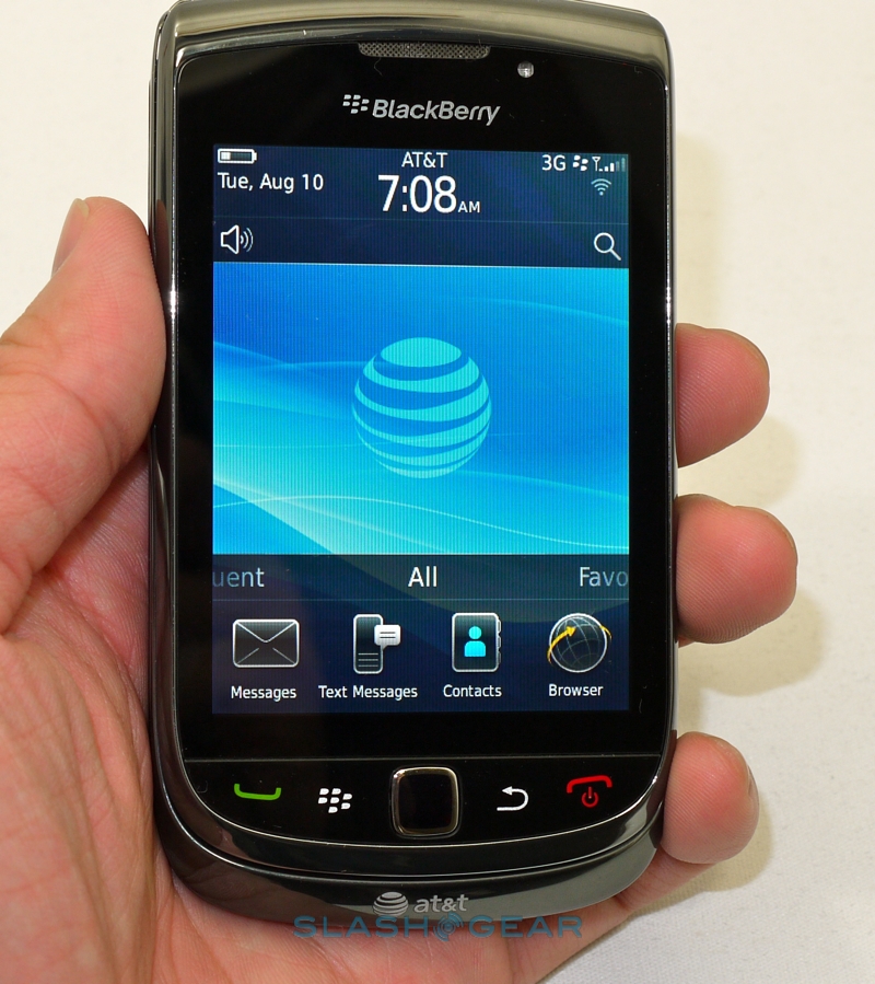
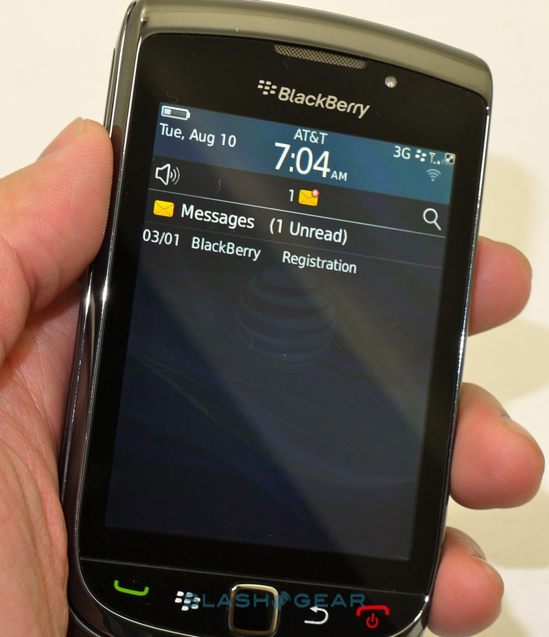
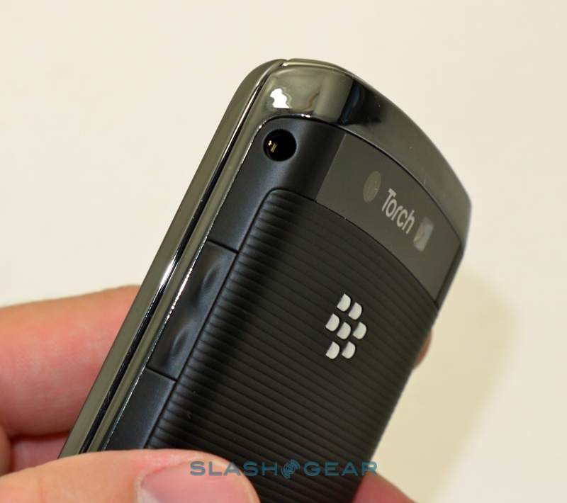
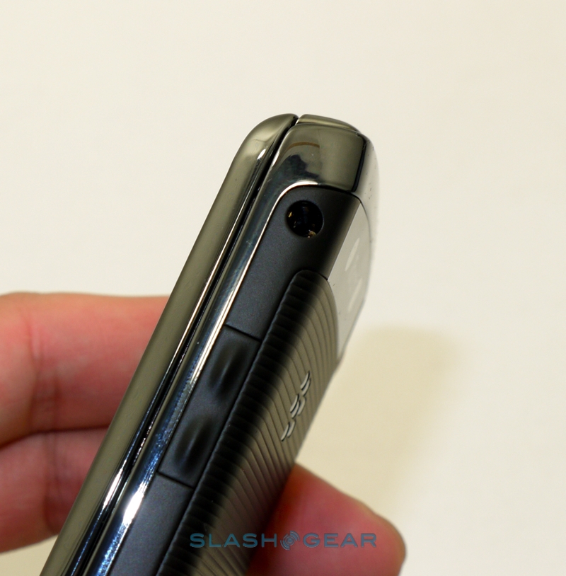
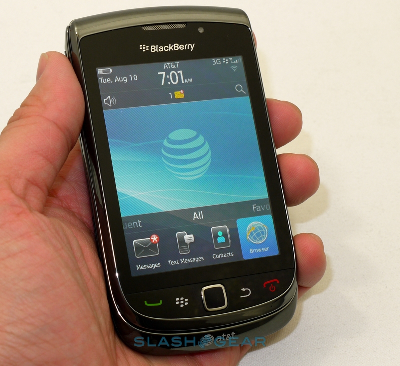
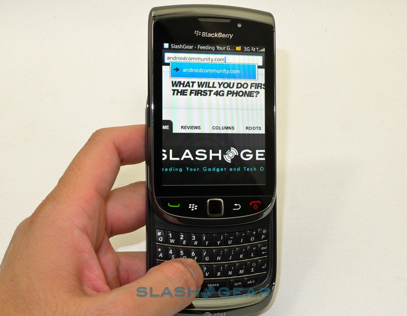
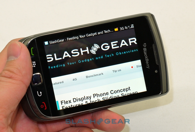
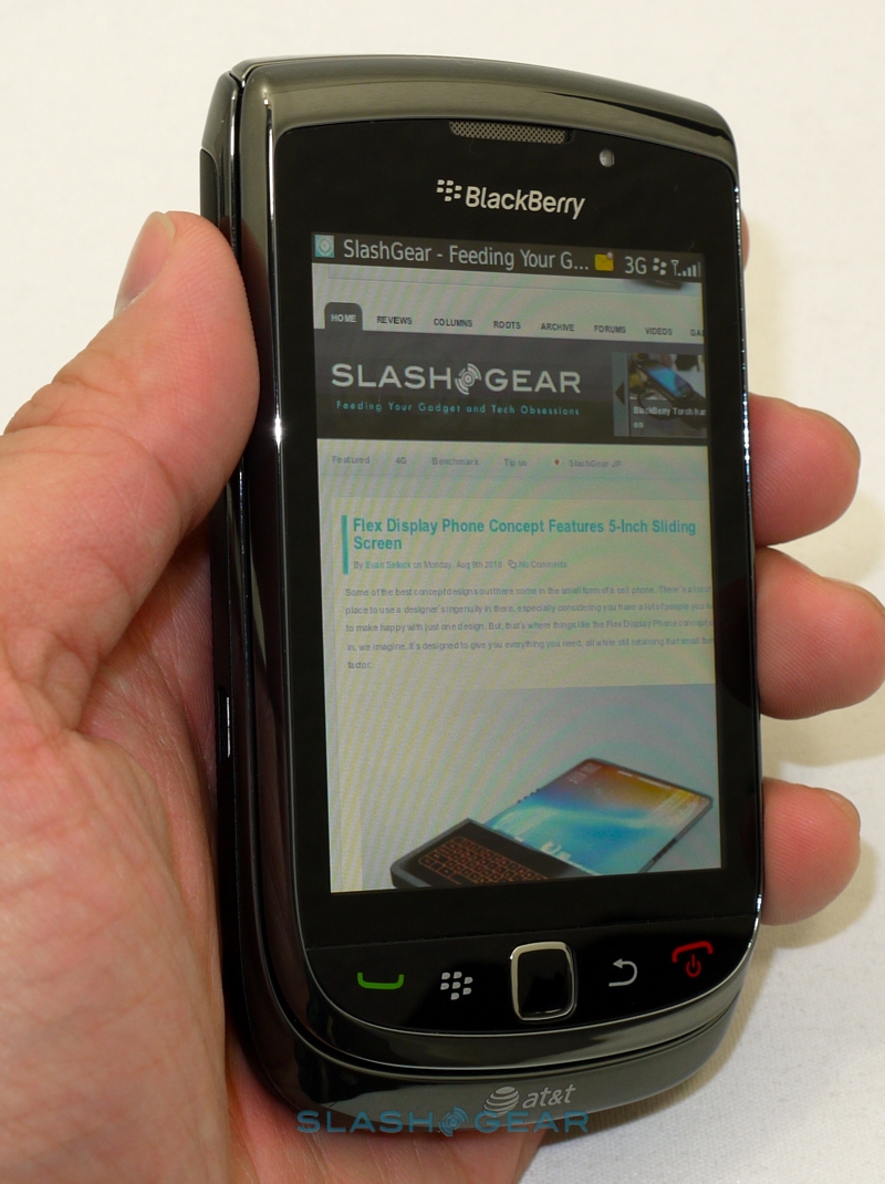
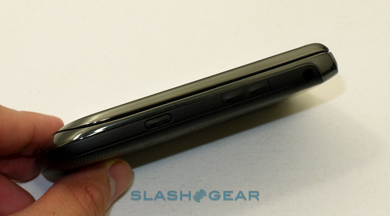
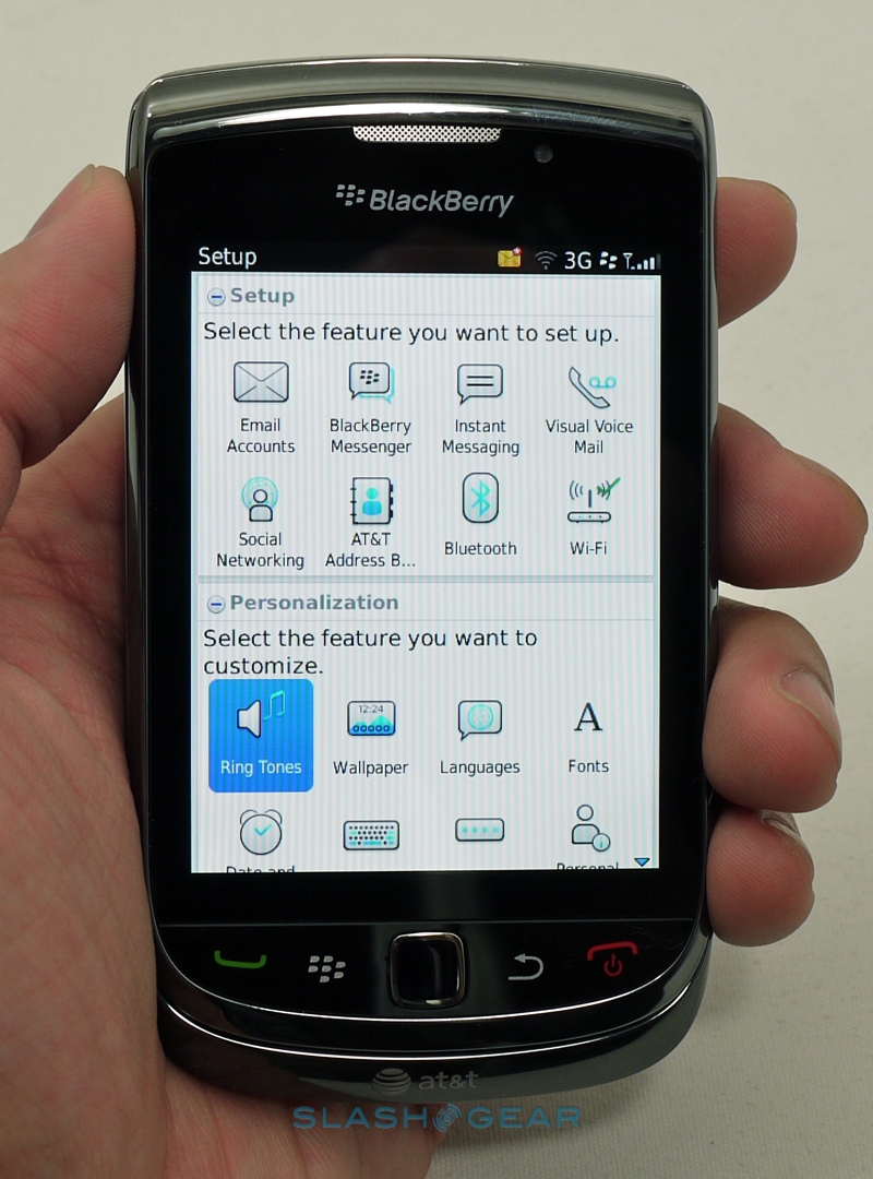
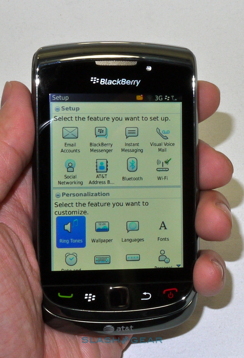
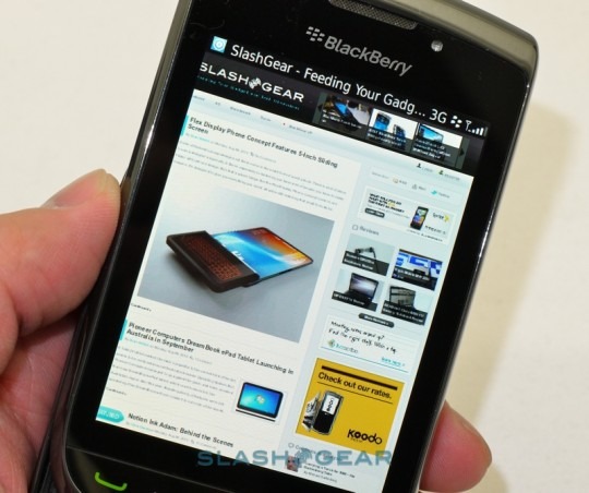
Hardware controls include a row of buttons along the front, for call, menu, back and end/power, along with the chrome-rimmed optical trackpad. The microUSB port is on the left edge, while the volume buttons, programmable shortcut key and 3.5mm headphones jack are on the right; lock and mute are on the top edge. Up front is the 3.2-inch capacitive touchscreen, and here our first complaint comes to the fore. At 480 x 360 resolution, the Torch's display simply falls short when it comes to pixels. Held next to WVGA rivals and the panel looks gritty and underwhelming; side-by-side with an iPhone 4's Retina Display, the Torch feels ancient.
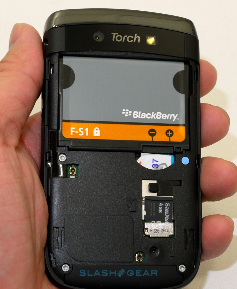
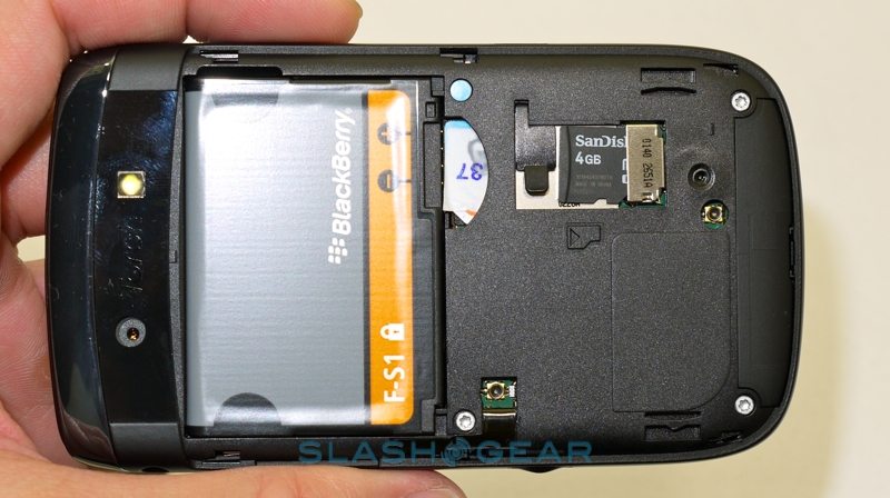
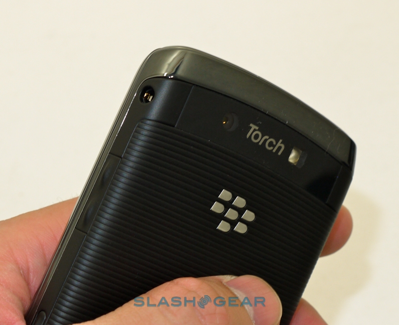
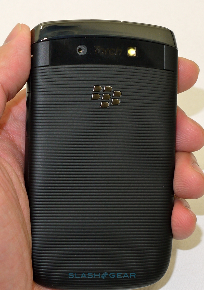
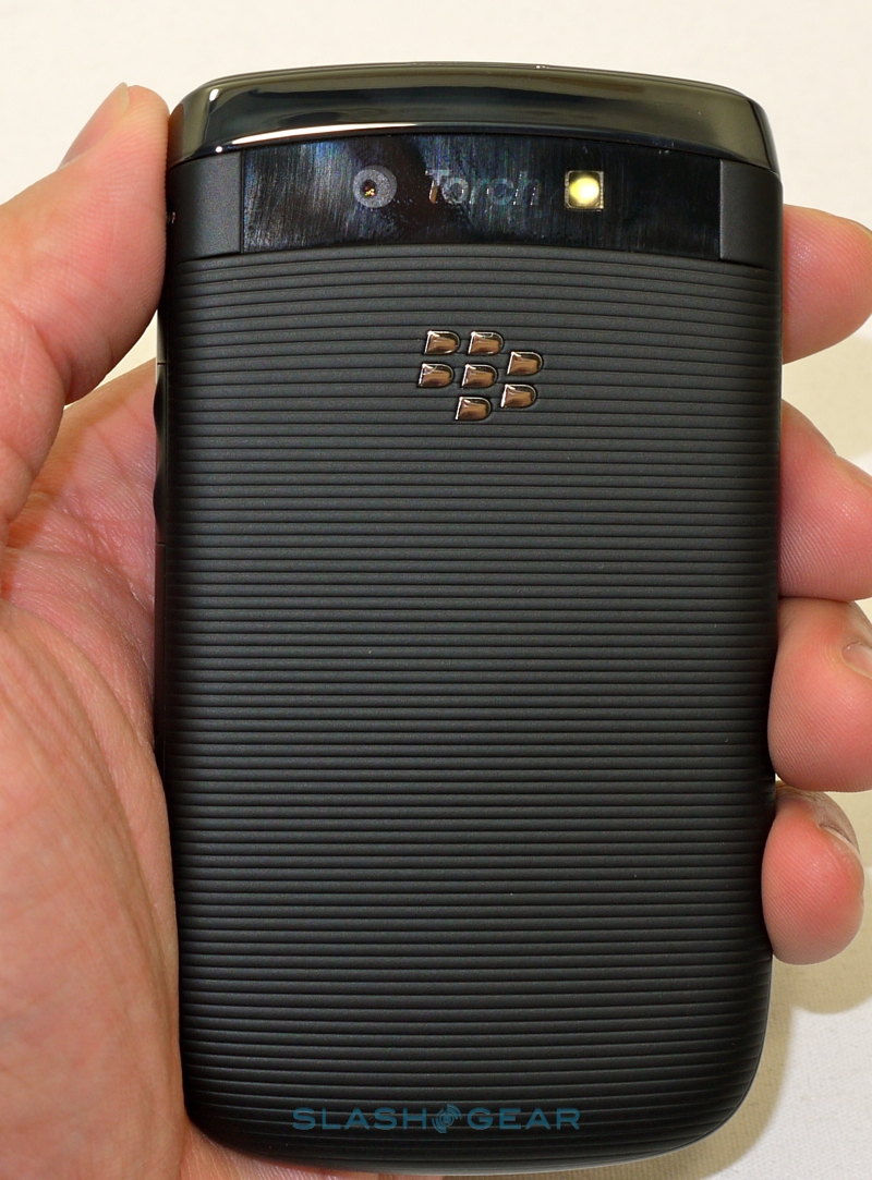
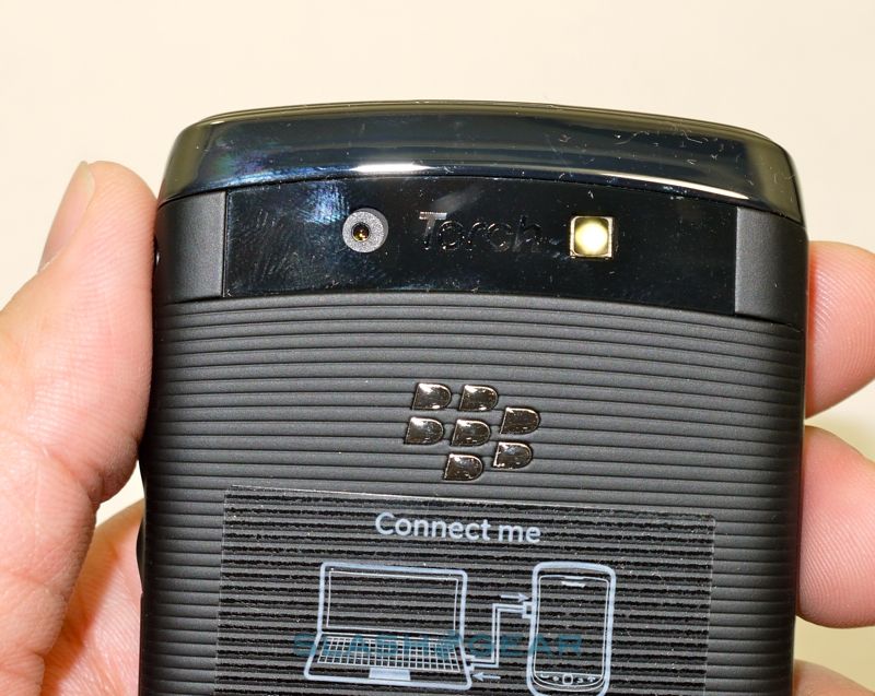
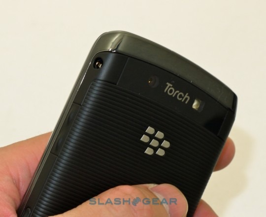
Keeping things moving is a 624MHz processor paired with 512MB of RAM and 4GB of internal storage; there's also a microSD slot under the ribbed battery door (RIM supply a 4GB card in the box, but the Torch can handle up to 32GB). Connectivity includes quadband GSM/EDGE, triband 3G/UMTS for AT&T, WiFi b/g/n and Bluetooth 2.1+EDR, plus there's GPS. No front-facing video camera – only the 5-megapixel autofocus shooter on the back, with an LED flash – but there are light and proximity sensors to control the display.
In use, despite RIM's momentum in BlackBerry 6, the Torch can feel worryingly laggy at times. Pinch-zooming in the new, Webkit based browser is particularly important when you consider the low resolution display can leave text blocky, but on all but the busiest pages we found it could be frustratingly jittery. Flicking between apps should be painless but, frankly, it's not. When rivals are delivering 1GHz chips in their smartphones and already looking to faster versions, RIM's decision to stick with the 624MHz Marvell CPU smacks of either mindless frugality or a blinkered attitude toward the current mobile market. Yes, if BB6 had run smoothly then adding extra megahertz would have been overkill, but at the end of the day the Torch doesn't.
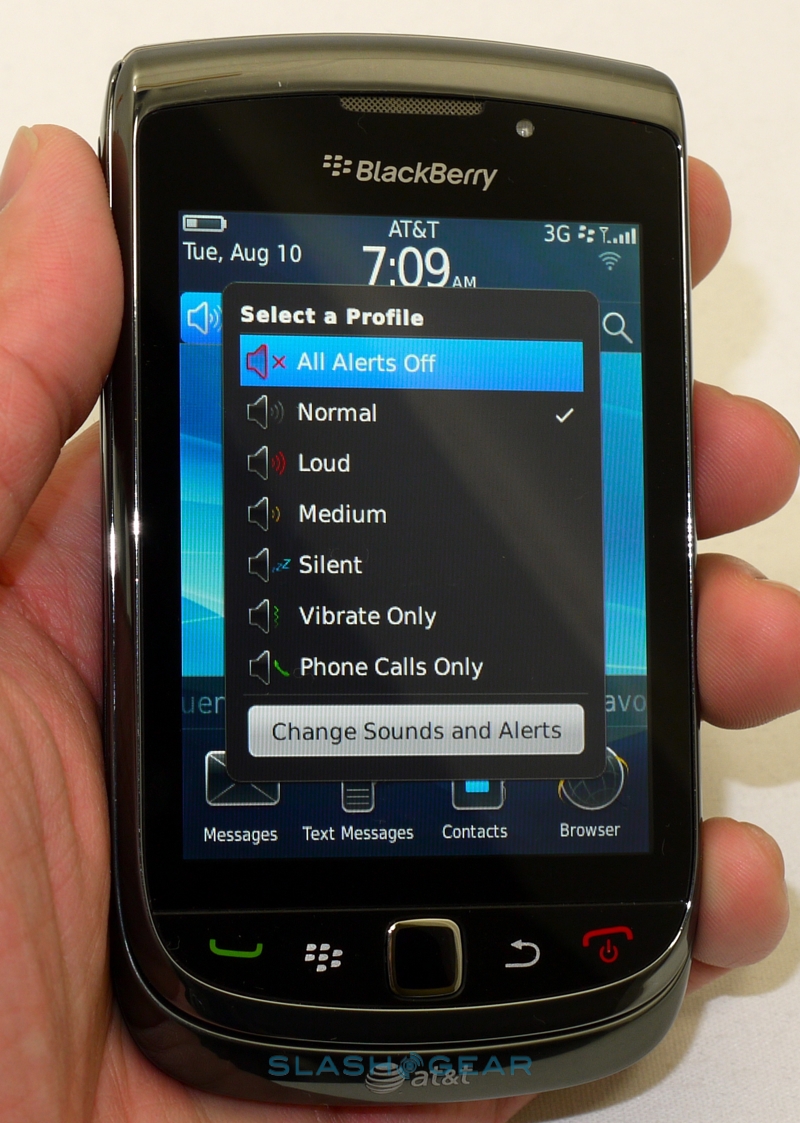
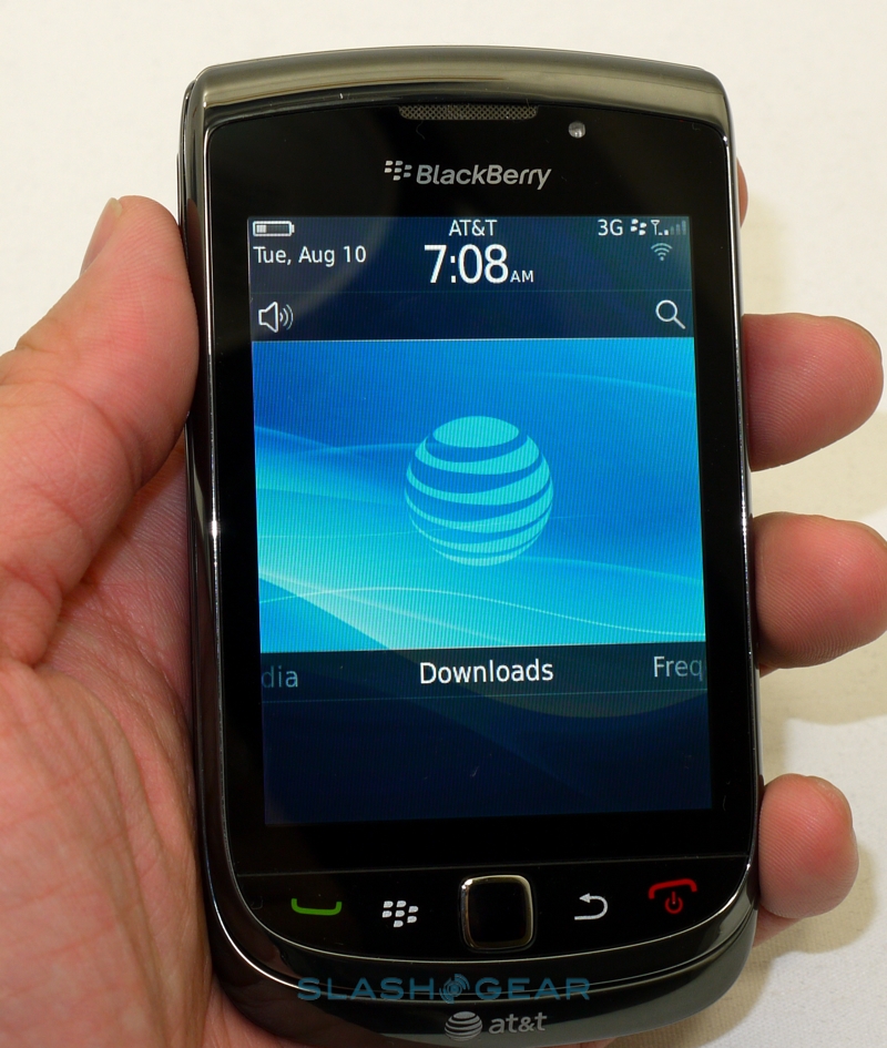
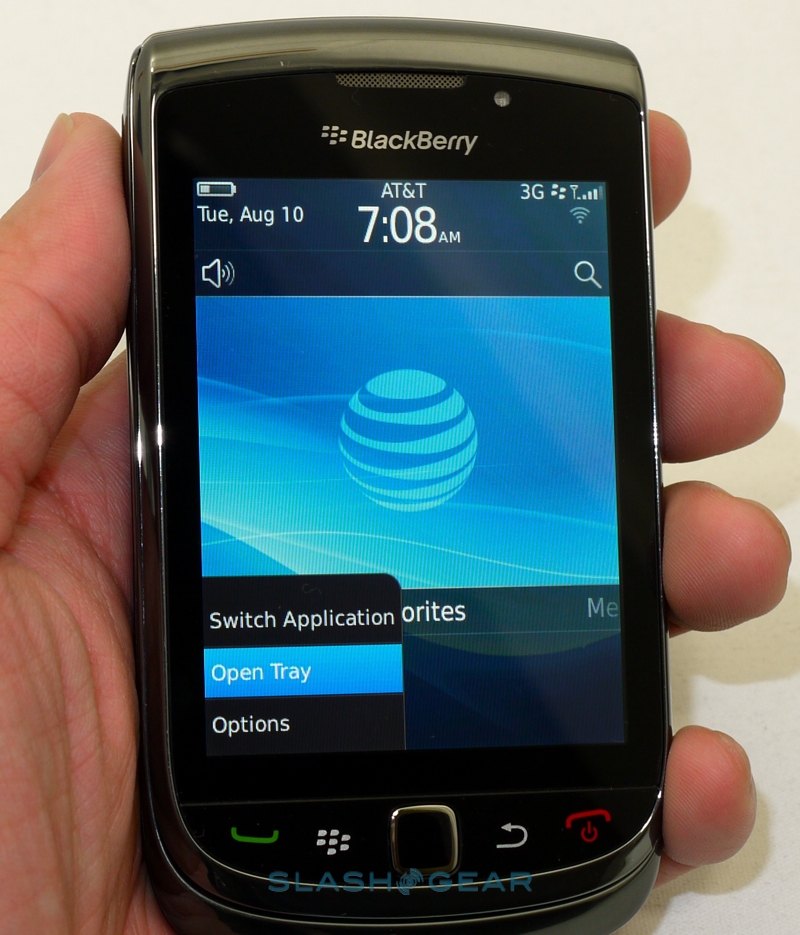
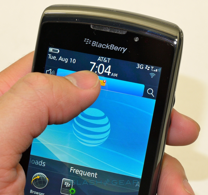
It's a decision that undermines the rest of the OS, overshadowing the improvements that have been made. BlackBerry software always felt very text-heavy, but RIM has pulled in some of Android's tricks with a sliding app drawer – that can be pinned to show one, two, three or four rows of shortcuts on the homescreen, rather than the traditional one, and swiped across to show different groups of apps like media, downloads or favorites – and a pull-down notifications menu that lists unread messages, missed calls, alerts and other activity. Meanwhile settings pages tend to use more finger-friendly icons than the text lists of before, and while it's unlikely to be as intuitive to first-time users as, say, iOS is, RIM has certainly struck a balance between familiarity for the old-guard and eye-candy for the newer recruits.

Like others manufacturers, RIM has recognized that social network integration is something consumers are actively seeking, and so they've baked in Facebook, Twitter and AIM/Yahoo!/Gtalk IM alongside their BBM, SMS, email and RSS support. All get funneled into RIM's usual unified inbox, as well as – for the social networks – a new Social Feeds inbox and individual Facebook, Twitter and other apps. Choice is fine, welcome in fact, but there's no way we could find to set defaults once you've decided on your preferred mode of interaction. If you tap a Twitter alert in the notifications bar, for instance, it will take you to the Social Feeds inbox to read it, but you have to cross over to the dedicated app in order to reply. Then, of course, you fall foul of the sluggish app switching, making the whole experience less than ideal.
For most, BlackBerry is synonymous with email, and the Torch – and BB6 – certainly hold up their end of the bargain. It's obviously easiest if you have a corporate account on RIM servers, but the Gmail experience is strong too. There's support for labels, threaded conversations and flagging, among other things, and it also syncs contacts and calendars to the Torch. There's two-way sync, as on an Exchange account, but phone-to-browser changes are faster than browser-to-phone. As with the various social networking apps, email messages show up in both the unified inbox and the account's own individual inbox; tapping an alert in the notifications bar defaults to the unified 'box, and there doesn't appear to be a way of changing that.
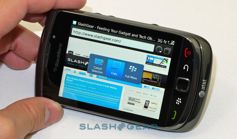
We've complained about the browser's pinch-zooming, but the general online experience is good. The faster WiFi support is welcome, though there's no HTML5 or Flash support at present and navigation is generally happier if you wait for the page to load fully first. Rather than the separate address and search bars of previous versions, there's now a single combined box that does both. That same underlying Webkit engine is used for email rendering too, which makes a significant difference to the reading experience.
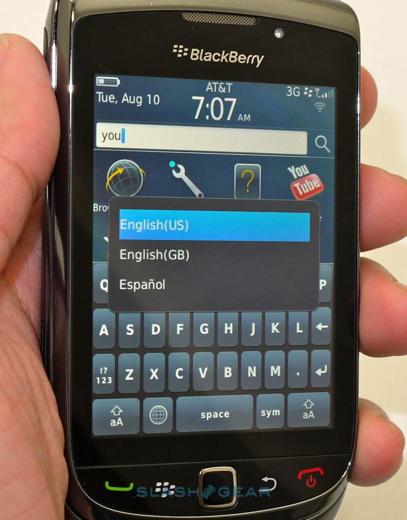
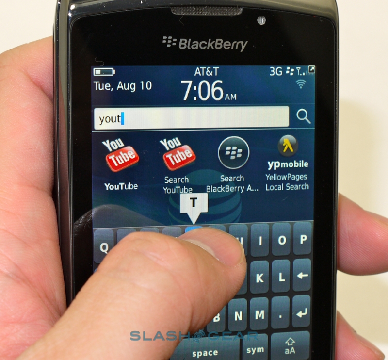
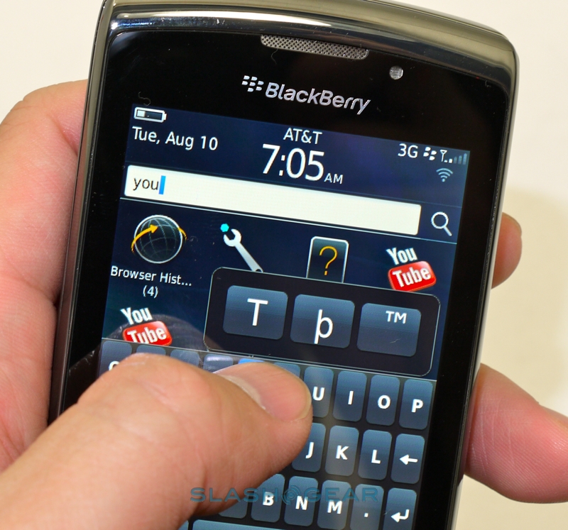
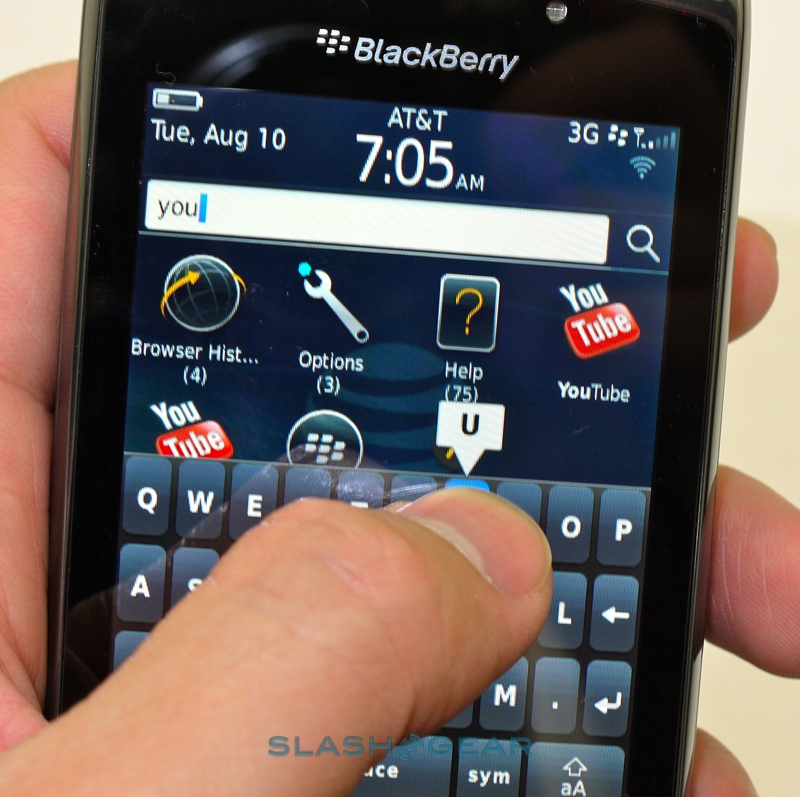
Where RIM do things well, though, they really improve usability. Universal search is familiar as a concept from other platforms, but BlackBerry 6's combination of caching and flexibility lifts it shoulders ahead of rivals. Results are shown as fast as you can peck in search terms, and it covers everything from local contacts, messages, notes, apps and multimedia before offering online queries for general searches, YouTube videos (which are the only streaming videos the Torch can cope with at present), software in BlackBerry App World and more. Ironically, while we were desperate for granularity of control for message behavior, Universal Search allows you to pick and choose which content is indexed despite being speedy enough to handle everything the Torch could throw at it.
Multimedia playback looks more inviting than on previous BlackBerries, with the Torch making heavy use of album art and the UI being both finger and trackpad friendly (handy, since BlackBerry 6 will have to cater to both touchscreen and non-touchscreen devices in RIM's lineup). Supported formats include MP3, AAC-LC, AAC+, eAAC+, WMA, WMV, Flac, Ogg Vorbis and AMR-NB for audio, together with MPEG4, H.263, H.264 and WMV3 (including Windows Media DRM10 encrypted files) for video; that's certainly a longer list than stock Android or iOS can manage. RIM has also introduced WiFi sync: as long as you have a Windows PC running RIM's BlackBerry Desktop client software, you can wirelessly send audio to the Torch. Unfortunately, despite the long list of supported formats for locally-stored tracks, the same doesn't appear to apply to the fussier WiFi sync app, and there's no synchronizing across mobile networks. Instead, you can choose playlists or individual tracks that are in your desktop library via the Torch's UI, and then have them automatically sync across to the smartphone whenever you're in range of WiFi or have a USB connection hooked up.
The camera, meanwhile, ticks many of the same spec boxes as rivals do, but falls short in a few fashionable areas. There are various shooting modes, including a decent macro setting that reproduced crisp text, but video recording tops out at VGA 640 x 480 resolution rather than the 720p HD we're seeing on many smartphones of late. Without touch-focus it's a case of half-pressing the shutter release to lock the focus in, as on a dedicated point-and-shoot camera, while the end results vary broadly. Daytime or brightly lit photos are show reasonable exposure balance but could do with a little more saturation in their colors, while low-light images – even with the LED flash in play – are murky and underwhelming. To be fair, that's a criticism we could level at many cellphone cameras.

If RIM's phones are known for their email abilities, they're also famed for their battery life. Happily the Torch doesn't disappoint, with a hefty day's use – including push email, calls and browsing – making a far smaller dint in the battery gauge than you'd expect to see on rival devices. The uncompromising executive will get through their full day with no complaints; the rest of us with more moderate use could potentially stretch to two days between recharges. As for call quality, audio was loud and lacked hiss or buzz. Antennas are headline news these days, but we had no problems with the Torch's ability to hold a signal.
It's hard to understand RIM's positioning with the Torch. While the plurality of input methods, new OS and general hyperbole would suggest the smartphone is the new BlackBerry flagship, the underwhelming screen resolution and processor leave the Torch lacking in comparison with what's top of rivals' ranges. The company is also making minimal noise regarding their enterprise customers, with a distinctly consumer-focus to the Torch launch event last week. Undoubtedly the Torch – or, more accurately, BlackBerry 6 – has the same sort of business savvy as earlier versions, but RIM seem to be hoping to pull in more mainstream consumers with the new handset and platform.
Our fear is that the Canadians have done too little to do that, given the state of the highly-competitive smartphone market today. Even if we could put aside the screen resolution, the Torch's CPU is obviously struggling with what's on the agenda today: that doesn't bode well for future upgrades. It's a shame considering the solid hardware; not exactly fashion-forward, true, but appealing in a sturdy, functional way. Twelve months ago, the Torch would be a strong contender. Now, with Android 2.2 looking slick even without manufacturer skins and the iPhone 4 dominating mindshare, the Torch's flaws are all the more undermining. It's not a bad smartphone, by any means, and RIM aficionados will likely find plenty of appeal in BlackBerry 6 if not the Torch itself. Nonetheless, RIM has fallen short of the goal to create an all-round compelling alternative to today's smartphone glitterati.
Unboxing and hands-on video
[vms f977cb6d9da15b76c3f3]
