BlackBerry Style Review
Before we begin, feel free to take a look at the unboxing of this purple people eater over here: [UNBOXING] to see the excellence in the box and the niceness of the feel of the phone in the hand. Then look below to see how actually working with this lady is: it's a slightly different story. Good points and bad points, all of them encased in a shiny royal purple.
Hardware
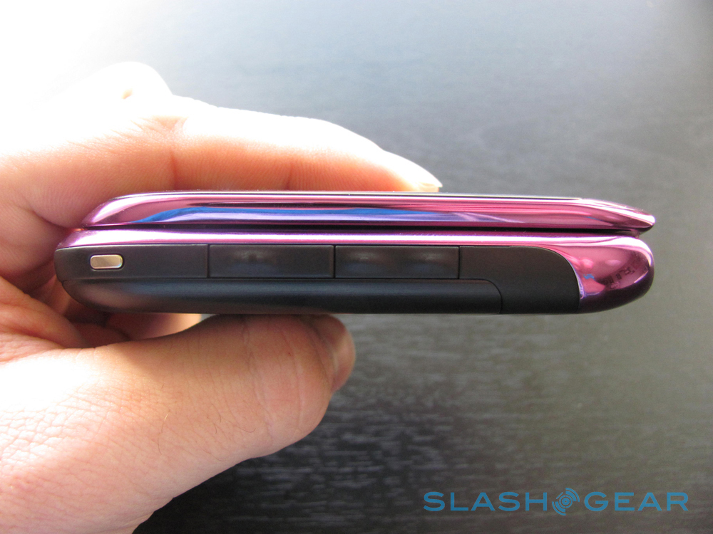
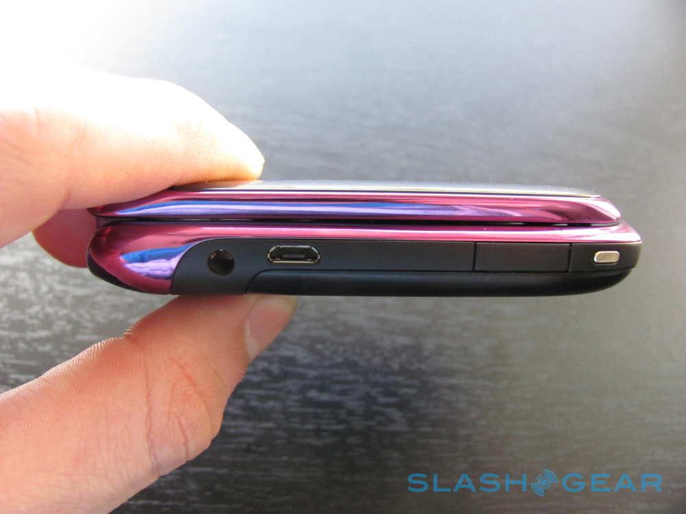
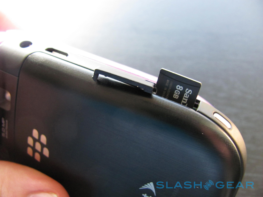
The phone feels nice to hold, like a hocky puck. It's 3.78 inches tall, 2.36 inches wide, .73 inches deep, and weighs 4.62 oz. 512 MB onboard memory and an 8 GB media card included. Wifi, GPS, and a 3G connection. It's got a 3.5 mm stereo headset jack, Built-in speakerphone, and a M4/T4 (open position) rating for hearing aids. It's got a High-resolution internal display: 360x400 pixel and High-resolution external display: 240x320 pixel, transmissive TFT LCD, supports over 65,000 colors and has user-selectable font sizes. Theres a trackpad, full QWERTY keyboard, ESC key to right of trackpad, menu key to left of trackpad, and keyboard backlighting. Password protection and keyboard lock, AES or Triple DES encryption with BlackBerry Enterprise Server, Sleep Mode, optional support for S/MIME, and FIPS validation. It's got a 5 MP camera, Continuous auto-focus, Image stabilization, Flash, 11 picture-taking modes, and VGA (640x480) video recording.
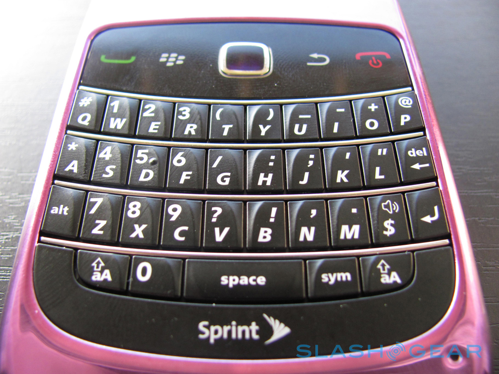
The keyboard has those great 3D keys that, even though they're right next to one another, allows them to be found by fingers in a jiffy. Everything is easy to access on the entire keyboard, and I don't just say that because I'm an analog-key-lover. Pocket texting would definitely be possible with this lady unless you're looking to key in more than just letters – then you'll have to actually take it out and see the keys as you press them.

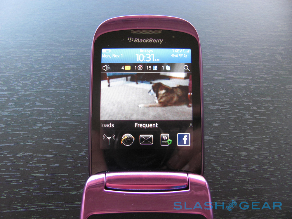
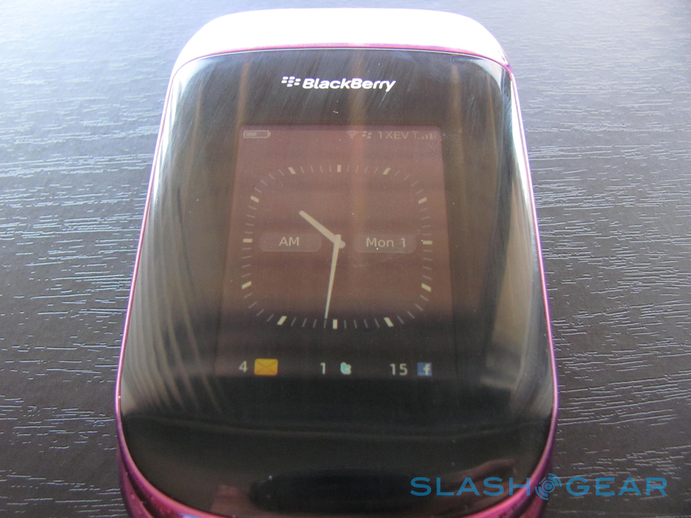
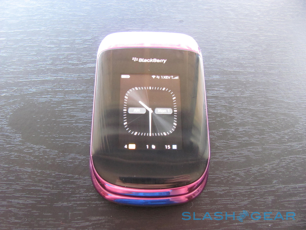
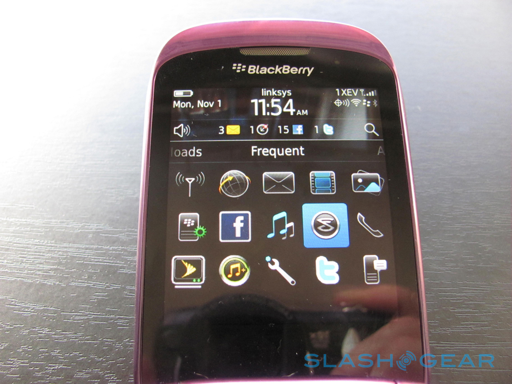
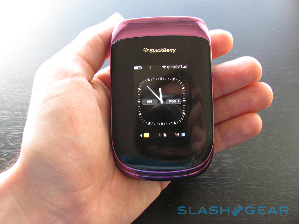
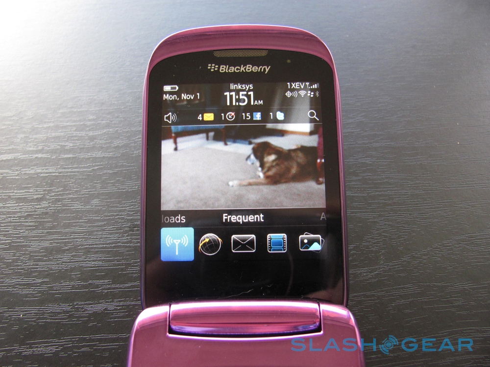
This screen is bright and sharp. The display on the top of the phone is bright and sharp as well, displaying a general battery time, connectedness, giant clock, and updates to messages, twitter, and facebook. I found myself on more than one occasion touching the screen expecting it to respond. I'm certain this is because I've gotten so used to being able to do so on the rest of the devices I've got, and I can imagine this being an option that makes its way into basically every medium-to-high grade phone in the future.
This phone is sturdy and will much more than likely never break, but if you do run it over with your car, probably make sure it's closed first. The sensual purple casing is lovely, and this does feel like a rather high-quality phone. Alls well so far.
[vms c3e9c84374c8919d2074]
Software
Once I pressed the on button and the screen popped up so fast it almost blasted through the screen, I noticed that the "Sprint" logo was kinda pixelated. Not a good sign! But once inside, I never saw anything look as terrible as that first screen. I imagine there was some sort of miscommunication between the person delivering that screen and the person telling them the size of the screen.
Inside this phone, everything seems to be really quick to move and open. Slides back and forth along menus appear to go in fast-forward (but not without appearing to actually slide, not just flip over.) Moving through the screens and the options on this phone for a person who's never used a BlackBerry phone before is going to be tough. If you're familiar with the layout and options of previous BlackBerry systems, you'll have a good time rolling with the options here. Then the same thing with the optical trackpad – if you've only used up-down-left-right controls before, this is going to be tough to get a hang of because it's very very touchy. If you've used something like this before or are familiar with going through menus and such using the knobs on, say, a PlayStation controller, you'll be fine.
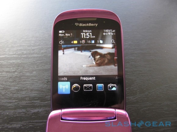
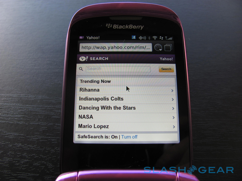
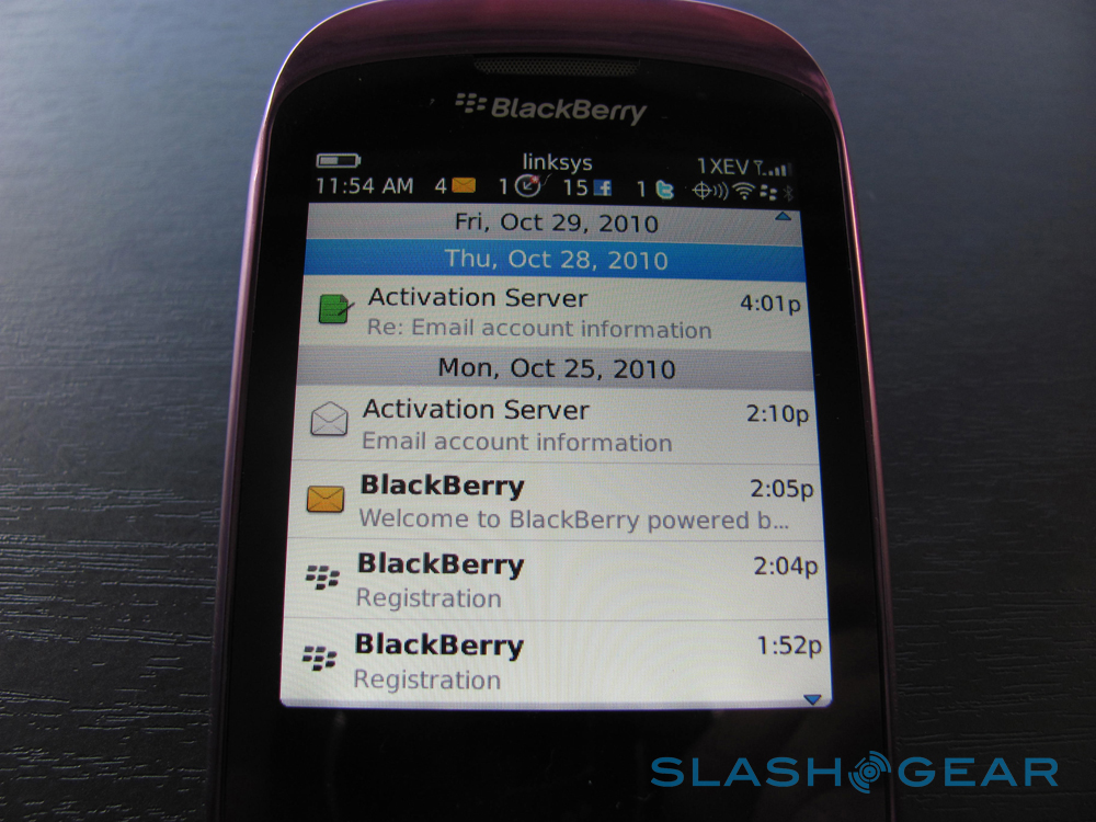
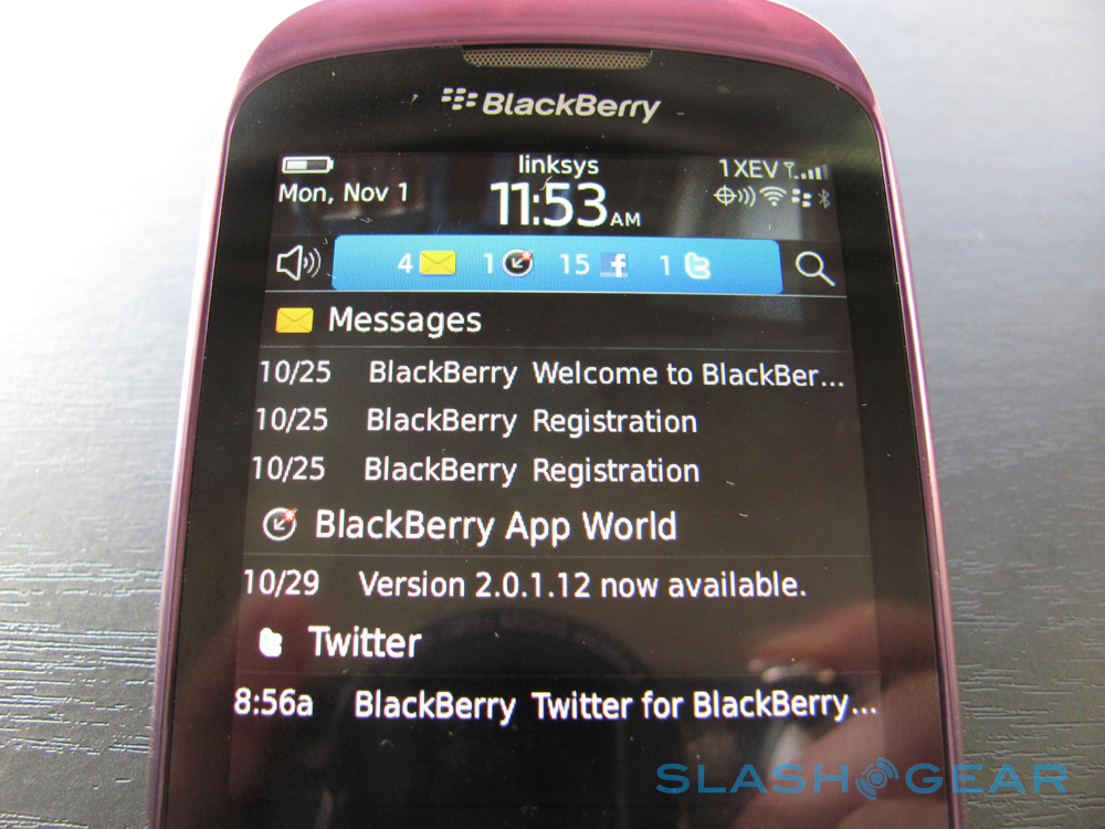
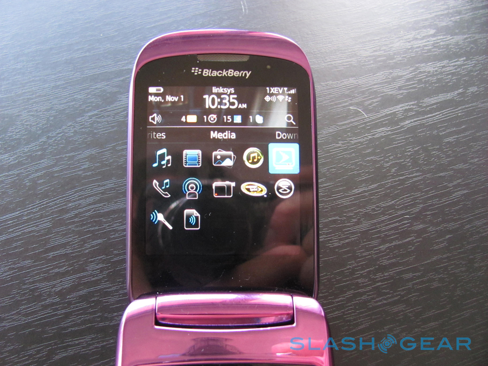
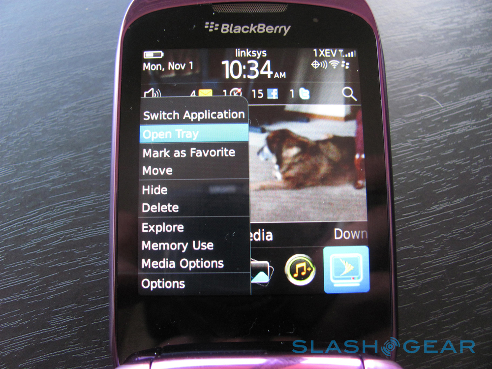
Icons are nice, flat, and following the trend of de-glossing that you'll see a lot of phones attaching to now. Shine is done, flatness in icons is in. Web browser is simple, easy to get used to using, but as always with a screen this small, it can get tough to navigate around. Of course this is why the sites like Facebook and Twitter, the ones you're used to using every day many many times have provided you with instant updates through apps. Right out of the box, you get Facebook and Twitter updates at the top of your screen right beside your voice messages and text messages.
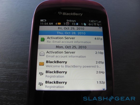
Reading updates is easy, especially with the "Social Feeds" option which puts everything you need into an easy-to-expand list. A strange addition to this list of built-in apps is the fading MySpace. I can't imagine many people even opening this one up, as the only people I've heard of using it in the past few years are musicians and people checking to see if it's changed in the 5 years they've been away.
Navigation changes from screen to screen, and sometimes erratically. For example, when you get into the second screen of Sprint Navigation, it's as if your cursor acts as a highlighter over text, making it impossible to get to the bottoms of the screens without hitting the first letter of every line. Another thing that happens along these lines is the odd sizing of text, sometimes buttons being 3x the size of the text it's following. Typography is abandoned in more than a couple places in the phone.
Opening maps, there's a download that finishes in less than 30 seconds, opens, and shows you were you are on a map, real slick. Then if you wanna get directions to the Dairy Queen, you just hit the menu, do a search, and what? It uses a Google search? That's interesting. But then you can get directions or show it on the map. Easy, works nice. Not for looking at while you're driving though, make sure to get a copilot. Sprint Music Store leads you to a page saying that Sprint Music Store launches soon. Playing music (through your library or with the included Slacker Radio app,) works well, especially if you're going to plug it into a speaker or your car to play through the radio. Sounds good, sounds nice.
[vms 9ab3b599035bc566ce2b]
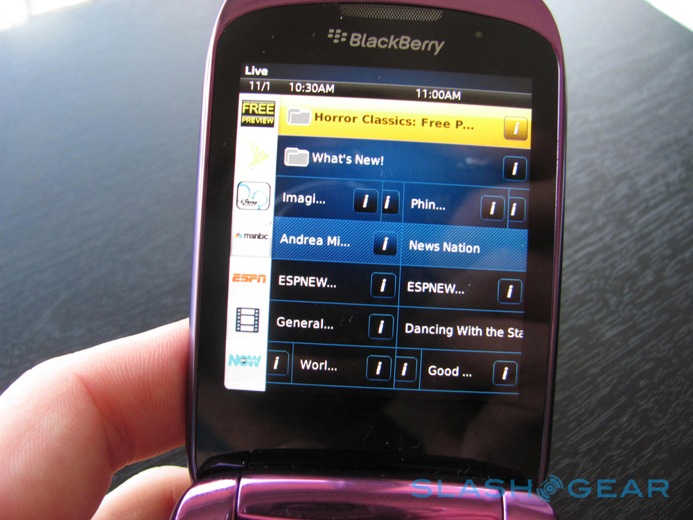
Sprint TV, like most of the apps on the phone, you've got to download to work by clicking through several screens after your initial selection of the icon in the dock. Once it's open, it's interesting, and the idea of watching television on your phone is cool, but it's not the easiest to navigate, and the picture is not good. Lots of phantom pixels and ghost screens. On the other hand, it doesn't seem to lag at all. If you just want to hear some sports commentary, you're good. If you want to watch a TV show where you've got to see details on the screen, you're outta luck.
Camera and Multimedia
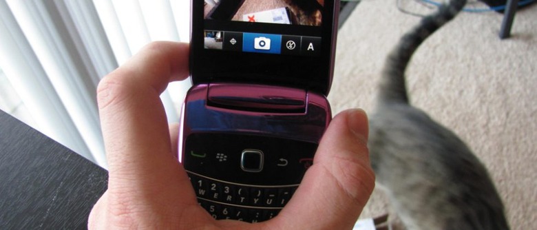
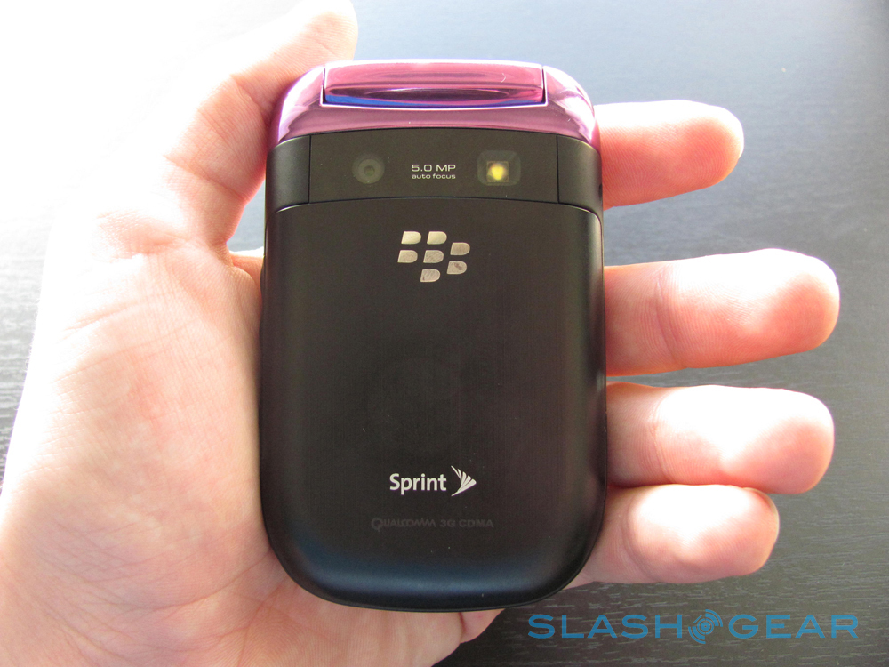
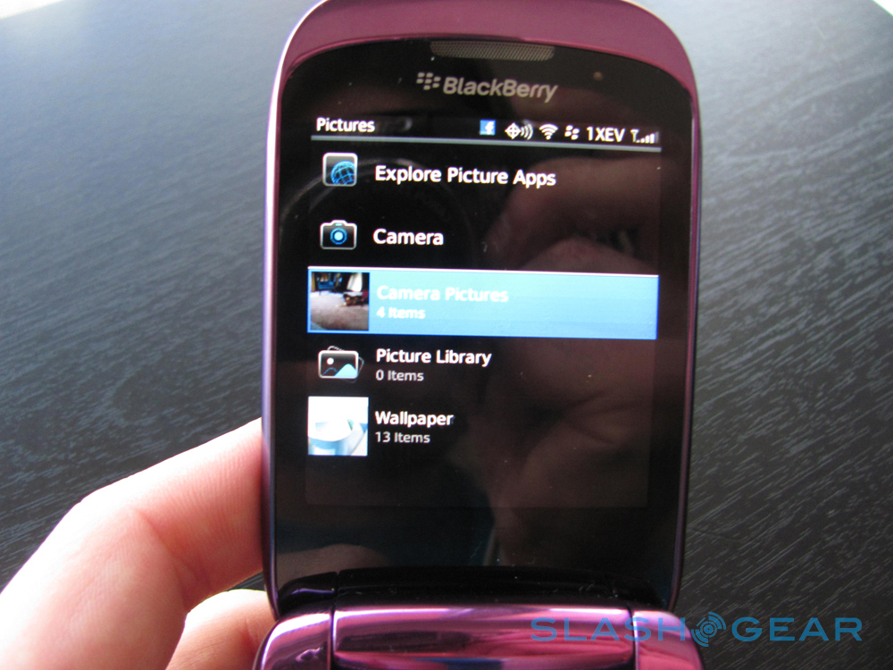
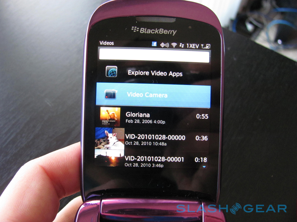
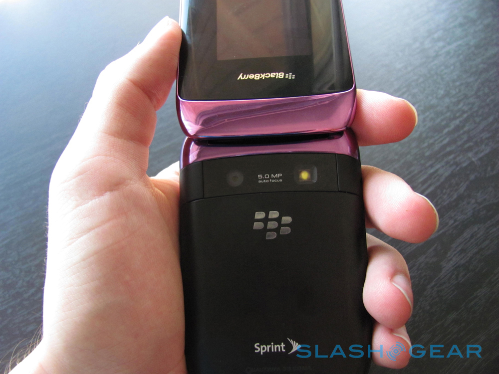
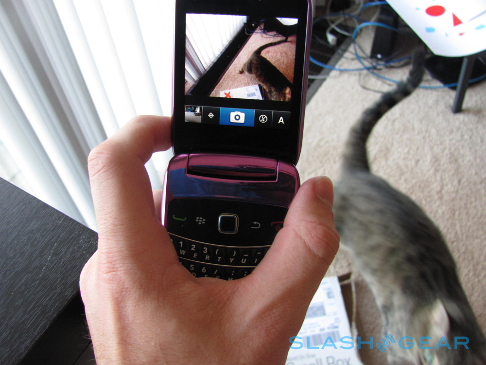
Pictures opens a list where you can access Picture Apps, Camera, Camera Pictures, Picture Library, and Wallpaper. Similarly, Video reveals a list including a link to Video Apps, Video Camera, and all the videos on the phone. There is a rather irritable problem with the placement of the camera on the phone. When I attempt to capture either video or photos, I point the top of the phone at the subject. This doesn't work with this phone, as the camera is attached to the lower half. Not only is it not behind the screen I'd normally point at the subject, it's behind my hand when I hold the phone. Yuckers.
[vms c4a2333b42b2dbb8f27b]
Video capturing is great, photos are so-so. If you just want to send photos to other phones for fun, it's alright, if you're looking to share on Facebook or other screen-seen places, you'll want a nicer camera than this. Video capturing has great points like its light adjustment and auto-focus which work quite well as I move the camera through the apartment capturing video. It also captures audio reasonably well.
Photos taken with the camera:


Phone and Battery
We're in the future as far as battery life goes, pretty amazing no matter what you're using, but that doesn't mean using the video and web-browsing functions all day aren't going to lead you to an empty pack. This phone has a battery that lasts the whole day through if you're the sort of person who isn't using it at a child's birthday party to capture their every smile and dance.
All the hardware looks great and works good. Audio playback is super, and although I did not test it in a bar or club setting, I can imagine it would be able to shred through that nightmare of sound. As far as normal everyphone functions, this device is certainly up to par.
Wrap-Up
This is a phone for people familiar with the BlackBerry OS, people that've used a BlackBerry phone before, and those who have a strong love for the BlackBerry system. I found it to be a phone with alright capabilities, and it's always cool to be able to watch live TV and listen to radio stations on the phone, but the user interface is difficult to parse. It's not an easy phone to use, especially when you compare it to the rest of the smart phones on the market now. The keys are easy to press, but it's not easy to get in and out of the places you've got to go to be able to press the keys.
I reccomend this phone to people who've used BlackBerry phones before and perhaps got angry at their Storm touchscreen breaking (IE my wife,) and other BlackBerry users looking for a slightly different experience than the flatness of the hardware of the past. My favorite part of the whole phone is the purple case. This is a phone that looks fabulous to carry, and real nice for BlackBerry users to use, but not something to switch to if you are used to any other system.
