AT&T Fuze Review - Sprint Touch Pro Comparison
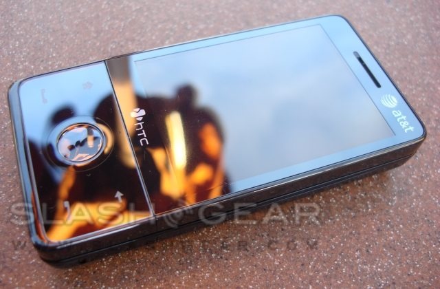
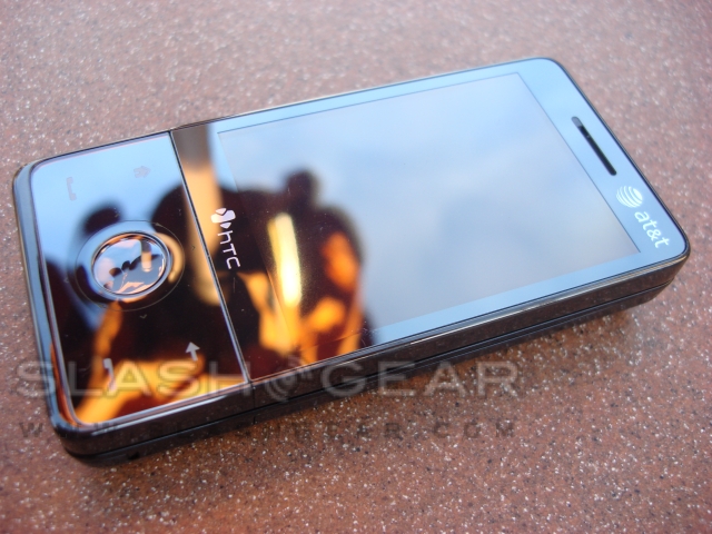
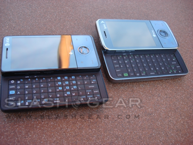
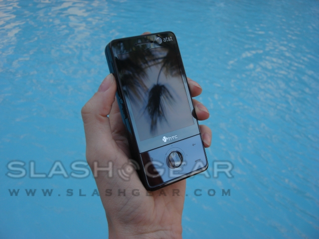
AT&T just released the HTC Fuze, which is very similar to Sprint's HTC Touch Pro, but has a few changes made for the AT&T version. The HTC Fuze is the newest AT&T phone to run Windows Mobile 6.1 with TouchFLO 3D and work with AT&T's Push To Talk service. We are going to go through and point out all the differences between the two handsets.
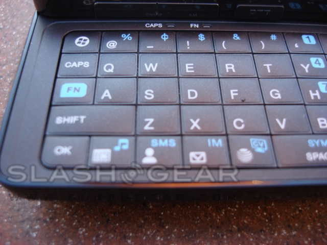
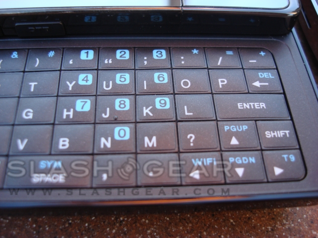
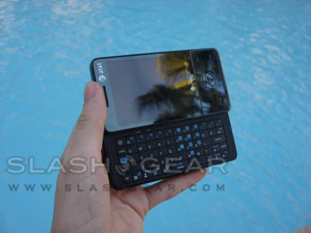
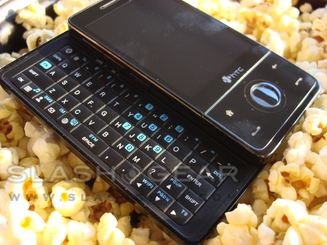
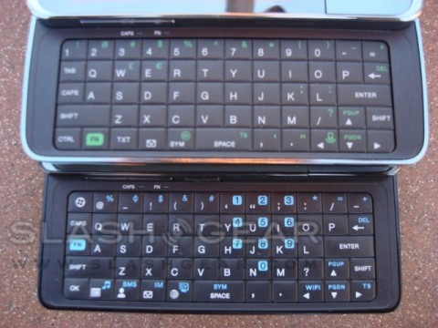
In the box you will find a screen protector, extra stylus, charging cable, USB data cable, mini-USB to 3.5mm headphone adapter and the phone itself. Unlike the HTC Touch Pro, the HTC Fuze does not come with a belt holster. The full-QWERTY keyboard on the Fuze is a lot different than the Touch Pro. The first thing you will notice is the designated number keys have been replaced with symbol keys and relocated in a more traditional phone layout.
On the Fuze you will find a dedicated start key that the Touch Pro lacks. In addition you will find designated keys for the calendar, contacts, text, the email inbox and browser, but it doesn't end there. There are many additional shortcut keys when you press the function (FN) buttons. They include AT&T music, SMS, IM, AT&T's Cellular Vision service, shortcut to wireless communications options and T9 toggle.

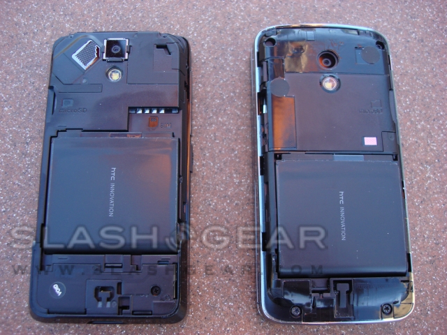
The Fuze weighs in at 5.8oz, just .5oz heavier than the Touch Pro, but hardly noticeable. Both handsets have a 1340mAh Lilon battery but the Fuze is rated for longer talk time at up to 6.6 hours; the Touch Pro only has up to 4 hours of talk time. The 3.2-megapixel camera has no notable changes between the two phones, as far as taking pictures and recording video.
The basic UI in the Fuze is the same as the Touch Pro. TouchFLO 3D, however, does not respond as well in the Touch Pro as it does with the Fuze. Visually the Touch Pro looks a lot better with the dark background and bright pictures. The UI on the Fuze is very simple, with white and gray with orange highlights. Another difference we noticed is the order in which the options are displayed when scrolling through the main menu.
Call quality, on both devices, through the headset and connecting via Bluetooth seems fairly equal between the two. The speakerphone in the Fuze was noticeably louder that the one in the Touch Pro, however the Fuze did not sound as full and rich in sound quality. The Fuze was very sharp in tone, requiring the volume to be turned down occasionally so not to hurt your ears. The Fuse also has the option to expand the memory with a microSD card. We are unsure if the device comes with a microSD card like the Touch Pro, but a card was not included in our box.
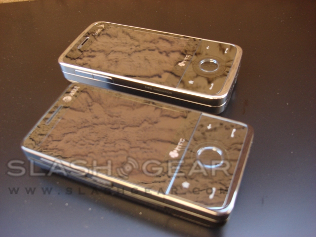
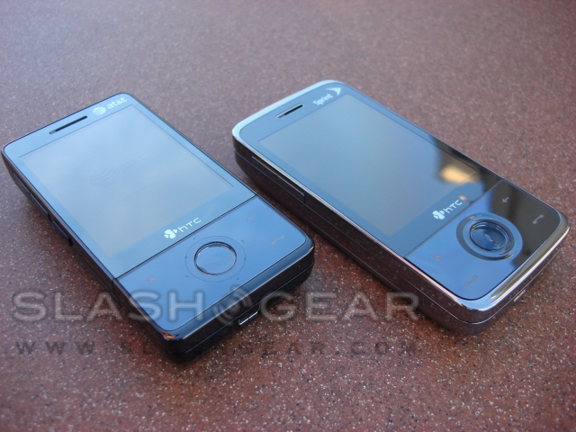
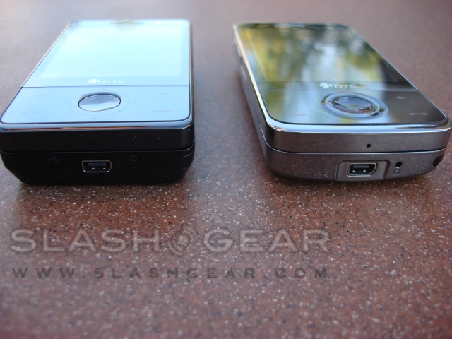
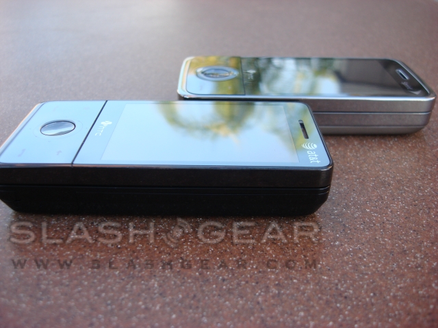
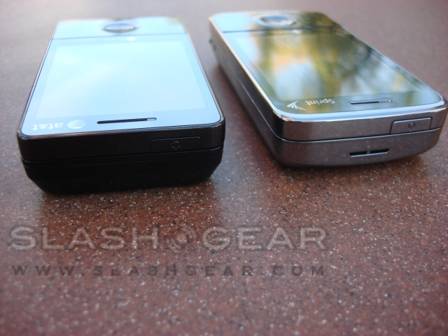
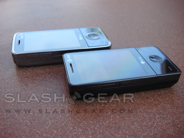
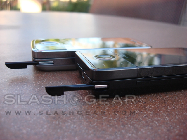
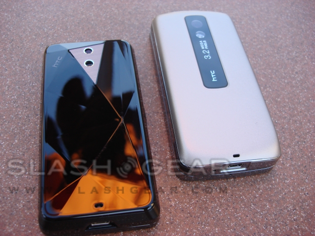
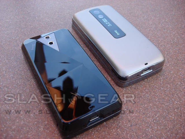
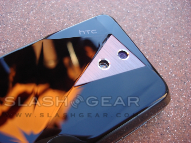
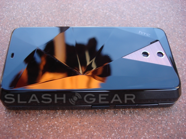
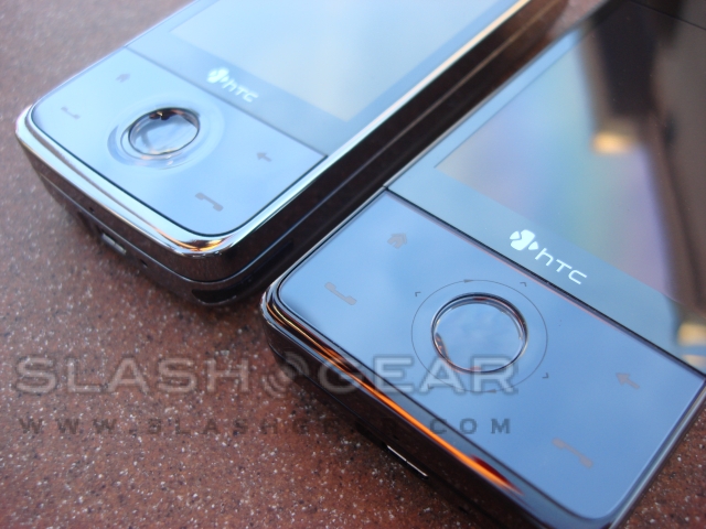
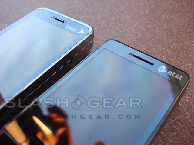
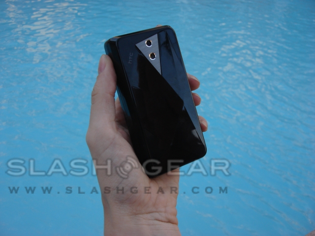
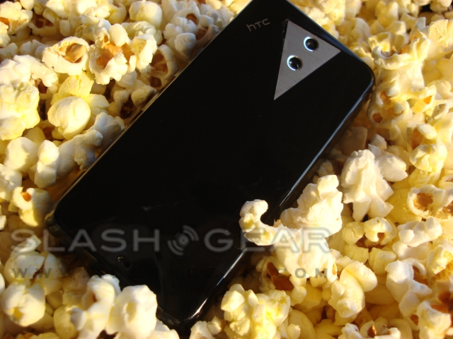
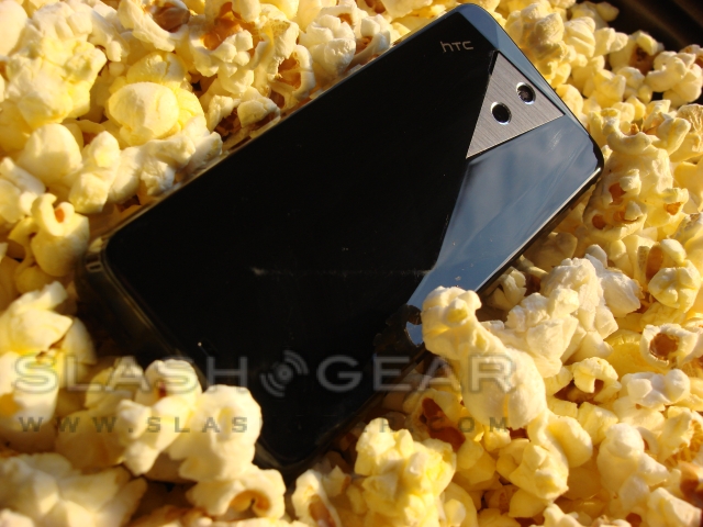
Physically, the Fuze is much different than it appears at first glance. The back of the Fuze is the same as the Touch Diamond, with a diamond-like shape. The Fuze is also a lot more squared off than the Touch Pro, which is rounded. The sides and accents of the Touch Pro are shiny chrome, while the Fuze is all black. The phones are virtually the exact same size, width wise, but when it comes to length, the Touch Pro is two or three millimeters longer. Due to the body design of the Fuze, the stylus is squared at the end, the Touch Pro's stylus is rounded to fit the contour of the body.
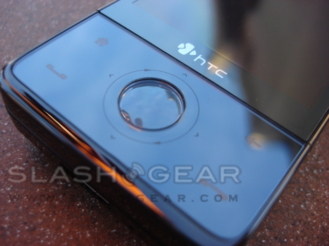
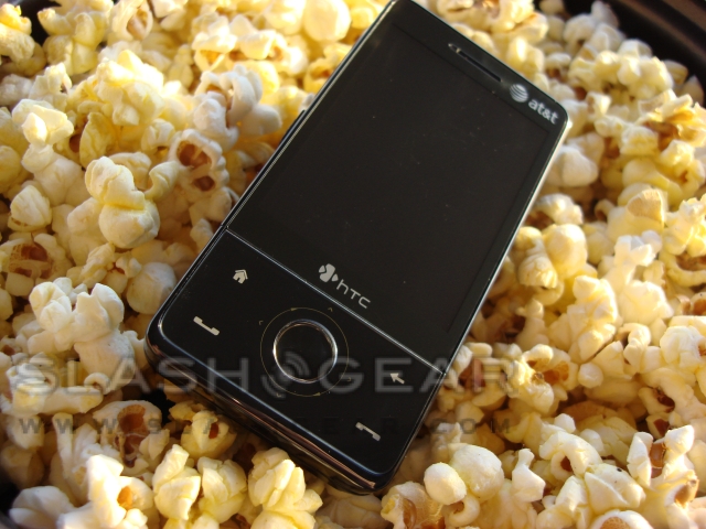
The speaker on the Touch Pro can be located on the top of the device, whereas the speaker on the Fuze is located next to the camera, on the top-left tip of the triangle. The keyboards on the two handsets are built the same, just with different functions. The selection button on the face of the Touch Pro is contoured to better fit your thumb than on the Fuze, whose button is just not as recessed. Another slight difference is the circular directional pattern around the selection button on the Fuze. The last physical difference that can be seen is the addition of the Push-to-Talk (PTT) button just below the volume keys on the left.

Again with the Fuze as with the Touch Pro, we felt that the responsiveness of the touchscreen while using the main menu fell short. We don't exactly like having the messaging shortcut key take us to email and text messages, we prefer one or the other. Also the numeric keys on the QWERTY keyboard really need to be located along the top, as they have it in the Touch Pro.
Overall the HTC Touch Pro and HTC Fuze are very similar; it really boils down to personal preference, from the overall style of the handsets to the layout of the keyboard. We would have to say we enjoyed the Fuze more, but the numeric keys need to be back up at the top of the keyboard.
