ASUS Eee Pad Transformer First-Impressions [Video]
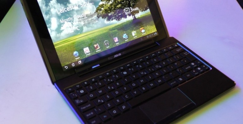
If you'd asked us yesterday which Android 3.0 Honeycomb tablet we were most excited about, we'd probably have said Samsung's upcoming Galaxy Tab 10.1, or maybe its smaller 8.9 sibling. Now we're not so sure. SlashGear caught up with ASUS today for the official launch of the Eee Pad Transformer, the company's 10.1-inch Tegra 2 tablet that can be optionally paired with a detachable, battery-toting keyboard dock. Announced back at CES 2011, and promptly lost amid the flurry of similar slates, it turns out that ASUS could well have a winner on its hands. Read on for our first-impressions.
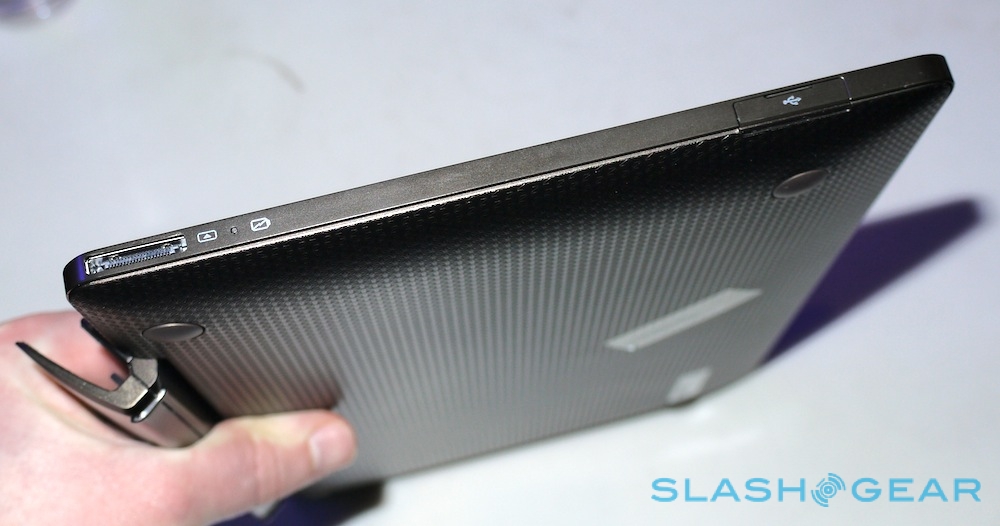
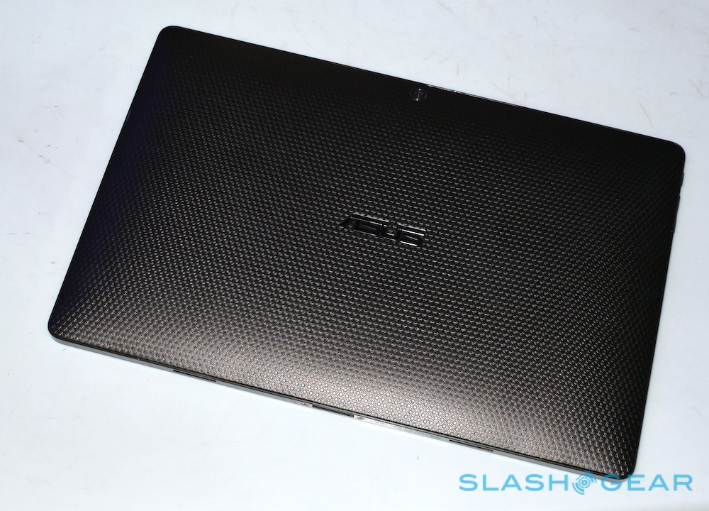
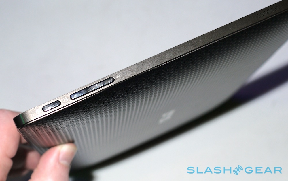
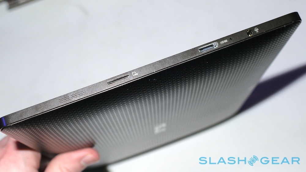
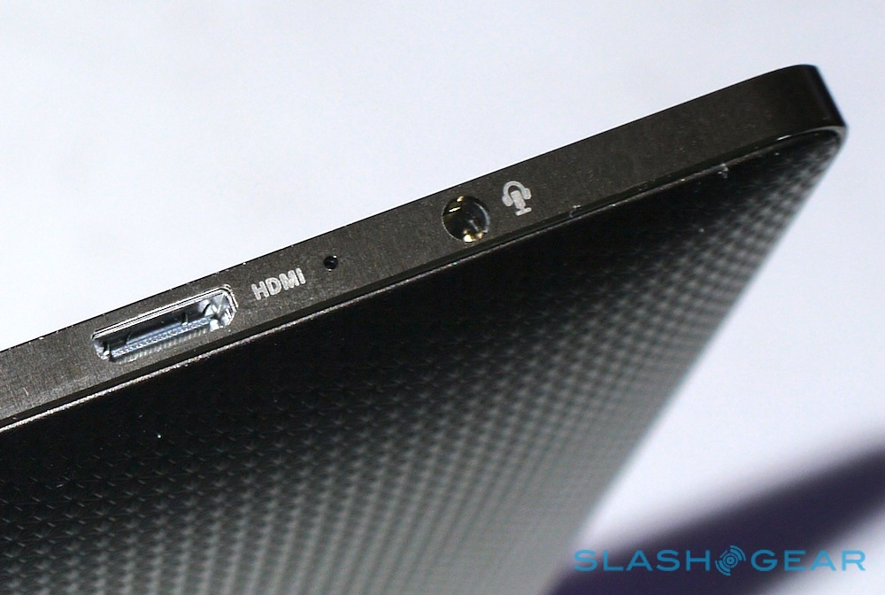
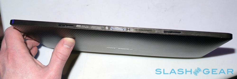
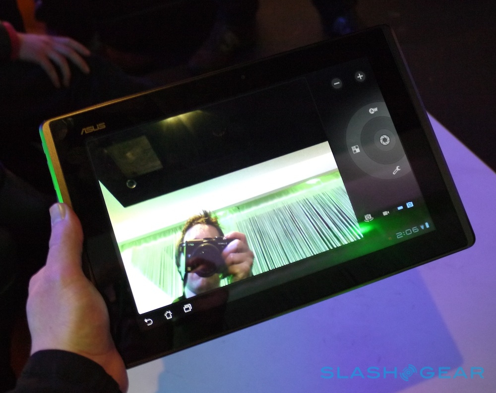
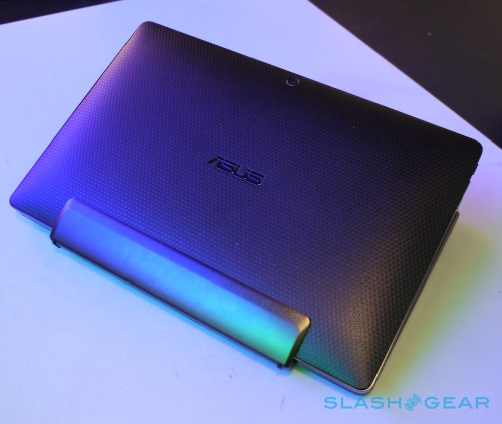
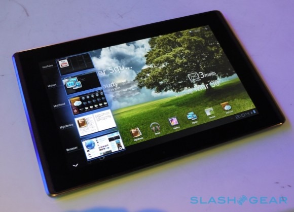
At 271 x 177 x 12.98 mm the Eee Pad Transformer isn't as thin as the iPad 2 or the Galaxy Tab 10.1, and nor, at 680g, is it as light. Still, it's a neatly portable slate in its own right, with a curved, textured back panel and brushed-metal effect sides. Ports are more comprehensive than Samsung's, too, with mini HDMI 1.3a along with a microSD card reader, and there are stereo speakers, a microphone, headset jack and a proprietary socket for the keyboard dock (more on which in a moment). Twin cameras – 1.2-megapixels on the front and 5-megapixels on the back – along with WiFi b/g/n and Bluetooth 2.1+EDR round out the main specs, plus of course there's the 1GHz dual-core Tegra 2 processor, 1GB of RAM and either 16GB or 32GB of flash storage.
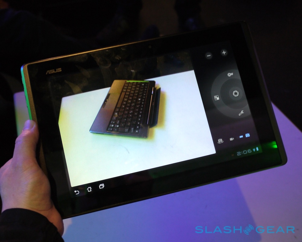
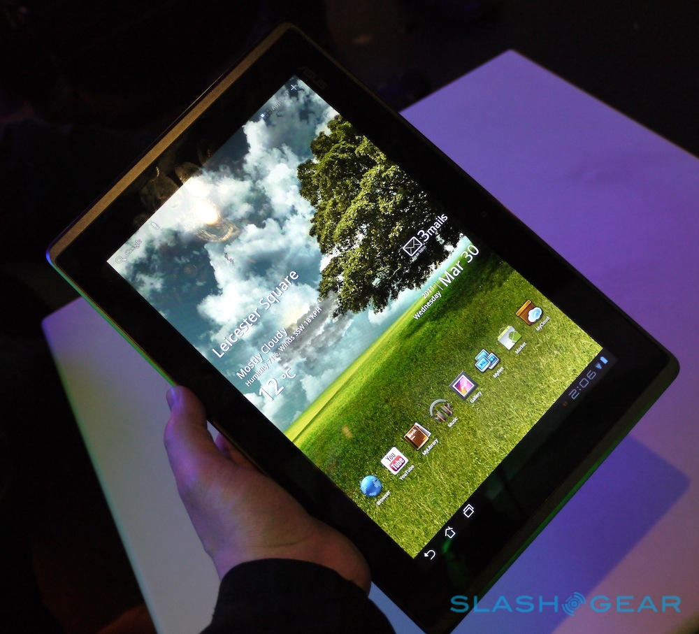
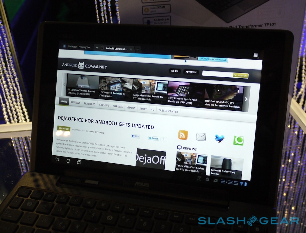
It's the display that's most impressive initially, however, a 10.1-inch 1280 x 800 IPS panel supporting 10-point multitouch and covered with a sheet of toughened Gorilla Glass. We can't say scientifically how it compares to the display on the iPad 2, but with incredibly broad viewing angles – we got almost side-on without seeing any color inversion – in all four orientations, and indecently rich colors, it's one of the best tablet displays we've seen to-date. Some of ASUS' demo units were a little finicky with their touch-responsiveness, but we're putting that down to calibration issues as it wasn't consistent across all of the Eee Pads.
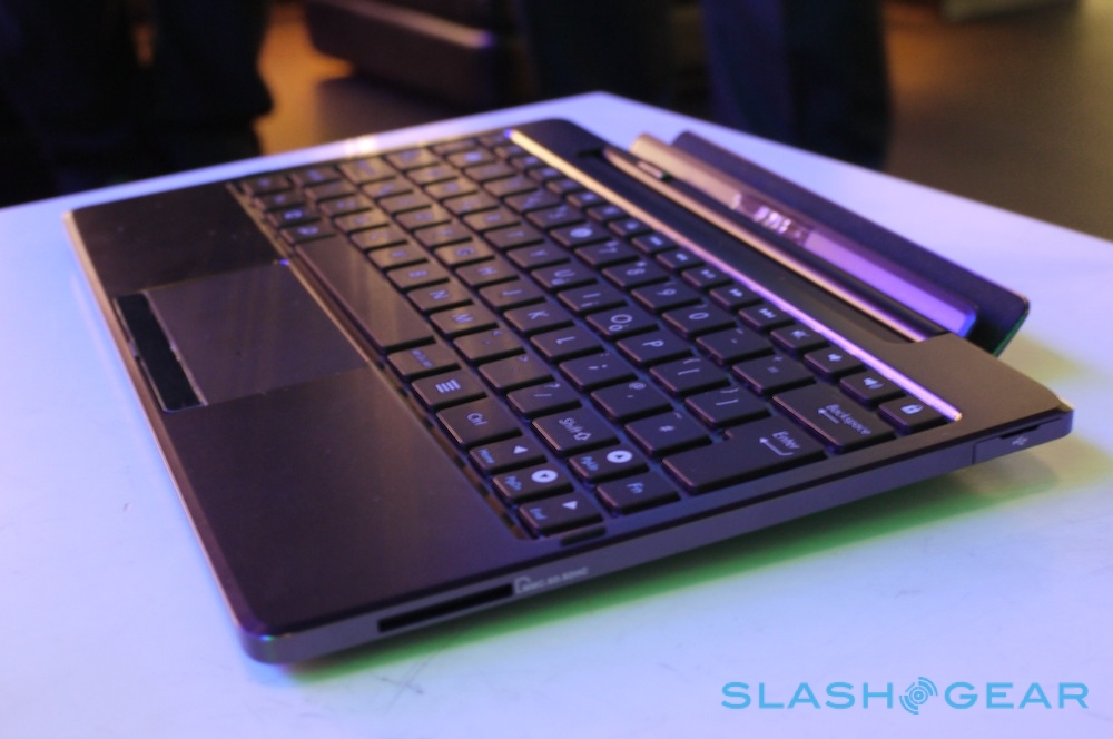
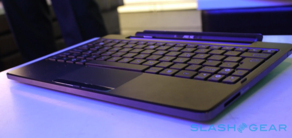
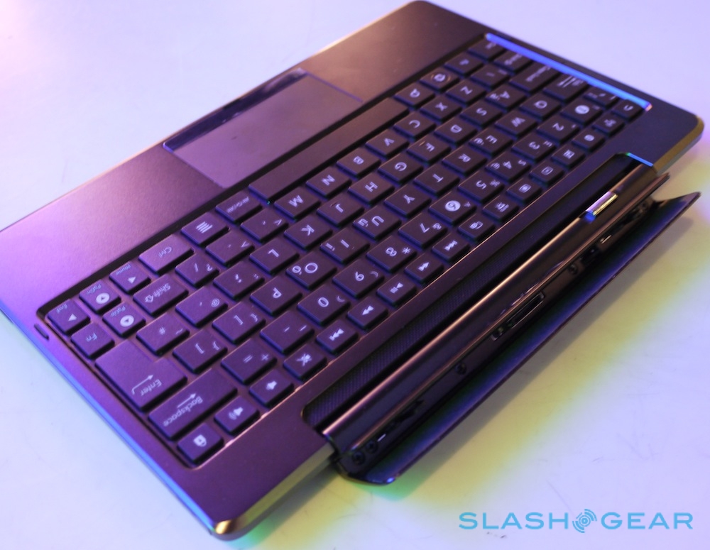
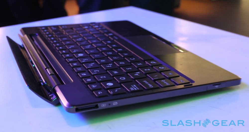
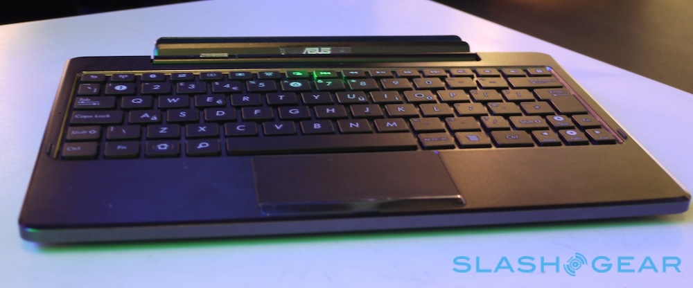
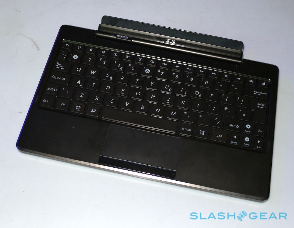
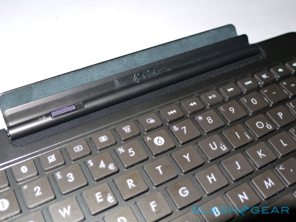
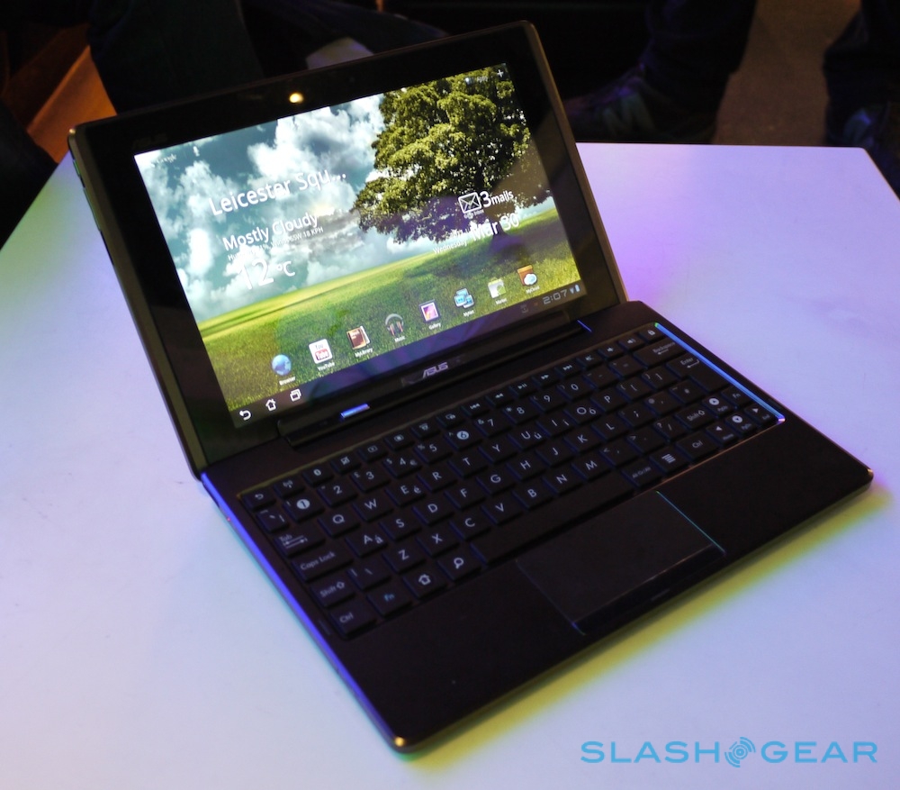
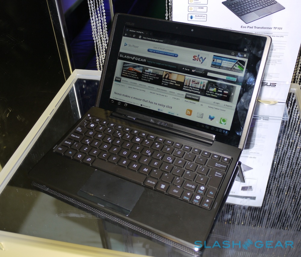
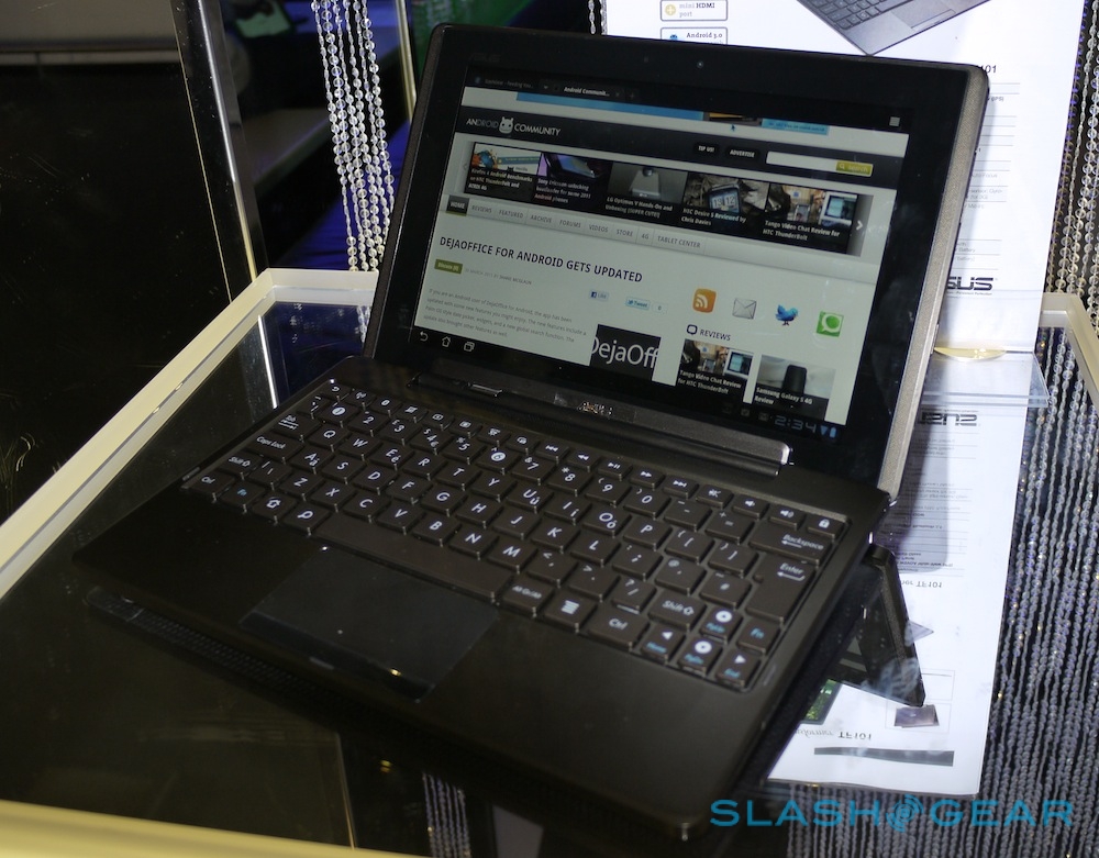
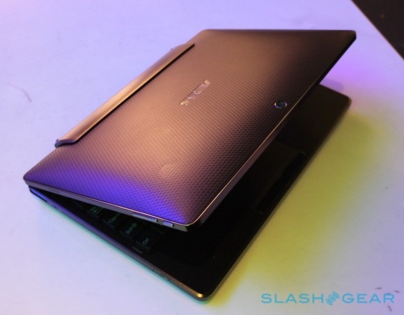
A brilliant screen is one thing, but we were equally impressed with the keyboard. ASUS will be offering it separately to the Eee Pad Transformer, but it's really an essential part of the value proposition. The chiclet keys are are on a par with those on an ASUS Eee PC netbook, with a row of Android-specific media and shortcut buttons and a responsive touchpad that supports tap-to-click. The Transformer docks in neatly with a double-click, and the hinge mechanism is stiff but reassuringly solid.
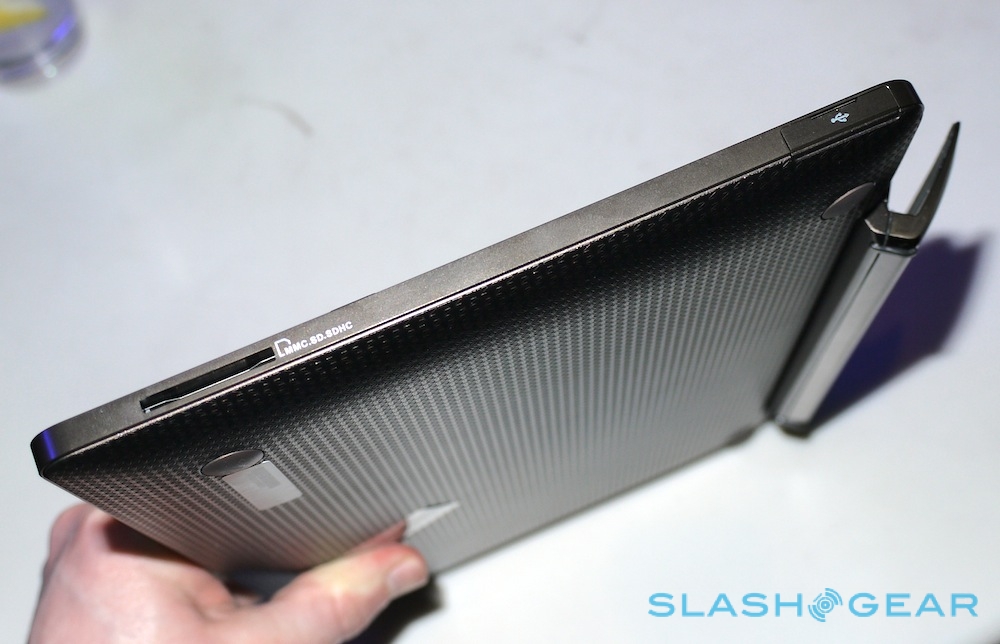
The keyboard adds a couple of extra USB 2.0 ports and a memory card reader, but more importantly there's an integrated battery. This promises to boost the slate's 9.5 hour runtime to a whopping 16 hours, automatically recharging the Transformer so that it's as close to full as possible when you later remove it from the dock. The supplied AC adapter has two plugs, allowing you to recharge both sections simultaneously. The battery adds the necessary weight to keep the whole thing stable when clipped together, adding up to a setup we far prefer to Acer's optional Iconia Tab W500 dock.
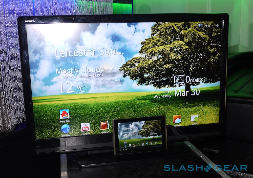
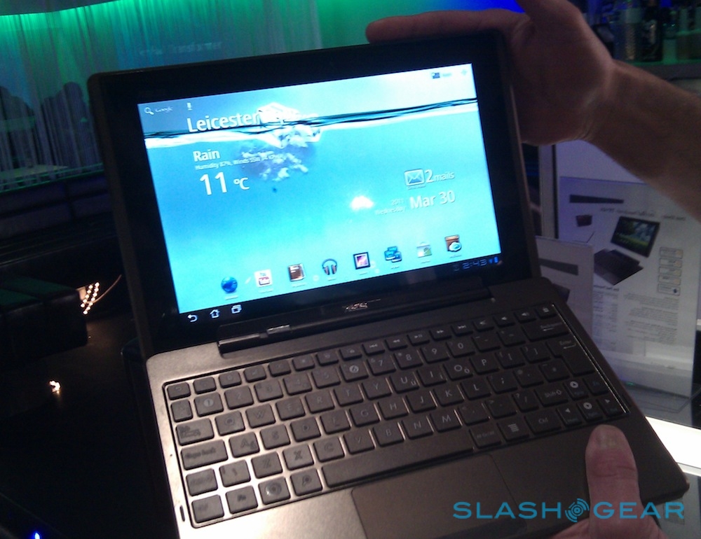
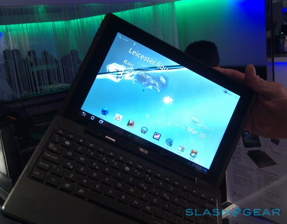
ASUS has done a little modification to Honeycomb, with a customized homescreen that has an active desktop with weather alerts, email counter and calendar. There's also a great Live Wallpaper which displays the Eee Pad's remaining battery as a water level that gradually sinks down the screen (complete with some floating ice cubes). Tilt the Transformer and the water sloshes around accordingly. While it's a visual gimmick, it also makes checking battery status far easier than peering down at the tiny icon in the Honeycomb dock. Unfortunately, ASUS tells us, Google isn't entirely happy with it, and so there's an ongoing battle to ensure the Eee Pad launches with it installed.

There'll also be a preloaded copy of Polaris Office 3, for creating and editing Office documents – ASUS is pretty keen that the Eee Pad Transformer be seen as a content creation tool, rather than just a consumption one – as well as some of the company's own apps. They include MyNet, a DLNA streaming client, MyLibrary, an ebook reader app, MyCloud, for accessing content stored on ASUS' WebStorage (a year's unlimited access to which is bundled with the Transformer) and MyDesktop, a remote log-in tool allowing you access to your PC, Mac or Android desktop.
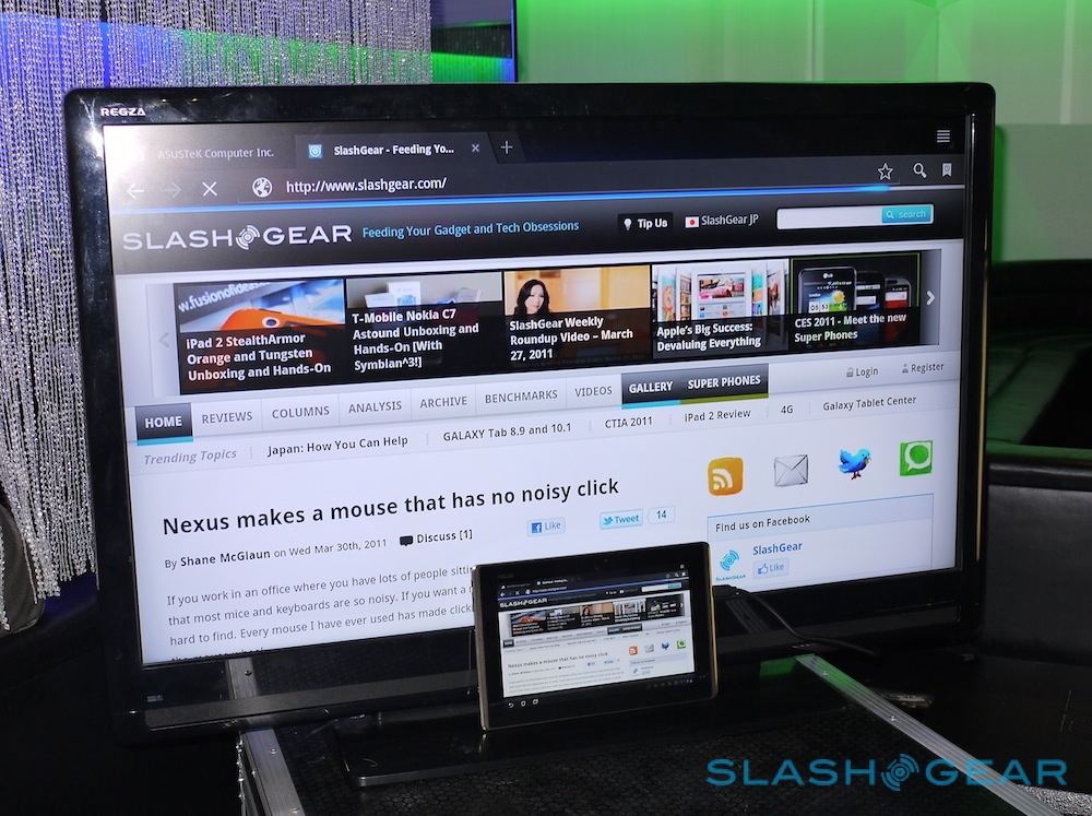
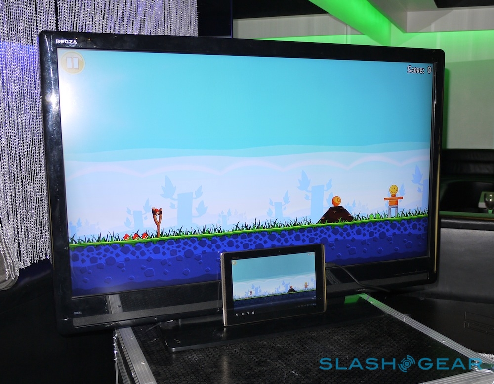
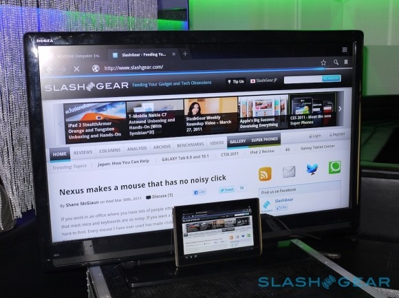
Performance was on a par with other Tegra 2 tablets we've used, with responsive pinch-zooming and apps flicking around neatly. The HDMI output upscales to 1080p nicely – browsing was particularly impressive on ASUS' big demo screen, though we also played a few sneaky levels of Angry Birds – though of course there's the DLNA support if you'd rather cut the cord.
The only real omission is 3G, which will follow on in models a couple of months down the line. Pricing – £379 for the 16GB WiFi model – puts the Eee Pad Transformer £20 less than the entry-level iPad 2 in the UK. It's arguably not as polished as the iOS slate, but that's not to say there's not an audience for it and Apple's Bluetooth keyboard support isn't as slick and solid a solution as the ASUS keyboard dock (which pushes the price up to £429).
We'll save our full verdict for when we've had a proper chance to review the Eee Pad Transformer, but there's undoubtedly a lot to like here. With the keyboard attached it's a solid, usable notebook alternative, while the slate alone is every bit the web-surfing experience of the Motorola XOOM or Samsung's new Galaxy Tabs. More details in the video below.
ASUS Eee Pad Transformer hands-on:
[vms 1f9b250ba689db6a0222]
