Apple Spirals UI For iTunes And iPods Tip Hypnotic Navigation
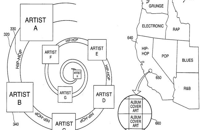
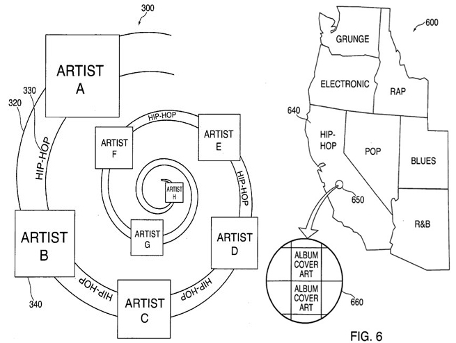
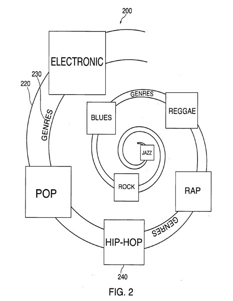
Apple are seeking to patent a new UI for iTunes and iPods, which could replace the existing Cover Flow side-scrolling system of album covers with a spiral, helix, curve or even a map. As with most patent applications the examples are pretty broad, but the general concept is that spirals of artist names, albums and genres could be navigated down through various levels of detail, spawning sub-spirals to further drill down into individual tracks.
The spirals would also lend themselves to circular navigation controls; ironically it comes as the iPod nano ditches its click wheel in favor of a touchscreen. Still, Apple does say that it could use a "virtual" click wheel on touchscreen devices. The spirals themselves could be punctuated by album art or various shapes.
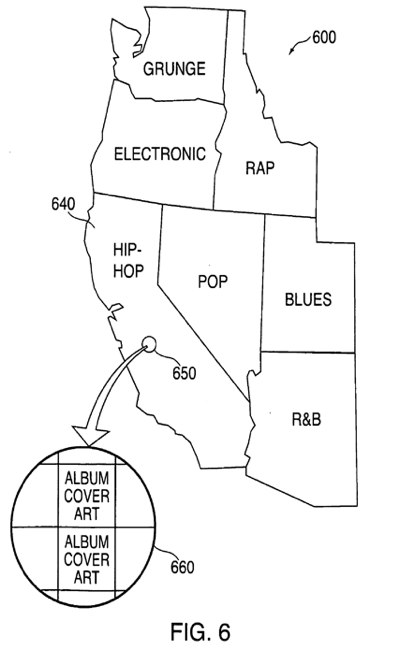
Meanwhile maps could be used to pinpoint where exactly the music comes from, or alternatively the original source of genre types. Whether we'll actually see something like this on a future iPod or iPhone remains to be seen, but with Apple's choice of mobile processors becoming more powerful with each generation, it's not hard to imagine them using some of that grunt to drive more graphically intensive UIs.
