Apple Photos Hands-On: Yosemite's iCloud-Loving Image App
Goodbye iPhoto, hello Photos. Apple has revealed a new, cloud-centric photo management and editing app for OS X Yosemite, recognizing the changing ways people take and organize photos, and the rise of the smartphone camera. Built completely afresh, Photos is set to be baked into OS X Yosemite 10.10.3, due for release this spring, but will be offered in the developer build from today. Most critically, with iPhotos and, also confirmed today, Aperture being given their retirement papers, Photos wants to satisfy both novice and expert photographers alike. I've been taking an early look, to see if Apple really has struck the perfect balance between usability and functionality.
Photos is clearly of the Yosemite school of design. The toolbar has been pared back to a few navigation buttons, tabs for Photos, Shared, Albums, and Projects, then sharing and search, leaving the bulk of the interface for photos and videos themselves. There, Photos matches the same UI as is familiar from iOS, sorting content into Moments, Collections, and Years.

That continuity of design is important, since Photos is intended to deliver pretty much the same user experience whether you're using the new desktop app or an iPhone or iPad.
Connecting the dots is iCloud, and while it's an optional part of the Photos experience, it's nonetheless how Apple expects most people to use the software. Rather than store all the photos locally, iCloud Photo Library keeps a single database in the cloud, preserving their original resolution and format (including RAW).

Photos on your Mac, therefore, caches a copy of that cloud library locally – for speed and offline convenience – but any changes you make are synchronized with iCloud and automatically pushed to any other device logged into the same account. Similarly, if you take a photo with your iPhone or iPad, it'll automatically show up in your Photos library on your Mac (though it'll wait until you have a WiFi connection first), and if you don't have any of those devices with you, you can sign in at iCloud.com and browse them there.
It sounds simple, but as far as I know this is the first, fully unified native/cloud photo editing and sharing system across multiple platforms. Other companies have tried different aspects of it – Eye-Fi, for instance, has been pushing the multi-device sync angle of late – but with iCloud so completely integrated with OS X and iOS, it has the edge.

To be entirely honest, though, most of the time you don't even realize that iCloud is there – and that's a good thing. There's zero lag when browsing through huge galleries, either when using the arrow keys or by scrubbing across the thumbnails with the cursor and checking out the pop-up previews, though you can also see shots auto-organized by the location they were taken on a map.
You can obviously organize shots into your own albums, but Photos does some of that automatically, picking out Faces, those last imported or marked as favorites, panoramas, slo-mo, burst shots, and videos. If you've already been using iPhoto or Aperture, you can import your existing libraries straight into Photos, complete with albums, recognized faces, and even undo-steps for any edits you may have made. Interestingly, you can still open up the library in iPhoto afterwards, if you're feeling nostalgic, though any edits won't be automatically synchronized.

In the background, Photos and iCloud are figuring out what should be on your device and what can safely remain in the cloud. Given the size of many peoples' photos and video libraries, I was a little concerned that those with a 16GB iPhone could quickly see it inundated with full-res content, but it's actually a little more nuanced than that.
The thumbnails are cached first, and then after that it all depends on size, timeliness, and frequency of access. The most recent photos and videos – either those just captured, or those recently edited or marked as favorites – will be kept on each device, in their original format, for as long as the local storage allows.
As that local storage decreases, however, library size is trimmed down, and the full shots are only downloaded when the thumbnail is clicked. Apple is still working on refining the algorithm that decides what gets downloaded, when, and for how long, ahead of Photos' full release in the coming months.

Already working well are the built-in editing tools, and what I'm already particularly impressed by is how Photos balances ease of use for those people who just want to "make this picture better" while also having more granular controls accessible.
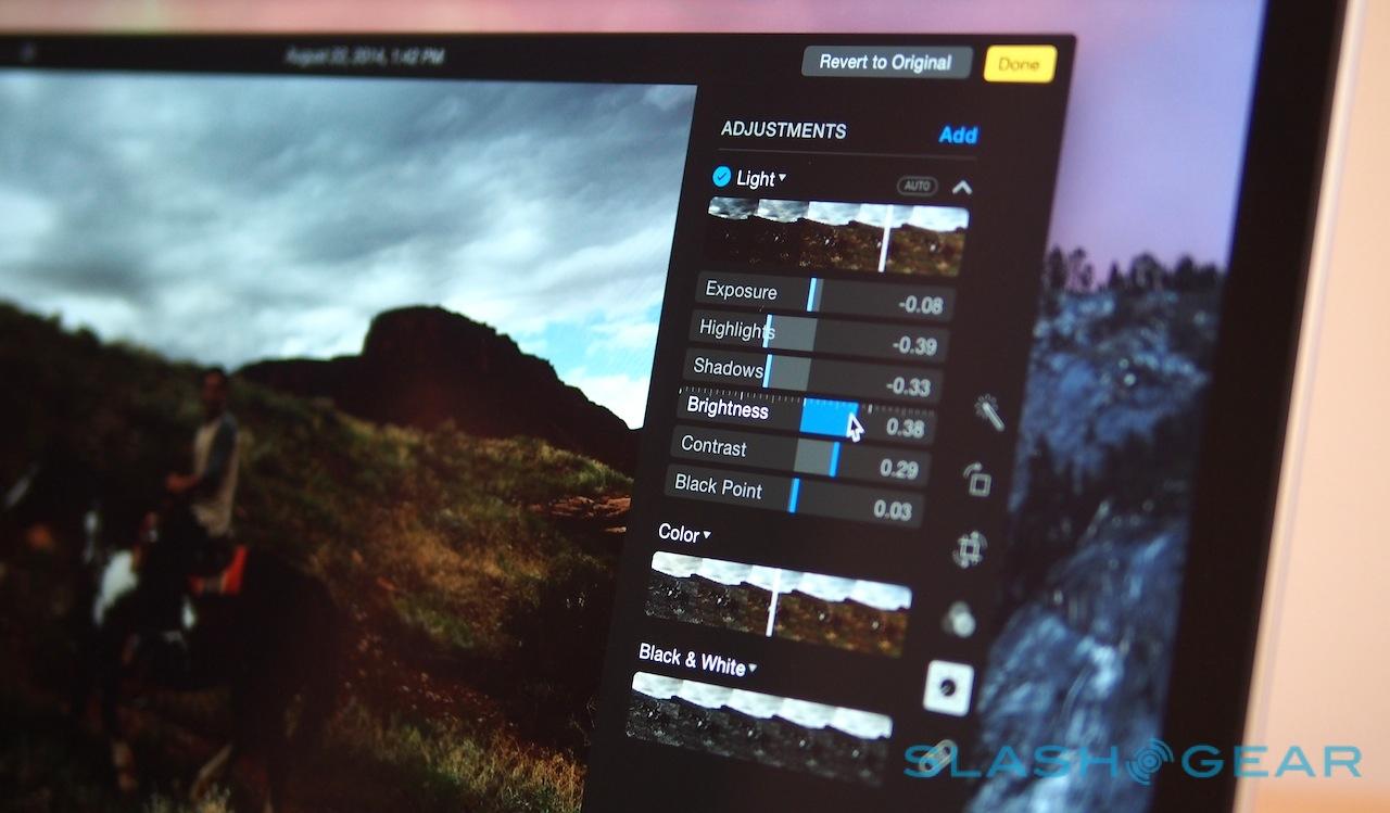
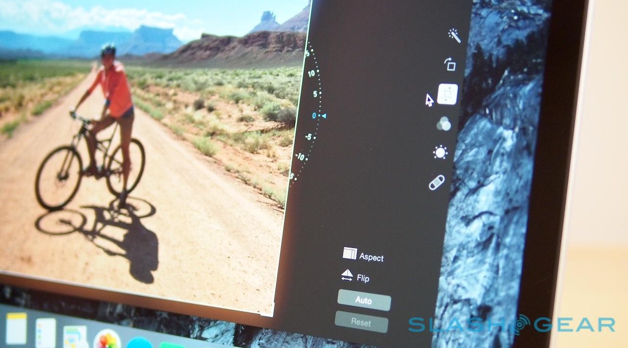
By default, you have options to "Enhance", rotate, crop, add filters, adjust individual settings, retouch, and deal with red-eye. Most offer a one-click fix: Enhance automatically fiddles the white balance, color, and light, for instance, while auto-crop not only tries to figure out the right orientation based on the horizon, but takes the rule-of-thirds into account to make sure the framing is pleasing, too.
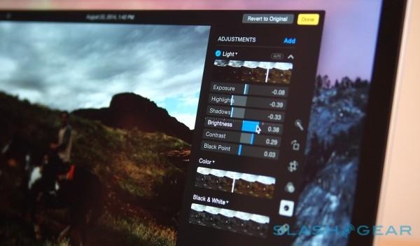
Click through into adjust, meanwhile, and there are simple sliders to tackle the most common complaints: a photo is too dark, maybe, or the colors aren't popping, or you want it to be black & white and super-contrasty. Dragging each actually plays with a number of criteria – changing brightness, for instance, is actually balancing exposure, highlights, shadows, and more behind the scenes – and if you want you can expand the dialog and tweak each component individually.

Photos goes a step further, too. You can add histograms to the UI, for instance, or get controls for vignettes, noise reduction, levels, and sharpness. The individual settings adjust in real-time as you use the automatic option, so if you really cared you could see just what Photos was doing in the background and then try it yourself later.
An original version of the photo is saved, of course, but the edited version is automatically synchronized through iCloud: you basically see the photo change automatically on any other device synchronizing with that library. That also means you can undo those changes from any other device, and iOS and OS X's native sharing tools are built-in for easily swapping photo sets with others.
Apple has also brought its photo books service more tightly into the fold, with a dedicated Projects tab in Photos offering a birds-eye view of the layouts of printed books and cards. There's a new 8x8 and 10x10 inch square book option – with both hard and soft covers – and new panoramic prints of up to 36-inches wide. The latter are automatically sized to use as much of the original photo as possible, without any blank space on the print.

I'll confess, I'd fallen out of love with iPhoto some versions of OS X ago. Its UI seemed increasingly clunky compared to other apps and devices, and its focus on importing photos from a camera rather than wireless synchronizing them didn't seem to tally with how my phone has become my primary camera.
Photos has two advantages there out of the gate, and it's both faster and easier to use than the software it replaces. The editing options are particularly well implemented: sometimes you just want a quick fix, and other times you're willing to spend a little longer to coax out better results, and from my early experience Photos seems to satisfy both.

There's also plenty of potential. Apple isn't intending this to be a family library – you still need to do explicit shares of photos and videos you want others to have access to – but I can envisage group galleries of things like trips and concerts, all pulling from multiple devices, being a real enhancement. Yes, there's Photostream and iCloud shared albums, but being able to create trusted contacts or flag particular locations or events and see those shots appear collectively would be great.
I'll have more on Photos as I get to grips with it over the coming weeks, and if you've got a developer account, you can access the new OS X Yosemite 10.10.3 beta today. The full release – which, in keeping with other recent Apple OS upgrades, will be free – is expected sometime in Spring 2015.


