MacBook Pro With Touch Bar Review (late-2016)
- DCI-P3 compatible Retina Display looks fantastic
- Graphics performance improved
- Touch Bar shows promise
- Thunderbolt 3 is fast and flexible
- Touch ID is convenient
- Expensive
- Intel's 7th-gen processors aren't available
- Dearth of legacy ports means dongles are a must
- Touch Bar isn't a must-have yet
Anticipation is a dangerous thing, and expectations around the long-awaited redesign of the Apple MacBook Pro for late 2016 were almost preternaturally high. Beloved workhorse of graphic designers, video editors, coders, and others wedded to the macOS ecosystem, any change to the MacBook Pro was going to be contentious. All the same, even stoic, self-confident Apple was seemingly rocked by the fierce reaction to features like Thunderbolt 3 and the brand new Touch Bar.
Why not a full touchscreen? Why have you abandoned the legacy ports? Why make it thinner when pro-users care about power? Why aren't the processor and graphics the very fastest, most cutting-edge? Why is memory limited to 16GB at most? Why are you forcing the MacBook's keyboard on us?
Amid it all, a common theme: Apple has forgotten the "Professional" in recreating the MacBook Pro. In a keynote filled with DJs, and family galleries in Photos, and Touch Bar access to emojis, was this new notebook no longer the machine of choice for the work-horse pro?
Hardware and Design
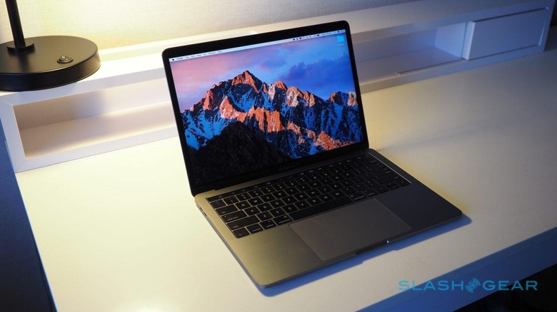
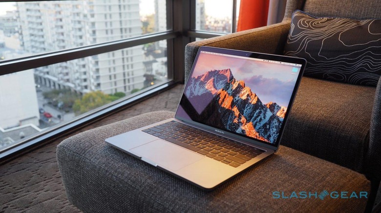
Familiar and yet different. At first glance you can't confuse the MacBook Pro with anything else, but look closer and the differences this time around start to make themselves noticed. Biggest change for this new version is the addition of a second color, the same Space Gray as the 12-inch MacBook is offered in, alongside the original Silver. No sign of Rose Gold, however, and though Jet Black would be eye-catching, it'd also be a sea of scratches after one trip in your bag.
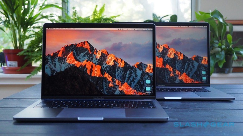
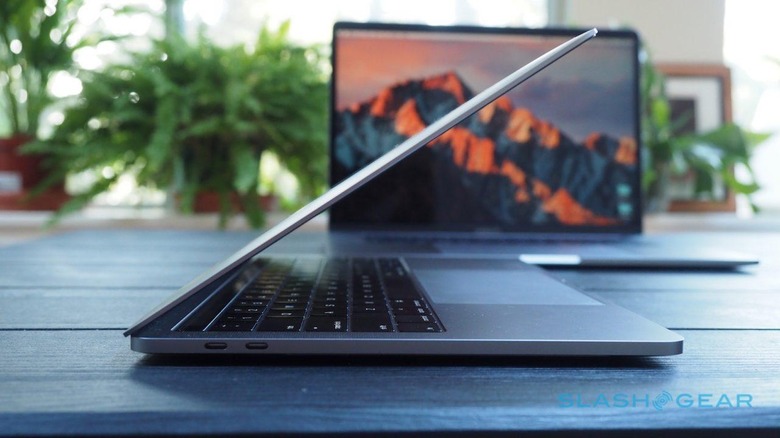
Thickness and weight are down. The old 13-inch MacBook Pro was 3.48 pounds and 0.71-inches thick; its replacement is 3.02 pounds and 0.59-inches thick. Meanwhile the old 15-inch MacBook Pro was 4.49 pounds and 0.71-inches thick, which drops to 4.02 pounds and 0.61-inches with the new model.
As has been Apple's way for the past few generations, user-upgrades aren't encouraged. If you get the base panel off, you'll find processor and memory are of course soldered in. Unexpectedly, the PCIe storage is removable, but since it uses a custom SSD controller we'll have to wait and see whether third-party suppliers will be allowed to offer replacements.
Specifications and Performance
In what's become a fairly full desktop, I've had all three main versions of the new MacBook Pro on hand for testing. The $1,499 entry-level model, which lacks the Touch Bar, has a 2.0 GHz dual-core Core i5 and Intel Iris Graphics 540. It's paired with 8GB of 1866 MHz LPDDR3 memory (16GB is an option) and a 256GB PCIe SSD (512GB/1TB are options).
The 13-inch MacBook Pro with Touch Bar has a 2.9 GHz dual-core Core i5 and Intel Iris Graphics 550, for $1,799. It's paired with 8GB of faster, 2133 MHz LPDDR3 memory (again, 16GB is an option) and a 256GB PCIe SSD (with the same 512GB/1TB options). Both versions can be configured with Core i7 processors, up to 3.3 GHz.
Finally, there's a 15-inch MacBook Pro, with a 2.6 GHz quad-core Core i7 processor and both Intel HD Graphics 530 and AMD Radeon Pro 450 2GB graphics, priced at $2,399. It has 16GB of 2133 MHz LPDDR3 memory as standard, along with a 256GB PCIe SSD (with up to 2TB options). The fastest processor in the largest MacBook Pro is a 2.9 GHz Core i7 quad-core.
Faster hardware has been top of the wishlist for MacBook Pro fans for some time, though Apple's decisions haven't been met with universal acclaim. Since Intel's very latest 7th-generation "Kaby Lake" processors aren't available in anything other than the ultra-low-voltage form Apple used in the 2016 12-inch MacBook update, and so it stuck with "Skylake". Dual-core and quad-core "Kaby Lake" chips will arrive in 2017, Intel says, though when they might show up inside a MacBook Pro remains to be seen.
The second controversy is memory. Even a fully maxed-out 15-inch MacBook Pro – which will set you back a cool $4,299 – can't be had with more than 16GB of RAM. Whether you have 8GB or 16GB, it's LPDDR3 not the newer, faster LPDDR4: Apple says that's a power usage decision made in combination with using the "Skylake" chips.
Benchmarks, of course, only tell part of the story, but they're useful in contrasting between the three variations of notebook I have here. Geekbench 3's results aren't too surprising, though there's clearly not a huge processing jump from going from the 2.0 GHz Core i5 dual-core to its 2.9 GHz sibling. The 15-inch's extra cores play their hand, meanwhile, though performance on paper is still comparable to the old version.
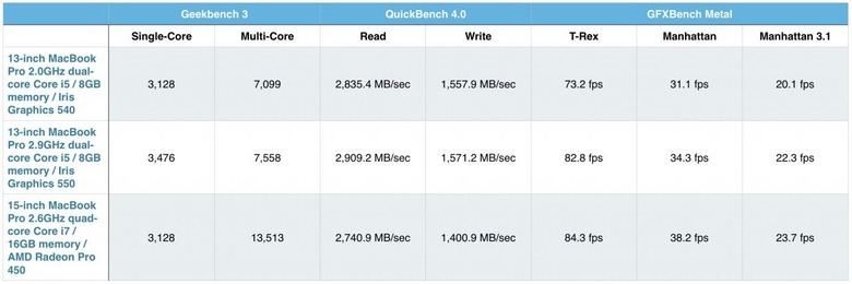
Apple has been pushing faster and faster solid-state storage in its notebooks for some generations now, and the new MacBook Pro line-up is no exception. Benchmark speeds were pretty consistent across all three models in QuickBench 4.0, hitting a hefty 2,909.2 MB/sec read and 1,571.2 MB/sec write at their fastest. Yes, Apple charges a fair amount to climb up through its SSD storage, but you can't argue with the performance.
Finally, there's graphics. Again, Apple has come in for some criticism with its choices of GPU, specifically the discrete Radeon chips in the 15-inch MacBook Pro, which aren't the very fastest in AMD's line-up. All get Intel Iris graphics too, and they hold up well in the 13-inch notebooks in comparison to the outgoing model.
Gains from the Radeon Pro 450 with its dedicated 2GB of memory aren't vast; it's worth remembering that this is the entry-level discrete GPU in Apple's lineup. Even so, it's a noticeable step up from the old machines. None of the new MacBook Pro models should be your first choice for graphics-intensive gaming – nothing new there – and those looking for the very fastest mobile GPU performance will still need to look to Windows notebooks, but all three are capable when it comes to video rendering, CAD and graphic design, and other such tasks.
Display and Speakers
Apple has stuck with its Retina-class resolution on both the 13-inch and 15-inch notebooks, the smaller using a 2560 x 1600 panel and the larger a 2880 x 1800 panel. Because of the way those screens work – by default, at least – you get a smoother 1440 x 900 on the 13-inch and 1680 x 1050 on the 15-inch. What's new this time around is brightness, contrast, and color quality.
For a start, brightness has climbed from 300 nits of the old model to 500 nits on the new. That means outdoor visibility is significantly improved, as well as screen legibility when dealing with reflections. The contrast ratio improvement helps too, now at 1,500:1 versus the 900:1 of the old LCD.
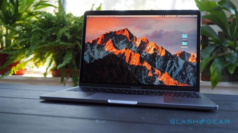
Finally, there's support for the DCI-P3 color space, which Apple has made such a big deal of in the recent iMac 5K and iPhone 7. In short, it means 25-percent more visible colors than with the old model, though reds and greens benefit particularly. Of course, you'll also need DCI-P3 compliant images to actually tell the difference: luckily, the iPhone 7 shoots them, while if your standalone digital camera doesn't produce them with its in-camera JPEG rendering, you can always edit them from RAW.
Of course, many people prefer to use an external display, and that's covered too. Courtesy of Thunderbolt 3 – more on which in the next section – you can drive as many as two 5K screens from the 15-inch MacBook Pro. The 13-inch isn't quite as powerful, but can still handle a single 5K display or two 4K displays.
Right now, native Thunderbolt 3 displays aren't especially common, and Apple hasn't replaced the discontinued Thunderbolt Display with a new version. Instead, it's pushing LG's UltraFine 5K and 4K screens, at 27- and 21.5-inches, which are $974 and $524 respectively until the end of the year. Unfortunately I've not been able to test them out yet.
Apple is particularly proud of the speakers on the new MacBook Pros, boasting of twice the dynamic range. They definitely sound better than the system on the old notebook, particularly in the case of the 15-inch which has a surprising amount of power to fill a room. Part of the difference, I'm told, is that the speaker system is wired directly into the system power now, for triple the peak power of the old approach which used an intermediary converter.
Physics only lets you get away with so much, of course, and while things sound balanced across the frequency range at low to medium volume, the bass starts to get overshadowed by treble and upper-mids at the upper end of the range.
Thunderbolt 3 and USB-C
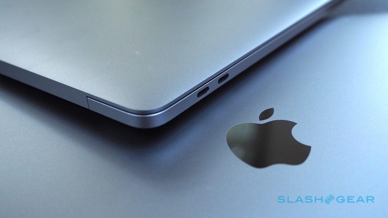
If the processor, memory, and graphics decisions Apple made are the internal cause of the new MacBook Pro furore, the choice to ditch almost all of the legacy ports is the external trigger. Gone is MagSafe 2, and USB 3.1, and Thunderbolt 2, and HDMI, and the SD card slot. In there place, you have Thunderbolt 3 using the USB Type-C connector.
The entry-level 13-inch MacBook Pro – the one without the Touch Bar – gets two such ports. Any Touch Bar-equipped model doubles that to four. The 3.5mm headphone jack lingers on the right edge, quietly taunting iPhone 7 owners.
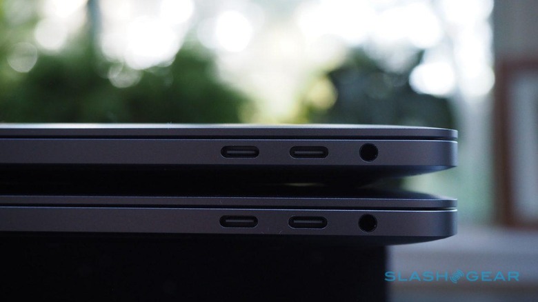
Few disagree that Thunderbolt 3 and USB-C is the port of the future. Its advantage is its speed and flexibility: one single cable can deliver power, data, and display signals all at the same time. It's fast, with up to 40 Gbit/sec data rates on paper at least, and backward compatible with USB 3.1 gen 2 (which maxes out at 10 Gbit/sec). Like Lightning, there's no "right side up" and you can plug it in either way. Unusually, it's bidirectional: the same port that one moment was drawing power from a hub, can the next minute be supplying power to an external hard-drive or other peripheral.
In short, Apple fans would've been livid had Apple not included it on the new MacBook Pro. Instead, they're just furious that Apple has embraced Thunderbolt 3 so enthusiastically. While it may be compatible with many of the ports we've grown used to over the past years, that requires adapters and dongles.
Need to plug in a USB Type-A device? You'll need a dongle. Want to connect your HDMI TV, or your VGA projector? You'll need a dongle. Need a port for wired ethernet? You guessed it, you need a dongle.
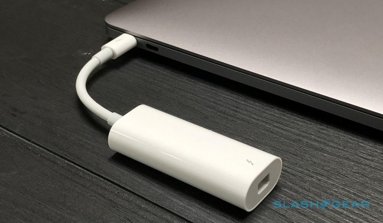
I'm a 12-inch MacBook user and have been since the first-gen model in early 2015. I mention that to make it clear that I've been living the USB-C-only lifestyle for some time now, and with just a single port. Along the way I've found some of the frustrations I expected to be less significant than I thought they'd be, and vice-versa.
Adapters have become a part of my daily life. Most commonly, that's because I need to import photos and videos from the SD card in my camera; I have a small card reader and Apple's USB Type-A to Type-C dongle in my bag. Unplugged, the latter can be used to read USB drives, or connect to scanners or non-wireless printers.
Would it be great to be able to plug everything in natively? Sure, though I think I thought something along the same lines back when floppy drives and CD drives and DVD drives rose and fell in popularity. Even the previous MacBook Pro with Retina display, which many are looking at with renewed fondness now, demanded I carry a Thunderbolt 2 ethernet adapter just-in-case.
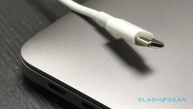
Personally, when it comes to adopting Thunderbolt 3 wholeheartedly I suspect Apple would've been damned if they did and damned if they didn't. This commitment to the USB Type-C connector is exactly what the port needs for peripheral and accessory makers to take the transition seriously: I think we'll see more USB-C devices, at a faster rate, as a result. Had Apple just switched the Thunderbolt 2 ports on the old MacBook Pro to Thunderbolt 3, and left the legacy connectors in place, we'd be complaining that the new standard was slow to gain traction.
All the same, Apple could've handled this transition better. The fact that you're paying upwards of $1.5k for a notebook and don't get a USB Type-A to Type-C adapter in the box seems miserly: sure, Apple sells them now for nine bucks apiece, but it's galling nonetheless. We're yet to see a compelling USB-C/Thunderbolt 3 hub from the Cupertino firm either; I've been carrying Huawei's, but reports from the Wild West of third-party options, many of which prove to be compromised in any number of ways, show the confusion Apple has dumped its users into.
I suspect Apple has held off from addressing that situation because it expects it to go away in time. That's probably true. All the same, right now for every moment of pleasure at plugging in a single 5K Thunderbolt 3 display and also having your MacBook Pro powered and hooked up to a row of extra ports for data, there's the sting of "hang on, where's my Type-A connector gone?" frustration.
Touch Bar
As someone who has used macOS for a reasonable number of years now, my fingers have picked up a fair few shortcuts along the way. Some, like command+S for save, or command+T for a new tab, or command+F for find have become second nature: my fingers punch them out before my brain consciously thinks about them. Ironically, it's that which makes touchscreen notebooks less functional for me, since it's quicker to hit a key combination than it is to reach up, tap the display, and then bring my hand back down again.
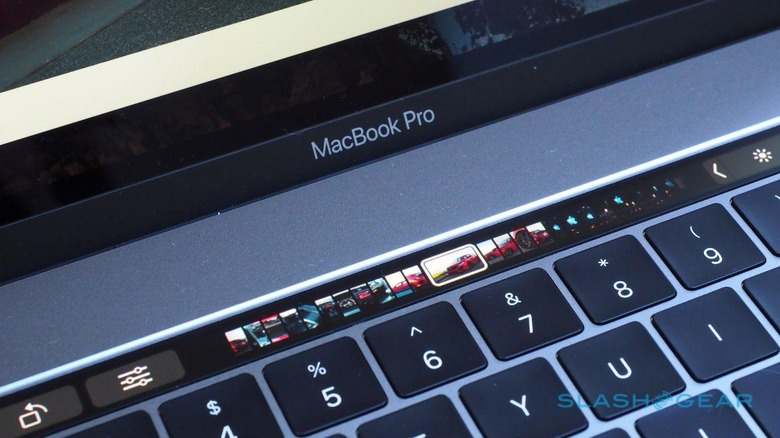
My first inclination was to force myself to stop using shortcuts and rely on the Touch Bar instead. That's harder than it first sounds, I discovered, not to mention fairly unproductive.
Just like setting up your iOS home screen, or choosing what apps to have in your macOS dock, it pays to spend a few minutes customizing the Touch Bar before you wade in. That's usually done in each individual app, where you get a selection of buttons you can drag down into the bar, or conversely drag those icons already present out. There's also a global setting for the default shortcuts which is accessed in the System Preferences. It'd be more convenient if you could see every Touch Bar layout from there, for each different app, but right now you have to switch between apps individually.
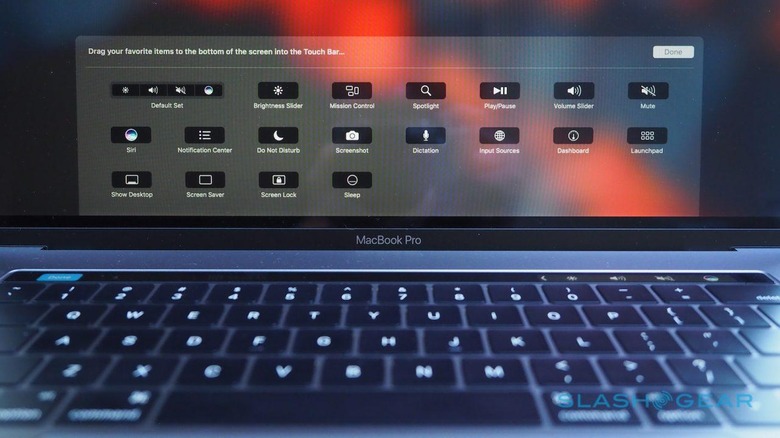
What surprised me was how quickly I got into the habit of using the Touch Bar, at least for certain tasks. Having switched back to Apple's Mail app – I'd usually rely on Gmail's browser interface, which also supports keyboard shortcuts – I found myself reaching up to stab the "Send" button on the Touch Bar alongside the escape key more often than not. In the Calendar app, being able to sweep through the weeks via the Touch Bar proved quicker than clicking through.
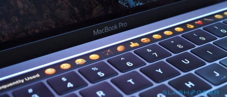
Some of Apple's more eye-catching demos are those that, ironically, don't work so well on the Touch Bar. Picking out emojis is fine if you're looking for one you frequently use – as on iOS, they're clustered at the start of the list – but actually going hunting for something different requires a whole lot of swiping. It's much easier to hit control+command+space and choose (or search) from there. Similarly, autocomplete when generally typing makes a lot less sense on a notebook than it does on an iPhone or iPad.
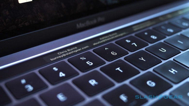
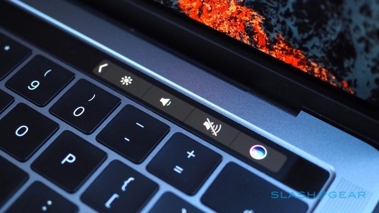
At times, it can actually be less convenient than the regular buttons were. In Spotify, for instance, shortcuts for media control are now two taps away – first you touch to expand the Control Strip of core commands, and then you can hit play/pause or skip tracks – though that's likely to become less of an issue as more developers add support.
I've used the Touch Bar more than I thought I did, though there are clearly some areas where improvement could be made. Some will presumably be addressed in time, like third-party apps which don't interact with the OLED strip at all. Others, though, depend on Apple choosing to embrace flexibility.
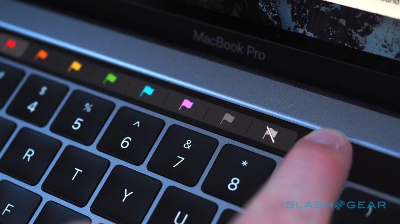
Right now, for instance, there's no way to assign macros to a Touch Bar button. You can't have a single button that automatically starts a new email and populates the To: box with preset recipients, or that creates a Pages document with certain styles and sections. I have Automator workflows set up to convert different image or document formats to JPEGs, but I can't assign them to the Touch Bar: all I have is Apple's selection of pre-approved buttons to choose between. The company tells me that it can't comment on what future integration might be added down the line.
A small handful of third-party apps will have Touch Bar support at launch – Apple says that includes Day One, Coda, and Pixelmator – while others, like Sketch, Photoshop, djay Pro, and OmniGraffle will be updated by the end of the year. Microsoft has committed to Touch Bar support in Office, Outlook, and Skype, while utilities like 1Password will also embrace the finger-strip.
That's fine if you live in standalone software, but plenty of our time is now spent in web apps. Unfortunately, while Apple has APIs for standalone software, apps that live in the browser don't get to play. Similarly, there was a conscious decision made not to allow notifications to break into the Touch Bar in any way: you can't have pop-up alerts on there, like a ticker tape machine, and nor can you interact with shortcuts in macOS notifications like delete or reply.
Overall, though, I'm curious to see how the Touch Bar fares once more people get their fingers on it. After you let go of the idea that it's a baby-step toward a full touch display, and instead a third type of interface alongside keyboard and trackpad, it becomes a case of finding the moment it suddenly chimes with how you use macOS. If you really decide you don't like it, meanwhile, you can set the Touch Bar to only show the function keys by default. Holding down the "Fn" button brings those old-school keys up temporarily, too.
Touch ID
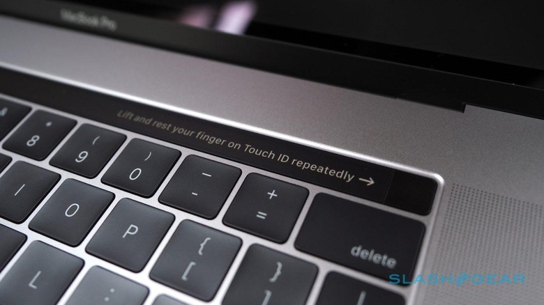
Apple's fingerprint sensor technology has at last made the jump from iOS to macOS, and it does much the same as the home button on the iPhone and iPad does today. Register your fingertip – up to five can be stored, though only at most three per user account – and tapping the square to the right of the Touch Bar will unlock your Mac and log you in. If you have more than one account set up, fingerprints can be used to switch between them.
Again, as on the iPhone, you can optionally use Touch ID to authenticate payments using Apple Pay, and purchases through iTunes and the App Store. If you set up locked notes, Touch ID can be used to unlock them again. APIs for third-party developers will mean other software should be able to do similar things down the line, though right now I couldn't find anything else which allowed me to log in via fingerprint.
It's one of those things that, after you've lived with it for a brief time, it's jarring to go back to passwords. I'm in the habit of locking my Mac whenever I leave it: with Touch ID it's less than a second and I'm back into the system – you don't even have to wake the screen separately first; just tapping the scanner takes you straight to whatever you were working on last – in contrast to having to punch in a password multiple times a day.
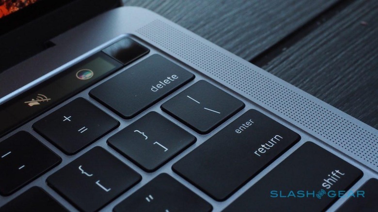
Apple has a new chip – the Apple T1 – which it uses to store fingerprint data and payment information securely. It's actually a surprisingly clever little chunk of silicon, in some ways more akin to a smartwatch than anything else, but the key element is the Secure Enclave. That's what encrypts your fingerprints and card information, tokenizing it rather than sharing it with apps and web-based stores.
The Touch ID square is actually a button, though you don't have to actually press it for your fingerprint to register, just rest it on top. Hold it down and it acts as a physical power button – it's also how you can restart in the case of a system crash – though you rarely have to use it. Just opening the lid of the notebook boots/resumes it.
In the process, Apple also removed the startup tone. I'm not entirely sure why that has prompted such an outpouring of sentiment, perhaps it's port requiem overspill.
Keyboard and Force Touch trackpad
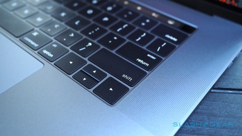
It's not just down to the Thunderbolt 3 switch that helped Apple make the new MacBook Pro thinner: the "butterfly mechanism" keyboard played a part, too. It also triggered a few groans from those familiar with – but not a fan of – the keyboard on the 12-inch MacBook, which was Apple's first play with the new mechanism. Happily for those skeptics, things are a little different second time around.
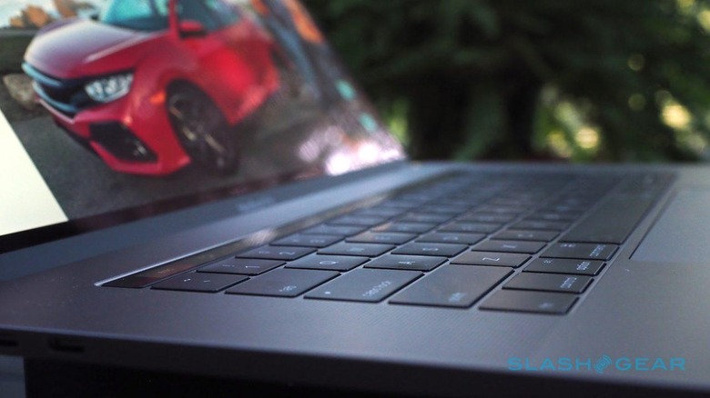
Though I'm personally a fan of the MacBook keyboard, I can understand why some people struggle with it. Though the company points out that each individual key is more stable, travel is much reduced in comparison to Apple's old 'board. That takes some getting used to.
On the MacBook Pro, travel is the same half-millimeter but the underlying dome switch is different. That may not sound like much, but it gives the keys far more "pop" as you strike them: it actually feels like they're moving more than they really are. Side by side with the 12-inch MacBook, it's a noticeable improvement.
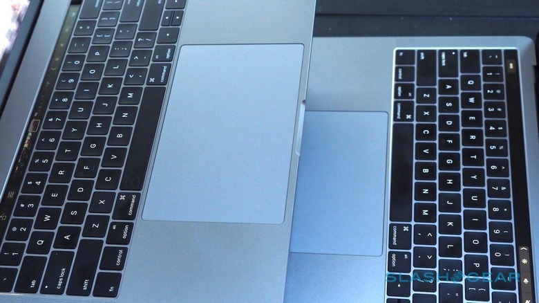
Just as the keycaps are larger on the new MacBook Pro, so the Force Touch trackpads have grown. On the 13-inch models it's now around 6.25-inches diagonal; the 15-inch is even bigger, at a vast 7.25-inches. As we've seen before, they provide the sensation of a click even though it's actually simulated – you can choose between light, medium, and firm sensations in the settings – which takes a little getting used to at first, but quickly becomes second nature.
All that extra room makes macOS gestures easier, and there's less swipe-and-lift involved in general navigation. I was a little worried about palm-rejection, given the size of the trackpad means there's a reasonable chance some part of your hand or wrist might be resting on it at times, but Apple's improved algorithms there have seemingly done the trick, and I've not noticed any issues. Its sheer size does make me wish that Apple had added Pencil compatibility for repurposing the trackpad as a graphics tablet.
Battery
After all the changes, Apple's commitment to a promised 10 hours of battery life is one of the few carry-overs from the old MacBook Pro. That's 10 hours of wireless web browsing, mind, or iTunes movie playback, both at 75-percent brightness. Actual battery size varies of course, though it's interesting to note that, because it doesn't have the Touch Bar to accommodate, the entry-level 13-inch has a slightly larger battery than its more expensive but identically-sized sibling.
My own testing suggests that 10 hour figure is pretty accurate, and even too conservative by an hour or so. It's very dependent on not only how much you're stressing the system but what apps you're using, however. If you're a Safari user then you're going to see much better results than if you prefer Chrome, for instance. Even if you're just browsing, it can mean the difference of a couple of hours.
Push things harder, such as doing 4K video processing, and you'll spend far less time away from the outlet. It took 11 minutes for iMovie to export a 10 minute 4K video on the 15-inch MacBook Pro, for instance. During that time, the battery dropped by 10-percent.
As for recharging, Apple supplies a 65W adapter with the 13-inch MacBook Pro, while the larger model gets an 87W adapter. There's no extension cable – it plugs directly into your outlet – though you can buy one separately, and there aren't the flip-out arms to wrap the cable around, either. Other USB Type-C devices, like Google's Pixel phones, are happy to recharge from them too.
Wrap-Up
Has Apple forgotten the professionals which are arguably its most vocal advocates? I don't think that's true, though I do suspect that group now finds itself at the fringe of MacBook Pro users. Such is the side-effect of a user group in general expanding.
Ergonomically, I'm among those still content with a non-touch primary display. My experience with the Touch Bar, meanwhile, has left me mighty curious to see what comes next as third-party developers get to grips with the potential of the added interface. Right now, a large part of its usefulness is in replicating keyboard shortcuts: that's handy if you're unfamiliar with them, but it's no great surprise that longtime Mac users have been less wowed.
That doesn't mean there's not plenty of potential for a small, full-color display that leaves your primary screen uncluttered and allows you to manipulate tools with one hand while you use the trackpad with the other. Just as Thunderbolt 3 needs time to gain traction, so the Touch Bar is dependent on third-party support and imagination to really come into its own. Life on the cutting edge is, inevitably, something of a gamble as you wait for everyone else to catch up.
I can't help but imagine a 2017 MacBook Pro with Kaby Lake processors and several months of developers getting to grips with the potential of Touch ID and the Touch Bar. As it stands today, though, the dongle frustration and the fact that you really need to pay $1799 or more – the entry-level 13-inch misses out too much, in my opinion, to be worth considering – are outweighed by the improvements in graphics, the excellent build quality, and the promise its unique hardware coupled with macOS represents.
