Android Navigation Buttons Rumored For Yet Another Change
Android's navigation buttons are almost the perfect example of what user interfaces should be. They should be near invisible to the user's mind, not requiring conscious thought to use. They really only get noticed when things break or change. The latter will seem to be the case according to a recent insider tip. According to the source, Google will be introducing visual changes to the navigation bar icons that will go beyond just subtle aesthetic tweaks. It could, however, also be a prefiguring of behavior changes.
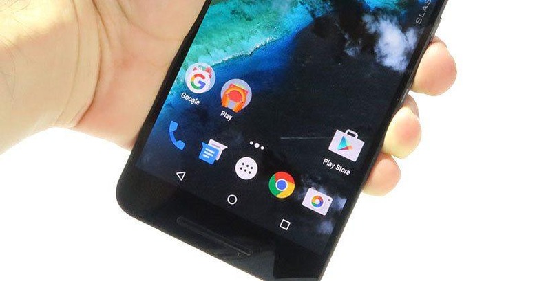
The most recent, and biggest, change Google did for Android's navigation buttons happened way back in Android 5.0 Lollipop. That was in line with Google's push of its new Material Design, moving away from its previous Holo theme. The icons retained their hollow appearances but were simplified to the very basic polygonal shapes of a triangle for Back, circle for Home, and square for multi-tasking/recent apps.
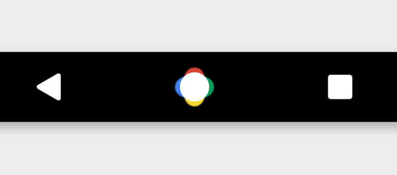
According to the leak, Android N will keep the shapes but, this time around, fill in the shapes with solid colors, mostly white in this case. That's going to be a very conspicuous change that has some already talking about possible burn-in problems. Still an issue even with today's advanced technologies, burn-in happens when the same image is displayed in the exact same spot for prolonged periods of time. Which precisely describes the navigation icons.
There is, however, one other change that might actually be more debated. The circular home button will apparently also show Google's four-color scheme. Somehow. Aside from that, the icon will supposedly also animate when you press and hold on it, with the colors arranging themselves in a row. It's a rather puzzling description, but one that does have basis in current Android implementation. On devices that use on-screen navigation buttons, when you tap and hold and then swipe up from the Home button, you bring up circles linked to actions, primarily Google Now. This could be an indication that Google has something bigger planned for that feature.

Or Google could just be playing around with the design, until it's finally set in stone. Which shouldn't actually be long now. Based on Google's self-imposed schedule, Android N is close to its Q3 release date, with a Preview 5 slated to land sometime next month.
VIA: Android Police
