Android 3.0 Honeycomb Hands-On [Motorola XOOM]
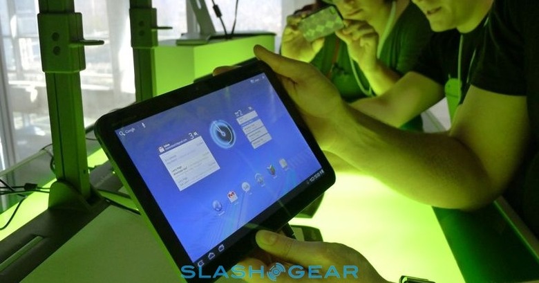
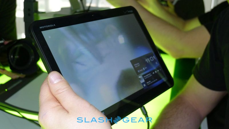
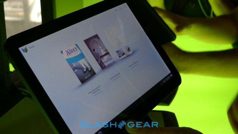
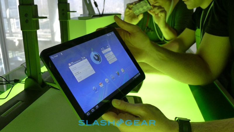
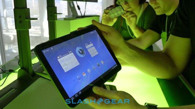
Google has just finished officially launching Android 3.0 Honeycomb, and we wasted no time in grabbing some hands-on experience with the tablet-centric OS on Motorola's XOOM slate. Unveiled back at CES 2011 the XOOM has a 10.1-inch display, dual-core 1GHz Tegra 2 processor and will debut on Verizon's network imminently. Read on for our first impressions of Honeycomb.
We've already had a chance to look at the XOOM, albeit relatively briefly with Honeycomb in its pre-launch demo state, and we've gone in-depth with Android 3.0 in our Android Community Preview Guide. What neither of those could show is just how smooth the new OS runs on the Tegra 2 hardware.
Android 3.0 Honeycomb demo!
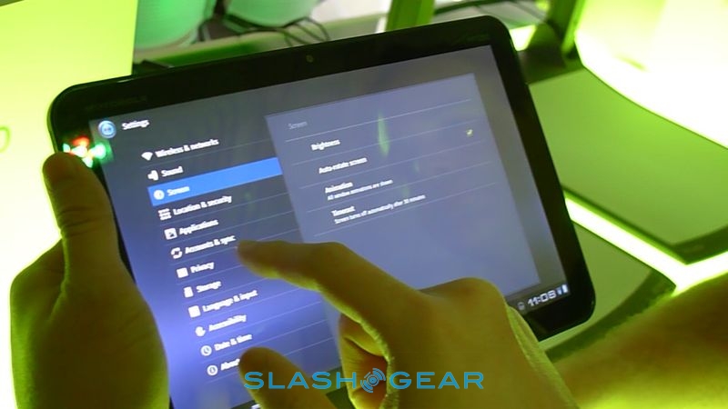
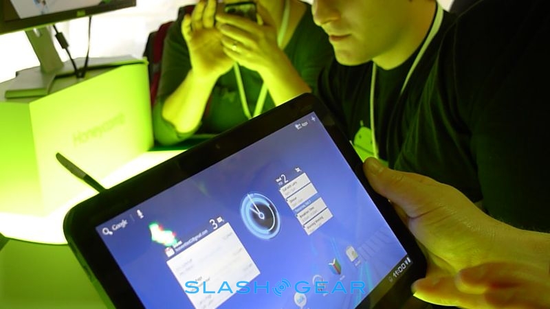
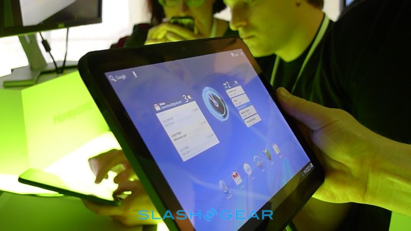
Where Froyo on the Galaxy Tab can feel labored at times, there's none of that with Honeycomb. The "holographic" UI sandwiches applications between the narrow action bar at the top of the screen (with contextual menus and quick access to widgets) and the system bar at the bottom (with notifications and soft navigation buttons, since with Honeycomb Android no longer demands physic controls on the hardware).

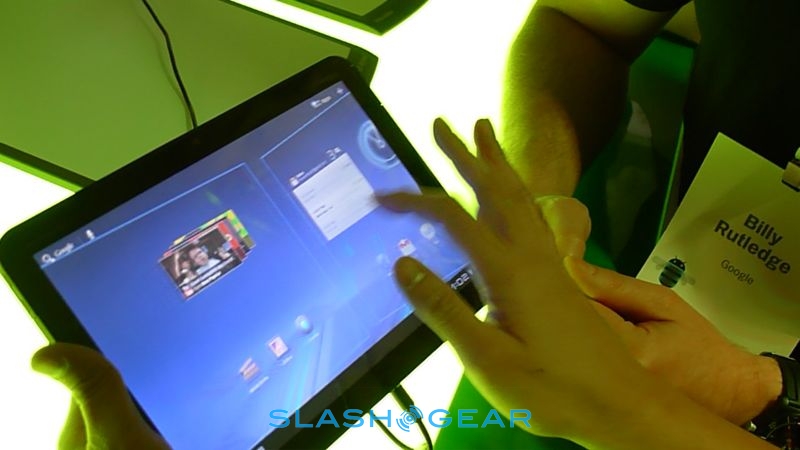
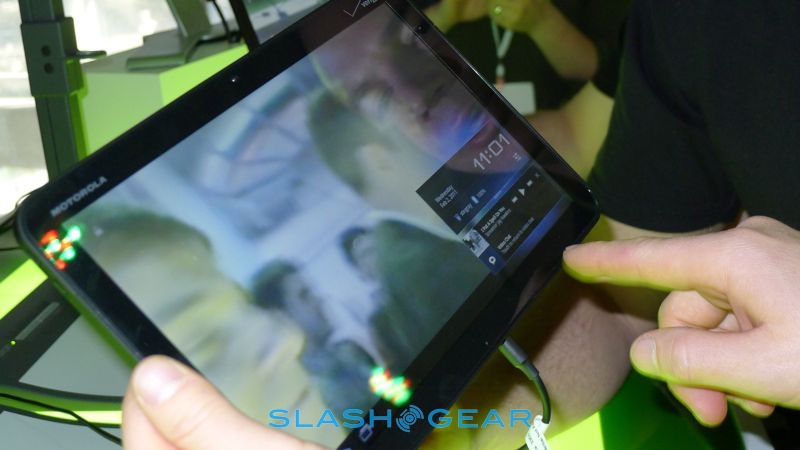
The bigger display also works well with Honeycomb's renewed focus on multitasking. Rather than the simple icon-driven app switcher of Android smartphones, a new Recent Apps option in system bar pulls up thumbnails of each program in the state you last left them. The notifications system also blurs the line between traditional pop-ups and widgets; for instance, social network updates like Twitter or Google Talk IMs include not only the text but the user icon, while music tracks have playback controls as well.
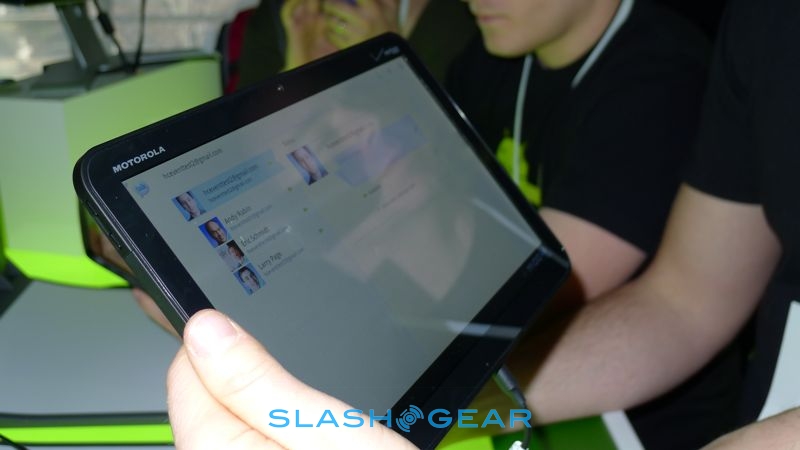
The Honeycomb Gmail app is particularly slick, a good example of Google's new paneled UI or, as it's being called, "application fragments." Controls are pushed to the action bar at the top, and by splitting the display into multiple segments, each rendered individually, the UI can dynamically suit different scale devices whether tablets or phones. All of the transitions are impressively smooth, using Google's new 3D engine and a "Render Script" graphics library

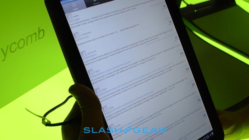
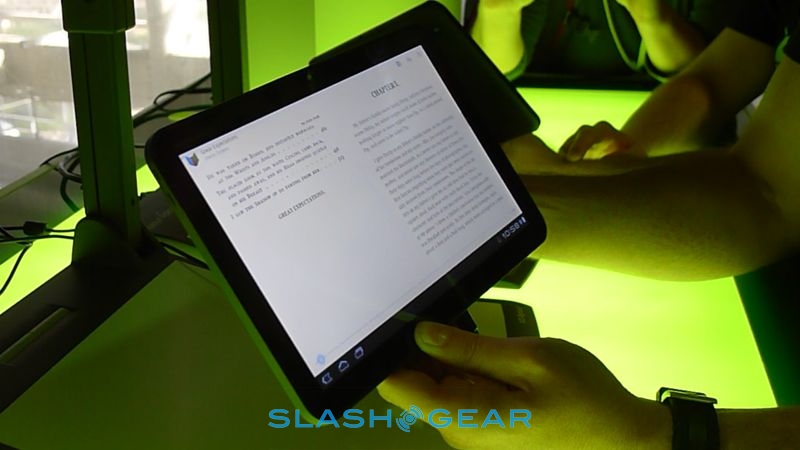
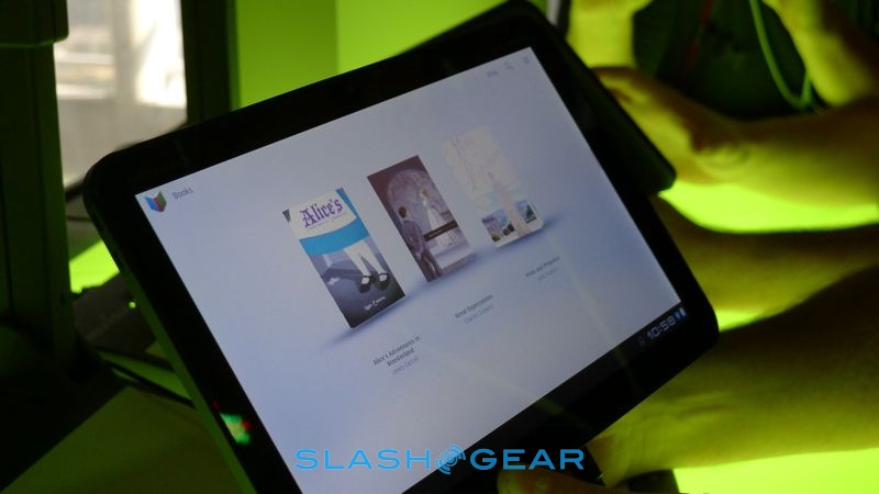
What Honeycomb – and the XOOM – shows is that Google wasn't joking when they said previous versions of Android weren't ready for tablet duty. 3.0 makes Froyo on the Galaxy Tab and other slates look half-baked. That existing Android apps should run well on the platform (assuming they were coded in keeping with Google's guidelines) is another strong point in Honeycomb's favor, and we had no problems loading up the Android Community app and having it scale perfectly on the XOOM. The new apps we've tried today, like Google Body and the new Google Talk video messaging, stand up well to what's available on other slates like the iPad.

It's early days for Android 3.0 Honeycomb, but this is certainly what's necessary for Google to bring real competition to Apple's iOS door.
Android Community App Demo on Android 3.0 Honeycomb XOOM device
[vms 3b03ae6d3f8540cd6362]
