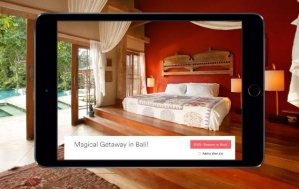
Airbnb Gives Android Tablet And iPad Users A Slick, New Interface
Airbnb decided that instead of simply scaling-up its mobile apps, it would completely design a new tablet interface from the ground up. The new apps boast a "cinematic" interface. The entire feel of the app is more like browsing through a thick, glossy travel magazine than searching through wordy hotel reviews. The new Airbnb apps for Android and iOS tablets give users more of what they want, pictures. Any armchair traveller knows the best part about looking at new travel destinations is the photographs. Sure, descriptions can excite the imagination, but a picture is worth a thousand words.
A new feature allow users to "dog-ear" pages, just like you would in your favorite guidebook. Once you've made a list of your favorite "must-see" places, you go back and narrow down which ones you actually have the time and money to see. Or, if you're lucky enough to have an open schedule and money to burn, hit every site on your bucket-list using the app.
The new layout aims to take all of the hassle out of planning a trip, and replace it with dreamy wanderlust. Hurdles like securing vacation days and a travel visa are placed far out of mind as you dream big and flip through photos of Airbnb destinations around the world.
Perhaps, the Airbnb team was inspired by Expedia's "sensual" travel app for Android and iOS. Its updated tablet app debuted last year, and as always, allows for for all-in-one bookings for flights, hotels, and rental cars.
You can get the app for Android at the Google Play store, and for iOS at the iTunes store.
