A Week With Windows 10: The Good, The Bad, And The Ugly
It seems almost surreal to think that it has already been a week since Microsoft unleashed Windows 10 to the world. Or at least to those not privy to Insider previews. In that short span of time, a lot has already been said about the latest, and supposedly the last, version of Windows. As expected, not all of them are good, but not all of them are bad either. Here are some of the top five things you can expect to experience when your time finally comes to upgrade.
The Good
1. Continuum
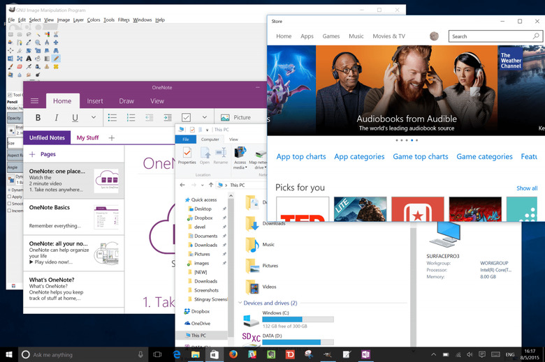
It should be no surprise that Windows 10's strongest feature is the one that Microsoft has been singing about all this time. Dubbed Continuum, it is an attempt to reconcile the disparate worlds of Windows 7 and Windows 8. In a more concrete sense, it means that there should be very little distinction between the regular "win32" apps and the touch-friendly "modern" apps. If you're in Desktop Mode, modern apps appear inside movable and resizable windows like any other. Conversely, when in Tablet Mode, win32 apps appear in fullscreen sessions of their own and not in a separate Desktop "window" like in Windows 8. Sure, there still exists a dichotomy between tablet and desktop and that's unlikely to go away. At least now each class of users have a choice which to choose by default, even forever if they wish. And for those that straddle both worlds, switching back and forth is as easy a touch of a button or an attachment or detachment of a keyboard.
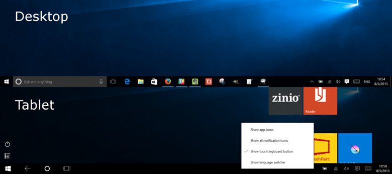
It isn't just windows and apps either. Continuum affects the panel and, of course, the Start Menu/Start Screen. In Desktop Mode, you get your regular taskbar with all the bells and whistles plus a semi-traditional Start Menu (more on that later). In Tablet Mode, the Start Screen is once again front and center. Interestingly, the taskbar actually remains in this mode, but shows fewer items and slightly different controls. You can, however, modify this to actually behave the same way as Desktop Mode. All it takes is a right-click/tap and hold gesture.
2. Cortana
Another no brainer, Cortana on the desktop is the first time one of the big three personal digital assistants is made officially on anything other than mobile. Now, you might wonder why you'd want Cortana on your desktop anyway. It's not like your phone where you'll be querying things all the time, right? Of course, Cortana does more than just react to what you say, actually offering up relevant information when and where you need it, a bit like Google Now. This can range from, of course, the weather, your upcoming appointments, and even interesting news.
That said, Cortana also shines when you ask her something. What that "something" is almost limitless. She can do math, web queries, send e-mails by voice, etc. But probably the most important function is actually something not tied to Cortana and works even without her: search. No, not web search, though that works well too. In this case, searching for settings in order to immediately jump to the appropriate one. Given how messy the Settings situation is, as we'll see later, this is more than just a convenience. It's necessary for survival.
3. Action Center
Finally! No more wondering where that ephemeral notification went or what it was trying to say in the first place. Windows now has a place where almost all notifications are stashed away until they are ready for your attention and action. Well, almost. At least for the ones that do matter, like email or messages, they do show up in the new Action Center. This new feature actually mirrors that of Windows Phone, meaning it is also home for quick settings, like turning Wi-Fi or Bluetooth on and off. It might put off some since it gives a more mobile feel even in desktop mode. Don't worry, all your other system tray icons are still there.
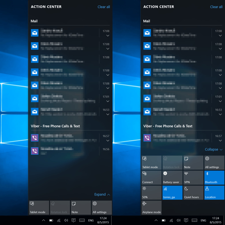
If you still feel overwhelmed by all the options, you can collapse that area into the four most used quick settings that you want. In fact, these are the only four out of about 12 that you can customize to your needs.
4. Start Menu
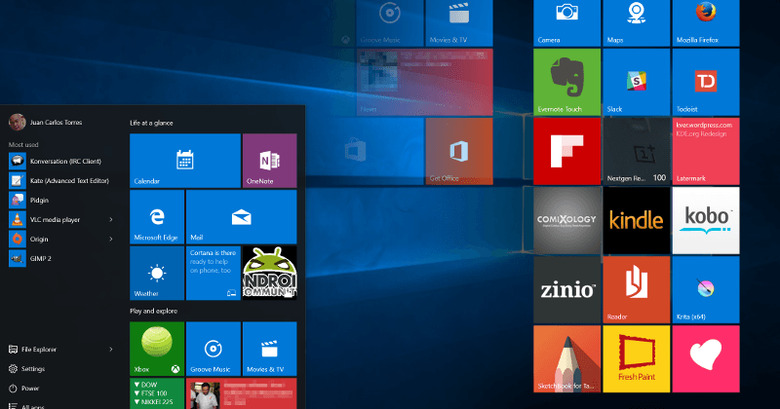
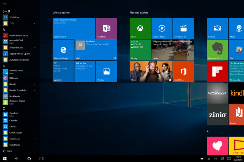
The venerable Start Menu is back! Well, sort of. Microsoft refuses to let its Modern UI Start Screen go to waste so instead of throwing it wholesale like what many wanted, it instead shoved it right into the new Start Menu. Well, at least the Start Menu is back, right? It is admittedly a strange beast now, but whatever you may have liked with the old Start Menu is mostly there. You can see a vertical listing of all software installed, type to search or jump to standard folders. By default, it only shows a shortcut to File Explorer and Settings, but with a few switches, you can also make it show Docments, Music, Pictures and such. One thing it doesn't have is the old school way of pinning to the Start Menu. You can still do that, but what it really does is pin the app as a Tile, pretty much like in gthe Windows 8 Start Screen. In fact, the two are really one and the same. What you pin, move, or remove in the Start Menu in Desktop Mode affects what gets show in the Start Screen in Tablet mode as well.
In exchange for this change of behavior, the Start Menu does gain one new ability. You can now Uninstall software directly from the list. If it's a "Modern" (now "Windows") app, it will be uninstalled directly. Otherwise, you are taken to the old Add/Remove Programs section of the Control Panel.
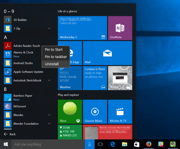
For those who actually got attached to the Windows 8 Start Screen, you do have an option to use that instead of the Start Menu even in Desktop Mode.
5. Task View and Virtual Desktops
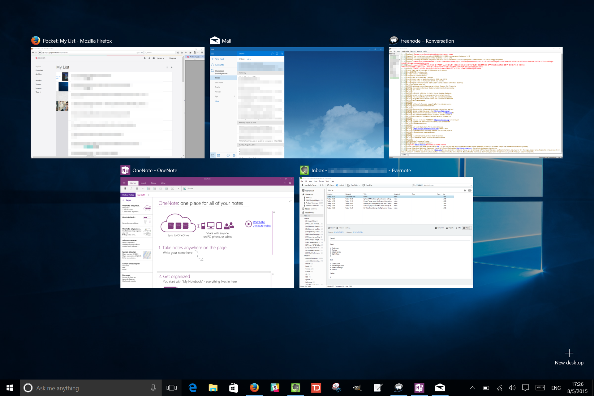
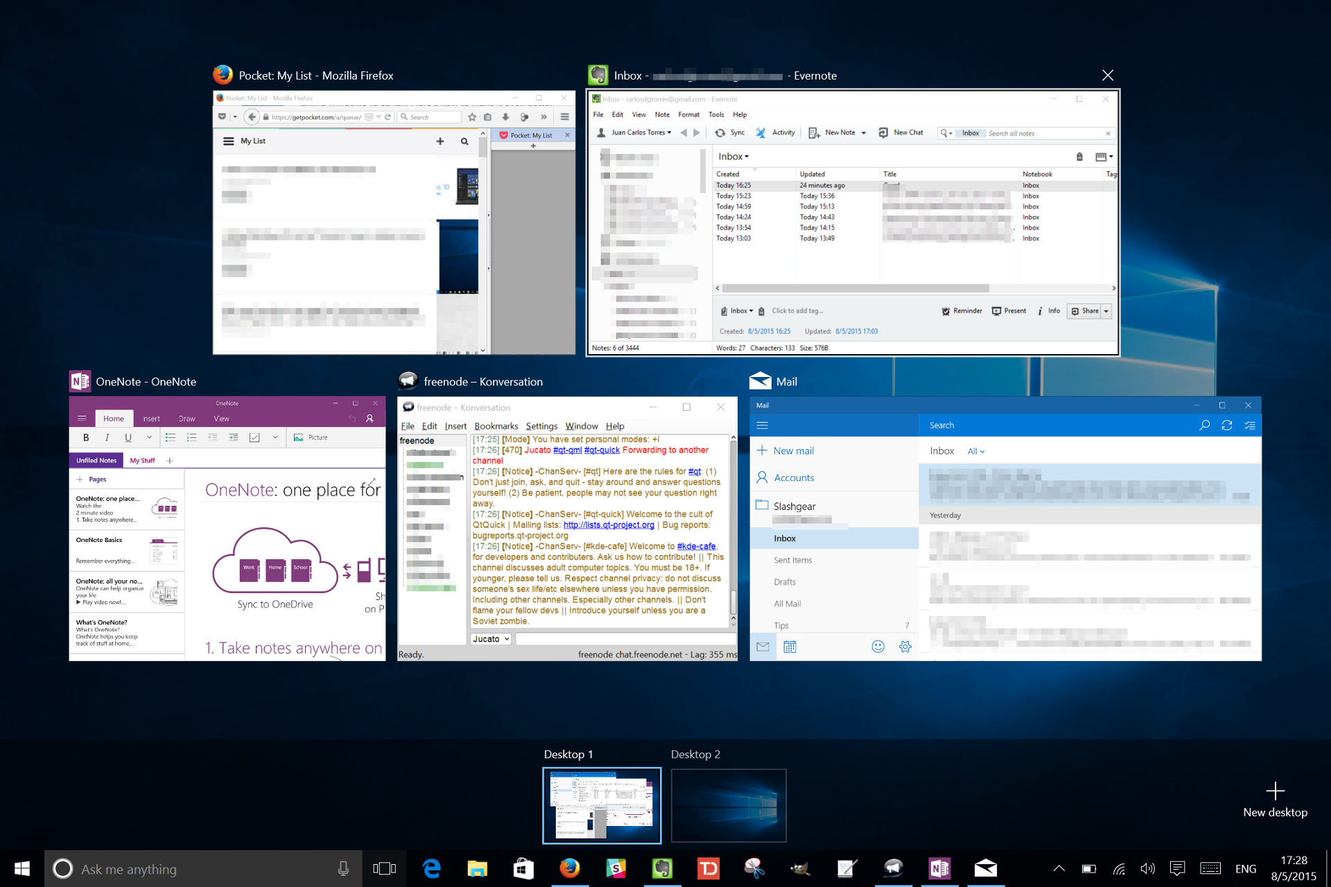
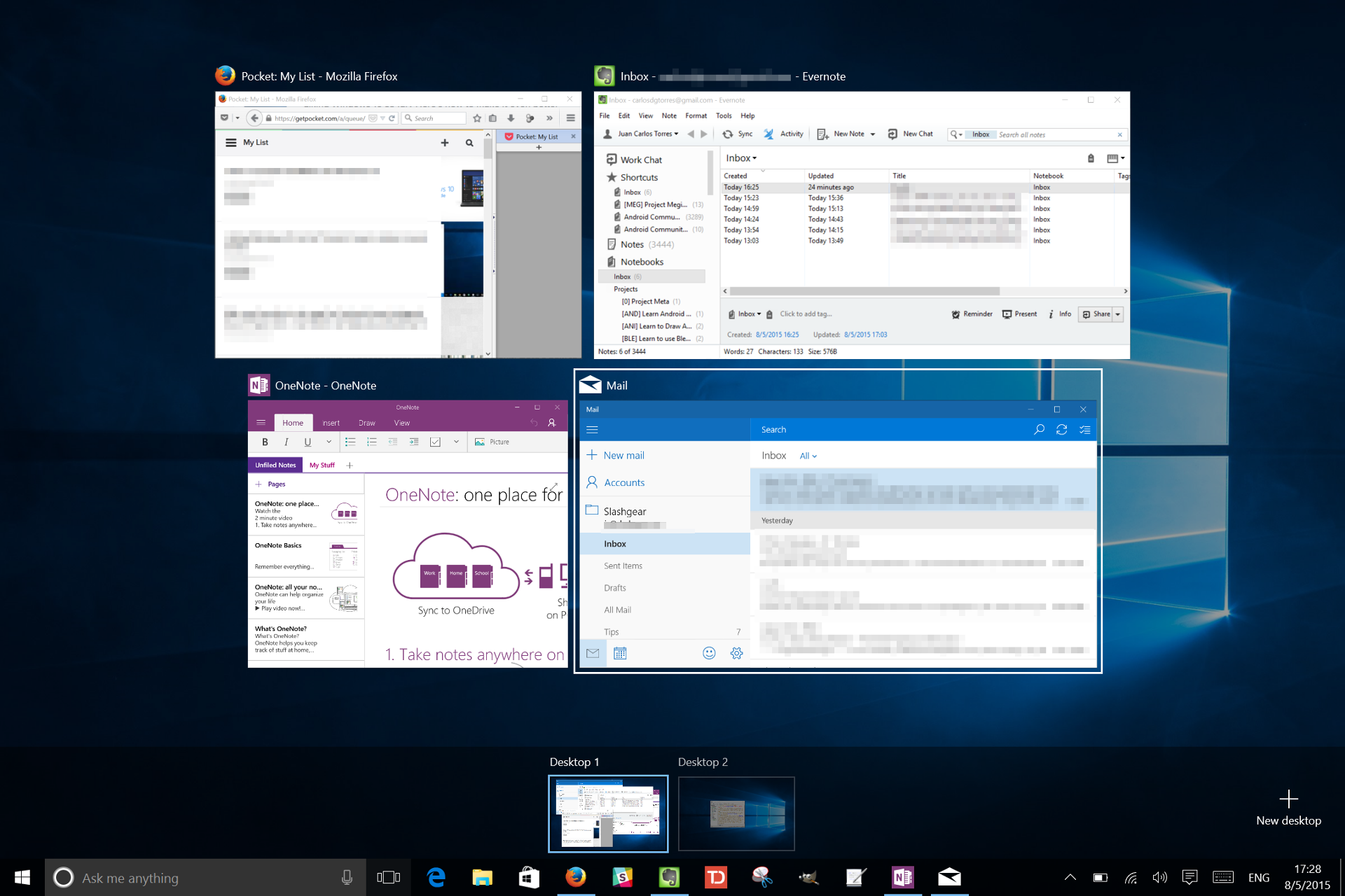
Windows finally gets a feature that Linux, and also recently OS X, has. Task View gives a more visual overview of the programs you have running more than what a simple Alt+Tab can do. Virtual Desktops allow you to seggregate Windows together into arbitrary groupings, like maybe a desktop for work, one for social apps, and the like. Admittedly, it falls under "power user" features, but it's a neat thing to have. Though hidden behind a Win+Tab shortcut (as opposed to the regular Alt+Tab), Microsoft wants you to know it's there as it puts the Task View button on the taskbar by default.
The Bad
Nothing's perfect. Especially not Windows. Given how new the OS is, there's bound to be a few hiccups. Here are just some of them.
1. Everything is new
It seems only yesterday that Windows 8 was released and yet here is Windows 10 to confound users. Well, at least now everyone is on equal footing. Those coming from Windows 7 who have never touched Windows 8 will find things both familiar and disconcerting at the same time. Those who have learned the ropes of Windows 8 will also find some common ground yet still get lost due to hard earned habits. Windows 10 tosses out some standard Windows 8 gestures and conventions in favor of the more unified approach that is Continuum. For some, it's just a learning curve. For others, it can be downright frustrating. Some things are no longer where they were and some are just buried too deep to be found. Good thing then, that we Cortana/Search on our side, eh?
2. Start Menu/Screen
The new Start Menu and Start Screen are both a boon and a bane. In trying to appeal to all types of users, Microsoft may have had to make concessions. Both are but a shadow of their Windows 7 and Windows 8 counterparts, shaving off simplicity and direct accessibility for the sake of a common interaction paradigm. For example, instead of just shortcuts, the Start Menu now has Tiles. There's just no way around that. You can remove all tiles to bring back a simple menu but you can't have pinned items on the Start Menu anymore. On the other hand, the Start Screen now feels a bit more constrained, especially in terms of space. Instead of flowing horizontally, tiles are now squished into a single screen that flows vertically instead. The list of apps is also no longer on a separate screen but on a very narrow side bar. Sadly, sacrifices had to be made and time will tell if they were worth it.
3. Windows Store
The new Windows Store is shiny and admittedly has a few more tenants but is still relatively a ghost town compared to, say, the iTunes App Store or Google Play Store. This is more a work in progress than an actual flaw, though you would have presumed that by now Microsoft would have herded more high-profile names. We're lucky to have Candy Crash from the get go, though. To some, especially those forever in Desktop Mode, it might not matter much as regular win32 software will always be available. But as a repository of "Trusted" Windows apps, it needs a bit more credibility. Microsoft's utopia of Universal Apps isn't going to happen overnight, sadly. For now, for example, we might have to settle for Microsoft's default selection. Sadly, they're not doing so well. Especially the next one.
4. Mail app
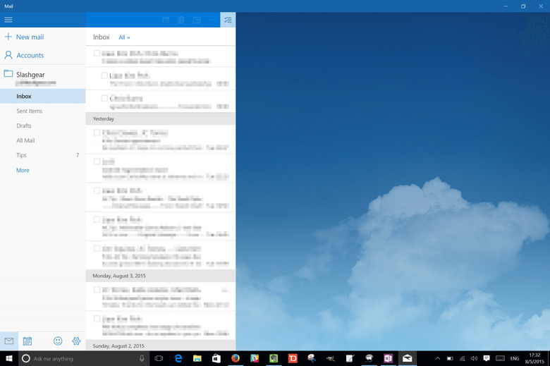
Why Microsoft chose to put out a Mail Windows app that was clearly worse than its predecessor will forever remain a mystery. In the transition to the Universal App Platform, it seems that Windows 10's default email app has shed off more than excess baggage. It actually lost basic functionality. Need to create folders from inside the app? Good luck making that happen. Fancy cleaning out a long list of emails? Have fun selecting each email one by one by one. If Microsoft's justification for losing such features is because they have to cater to smartphones too, which might not have that kind of user interface, then Microsoft will be admitting to one serious flaw in the Universal App Platform dream. When you design for the lowest common denominator, you might inevitably hit rock bottom.
5. Default Settings
It is natural that Microsoft would choose some setting that it thinks is best for its users, but sometimes you really have to wonder what fuels those decisions. While upgrading from Windows 7 or 8 to Windows 10 is a huge jump, you'd still expect that it would preserve your previous choices, or at least be courteous enough to ask first. Instead, Windows 10 just simply plows through. One that reached the media thanks to a very vocal Mozilla is the default browser setting. Whatever browser you may have been using before the upgrade, that is automatically changed to the new Microsoft Edge. That wouldn't be much of a problem if you were an Internet Explorer loyal, but Firefox and Chrome (or even Opera) fans definitely felt violated. It is understandable the Microsoft wants people to really try out its new Edge browser, which does deserve a good look, but this was probably the worst way to make a good first impression.
The Ugly
Sadly, the default settings drama doesn't actually stop at the browser. It goes on and on, especially with other, more critical settings. Now it's time for the really disturbing parts of Windows 10.
1. Privacy
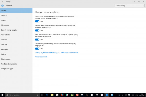
One could probably say that Windows 10 is not a privacy conscious OS by default. Yes, it has all the switches to enable or disable potential privacy and security risks, but they all default to on, from serving you ads to gathering up your personal data to sharing some bits and pieces to your friends. To be fair, you do have the option to set those during the upgrade process. But unless you already know what to expect, you'll most likely choose the Express Settings option. Given the rampant security and privacy violations these days, you'd hope Microsoft would have a bit of sense to dedicate a single page during the upgrade to set the most important ones even in Express Settings.
That said, Windows 10 does give you fine grained control over all privacy settings. Have fun swimming through all of them.
2. Wi-Fi Sense
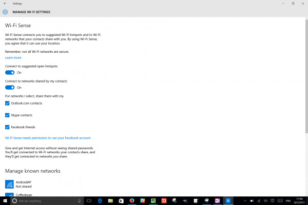
Wi-Fi Sense is one of those more worrying privacy options that Microsoft has chosen to enable by default for the sake of convenience. We won't dwell on what was already said in the past. Suffice it to say, it's a strange feature to have turned on by default anyway. Given how it has already been criticized well before Windows 10's launch date, it is disappointing to see Microsoft refusing to budge on a feature that has very little gain. Of course, you can easily turn it off, if you know where to find it. That is, unless you actually want it.
3. P2P Update
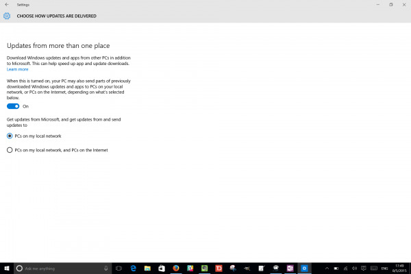
Somewhat less controversial but still a puzzling default choice is the new way to speed up downloads of updates. And by that we really mean slow down your Internet connection. Microsoft got this fancy idea to use peer-to-peer or P2P technology (yes, the very same used for those bad, bad torrents) to offload the burden of distributing updates from its servers. And guess who it offloads them to. There might be some who are generous enough to donate their bandwidth for this purpose, but those on limited networks might be in for a surprise. Hopefully, this won't be turned on by default for Windows 10 mobile.
4. Forced Updates
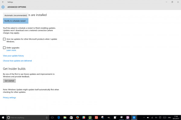
Again a highly contentious topic. There really is no way around this, unless, of course you meticulously watch every update and delay them even before they hit. Or you can opt to leave your system vulnerable for long periods of time by delaying updates for several months. Although there is very little you can do about that, you can change when Windows 10 decides its time to restart your system after an update. By default, it will do so automatically, so you should, instead, prompt you to schedule a restart instead of deciding by itself when it thinks is the best time for a reboot.
5. Settings vs. Control Panel
If you have dived into the new Settings app by now, you will probably notice a pattern. Not only is the app itself filled with pages and pages of options, they also link out to Control Panel settings. Yes, the Control Panel still lives, despite Settings getting a revamp and more features compared to Windows 8. This dichotomy is seemingly a remnant of the dichotomy in Windows 8, and one that doesn't want to die. It can be confusing to navigate, considering both programs are filled to the brim. It's also mostly a one way street, with Settings linking to Control Panel settings but not vice versa. Will we ever see a unified Settings app? Probably never. Again, this makes Cortana/Search not only nice to have, but almost essential.
Wrap-up
Like any of its major releases, Windows 10 is a double-edged sword, perhaps more than the others. Microsoft has delivered on most of its promises, though one critical promise, the Universal App Platform, might take a few more months to see fulfillment. At the same time, it has seemingly fallen short of expectation, or, at the very least, made some questionable choices. All in all, it is a significant step forward in mending the divisions caused by previous releases.
It is, however, not the final verdict. In fact, it might never be possible to give a final verdict. By making Windows into a service, Microsoft is basically saying that Windows 10 is never "done". It is always a work in progress and things can still change. Hopefully, some will, and hopefully for the better.
