The Biggest Mistakes You're Making With Your Squarespace Website

Squarespace allows amateurs to DIY their own website without writing code. We recently named it one of the best website-building tools for small businesses, partly because of the plethora of customizable drag-and-drop tools it offers. It's also incredibly easy to use, so you don't need a tech guru to walk you through the process. You can create a functional web page in a few hours just by selecting and customizing ready-made templates. These are the platform's biggest attractions but could quickly become a pitfall for its target audience. Most Squarespace users are new to web design, so it follows that they tend to make some rookie mistakes that can add up to deter site growth.
If you've gone through the trouble of setting up a website, it means you're doing something you take seriously — and want to be taken seriously — but these mistakes might keep that from happening. To keep you on track with your growth goals, we'll highlight some of these common errors and show you how to fix them. And don't worry — most of these are fixes that only require simple tweaks, so you don't need any technical expertise to fix them.
Keeping Squarespace's default elements

Squarespace templates come with some placeholder elements, like the favicon, body text formatting, and footer copy, among others — consider them the lorem ipsum of the entire interface. Leaving these elements uncustomized will lower your brand's chances of appearing legitimate and professional, hurting your website's performance in the long run.
A WebFX survey found that a brand's website design accounts for 75% of how credible people find it, and it's not hard to see why. The internet is full of scammers and other malicious parties, so customers are likelier to associate low-effort websites with the shoddy, subpar work that's typical of them.
To boost trust (and performance), make sure to personalize the following elements:
-
Favicon: This is the little icon that appears on your browser tab. The default is Squarespace's stock cube icon — you want to change that to your logo (like most businesses do) or any other icon representing your brand.
-
Template text: All the text in Squarespace templates comes multi-spaced and tracked out, probably so they could fill more space with less text. If you don't adjust this formatting to the standard letter spacing (0), your website copy will be difficult and tiring to read, which is bad news for user retention.
-
Footer content: Remove the default "Made with Squarespace" or "Powered by Squarespace" in your footer and replace it with a more original copy. The less obvious it is that your website is easy to make, the more legitimate it will seem.
-
URL slugs: Squarespace auto-generates URLs (the little hyphenated words behind the "/" after your domain name). Squarespace usually creates them from random words on the page, but it'll aid navigation and search engine performance if you customize the URL with words that describe the page content.
Not optimizing images for the web

Images play a big role in effective site performance. First, their size matters — large images take eons to load and risk driving away users who lose patience. According to WebFX, a whopping 40% of users stop interacting with a page if images fail to load. Not only that, but Google also frowns upon pages with long loading times, relegating them to lower ranks on SERPs. This translates to diminished visibility and, ultimately, a dent in conversion rates.
It's also important to choose quality images. Using high-res images not only improves the look and feel of your website but also inspires trust in users. Consumers are more likely to consider your brand legitimate and professional if you have high-quality images rather than pixelated, blurry, outdated, or badly cropped ones, and there's data to support this. TopDesignFirms reports that 40% of users judge good web design by the quality of photos used.
So that you don't sacrifice quality for speed, Squarespace has a system that creates different versions of every image you upload and selects whichever will load the fastest, depending on the user's device. Still, it recommends that web images be no more than 500KB, with widths between 1,500 and 2,500 pixels. Squarespace will automatically reformat larger body images, but keep in mind that background images and site-wide banners will load at their original dimensions.
It's also good SEO practice to add alt text to every image you upload. It's a little description that describes the content of your image, and it helps improve accessibility and search ranking. You also want to include enough (but not too many) images on pages with a lot of text. There's no set rule, but it's recommended one image for every 150-350 words.
Neglecting responsive design

Approaching your layout responsively means considering how the contents of your website adapt to different screen sizes. Good web design must be dynamic, not static. A wide site banner might display correctly on your PC but appear skewed or misplaced on mobile. This is the problem that a responsive approach aims to solve.
Again, Squarespace shines in this regard. The platform automatically resizes your content and images for different devices and screen widths. However, you still have a part to play in ensuring that all the elements look right in different dimensions. As you tweak and tinker with templates to create your own website, make sure you're frequently switching to Squarespace's mobile view to see how your layout renders on smartphones. Site banners, background images, and live media such as GIFs and videos are especially tricky, so it's important to resize your browser window for mobile when you're using those elements.
Not including clear CTAs

Typically, it takes an entire team to create a professional website. Beyond the talents of web designers and UI/UX experts, there's a crucial role played by writers and strategists. They're the architects of copy and content, ensuring they're finely tuned to drive conversions. Most DIYers don't have access to that kind of expert input (although you can get that from Squarespace's Marketplace), and so miss an important element in web copywriting: call-to-actions, or CTAs. Think of these concise prompts as digital signposts, guiding visitors to take specific actions.
It's important to create a CTA prompt consistent with your brand identity and the web page where it's located. It's recommended that CTAs have a distinct color and style from the rest of the page, include keywords, and are tailored for your audience. For instance, if your brand caters to a younger demographic, you can infuse more informal or slangy language into your CTAs. However, a universal principle remains: specificity is key. Tell the visitor exactly what you want them to do next. Ditch a generic "Click here to learn more" for specific "Join my mailing list" or "Book a session," for example.
Neglecting internal cross-linking
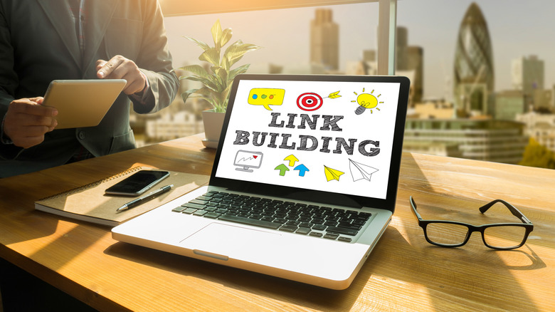
Inbound links are a big part of good SEO. Other websites linking to your content signal to the search engine that you're legitimate and trustworthy, which can improve your ranking on SERPs. But it takes a lot of time and effort to build the kind of content library and visibility that'll have other websites mentioning yours.
Thankfully, internal links are just as important for improving your reach and authority. Linking to other pages on your website can do wonders for your SEO if you do it right. First, it helps establish a network of connections between content related to a specific topic (e.g., here's one about Squarespace acquiring Google domains) and encourages visitors to stay on your site for longer. Plus, internal linking is a powerful tool for building link equity — essentially, it's like page-sharing SEO juice. If one page gains traction, internal linking channels that pay attention to other pages amplify your overall online presence. Running a brand blog amplifies these efforts by providing the platform to create more content, thus increasing your chances of conversion.
So, start a blog, create some helpful content (you can find FAQs and other pain points in the People Also Ask section on Google Search), and cross-link away.